A Picture Paints a Thousand Numbers

Charts

Introduction

The recent update of The Data & Analytics Dictionary featured an entry on Charts. Entries in The Dictionary are intended to be relatively brief [1] and also the layout does not allow for many illustrations. Given this, I have used The Dictionary entries as a basis for this slightly expanded article on the subject of chart types.

A Chart is a way to organise and Visualise Data with the general objective of making it easier to understand and – in particular – to discern trends and relationships. This article will cover some of the most frequently used Chart types, which appear in alphabetical order.

Note:
 
Categories, Values and Axes

Here an “axis” is a fixed reference line (sometimes invisible for stylistic reasons) which typically goes vertically up the page or horizontally from left to right across the page (but see also Radar Charts). Categories and values (see below) are plotted on axes. Most charts have two axes.

Throughout I use the word “category” to refer to something discrete that is plotted on an axis, for example France, Germany, Italy and The UK, or 2016, 2017, 2018 and 2019. I use the word “value” to refer to something more continuous plotted on an axis, such as sales or number of items etc. With a few exceptions, the Charts described below plot values against categories. Both Bubble Charts and Scatter Charts plot values against other values.

Series

I use “series” to mean sets of categories and values. So if the categories are France, Germany, Italy and The UK; and the values are sales; then different series may pertain to sales of different products by country.


Index

Bar & Column Charts Bubble Charts Cartograms
Histograms Line Charts Map Charts
Pie Charts Radar Charts / Spider Charts Scatter Charts
Tree Maps    


Bar & Column Charts
Clustered Bar Charts, Stacked Bar Charts

Bar Chart

Bar Charts is the generic term, but this is sometimes reserved for charts where the categories appear on the vertical axis, with Column Charts being those where categories appear on the horizontal axis. In either case, the chart has a series of categories along one axis. Extending righwards (or upwards) from each category is a rectangle whose width (height) is proportional to the value associated with this category. For example if the categories related to products, then the size of rectangle appearing against Product A might be proportional to the number sold, or the value of such sales.

Click here to view a larger version in a new tab

|  © JMB (2014)  |  Used under a Creative Commons licence  |

The exhibit above, which is excerpted from Data Visualisation – A Scientific Treatment, is a compound one in which two bar charts feature prominently.

Clustered Column Chart with Products

Sometimes the bars are clustered to allow multiple series to be charted side-by-side, for example yearly sales for 2015 to 2018 might appear against each product category. Or – as above – sales for Product A and Product B may both be shown by country.

Stacked Bar Chart

Another approach is to stack bars or columns on top of each other, something that is sometimes useful when comparing how the make-up of something has changed.

See also: a section of As Nice as Pie


Bubble Charts

Bubble Chart

Bubble Charts are used to display three dimensions of data on a two dimensional chart. A circle is placed with its centre at a value on the horizontal and vertical axes according to the first two dimensions of data, but then then the area (or less commonly the diameter [2]) of the circle reflects the third dimension. The result is reminiscent of a glass of champagne (then maybe this says more about the author than anything else).

Bubble Planets

You can also use bubble charts in a quite visceral way, as exemplified by the chart above. The vertical axis plots the number of satellites of the four giant planets in the Solar System. The horizontal axis plots the closest that they ever come to the Sun. The size of the planets themselves is proportional to their relative sizes.

See also: Data Visualisation according to a Four-year-old


Cartograms

Cartogram

There does not seem to be a generally accepted definition of Cartograms. Some authorities describe them as any diagram using a map to display statistical data; I cover this type of general chart in Map Charts below. Instead I will define a Cartogram more narrowly as a geographic map where areas of map sections are changed to be proportional to some other value; resulting in a distorted map. So, in a map of Europe, the size of countries might be increased or decreased so that their new areas are proportional to each country’s GDP.

Cartogram

Alternatively the above cartogram of the United States has been distorted (and coloured) to emphasise the population of each state. The dark blue of California and the slightly less dark blues of Texas, Florida and New York dominate the map.


Histograms

Histogram

A type of Bar Chart (typically with categories along the horizontal axis) where the categories are bins (or buckets) and the bars are proportional to the number of items falling into a bin. For example, the bins might be ranges of ages, say 0 to 19, 20 to 39, 30 to 49 and 50+ and the bars appearing against each might be the UK female population falling into each bin.

Brexit Bar
UK Referendum on EU Membership – Voting by age bracket

The diagram above is a bipartite quasi-histogram [3] that I created to illustrate another article. It is not a true histogram as it shows percentages for and against in each bin rather than overall frequencies.

Brexit Bar 2
UK Referendum on EU Membership – Numbers voting by age bracket

In the same article, I addressed this shortcoming with a second view of the same data, which is more histogram-like (apart from having a total category) and appears above. The point that I was making related to how Data Visualisation can both inform and mislead depending on the presentational choices taken.


Line Charts
Fan Charts, Area Charts

Line Chart

These typically have categories across the horizontal axis and could be considered as a set of line segments joining up the tops of what would be the rectangles on a Bar Chart. Clearly multiple lines, associated with multiple series, can be plotted simultaneously without the need to cluster rectangles as is required with Bar Charts. Lines can also be used to join up the points on Scatter Charts assuming that these are sufficiently well ordered to support this.

Line (Fan) Chart

Adaptations of Line Charts can also be used to show the probability of uncertain future events as per the exhibit above. The single red line shows the actual value of some metric up to the middle section of the chart. Thereafter it is the central prediction of a range of possible values. Lying above and below it are shaded areas which show bands of probability. For example it may be that the probability of the actual value falling within the area that has the darkest shading is 50%. A further example is contained in Limitations of Business Intelligence. Such charts are sometimes called Fan Charts.

Area Chart

Another type of Line Chart is the Area Chart. If we can think of a regular Line Chart as linking the tops of an invisible Bar Chart, then an Area Chart links the tops of an invisible Stacked Bar Chart. The effect is that how a band expands and contracts as we move across the chart shows how the contribution this category makes to the whole changes over time (or whatever other category we choose for the horizontal axis).

See also: The first exhibit in New Thinking, Old Thinking and a Fairytale


Map Charts

Cartogram

These place data on top of geographic maps. If we consider the canonical example of a map of the US divided into states, then the degree of shading of each state could be proportional to some state-related data (e.g. average income quartile of residents). Or more simply, figures could appear against each state. Bubbles could be placed at the location of major cities (or maybe a bubble per country or state etc.) with their size relating to some aspect of the locale (e.g.population). An example of this approach might be a map of US states with their relative populations denoted by Bubble area.

Rainfall intensity

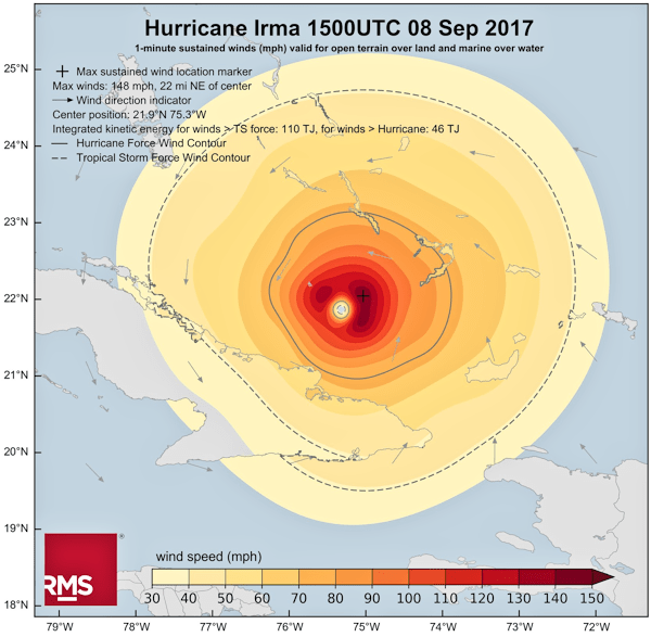
Also data could be overlaid on a map, for example – as shown above – coloured bands corresponding to different intensities of rainfall in different areas. This exhibit is excerpted from Hurricanes and Data Visualisation: Part I – Rainbow’s Gravity.


Pie Charts

Pie Chart

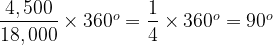
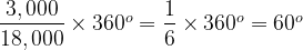
These circular charts normally display a single series of categories with values, showing the proportion each category contributes to the total. For example a series might be the nations that make up the United Kingdom and their populations: England 55.62 million people, Scotland 5.43 million, Wales 3.13 million and Northern Ireland 1.87 million.

UK Population by Nation

The whole circle represents the total of all the category values (e.g. the UK population of 66.05 million people [4]). The ratio of a segment’s angle to 360° (i.e. the whole circle) is equal to the percentage of the total represented by the linked category’s value (e.g. Scotland is 8.2% of the UK population and so will have a segment with an angle of just under 30°).

Brexit Flag
UK Referendum on EU Membership – Number voting by age bracket (see notes)

Sometimes – as illustrated above – the segments are “exploded”away from each other. This is taken from the same article as the other voting analysis exhibits.

See also: As Nice as Pie, which examines the pros and cons of this type of chart in some depth.


Radar Charts / Spider Charts

Radar Chart

Radar Charts are used to plot one or more series of categories with values that fall into the same range. If there are six categories, then each has its own axis called a radius and the six of these radiate at equal angles from a central point. The calibration of each radial axis is the same. For example Radar Charts are often used to show ratings (say from 5 = Excellent to 1 = Poor) so each radius will have five points on it, typically with low ratings at the centre and high ones at the periphery. Lines join the values plotted on each adjacent radius, forming a jagged loop. Where more than one series is plotted, the relative scores can be easily compared. A sense of aggregate ratings can also be garnered by seeing how much of the plot of one series lies inside or outside of another.

Part of a Data Capability Assessment

I use Radar Charts myself extensively when assessing organisations’ data capabilities. The above exhibit shows how an organisation ranks in five areas relating to Data Architecture compared to the best in their industry sector [5].


Scatter Charts

Scatter Chart

In most of the cases we have dealt with to date, one axis has contained discrete categories and the other continuous values (though our rating example for the Radar Chart) had discrete categories and values). For a Scatter Chart both axes plot values, either continuous or discrete. A series would consist of a set of pairs of values, one to plotted on the horizontal axis and one to be plotted on the vertical axis. For example a series might be a number of pairs of midday temperature (to be plotted on the horizontal axis) and sales of ice cream (to be plotted on the vertical axis). As may be deduced from the example, often the intention is to establish a link between the pairs of values – do ice cream sales increase with temperature? This aspect can be highlighted by drawing a line of best fit on the chart; one that minimises the total distance between each plotted point and the line. Further series, say sales of coffee versus midday temperature can be added.

Here is a further example, which illustrates potential correlation between two sets of data, one on the x-axis and the other on the y-axis:

Climate Change Scatter Chart

As always a note of caution must be introduced when looking to establish correlations using scatter graphs. The inimitable Randall Munroe of xkcd.com [7] explains this pithility as follows:

By the third trimester there will be hundreds of babies inside you.

|  © Randall Munroe, xkcd.com (2009)  |  Excerpted from: Extrapolating  |

See also: Linear Regression


Tree Maps

Tree Map

Tree Maps require a little bit of explanation. The best way to understand them is to start with something more familiar, a hierarchy diagram with three levels (i.e. something like an organisation chart). Consider a cafe that sells beverages, so we have a top level box labeled Beverages. The Beverages box splits into Hot Beverages and Cold Beverages at level 2. At level 3, Hot Beverages splits into Tea, Coffee, Herbal Tea and Hot Chocolate; Cold Beverages splits into Still Water, Sparkling Water, Juices and Soda. So there is one box at level 1, two at level 2 and eight at level 3. As ever a picture paints a thousand words:

Hierarchy Diagram

Next let’s also label each of the boxes with the value of sales in the last week. If you add up the sales for Tea, Coffee, Herbal Tea and Hot Chocolate we obviously get the sales for Hot Beverages.

Labelled Hierarchy Diagram

A Tree Map takes this idea and expands on it. A Tree Map using the data from our example above might look like this:

Treemap

First, instead of being linked by lines, boxes at level 3 (leaves let’s say) appear within their parent box at level 2 (branches maybe) and the level 2 boxes appear within the overall level 1 box (the whole tree); so everything is nested. Sometimes, as is the case above, rather than having the level 2 boxes drawn explicitly, the level 3 boxes might be colour coded. So above Tea, Coffee, Herbal Tea and Hot Chocolate are mid-grey and the rest are dark grey.

Next, the size of each box (at whatever level) is proportional to the value associated with it. In our example, 66.7% of sales (\frac{1000}{1500}) are of Hot Beverages. Then two-thirds of the Beverages box will be filled with the Hot Beverages box and one-third (\frac{500}{1500}) with the Cold Beverage box. If 20% of Cold Beverages sales (\frac{100}{500}) are Still Water, then the Still Water box will fill one fifth of the Cold Beverages box (or one fifteenth – \frac{100}{1500} – of the top level Beverages box).

It is probably obvious from the above, but it is non-trivial to find a layout that has all the boxes at the right size, particularly if you want to do something else, like have the size of boxes increase from left to right. This is a task generally best left to some software to figure out.


In Closing

The above review of various chart types is not intended to be exhaustive. For example, it doesn’t include Waterfall Charts [8], Stock Market Charts (or Open / High / Low / Close Charts [9]), or 3D Surface Charts [10] (which seldom are of much utility outside of Science and Engineering in my experience). There are also a number of other more recherché charts that may be useful in certain niche areas. However, I hope we have covered some of the more common types of charts and provided some helpful background on both their construction and usage.


Notes

 
[1]
 
Certainly by my normal standards!
 
[2]
 
Research suggests that humans are more attuned to comparing areas of circles than say their diameters.
 
[3]
 
© peterjamesthomas.com Ltd. (2019).
 
[4]
 
Excluding overseas territories.
 
[5]
 
This has been suitably redacted of course. Typically there are four other such exhibits in my assessment pack: Data Strategy, Data Organisation, MI & Analytics and Data Controls, together with a summary radar chart across all five lower level ones.
 
[6]
 
The atmospheric CO2 records were sourced from the US National Oceanographic and Atmospheric Administration’s Earth System Research Laboratory and relate to concentrations measured at their Mauna Loa station in Hawaii. The Global Average Surface Temperature records were sourced from the Earth Policy Institute, based on data from NASA’s Goddard Institute for Space Studies and relate to measurements from the latter’s Global Historical Climatology Network. This exhibit is meant to be a basic illustration of how a scatter chart can be used to compare two sets of data. Obviously actual climatological research requires a somewhat more rigorous approach than the simplistic one I have employed here.
 
[7]
 
Randall’s drawings are used (with permission) liberally throughout this site,Including:

 
[8]
 
Waterfall Chart – Wikipedia.
 
[9]
 
Open-High-Low-Close Chart – Wikipedia.
 
[10]
 
Surface Chart – AnyCharts.

peterjamesthomas.com

Another article from peterjamesthomas.com. The home of The Data and Analytics Dictionary, The Anatomy of a Data Function and A Brief History of Databases.


A Retrospective of 2018’s Articles

A Review of 2018

This is the second year in which I have produced a retrospective of my blogging activity. As in 2017, I have failed miserably in my original objective of posting this early in January. Despite starting to write this piece on 18th December 2018, I have somehow sneaked into the second quarter before getting round to completing it. Maybe I will do better with 2019’s highlights!

Anyway, 2018 was a record-breaking year for peterjamesthomas.com. The site saw more traffic than in any other year since its inception; indeed hits were over a third higher than in any previous year. This increase was driven in part by the launch of my new Maths & Science section, articles from which claimed no fewer than 6 slots in the 2018 top 10 articles, when measured by hits [1]. Overall the total number of articles and new pages I published exceeded 2017’s figures to claim the second spot behind 2009; our first year in business.

As with every year, some of my work was viewed by tens of thousands of people, while other pieces received less attention. This is my selection of the articles that I enjoyed writing most, which does not always overlap with the most popular ones. Given the advent of the Maths & Science section, there are now seven categories into which I have split articles. These are as follows:

  1. General Data Articles
  2. Data Visualisation
  3. Statistics & Data Science
  4. CDO perspectives
  5. Programme Advice
  6. Analytics & Big Data
  7. Maths & Science

In each category, I will pick out one or two pieces which I feel are both representative of my overall content and worth a read. I would be more than happy to receive any feedback on my selections, or suggestions for different choices.


General Data Articles
 
A Brief History of Databases
 
February
A Brief History of Databases
An infographic spanning the history of Database technology from its early days in the 1960s to the landscape in the late 2010s..
 
Data Strategy Alarm Bell
 
July
How to Spot a Flawed Data Strategy
What alarm bells might alert you to problems with your Data Strategy; based on the author’s extensive experience of both developing Data Strategies and vetting existing ones.
 
Just the facts...
 
August
Fact-based Decision-making
Fact-based decision-making sounds like a no brainer, but just how hard is it to generate accurate facts?
 
 
Data Visualisation
 
Comparative Pie Charts
 
August
As Nice as Pie
A review of the humble Pie Chart, what it is good at, where it presents problems and some alternatives.
 
 
Statistics & Data Science
 
Data Science Challenges – It’s Deja Vu all over again!
 
August
Data Science Challenges – It’s Deja Vu all over again!
A survey of more than 10,000 Data Scientists highlights a set of problems that will seem very, very familiar to anyone working in the data space for a few years.
 
 
CDO Perspectives
 
The CDO Dilemma
 
February
The CDO – A Dilemma or The Next Big Thing?
Two Forbes articles argue different perspectives about the role of Chief Data Officer. The first (by Lauren deLisa Coleman) stresses its importance, the second (by Randy Bean) highlights some of the challenges that CDOs face.
 
2018 CDO Interviews
 
May onwards
The “In-depth” series of CDO interviews
Rather than a single article, this is a series of four talks with prominent CDOs, reflecting on the role and its challenges.
 
The Chief Marketing Officer and the CDO – A Modern Fable
 
October
The Chief Marketing Officer and the CDO – A Modern Fable
Discussing an alt-facts / “fake” news perspective on the Chief Data Officer role.
 
 
Programme Advice
 
Building Momentum
 
June
Building Momentum – How to begin becoming a Data-driven Organisation
Many companies want to become data driven, but getting started on the journey towards this goal can be tough. This article offers a framework for building momentum in the early stages of a Data Programme.
 
 
Analytics & Big Data
 
Enterprise Data Marketplace
 
January
Draining the Swamp
A review of some of the problems that can beset Data Lakes, together with some ideas about what to do to fix these from Dan Woods (Forbes), Paul Barth (Podium Data) and Dave Wells (Eckerson Group).
 
Sic Transit Gloria Mundi
 
February
Sic Transit Gloria Magnorum Datorum
In a world where the word has developed a very negative connotation, what’s so bad about being traditional?
 
Convergent Evolution of Data Architectures
 
August
Convergent Evolution
What the similarities (and differences) between Ichthyosaurs and Dolphins can tell us about different types of Data Architectures.
 
 
Maths & Science
 
Euler's Number
 
March
Euler’s Number
A long and winding road with the destination being what is probably the most important number in Mathematics.
 The Irrational Ratio  
August
The Irrational Ratio
The number π is surrounded by a fog of misunderstanding and even mysticism. This article seeks to address some common misconceptions about π, to show that in many ways it is just like any other number, but also to demonstrate some of its less common properties.
 
Emmy Noether
 
October
Glimpses of Symmetry, Chapter 24 – Emmy
One of the more recent chapters in my forthcoming book on Group Theory and Particle Physics. This focuses on the seminal contributions of Mathematician Emmy Noether to the fundamentals of Physics and the connection between Symmetry and Conservation Laws.

 
Notes

 
[1]
 

The 2018 Top Ten by Hits
1. The Irrational Ratio
2. A Brief History of Databases
3. Euler’s Number
4. The Data and Analytics Dictionary
5. The Equation
6. A Brief Taxonomy of Numbers
7. When I’m 65
8. How to Spot a Flawed Data Strategy
9. Building Momentum – How to begin becoming a Data-driven Organisation
10. The Anatomy of a Data Function – Part I

 
peterjamesthomas.com

Another article from peterjamesthomas.com. The home of The Data and Analytics Dictionary, The Anatomy of a Data Function and A Brief History of Databases.


More Definitions in the Data and Analytics Dictionary

The Data and Analytics Dictionary

The peterjamesthomas.com Data and Analytics Dictionary is an active document and I will continue to issue revised versions of it periodically. Here are 20 new definitions, including the first from other contributors (thanks Tenny!):

  1. Artificial Intelligence Platform
  2. Data Asset
  3. Data Audit
  4. Data Classification
  5. Data Consistency
  6. Data Controls
  7. Data Curation (contributor: Tenny Thomas Soman)
  8. Data Democratisation
  9. Data Dictionary
  10. Data Engineering
  11. Data Ethics
  12. Data Integrity
  13. Data Lineage
  14. Data Platform
  15. Data Strategy
  16. Data Wrangling (contributor: Tenny Thomas Soman)
  17. Explainable AI (contributor: Tenny Thomas Soman)
  18. Information Governance
  19. Referential Integrity
  20. Testing Data (Training Data)

Remember that The Dictionary is a free resource and quoting contents (ideally with acknowledgement) and linking to its entries (via the buttons provided) are both encouraged.

People are now also welcome to contribute their own definitions. You can use the comments section here, or the dedicated form. Submissions will be subject to editorial review and are not guaranteed to be accepted.


From: peterjamesthomas.com, home of The Data and Analytics Dictionary, The Anatomy of a Data Function and A Brief History of Databases


The Latest from the Maths & Science Section

Cyclic Group of Order 3

This site has always had a strong flavour of both Mathematics and Science [1]; sometimes overt as in How to be Surprisingly Popular, Toast, Data Visualisation – A Scientific Treatment, Hurricanes and Data Visualisation: Part II – Map Reading or Patterns Patterns Everywhere; sometimes implicit as in Analogies or A Single Version of the Truth. These articles typically blend Business and Scientific or Mathematical ideas, seeking to find learnings from one applicable to the other. More recently, I have started writing some entirely Maths or Science-focused articles, starting with my book about Group Theory and Particle Physics, Glimpses of Symmetry [2]. These are collected in the Maths & Science Section, which can be accessed from the site menu; it’s right next to the Data & Analytics Dictionary as per:

Maths & Science Section

Recent trends have begun to drive a confluence between Mathematics and aspects of the data arena, notably to do with Data Science and Artificial Intelligence approaches like Machine Learning [3]. For this reason, I will periodically share selected articles from the Maths & Science Section here on the main site. I hope that they are of interest to at least some regular readers. I’ll kick this off with three, interconnecting articles about one of the most important numbers in Mathematics, e, one of the most misunderstood, \pi, and finally their beautiful relationship to each other [4].

 
1.
 
Euler’s Number

Euler's Number

A long and winding road with the destination being, e, probably the most important number in Mathematics.

 
2.
 
The Irrational Ratio

The Irrational Ratio

The number π is surrounded by a fog of misunderstanding and even mysticism. This article seeks to address some common misconceptions about π, to show that in many ways it is just like any other number, but also to demonstrate some of its less common properties.

 
3.
 
The Equation

The Equation

Deriving (and demystifying) one of the most famous equations in Mathematics.

I will occasionally share further content from the Maths & Science Section, particularly when there is some linkage to data matters or the other subjects that I cover in the main site.


Notes

 
[1]
 
No doubt related to its author’s background and indeed that of his wife.
 
[2]
 
Glimpses of Symmetry is about 75% finished at the time of writing.
 
[3]
 
A cornerstone of Machine Learning is of course Linear Algebra, a topic running throughout Glimpses of Symmetry from Chapter 6 onwards.
 
[4]
 
As may be obvious from elements of their content, these articles are presented out of chronological order, but the overall flow makes more sense this way round.


From: peterjamesthomas.com, home of The Data and Analytics Dictionary, The Anatomy of a Data Function and A Brief History of Databases


As Nice as Pie

If you can't get your graphing tool to do the shading, just add some clip art of cosmologists discussing the unusual curvature of space in the area.

© Randall Munroe of xkcd.com – Image adjusted to fit dimensions of this page

Work by the inimitable Randall Munroe, author of long-running web-comic, xkcd.com, has been featured (with permission) multiple times on these pages [1]. The above image got me thinking that I had not penned a data visualisation article since the series starting with Hurricanes and Data Visualisation: Part I – Rainbow’s Gravity nearly a year ago. Randall’s perspective led me to consider that staple of PowerPoint presentations, the humble and much-maligned Pie Chart.


While the history is not certain, most authorities credit the pioneer of graphical statistics, William Playfair, with creating this icon, which appeared in his Statistical Breviary, first published in 1801 [2]. Later Florence Nightingale (a statistician in case you were unaware) popularised Pie Charts. Indeed a Pie Chart variant (called a Polar Chart) that Nightingale compiled appears at the beginning of my article Data Visualisation – A Scientific Treatment.

I can’t imagine any reader has managed to avoid seeing a Pie Chart before reading this article. But, just in case, here is one (Since writing Rainbow’s Gravity – see above for a link – I have tried to avoid a rainbow palette in visualisations, hence the monochromatic exhibit):

Basic Pie Chart

The above image is a representation of the following dataset:

 
Label Count
A 4,500
B 3,000
C 3,000
D 3,000
E 4,500
Total 18,000
 

The Pie Chart consists of a circle divided in to five sectors, each is labelled A through E. The basic idea is of course that the amount of the circle taken up by each sector is proportional to the count of items associated with each category, A through E. What is meant by the innocent “amount of the circle” here? The easiest way to look at this is that going all the way round a circle consumes 360°. If we consider our data set, the total count is 18,000, which will equate to 360°. The count for A is 4,500 and we need to consider what fraction of 18,000 this represents and then apply this to 360°:

\dfrac{4,500}{18,000}\times 360^o=\dfrac{1}{4}\times 360^o=90^o

So A must take up 90°, or equivalently one quarter of the total circle. Similarly for B:

\dfrac{3,000}{18,000}\times 360^o=\dfrac{1}{6}\times 360^o=60^o

Or one sixth of the circle.

If we take this approach then – of course – the sum of all of the sectors must equal the whole circle and neither more nor less than this (pace Randall). In our example:

 
Label Degrees
A 90°
B 60°
C 60°
D 60°
E 90°
Total 360°
 

So far, so simple. Now let’s consider a second data-set as follows:

 
Label Count
A 9,480,301
B 6,320,201
C 6,320,200
D 6,320,201
E 9,480,301
Total 37,921,204
 

What does its Pie Chart look like? Well it’s actually rather familiar, it looks like this:

Basic Pie Chart

This observation stresses something important about Pie Charts. They show how a number of categories contribute to a whole figure, but they only show relative figures (percentages of the whole if you like) and not the absolute figures. The totals in our two data-sets differ by a factor of over 2,100 times, but their Pie Charts are identical. We will come back to this point again later on.


Pie Charts have somewhat fallen into disrepute over the years. Some of this is to do with their ubiquity, but there is also at least one more substantial criticism. This is that the human eye is bad at comparing angles, particularly if they are not aligned to some reference point, e.g. a vertical. To see this consider the two Pie Charts below (please note that these represent a different data set from above – for starters, there are only four categories plotted as opposed to five earlier on):

Comparative Pie Charts

The details of the underlying numbers don’t actually matter that much, but let’s say that the left-hand Pie Chart represents annual sales in 2016, broken down by four product lines. The right-hand chart has the same breakdown, but for 2017. This provides some context to our discussions.

Suppose what is of interest is how the sales for each product line in the 2016 chart compare to their counterparts in the right-hand one; e.g. A and A’, B and B’ and so on. Well for the As, we have the helpful fact that they both start from a vertical line and then swing down and round, initially rightwards. This can be used to gauge that A’ is a bit bigger than A. What about B and B’? Well they start in different places and end in different places, looking carefully, we can see that B’ is bigger than B. C and C’ are pretty easy, C is a lot bigger. Then we come to D and D’, I find this one a bit tricky, but we can eventually hazard a guess that they are pretty much the same.

So we can compare Pie Charts and talk about how sales change between two years, what’s the problem? The issue is that it takes some time and effort to reach even these basic conclusions. How about instead of working out which is bigger, A or A’, I ask the reader to guess by what percentage A’ is bigger. This is not trivial to do based on just the charts.

If we really want to look at year-on-year growth, we would prefer that the answer leaps off the page; after all, isn’t that the whole point of visualisations rather than tables of numbers? What if we focus on just the right-hand diagram? Can you say with certainty which is bigger, A or C, B or D? You can work to an answer, but it takes longer than should really be the case for a graphical exhibit.

Aside:

There is a further point to be made here and it relates to what we said Pie Charts show earlier in this piece. What we have in our two Pie Charts above is the make-up of a whole number (in the example we have been working through, this is total annual sales) by categories (product lines). These are percentages and what we have been doing above is to compare the fact that A made up 30% of the total sales in 2016 and 33% in 2017. What we cannot say based on just the above exhibits is how actual sales changed. The total sales may have gone up or down, the Pie Chat does not tell us this, it just deals in how the make-up of total sales has shifted.

Some people try to address this shortcoming, which can result in exhibits such as:

Comparative Pie Charts - with Growth

Here some attempt has been made to show the growth in the absolute value of sales year on year. The left-hand Pie Chart is smaller and so we assume that annual sales have increased between 2016 and 2017. The most logical thing to do would be to have the change in total area of the two Pie Charts to be in proportion to the change in sales between the two years (in this case – based on the underlying data – 2017 sales are 69% bigger than 2016 sales). However, such an approach, while adding information, makes the task of comparing sectors from year to year even harder.


The general argument is that Nested Bar Charts are better for the type of scenario I have presented and the types of questions I asked above. Looking at the same annual sales data this way we could generate the following graph:

Comparative Bar Charts

Aside:

While Bar Charts are often used to show absolute values, what we have above is the same “percentage of the whole” data that was shown in the Pie Charts. We have already covered the relative / absolute issue inherent in Pie Charts, from now on, each new chart will be like a Pie Chart inasmuch as it will contain relative (percentage of the whole) data, not absolute. Indeed you could think about generating the bar graph above by moving the Pie Chart sectors around and squishing them into new shapes, while preserving their area.

The Bar Chart makes the yearly comparisons a breeze and it is also pretty easy to take a stab at percentage differences. For example B’ looks about a fifth bigger than B (it’s actually 17.5% bigger) [3]. However, what I think gets lost here is a sense of the make-up of the elements of the two sets. We can see that A is the biggest value in the first year and A’ in the second, but it is harder to gauge what percentage of the overall both A and A’ represent.

To do this better, we could move to a Stacked Bar Chart as follows (again with the same sales data):

Stacked Bar Chart

Aside:

Once more, we are dealing with how proportions have changed – to put it simply the height of both “skyscrapers” is the same. If we instead shifted to absolute values, then our exhibit might look more like:

Stacked Bar Chart (Absolute Values)

The observant reader will note that I have also added dashed lines linking the same category for each year. These help to show growth. Regardless of what angle to the horizontal the lower line for a category makes, if it and the upper category line diverge (as for B and B’), then the category is growing; if they converge (as for C and C’), the category is shrinking [4]. Parallel lines indicate a steady state. Using this approach, we can get a better sense of the relative size of categories in the two years.


However, here – despite the dashed lines – we lose at least some of of the year-on-year comparative power of the Nested Bar Chart above. In turn the Nested Bar Chart loses some of the attributes of the original Pie Chart. In truth, there is no single chart which fits all purposes. Trying to find one is analogous to trying to find a planar projection of a sphere that preserves angles, distances and areas [5].

Rather than finding the Philosopher’s Stone [6] of an all-purpose chart, the challenge for those engaged in data visualisation is to anticipate the central purpose of an exhibit and to choose a chart type that best resonates with this. Sometimes, the Pie Chart can be just what is required, as I found myself in my article, A Tale of Two [Brexit] Data Visualisations, which closed with the following image:

Brexit Flag
UK Referendum on EU Membership – Number voting by age bracket (see caveats in original article)

Or, to put it another way:

You may very well be well bred
Chart aesthetics filling your head
But there’s always some special case, time or place
To replace perfect taste

For instance…

Never cry ’bout a Chart of Pie
You can still do fine with a Chart of Pie
People may well laugh at this humble graph
But it can be just the thing you need to help the staff

Never cry ’bout a Chart of Pie
Though without due care things can go awry
Bars are fine, Columns shine
Lines are ace, Radars race
Boxes fly, but never cry about a Chart of Pie

With apologies to the Disney Corporation!


Addendum:

It was pointed out to me by Adam Carless that I had omitted the following thing of beauty from my Pie Chart menagerie. How could I have forgotten?

3D Pie Chart

It is claimed that some Theoretical Physicists (and most Higher Dimensional Geometers) can visualise in four dimensions. Perhaps this facility would be of some use in discerning meaning from the above exhibit.


Notes

 
[1]
 
Including:

 
[2]
 
Playfair also most likely was the first to introduce line, area and bar charts.
 
[3]
 
Recall again we are comparing percentages, so 50% is 25% bigger than 40%.
 
[4]
 
This assertion would not hold for absolute values, or rather parallel lines would indicate that the absolute value of sales (not the relative one) had stayed constant across the two years.
 
[5]
 
A little-known Mathematician, going by the name of Gauss, had something to say about this back in 1828 – Disquisitiones generales circa superficies curvas. I hope you read Latin.
 
[6]
 
The Philosopher's Stone

No, not that one!.


From: peterjamesthomas.com, home of The Data and Analytics Dictionary, The Anatomy of a Data Function and A Brief History of Databases


Convergent Evolution

Ichthyosaur and Dolphin

No this article has not escaped from my Maths & Science section, it is actually about data matters. But first of all, channeling Jennifer Aniston [1], “here comes the Science bit – concentrate”.


Shared Shapes

The Theory of Common Descent holds that any two organisms, extant or extinct, will have a common ancestor if you roll the clock back far enough. For example, each of fish, amphibians, reptiles and mammals had a common ancestor over 500 million years ago. As shown below, the current organism which is most like this common ancestor is the Lancelet [2].

Chordate Common Ancestor

To bring things closer to home, each of the Great Apes (Orangutans, Gorillas, Chimpanzees, Bonobos and Humans) had a common ancestor around 13 million years ago.

Great Apes Common Ancestor

So far so simple. As one would expect, animals sharing a recent common ancestor would share many attributes with both it and each other.

Convergent Evolution refers to something else. It describes where two organisms independently evolve very similar attributes that were not features of their most recent common ancestor. Thus these features are not inherited, instead evolutionary pressure has led to the same attributes developing twice. An example is probably simpler to understand.

The image at the start of this article is of an Ichthyosaur (top) and Dolphin. It is striking how similar their body shapes are. They also share other characteristics such as live birth of young, tail first. The last Ichthyosaur died around 66 million years ago alongside many other archosaurs, notably the Dinosaurs [3]. Dolphins are happily still with us, but the first toothed whale (not a Dolphin, but probably an ancestor of them) appeared around 30 million years ago. The ancestors of the modern Bottlenose Dolphins appeared a mere 5 million years ago. Thus there is tremendous gap of time between the last Ichthyosaur and the proto-Dolphins. Ichthyosaurs are reptiles, they were covered in small scales [4]. Dolphins are mammals and covered in skin not massively different to our own. The most recent common ancestor of Ichthyosaurs and Dolphins probably lived around quarter of a billion years ago and looked like neither of them. So the shape and other attributes shared by Ichthyosaurs and Dolphins do not come from a common ancestor, they have developed independently (and millions of years apart) as adaptations to similar lifestyles as marine hunters. This is the essence of Convergent Evolution.

That was the Science, here comes the Technology…


A Brief Hydrology of Data Lakes

From 2000 to 2015, I had some success [5] with designing and implementing Data Warehouse architectures much like the following:

Data Warehouse Architecture (click to view larger version in a new window)

As a lot of my work then was in Insurance or related fields, the Analytical Repositories tended to be Actuarial Databases and / or Exposure Management Databases, developed in collaboration with such teams. Even back then, these were used for activities such as Analytics, Dashboards, Statistical Modelling, Data Mining and Advanced Visualisation.

Overlapping with the above, from around 2012, I began to get involved in also designing and implementing Big Data Architectures; initially for narrow purposes and later Data Lakes spanning entire enterprises. Of course some architectures featured both paradigms as well.

One of the early promises of a Data Lake approach was that – once all relevant data had been ingested – this would be directly leveraged by Data Scientists to derive insight.

Over time, it became clear that it would be useful to also have some merged / conformed and cleansed data structures in the Data Lake. Once the output of Data Science began to be used to support business decisions, a need arose to consider how it could be audited and both data privacy and information security considerations also came to the fore.

Next, rather than just being the province of Data Scientists, there were moves to use Data Lakes to support general Data Discovery and even business Reporting and Analytics as well. This required additional investments in metadata.

The types of issues with Data Lake adoption that I highlighted in Draining the Swamp earlier this year also led to the advent of techniques such as Data Curation [6]. In parallel, concerns about expensive Data Science resource spending 80% of their time in Data Wrangling [7] led to the creation of a new role, that of Data Engineer. These people take on much of the heavy lifting of consolidating, fixing and enriching datasets, allowing the Data Scientists to focus on Statistical Analysis, Data Mining and Machine Learning.

Big Data Architecture (click to view larger version in a new window)

All of which leads to a modified Big Data / Data Lake architecture, embodying people and processes as well as technology and looking something like the exhibit above.

This is where the observant reader will see the concept of Convergent Evolution playing out in the data arena as well as the Natural World.


In Closing

Convergent Evolution of Data Architectures

Lest it be thought that I am saying that Data Warehouses belong to a bygone era, it is probably worth noting that the archosaurs, Ichthyosaurs included, dominated the Earth for orders of magnitude longer that the mammals and were only dethroned by an asymmetric external shock, not any flaw their own finely honed characteristics.

Also, to be crystal clear, much as while there are similarities between Ichthyosaurs and Dolphins there are also clear differences, the same applies to Data Warehouse and Data Lake architectures. When you get into the details, differences between Data Lakes and Data Warehouses do emerge; there are capabilities that each has that are not features of the other. What is undoubtedly true however is that the same procedural and operational considerations that played a part in making some Warehouses seem unwieldy and unresponsive are also beginning to have the same impact on Data Lakes.

If you are in the business of turning raw data into actionable information, then there are inevitably considerations that will apply to any technological solution. The key lesson is that shape of your architecture is going to be pretty similar, regardless of the technical underpinnings.


Notes

 
[1]
 
The two of us are constantly mistaken for one another.
 
[2]
 
To be clear the common ancestor was not a Lancelet, rather Lancelets sit on the branch closest to this common ancestor.
 
[3]
 
Ichthyosaurs are not Dinosaurs, but a different branch of ancient reptiles.
 
[4]
 
This is actually a matter of debate in paleontological circles, but recent evidence suggests small scales.
 
[5]
 
See:

 
[6]
 
A term that is unaccountably missing from The Data & Analytics Dictionary – something to add to the next release. UPDATE: Now remedied here.
 
[7]
 
Ditto. UPDATE: Now remedied here


From: peterjamesthomas.com, home of The Data and Analytics Dictionary, The Anatomy of a Data Function and A Brief History of Databases


Fact-based Decision-making

All we need is fact-based decision-making ma'am
This article is about facts. Facts are sometimes less solid than we would like to think; sometimes they are downright malleable. To illustrate, consider the fact that in 98 episodes of Dragnet, Sergeant Joe Friday never uttered the words “Just the facts Ma’am”, though he did often employ the variant alluded to in the image above [1]. Equally, Rick never said “Play it again Sam” in Casablanca [2] and St. Paul never suggested that “money is the root of all evil” [3]. As Michael Caine never said in any film, “not a lot of people know that” [4].

 
Up-front Acknowledgements

These normally appear at the end of an article, but it seemed to make sense to start with them in this case:

Recently I published Building Momentum – How to begin becoming a Data-driven Organisation. In response to this, one of my associates, Olaf Penne, asked me about my thoughts on fact-base decision-making. This piece was prompted by both Olaf’s question and a recent article by my friend Neil Raden on his Silicon Angle blog, Performance management: Can you really manage what you measure? Thanks to both Olaf and Neil for the inspiration.

Fact-based decision making. It sounds good doesn’t it? Especially if you consider the alternatives: going on gut feel, doing what you did last time, guessing, not taking a decision at all. However – as is often the case with issues I deal with on this blog – fact-based decision-making is easier to say than it is to achieve. Here I will look to cover some of the obstacles and suggest a potential way to navigate round them. Let’s start however with some definitions.

Fact NOUN A thing that is known or proved to be true.
(Oxford Dictionaries)
Decision NOUN A conclusion or resolution reached after consideration.
(Oxford Dictionaries)

So one can infer that fact-based decision-making is the process of reaching a conclusion based on consideration of things that are known to be true. Again, it sounds great doesn’t it? It seems that all you have to do is to find things that are true. How hard can that be? Well actually quite hard as it happens. Let’s cover what can go wrong (note: this section is not intended to be exhaustive, links are provided to more in-depth articles where appropriate):


Accuracy of Data that is captured

Data Accuracy

A number of factors can play into the accuracy of data capture. Some systems (even in 2018) can still make it harder to capture good data than to ram in bad. Often an issue may also be a lack of master data definitions, so that similar data is labelled differently in different systems.

A more pernicious problem is combinatorial data accuracy, two data items are both valid, but not in combination with each other. However, often the biggest stumbling block is a human one, getting people to buy in to the idea that the care and attention they pay to data capture will pay dividends later in the process.

These and other areas are covered in greater detail in an older article, Using BI to drive improvements in data quality.
 
 
Honesty of Data that is captured

Honesty of Data

Data may be perfectly valid, but still not represent reality. Here I’ll let Neil Raden point out the central issue in his customary style:

People find the most ingenious ways to distort measurement systems to generate the numbers that are desired, not only NOT providing the desired behaviors, but often becoming more dysfunctional through the effort.

[…] voluntary compliance to the [US] tax code encourages a national obsession with “loopholes”, and what salesman hasn’t “sandbagged” a few deals for next quarter after she has met her quota for the current one?

Where there is a reward to be gained or a punishment to be avoided, by hitting certain numbers in a certain way, the creativeness of humans often comes to the fore. It is hard to account for such tweaking in measurement systems.
 
 
Timing issues with Data

Timing Issues

Timing is often problematic. For example, a transaction completed near the end of a period gets recorded in the next period instead, one early in a new period goes into the prior period, which is still open. There is also (as referenced by Neil in his comments above) the delayed booking of transactions in order to – with the nicest possible description – smooth revenues. It is not just hypothetical salespeople who do this of course. Entire organisations can make smoothing adjustments to their figures before publishing and deferral or expedition of obligations and earnings has become something of an art form in accounting circles. While no doubt most of this tweaking is done with the best intentions, it can compromise the fact-based approach that we are aiming for.
 
 
Reliability with which Data is moved around and consolidated

Data Transcription

In our modern architectures, replete with web-services, APIs, cloud-based components and the quasi-instantaneous transmission of new transactions, it is perhaps not surprising that occasionally some data gets lost in translation [5] along the way. That is before data starts to be Sqooped up into Data Lakes, or other such Data Repositories, and then otherwise manipulated in order to derive insight or provide regular information. All of these are processes which can introduce their own errors. Suffice it to say that transmission, collation and manipulation of data can all reduce its accuracy.

Again see Using BI to drive improvements in data quality for further details.
 
 
Pertinence and fidelity of metrics developed from Data

Data Metric

Here we get past issues with data itself (or how it is handled and moved around) and instead consider how it is used. Metrics are seldom reliant on just one data element, but are often rather combinations. The different elements might come in because a given metric is arithmetical in nature, e.g.

\text{Metric X} = \dfrac{\text{Data Item A}+\text{Data Item B}}{\text{Data Item C}}

Choices are made as to how to construct such compound metrics and how to relate them to actual business outcomes. For example:

\text{New Biz Growth} = \dfrac{(\text{Sales CYTD}-\text{Repeat CYTD})-(\text{Sales PYTD}-\text{Repeat PYTD})}{(\text{Sales PYTD}-\text{Repeat PYTD})}

Is this a good way to define New Business Growth? Are there any weaknesses in this definition, for example is it sensitive to any glitches in – say – the tagging of Repeat Business? Do we need to take account of pricing changes between Repeat Business this year and last year? Is New Business Growth something that is even worth tracking; what will we do as a result of understanding this?

The above is a somewhat simple metric, in a section of Using historical data to justify BI investments – Part I, I cover some actual Insurance industry metrics that build on each other and are a little more convoluted. The same article also considers how to – amongst other things – match revenue and outgoings when the latter are spread over time. There are often compromises to be made in defining metrics. Some of these are based on the data available. Some relate to inherent issues with what is being measured. In other cases, a metric may be a best approximation to some indication of business health; a proxy used because that indication is not directly measurable itself. In the last case, staff turnover may be a proxy for staff morale, but it does not directly measure how employees are feeling (a competitor might be poaching otherwise happy staff for example).
 
 
Robustness of extrapolations made from Data

By the third trimester, there will be hundreds of babies inside you...

© Randall Munroe, xkcd.com

I have used the above image before in these pages [6]. The situation it describes may seem farcical, but it is actually not too far away from some extrapolations I have seen in a business context. For example, a prediction of full-year sales may consist of this year’s figures for the first three quarters supplemented by prior year sales for the final quarter. While our metric may be better than nothing, there are some potential distortions related to such an approach:

  1. Repeat business may have fallen into Q4 last year, but was processed in Q3 this year. This shift in timing would lead to such business being double-counted in our year end estimate.
     
  2. Taking point 1 to one side, sales may be growing or contracting compared to the previous year. Using Q4 prior year as is would not reflect this.
     
  3. It is entirely feasible that some market event occurs this year ( for example the entrance or exit of a competitor, or the launch of a new competitor product) which would render prior year figures a poor guide.

Of course all of the above can be adjusted for, but such adjustments would be reliant on human judgement, making any projections similarly reliant on people’s opinions (which as Neil points out may be influenced, conciously or unconsciously, by self-interest). Where sales are based on conversions of prospects, the quantum of prospects might be a more useful predictor of Q4 sales. However here a historical conversion rate would need to be calculated (or conversion probabilities allocated by the salespeople involved) and we are back into essentially the same issues as catalogued above.

I explore some similar themes in a section of Data Visualisation – A Scientific Treatment
 
 
Integrity of statistical estimates based on Data

Statistical Data

Having spent 18 years working in various parts of the Insurance industry, statistical estimates being part of the standard set of metrics is pretty familiar to me [7]. However such estimates appear in a number of industries, sometimes explicitly, sometimes implicitly. A clear parallel would be credit risk in Retail Banking, but something as simple as an estimate of potentially delinquent debtors is an inherently statistical figure (albeit one that may not depend on the output of a statistical model).

The thing with statistical estimates is that they are never a single figure but a range. A model may for example spit out a figure like £12.4 million ± £0.5 million. Let’s unpack this.

Example distribution

Well the output of the model will probably be something analogous to the above image. Here a distribution has been fitted to the business event being modelled. The central point of this (the one most likely to occur according to the model) is £12.4 million. The model is not saying that £12.4 million is the answer, it is saying it is the central point of a range of potential figures. We typically next select a symmetrical range above and below the central figure such that we cover a high proportion of the possible outcomes for the figure being modelled; 95% of them is typical [8]. In the above example, the range extends plus £0. 5 million above £12.4 million and £0.5 million below it (hence the ± sign).

Of course the problem is then that Financial Reports (or indeed most Management Reports) are not set up to cope with plus or minus figures, so typically one of £12.4 million (the central prediction) or £11.9 million (the most conservative estimate [9]) is used. The fact that the number itself is uncertain can get lost along the way. By the time that people who need to take decisions based on such information are in the loop, the inherent uncertainty of the prediction may have disappeared. This can be problematic. Suppose a real result of £12.4 million sees an organisation breaking even, but one of £11.9 million sees a small loss being recorded. This could have quite an influence on what course of action managers adopt [10]; are they relaxed, or concerned?

Beyond the above, it is not exactly unheard of for statistical models to have glitches, sometimes quite big glitches [11].

This segment could easily expand into a series of articles itself. Hopefully I have covered enough to highlight that there may be some challenges in this area.
 
 
And so what?

The dashboard has been updated, how thrilling...

Even if we somehow avoid all of the above pitfalls, there remains one booby-trap that is likely to snare us, absent the necessary diligence. This was alluded to in the section about the definition of metrics:

Is New Business Growth something that is even worth tracking; what will we do as a result of understanding this?

Unless a reported figure, or output of a model, leads to action being taken, it is essentially useless. Facts that never lead to anyone doing anything are like lists learnt by rote at school and regurgitated on demand parrot-fashion; they demonstrate the mechanism of memory, but not that of understanding. As Neil puts it in his article:

[…] technology is never a solution to social problems, and interactions between human beings are inherently social. This is why performance management is a very complex discipline, not just the implementation of dashboard or scorecard technology.


How to Measure the Unmeasurable

Measuring the Unmeasurable

Our dream of fact-based decision-making seems to be crumbling to dust. Regular facts are subject to data quality issues, or manipulation by creative humans. As data is moved from system to system and repository to repository, the facts can sometimes acquire an “alt-” prefix. Timing issues and the design of metrics can also erode accuracy. Then there are many perils and pitfalls associated with simple extrapolation and less simple statistical models. Finally, any fact that manages to emerge from this gantlet [12] unscathed may then be totally ignored by those whose actions it is meant to guide. What can be done?

As happens elsewhere on this site, let me turn to another field for inspiration. Not for the first time, let’s consider what Science can teach us about dealing with such issues with facts. In a recent article [13] in my Maths & Science section, I examined the nature of Scientific Theory and – in particular – explored the imprecision inherent in the Scientific Method. Here is some of what I wrote:

It is part of the nature of scientific theories that (unlike their Mathematical namesakes) they are not “true” and indeed do not seek to be “true”. They are models that seek to describe reality, but which often fall short of this aim in certain circumstances. General Relativity matches observed facts to a greater degree than Newtonian Gravity, but this does not mean that General Relativity is “true”, there may be some other, more refined, theory that explains everything that General Relativity does, but which goes on to explain things that it does not. This new theory may match reality in cases where General Relativity does not. This is the essence of the Scientific Method, never satisfied, always seeking to expand or improve existing thought.

I think that the Scientific Method that has served humanity so well over the centuries is applicable to our business dilemma. In the same way that a Scientific Theory is never “true”, but instead useful for explaining observations and predicting the unobserved, business metrics should be judged less on their veracity (though it would be nice if they bore some relation to reality) and instead on how often they lead to the right action being taken and the wrong action being avoided. This is an argument for metrics to be simple to understand and tied to how decision-makers actually think, rather than some other more abstruse and theoretical definition.

A proxy metric is fine, so long as it yields the right result (and the right behaviour) more often than not. A metric with dubious data quality is still useful if it points in the right direction; if the compass needle is no more than a few degrees out. While of course steps that improve the accuracy of metrics are valuable and should be undertaken where cost-effective, at least equal attention should be paid to ensuring that – when the metric has been accessed and digested – something happens as a result. This latter goal is a long way from the arcana of data lineage and metric definition, it is instead the province of human psychology; something that the accomploished data professional should be adept at influencing.

I have touched on how to positively modify human behaviour in these pages a number of times before [14]. It is a subject that I will be coming back to again in coming months, so please watch this space.


Further reading on this subject:


Notes

 
[1]
 
According to Snopes, the phrase arose from a spoof of the series.
 
[2]
 
The two pertinent exchanges were instead:

Ilsa: Play it once, Sam. For old times’ sake.
Sam: I don’t know what you mean, Miss Ilsa.
Ilsa: Play it, Sam. Play “As Time Goes By”
Sam: Oh, I can’t remember it, Miss Ilsa. I’m a little rusty on it.
Ilsa: I’ll hum it for you. Da-dy-da-dy-da-dum, da-dy-da-dee-da-dum…
Ilsa: Sing it, Sam.

and

Rick: You know what I want to hear.
Sam: No, I don’t.
Rick: You played it for her, you can play it for me!
Sam: Well, I don’t think I can remember…
Rick: If she can stand it, I can! Play it!
 
[3]
 
Though he, or whoever may have written the first epistle to Timothy, might have condemned the “love of money”.
 
[4]
 
The origin of this was a Peter Sellers interview in which he impersonated Caine.
 
[5]
 
One of my Top Ten films.
 
[6]
 
Especially for all Business Analytics professionals out there (2009).
 
[7]
 
See in particular my trilogy:

  1. Using historical data to justify BI investments – Part I (2011)
  2. Using historical data to justify BI investments – Part II (2011)
  3. Using historical data to justify BI investments – Part III (2011)
 
[8]
 
Without getting into too many details, what you are typically doing is stating that there is a less than 5% chance that the measurements forming model input match the distribution due to a fluke; but this is not meant to be a primer on null hypotheses.
 
[9]
 
Of course, depending on context, £12.9 million could instead be the most conservative estimate.
 
[10]
 
This happens a lot in election polling. Candidate A may be estimated to be 3 points ahead of Candidate B, but with an error margin of 5 points, it should be no real surprise when Candidate B wins the ballot.
 
[11]
 
Try googling Nobel Laureates Myron Scholes and Robert Merton and then look for references to Long-term Capital Management.
 
[12]
 
Yes I meant “gantlet” that is the word in the original phrase, not “gauntlet” and so connections with gloves are wide of the mark.
 
[13]
 
Finches, Feathers and Apples (2018).
 
[14]
 
For example:


From: peterjamesthomas.com, home of The Data and Analytics Dictionary, The Anatomy of a Data Function and A Brief History of Databases


A Retrospective of 2017’s Articles

A Review of 2017

This article was originally intended for publication late in the year it reviews, but, as they [1] say, the best-laid schemes o’ mice an’ men gang aft agley…

In 2017 I wrote more articles [2] than in any year since 2009, which was the first full year of this site’s existence. Some were viewed by thousands of people, others received less attention. Here I am going to ignore the metric of popular acclaim and instead highlight a few of the articles that I enjoyed writing most, or sometimes re-reading a few months later [3]. Given the breadth of subject matter that appears on peterjamesthomas.com, I have split this retrospective into six areas, which are presented in decreasing order of the number of 2017 articles I wrote in each. These are as follows:

  1. General Data Articles
  2. Data Visualisation
  3. Statistics & Data Science
  4. CDO perspectives
  5. Programme Advice
  6. Analytics & Big Data

In each category, I will pick out two or three of pieces which I feel are both representative of my overall content and worth a read. I would be more than happy to receive any feedback on my selections, or suggestions for different choices.


General Data Articles
 
The Data & Analytics Dictionary
 
August
The Data and Analytics Dictionary
My attempt to navigate the maze of data and analytics terminology. Everything from Algorithm to Web Analytics.
 
The Anatomy of a Data Function
 
November & December
The Anatomy of a Data Function: Part I, Part II and Part III
Three articles focussed on the structure and components of a modern Data Function and how its components interact with both each other and the wider organisation in order to support business goals.
 
 
Data Visualisation
 
Nucleosynthesis and Data Visualisation
 
January
Nucleosynthesis and Data Visualisation
How one of the most famous scientific data visualisations, the Periodic Table, has been repurposed to explain where the atoms we are all made of come from via the processes of nucleosynthesis.
 
Hurricanes and Data Visualisation
 
September & October
Hurricanes and Data Visualisation: Part I – Rainbow’s Gravity and Part II – Map Reading
Two articles on how Data Visualisation is used in Meteorology. Part I provides a worked example illustrating some of the problems that can arise when adopting a rainbow colour palette in data visualisation. Part II grapples with hurricane prediction and covers some issues with data visualisations that are intended to convey safety information to the public.
 
 
Statistics & Data Science
 
Toast
 
February
Toast
What links Climate Change, the Manhattan Project, Brexit and Toast? How do these relate to the public’s trust in Science? What does this mean for Data Scientists?
Answers provided by Nature, The University of Cambridge and the author.
 
How to be Surprisingly Popular
 
February
How to be Surprisingly Popular
The wisdom of the crowd relies upon essentially democratic polling of a large number of respondents; an approach that has several shortcomings, not least the lack of weight attached to people with specialist knowledge. The Surprisingly Popular algorithm addresses these shortcomings and so far has out-performed existing techniques in a range of studies.
 
A Nobel Laureate’s views on creating Meaning from Data
 
October
A Nobel Laureate’s views on creating Meaning from Data
The 2017 Nobel Prize for Chemistry was awarded to Structural Biologist Richard Henderson and two other co-recipients. What can Machine Learning practitioners learn from Richard’s observations about how to generate images from Cryo-Electron Microscopy data?
 
 
CDO Perspectives
 
Alphabet Soup
 
January
Alphabet Soup
Musings on the overlapping roles of Chief Analytics Officer and Chief Data Officer and thoughts on whether there should be just one Top Data Job in an organisation.
 
A Sweeter Spot for the CDO?
 
February
A Sweeter Spot for the CDO?
An extension of my concept of the Chief Data Officer sweet spot, inspired by Bruno Aziza of AtScale.
 
A truth universally acknowledged…
 
September
A truth universally acknowledged…
Many Chief Data Officer job descriptions have a list of requirements that resemble Swiss Army Knives. This article argues that the CDO must be the conductor of an orchestra, not someone who is a virtuoso in every single instrument.
 
 
Programme Advice
 
Bumps in the Road
 
January
Bumps in the Road
What the aftermath of repeated roadworks can tell us about the potentially deleterious impact of Change Programmes on Data Landscapes.
 
20 Risks that Beset Data Programmes
 
February
20 Risks that Beset Data Programmes
A review of 20 risks that can plague data programmes. How effectively these are managed / mitigated can make or break your programme.
 
Ideas for avoiding Big Data failures and for dealing with them if they happen
 
March
Ideas for avoiding Big Data failures and for dealing with them if they happen
Paul Barsch (EY & Teradata) provides some insight into why Big Data projects fail, what you can do about this and how best to treat any such projects that head off the rails. With additional contributions from Big Data gurus Albert Einstein, Thomas Edison and Samuel Beckett.
 
 
Analytics & Big Data
 
Bigger and Better (Data)?
 
February
Bigger and Better (Data)?
Some examples of where bigger data is not necessarily better data. Provided by Bill Vorhies and Larry Greenemeier .
 
Elephants’ Graveyard?
 
March
Elephants’ Graveyard?
Thoughts on trends in interest in Hadoop and Spark, featuring George Hill, James Kobielus, Kashif Saiyed and Martyn Richard Jones, together with the author’s perspective on the importance of technology in data-centric work.
 
 
and Finally…

I would like to close this review of 2017 with a final article, one that somehow defies classification:

 
25 Indispensable Business Terms
 
April
25 Indispensable Business Terms
An illustrated Buffyverse take on Business gobbledygook – What would Buffy do about thinking outside the box? To celebrate 20 years of Buffy the Vampire Slayer and 1st April 2017.

 
Notes

 
[1]
 
“They” here obviously standing for Robert Burns.
 
[2]
 
Thirty-four articles and one new page.
 
[3]
 
Of course some of these may also have been popular, I’m not being masochistic here!


From: peterjamesthomas.com, home of The Data and Analytics Dictionary


Hurricanes and Data Visualisation: Part II – Map Reading

Confusing map reading

This is the second of two articles whose genesis was the nexus of hurricanes and data visualisation. The first article was, Part I – Rainbow’s Gravity [1].
 
 
Introduction

In the first article in this mini-series we looked at alternative approaches to colour and how these could inform or mislead in data visualisations relating to weather events. In particular we discussed drawbacks of using a rainbow palette in such visualisations and some alternatives. Here we move into much more serious territory, how best to inform the public about what a specific hurricane will do next and the risks that it poses. It would not be an exaggeration to say that sometimes this area may be a matter of life and death. As with rainbow-coloured maps of weather events, some aspects of how the estimated future course of hurricanes are communicated and understood leave much to be desired.

Hurricane Irma cone
Source: US National Weather Service (NWS)

The above diagram is called a the cone of uncertainty of a hurricane. Cone of uncertainty sounds like an odd term. What does it mean? Let’s start by offering a historical perspective on hurricane modelling.
 
 
Paleomodelling

Well like any other type of weather prediction, determining the future direction and speed of a hurricane is not an exact science [2]. In the earlier days of hurricane modelling, Meteorologists used to employ statistical models, which were built based on detailed information about previous hurricanes, took as input many data points about the history of a current hurricane’s evolution and provided as output a prediction of what it could do in coming days.

Black Box

There were a variety of statistical models, but the output of them was split into two types when used for hurricane prediction.

Type A and Type B
A) A prediction of the next location of the hurricane was made. This included an average error (in km) based on the inaccuracy of previous hurricane predictions. A percentage of this, say 80%, gave a “circle of uncertainty”, x km around the prediction.

B) Many predictions were generated and plotted; each had a location and an probability associated with it. The centroid of these (adjusted by the probability associated with each location) was calculated and used as the central prediction (cf. A). A circle was drawn (y km from the centroid) so that a percentage of the predictions fell within this. Above, there are 100 estimates and the chosen percentage is 80%; so 80 points lie within the red “circle of uncertainty”.

Type A

First, the model could have generated a single prediction (the centre of the hurricane will be at 32.3078° N, 64.7505° W tomorrow) and supplemented this with an error measure. The error measure would have been based on historical hurricane data and related to how far out prior predictions had been on average; this measure would have been in kilometres. It would have been typical to employ some fraction of the error measure to define a “circle of uncertainty” around the central prediction; 80% in the example directly above (compared to two thirds in the NWS exhibit at the start of the article).

Type B

Second, the model could have generated a large number of mini-predictions, each of which would have had a probability associated with it (e.g. the first two estimates of location could be that the centre of the hurricane is at 32.3078° N, 64.7505° W with a 5% chance, or a mile away at 32.3223° N, 64.7505° W with a 2% chance and so on). In general if you had picked the “centre of gravity” of the second type of output, it would have been analogous to the single prediction of the first type of output [3]. The spread of point predictions in the second method would have also been analogous to the error measure of the first. Drawing a circle around the centroid would have captured a percentage of the mini-predictions, once more 80% in the example immediately above and two thirds in the NWS chart, generating another “circle of uncertainty”.
 
 
Here comes the Science

Fluid Dynamics

That was then of course, nowadays the statistical element of hurricane models is less significant. With increased processing power and the ability to store and manipulate vast amounts of data, most hurricane models instead rely upon scientific models; let’s call this Type C.

Type C

As the air is a fluid [4], its behaviour falls into the area of study known as fluid dynamics. If we treat the atmosphere as being viscous, then the appropriate equation governing fluid dynamics is the Navier-Stokes equation, which is itself derived from the Cauchy Momentum equation:

\displaystyle\frac{\partial}{\partial t}(\rho \boldsymbol{u}) + \nabla \cdot (\rho \boldsymbol{u}\otimes \boldsymbol{u})=-\nabla\cdot p\boldsymbol{I}+\nabla\cdot\boldsymbol{\tau} + \rho\boldsymbol{g}

If viscosity is taken as zero (as a simplification), instead the Euler equations apply:

\displaystyle\left\{\begin{array}{lr}\displaystyle\frac{\partial\boldsymbol{u}}{\partial t} + \nabla \cdot (\boldsymbol{u}\otimes \boldsymbol{u} + w\boldsymbol{I}) = \boldsymbol{g} \\ \\ \nabla \cdot \boldsymbol{u}= 0\end{array}\right.

The reader may be glad to know that I don’t propose to talk about any of the above equations any further.

3D Grid

To get back to the model, in general the atmosphere will be split into a three dimensional grid (the atmosphere has height as well). The current temperature, pressure, moisture content etc. are fed in (or sometimes interpolated) at each point and equations such as the ones above are used to determine the evolution of fluid flow at a given grid element. Of course – as is typical in such situations – approximations of the equations are used and there is some flexibility over which approximations to employ. Also, there may be uncertainty about the input parameters, so statistics does not disappear entirely. Leaving this to one side, how the atmospheric conditions change over time at each grid point rolls up to provide a predictive basis for what a hurricane will do next.

Although the methods are very different, the output of these scientific models will be pretty similar, qualitatively, to the Type A statistical model above. In particular, uncertainty will be delineated based on how well the model performed on previous occasions. For example, what was the average difference between prediction and fact after 6 hours, 12 hours and so on. Again, the uncertainty will have similar characteristics to that of Type A above.
 
 
A Section about Conics

An advanced statistical approach

In all of the cases discussed above, we have a central prediction (which may be an average of several predictions as per Type B) and a circular distribution around this indicating uncertainty. Let’s consider how these predictions might change as we move into the future.

If today is Monday, then there will be some uncertainty about what the hurricane does on Tuesday. For Wednesday, the uncertainty will be greater than for Tuesday (the “circle of uncertainty” will have grown) and so on. With the Type A and Type C outputs, the error measure will increase with time. With the Type B output, if the model spits out 100 possible locations for the hurricane on a specific day (complete with the likelihood of each of these occurring), then these will be fairly close together on Tuesday and further apart on Wednesday. In all cases, uncertainty about the location of the becomes smeared out over time, resulting in a larger area where it is likely to be located and a bigger “circle of uncertainty”.

This is where the circles of uncertainty combine to become a cone of uncertainty. For the same example, on each day, the meteorologists will plot the central prediction for the hurricane’s location and then draw a circle centered on this which captures the uncertainty of the prediction. For the same reason as stated above, the size of the circle will (in general) increase with time; Wednesday’s circle will be bigger than Tuesday’s. Also each day’s central prediction will be in a different place from the previous day’s as the hurricane moves along. Joining up all of these circles gives us the cone of uncertainty [5].

If the central predictions imply that a hurricane is moving with constant speed and direction, then its cone of uncertainty would look something like this:

Cone of uncertainty

In this diagram, broadly speaking, on each day, there is a 67% probability that the centre of the hurricane will be found within the relevant circle that makes up the cone of uncertainty. We will explore the implications of the underlined phrase in the next section.

Of course hurricanes don’t move in a single direction at an unvarying pace (see the actual NWS exhibit above as opposed to my idealised rendition), so part of the purpose of the cone of uncertainty diagram is to elucidate this.
 
 
The Central Issue

So hopefully the intent of the NWS chart at the beginning of this article is now clearer. What is the problem with it? Well I’ll go back to the words I highlighted couple of paragraphs back:

There is a 67% probability that the centre of the hurricane will be found within the relevant circle that makes up the cone of uncertainty

So the cone helps us with where the centre of the hurricane may be. A reasonable question is, what about the rest of the hurricane?

For ease of reference, here is the NWS exhibit again:

Hurricane Irma cone

Let’s first of all pause to work out how big some of the NWS “circles of uncertainty” are. To do this we can note that the grid lines (though not labelled) are clearly at 5° intervals. The distance between two lines of latitude (ones drawn parallel to the equator) that are 1° apart from each other is a relatively consistent number; approximately 111 km [6]. This means that the lines of latitude on the page are around 555 km apart. Using this as a reference, the “circle of uncertainty” labelled “8 PM Sat” has a diameter of about 420 km (260 miles).

Let’s now consider how big Hurricane Irma was [7].

Size of Irma
Source: RMS

Aside: I’d be remiss if I didn’t point out here that RMS have selected what seems to me to be a pretty good colour palette in the chart above.

Well there is no defined sharp edge of a hurricane, rather the speed of winds tails off as may be seen in the above diagram. In order to get some sense of the size of Irma, I’ll use the dashed line in the chart that indicates where wind speeds drop below that classified as a tropical storm (65 kmph or 40 mph [8]). This area is not uniform, but measures around 580 km (360 miles) wide.

Misplaced hurricane
A) The size of the hurricane is greater than the size of the “circle of uncertainty”, the former extends 80 km beyond the circumference of the latter in all directions.

B) The “circle of uncertainty” captures the area within which the hurricane’s centre is likely to fall. But this includes cases where the centre of the hurricane is on the circumference of the “circle of uncertainty”. This means the the furthermost edge of the hurricane could be up to 290 km outside of the “circle of uncertainty”.

There are two issues here, which are illustrated in the above diagram.

Issue A

Irma was actually bigger [9] than at least some of the “circles of uncertainty”. A cursory glance at the NWS exhibit would probably give the sense that the cone of uncertainty represents the extent of the storm, it doesn’t. In our example, Irma extends 80 km beyond the “circle of uncertainty” we measured above. If you thought you were safe because you were 50 km from the edge of the cone, then this was probably an erroneous conclusion.

Issue B

Even more pernicious, because each “circle of uncertainty” provides an area within which the centre of the hurricane could be situated, this includes cases where the centre of the hurricane sits on the circumference of the “circle of uncertainty”. This, together with the size of the storm, means that someone 290 km from the edge of the “circle of uncertainty” could suffer 65 kmph (40 mph) winds. Again, based on the diagram, if you felt that you were guaranteed to be OK if you were 250 km away from the edge of the cone, you could get a nasty surprise.

Hurricane Season

These are not academic distinctions, the real danger that hurricane cones were misinterpreted led the NWS to start labelling their charts with “This cone DOES NOT REPRESENT THE SIZE OF THE STORM!![10].

Even Florida senator Marco Rubio got in on the act, tweeting:

Rubio tweet

When you need a politician help you avoid misinterpreting a data visualisation, you know that there is something amiss.
 
 
In Summary

Could do better

The last thing I want to do is to appear critical of the men and women of the US National Weather Service. I’m sure that they do a fine job. If anything, the issues we have been dissecting here demonstrate that even highly expert people with a strong motivation to communicate clearly can still find it tough to select the right visual metaphor for a data visualisation; particularly when there is a diverse audience consuming the results. It also doesn’t help that there are many degrees of uncertainty here: where might the centre of the storm be? how big might the storm be? how powerful might the storm be? in which direction might the storm move? Layering all of these onto a single exhibit while still rendering it both legible and of some utility to the general public is not a trivial exercise.

The cone of uncertainty is a precise chart, so long as the reader understands what it is showing and what it is not. Perhaps the issue lies more in the eye of the beholder. However, having to annotate your charts to explain what they are not is never a good look on anyone. The NWS are clearly aware of the issues, I look forward to viewing whatever creative solution they come up with later this hurricane season.


Acknowledgements

I would like to thank Dr Steve Smith, Head of Catastrophic Risk at Fractal Industries, for reviewing this piece and putting me right on some elements of modern hurricane prediction. I would also like to thank my friend and former colleague, Dr Raveem Ismail, also of Fractal Industries, for introducing me to Steve. Despite the input of these two experts, responsibility for any errors or omissions remains mine alone.


Notes

 
[1]
 
I also squeezed Part I(b) – The Mona Lisa in between the two articles I originally planned.
 
[2]
 
I don’t mean to imply by this that the estimation process is unscientific of course. Indeed, as we will see later, hurricane prediction is becoming more scientific all the time.
 
[3]
 
If both methods were employed in parallel, it would not be too surprising if their central predictions were close to each other.
 
[4]
 
A gas or a liquid.
 
[5]
 
Cone

A shape traced out by a particle traveling with constant speed and with a circle of increasing radius inscribed around it would be a cone.

 
[6]
 
Latitude and Longitude

The distance between lines of longitude varies between 111 km at the equator and 0 km at either pole. This is because lines of longitude are great circles (or meridians) that meet at the poles. Lines of latitude are parallel circles (parallels) progressing up and down the globe from the equator.

 
[7]
 
At a point in time of course. Hurricanes change in size over time as well as in their direction/speed of travel and energy.
 
[8]
 
I am rounding here. The actual threshold values are 63 kmph and 39 mph.
 
[9]
 
Using the definition of size that we have adopted above.
 
[10]
 
Their use of capitals, bold and multiple exclamation marks.


From: peterjamesthomas.com, home of The Data and Analytics Dictionary


A Nobel Laureate’s views on creating Meaning from Data

Image © MRC Laboratory of Molecular Biology, Cambridge, UK

Praise for the Praiseworthy

Today the recipients of the 2017 Nobel Prize for Chemistry were announced [1]. I was delighted to learn that one of the three new Laureates was Richard Henderson, former Director of the UK Medical Research Council’s Laboratory of Molecular Biology in Cambridge; an institute universally known as the LMB. Richard becomes the fifteenth Nobel Prize winner who worked at the LMB. The fourteenth was Venkatraman Ramakrishnan in 2009. Venki was joint Head of Structural Studies at the LMB, prior to becoming President of the Royal Society [2].

MRC Laboratory of Molecular Biology

I have mentioned the LMB in these pages before [3]. In my earlier article, which focussed on Data Visualisation in science, I also provided a potted history of X-ray crystallography, which included the following paragraph:

Today, X-ray crystallography is one of many tools available to the structural biologist with other approaches including Nuclear Magnetic Resonance Spectroscopy, Electron Microscopy and a range of biophysical techniques.

I have highlighted the term Electron Microscopy above and it was for his immense contributions to the field of Cryo-electron Microscopy (Cryo-EM) that Richard was awarded his Nobel Prize; more on this shortly.

First of all some disclosure. The LMB is also my wife’s alma mater, she received her PhD for work she did there between 2010 and 2014. Richard was one of two people who examined her as she defended her thesis [4]. As Venki initially interviewed her for the role, the bookends of my wife’s time at the LMB were formed by two Nobel laureates; an notable symmetry.

2017 Nobel Prize

The press release about Richard’s Nobel Prize includes the following text:

The Nobel Prize in Chemistry 2017 is awarded to Jacques Dubochet, Joachim Frank and Richard Henderson for the development of cryo-electron microscopy, which both simplifies and improves the imaging of biomolecules. This method has moved biochemistry into a new era.

[…]

Electron microscopes were long believed to only be suitable for imaging dead matter, because the powerful electron beam destroys biological material. But in 1990, Richard Henderson succeeded in using an electron microscope to generate a three-dimensional image of a protein at atomic resolution. This breakthrough proved the technology’s potential.

Electron microscopes [5] work by passing a beam of electrons through a thin film of the substance being studied. The electrons interact with the constituents of the sample and go on to form an image which captures information about these interactions (nowadays mostly on an electronic detector of some sort). Because the wavelength of electrons [6] is so much shorter than light [7], much finer detail can be obtained using electron microscopy than with light microscopy. Indeed electron microscopes can be used to “see” structures at the atomic scale. Of course it is not quite as simple as printing out the image snapped by you SmartPhone. The data obtained from electron microscopy needs to be interpreted by software; again we will come back to this point later.

Cryo-EM refers to how the sample being examined is treated prior to (and during) microscopy. Here a water-suspended sample of the substance is frozen (to put it mildly) in liquid ethane to temperatures around -183 °C and maintained at that temperature during the scanning procedure. The idea here is to protect the sample from the damaging effects of the cathode rays [8] it is subjected to during microscopy.
 
 
A Matter of Interpretation

On occasion, I write articles which are entirely scientific or mathematical in nature, but more frequently I bring observations from these fields back into my own domain, that of data, information and insight. This piece will follow the more typical course. To do this, I will rely upon a perspective that Richard Henderson wrote for the Proceedings of the National Academy of Science back in 2013 [9].

Here we come back to the interpretation of Cryo-EM data in order to form an image. In the article, Richard refers to:

[Some researchers] who simply record images, follow an established (or sometimes a novel or inventive [10]) protocol for 3D map calculation, and then boldly interpret and publish their map without any further checks or attempts to validate the result. Ten years ago, when the field was in its infancy, referees would simply have to accept the research results reported in manuscripts at face value. The researchers had recorded images, carried out iterative computer processing, and obtained a map that converged, but had no way of knowing whether it had converged to the true structure or some complete artifact. There were no validation tests, only an instinct about whether a particular map described in the publication looked right or wrong.

The title of Richard’s piece includes the phrase “Einstein from noise”. This refers to an article published in the Journal of Structural Biology in 2009 [11]. Here the authors provided pure white noise (i.e. a random set of black and white points) as the input to an Algorithm which is intended to produce EM maps and – after thousands of iterations – ended up with the following iconic mage:

Reprinted from the Journal of Structural Biology, Vol. 166. © Elsevier. Used under licence 4201981508561. Copyright Clearance Center.

Richard lists occurrences of meaning being erroneously drawn from EM data from his own experience of reviewing draft journal articles and cautions scientists to hold themselves to the highest standards in this area, laying out meticulous guidelines for how the creation of EM images should be approached, checked and rechecked.

The obvious correlation here is to areas of Data Science such as Machine Learning. Here again algorithms are applied iteratively to data sets with the objective of discerning meaning. Here too conscious or unconscious bias on behalf of the people involved can lead to the business equivalent of Einstein ex machina. It is instructive to see the level of rigour which a Nobel Laureate views as appropriate in an area such as the algorithmic processing of data. Constantly questioning your results and validating that what emerges makes sense and is defensible is just one part of what can lead to gaining a Nobel Prize [12]. The opposite approach will invariably lead to disappointment in either academia or in business.

Having introduced a strong cautionary note, I’d like to end this article with a much more positive tone by extending my warm congratulations to Richard both for his well-deserved achievement, but more importantly for his unwavering commitment to rolling back the bounds of human knowledge.
 
 
If you are interested in learning more about Cryo-Electron Microscopy, the following LMB video, which features Richard Henderson and colleagues, may be of interest:


Notes

 
[1]
 
The Nobel Prize in Chemistry 2017.
 
[2]
 
Both Richard and Venki remain Group Leaders at the LMB and are actively involved in new scientific research.
 
[3]
 
Data Visualisation – A Scientific Treatment.
 
[4]
 
Her thesis was passed without correction – an uncommon occurrence – and her contribution to the field was described as significant in the formal documentation.
 
[5]
 
More precisely this description applies to Transmission Electron Microscopes, which are the type of kit used in Cryo-EM.
 
[6]
 
The wave-particle duality that readers may be familiar with when speaking about light waves / photons also applies to all sub-atomic particles. Electrons have both a wave and a particle nature and so, in particular, have wavelengths.
 
[7]
 
This is still the case even if ultraviolet or more energetic light is used instead of visible light.
 
[8]
 
Cathode rays are of course just beams of electrons.
 
[9]
 
Henderson, R. (2013). Avoiding the pitfalls of single particle cryo-electron microscopy: Einstein from noise. PNAS This opens a PDF.
 
[10]
 
This is an example of Richard being very, very polite.
 
[11]
 
Shatsky, M., Hall, R.J., Brenner, S.E., Glaeser, R.M. (2009). A method for the alignment of heterogeneous macromolecules from electron microscopy. JSB This article is behind a paywall.
 
[12]
 
There are a couple of other things you need to do as well I believe.


From: peterjamesthomas.com, home of The Data and Analytics Dictionary