Today the recipients of the 2017 Nobel Prize for Chemistry were announced [1]. I was delighted to learn that one of the three new Laureates was Richard Henderson, former Director of the UK Medical Research Council’s Laboratory of Molecular Biology in Cambridge; an institute universally known as the LMB. Richard becomes the fifteenth Nobel Prize winner who worked at the LMB. The fourteenth was Venkatraman Ramakrishnan in 2009. Venki was joint Head of Structural Studies at the LMB, prior to becoming President of the Royal Society [2].
I have mentioned the LMB in these pages before [3]. In my earlier article, which focussed on Data Visualisation in science, I also provided a potted history of X-ray crystallography, which included the following paragraph:
Today, X-ray crystallography is one of many tools available to the structural biologist with other approaches including Nuclear Magnetic Resonance Spectroscopy, Electron Microscopy and a range of biophysical techniques.
I have highlighted the term Electron Microscopy above and it was for his immense contributions to the field of Cryo-electron Microscopy (Cryo-EM) that Richard was awarded his Nobel Prize; more on this shortly.
First of all some disclosure. The LMB is also my wife’s alma mater, she received her PhD for work she did there between 2010 and 2014. Richard was one of two people who examined her as she defended her thesis [4]. As Venki initially interviewed her for the role, the bookends of my wife’s time at the LMB were formed by two Nobel laureates; an notable symmetry.
The press release about Richard’s Nobel Prize includes the following text:
The Nobel Prize in Chemistry 2017 is awarded to Jacques Dubochet, Joachim Frank and Richard Henderson for the development of cryo-electron microscopy, which both simplifies and improves the imaging of biomolecules. This method has moved biochemistry into a new era.
[…]
Electron microscopes were long believed to only be suitable for imaging dead matter, because the powerful electron beam destroys biological material. But in 1990, Richard Henderson succeeded in using an electron microscope to generate a three-dimensional image of a protein at atomic resolution. This breakthrough proved the technology’s potential.
Electron microscopes [5] work by passing a beam of electrons through a thin film of the substance being studied. The electrons interact with the constituents of the sample and go on to form an image which captures information about these interactions (nowadays mostly on an electronic detector of some sort). Because the wavelength of electrons [6] is so much shorter than light [7], much finer detail can be obtained using electron microscopy than with light microscopy. Indeed electron microscopes can be used to “see” structures at the atomic scale. Of course it is not quite as simple as printing out the image snapped by you SmartPhone. The data obtained from electron microscopy needs to be interpreted by software; again we will come back to this point later.
Cryo-EM refers to how the sample being examined is treated prior to (and during) microscopy. Here a water-suspended sample of the substance is frozen (to put it mildly) in liquid ethane to temperatures around -183 °C and maintained at that temperature during the scanning procedure. The idea here is to protect the sample from the damaging effects of the cathode rays [8] it is subjected to during microscopy.
A Matter of Interpretation
On occasion, I write articles which are entirely scientific or mathematical in nature, but more frequently I bring observations from these fields back into my own domain, that of data, information and insight. This piece will follow the more typical course. To do this, I will rely upon a perspective that Richard Henderson wrote for the Proceedings of the National Academy of Science back in 2013 [9].
Here we come back to the interpretation of Cryo-EM data in order to form an image. In the article, Richard refers to:
[Some researchers] who simply record images, follow an established (or sometimes a novel or inventive [10]) protocol for 3D map calculation, and then boldly interpret and publish their map without any further checks or attempts to validate the result. Ten years ago, when the field was in its infancy, referees would simply have to accept the research results reported in manuscripts at face value. The researchers had recorded images, carried out iterative computer processing, and obtained a map that converged, but had no way of knowing whether it had converged to the true structure or some complete artifact. There were no validation tests, only an instinct about whether a particular map described in the publication looked right or wrong.
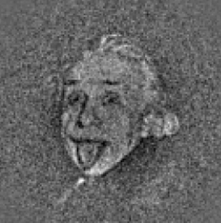
The title of Richard’s piece includes the phrase “Einstein from noise”. This refers to an article published in the Journal of Structural Biology in 2009 [11]. Here the authors provided pure white noise (i.e. a random set of black and white points) as the input to an Algorithm which is intended to produce EM maps and – after thousands of iterations – ended up with the following iconic mage:
Richard lists occurrences of meaning being erroneously drawn from EM data from his own experience of reviewing draft journal articles and cautions scientists to hold themselves to the highest standards in this area, laying out meticulous guidelines for how the creation of EM images should be approached, checked and rechecked.
The obvious correlation here is to areas of Data Science such as Machine Learning. Here again algorithms are applied iteratively to data sets with the objective of discerning meaning. Here too conscious or unconscious bias on behalf of the people involved can lead to the business equivalent of Einstein ex machina. It is instructive to see the level of rigour which a Nobel Laureate views as appropriate in an area such as the algorithmic processing of data. Constantly questioning your results and validating that what emerges makes sense and is defensible is just one part of what can lead to gaining a Nobel Prize [12]. The opposite approach will invariably lead to disappointment in either academia or in business.
Having introduced a strong cautionary note, I’d like to end this article with a much more positive tone by extending my warm congratulations to Richard both for his well-deserved achievement, but more importantly for his unwavering commitment to rolling back the bounds of human knowledge.
If you are interested in learning more about Cryo-Electron Microscopy, the following LMB video, which features Richard Henderson and colleagues, may be of interest:
Her thesis was passed without correction – an uncommon occurrence – and her contribution to the field was described as significant in the formal documentation.
[5]
More precisely this description applies to Transmission Electron Microscopes, which are the type of kit used in Cryo-EM.
[6]
The wave-particle duality that readers may be familiar with when speaking about light waves / photons also applies to all sub-atomic particles. Electrons have both a wave and a particle nature and so, in particular, have wavelengths.
[7]
This is still the case even if ultraviolet or more energetic light is used instead of visible light.
[8]
Cathode rays are of course just beams of electrons.
As readers will have noticed, my wife and I have spent a lot of time talking to medical practitioners in recent months. The same readers will also know that my wife is a Structural Biologist, whose work I have featured before in Data Visualisation – A Scientific Treatment[1]. Some of our previous medical interactions had led to me thinking about the nexus between medical science and statistics [2]. More recently, my wife had a discussion with a doctor which brought to mind some of her own previous scientific work. Her observations about the connections between these two areas have formed the genesis of this article. While the origins of this piece are in science and medicine, I think that the learnings have broader applicability.
So the general context is a medical test, the result of which was my wife being told that all was well [3]. Given that humans are complicated systems (to say the very least), my wife was less than convinced that just because reading X was OK it meant that everything else was also necessarily OK. She contrasted the approach of the physician with something from her own experience and in particular one of the experiments that formed part of her PhD thesis. I’m going to try to share the central point she was making with you without going in to all of the scientific details [4]. However to do this I need to provide at least some high-level background.
Structural Biology is broadly the study of the structure of large biological molecules, which mostly means proteins and protein assemblies. What is important is not the chemical make up of these molecules (how many carbon, hydrogen, oxygen, nitrogen and other atoms they consist of), but how these atoms are arranged to create three dimensional structures. An example of this appears below:
This image is of a bacterial Ribosome. Ribosomes are miniature machines which assemble amino acids into proteins as part of the chain which converts information held in DNA into useful molecules [5]. Ribosomes are themselves made up of a number of different proteins as well as RNA.
In order to determine the structure of a given protein, it is necessary to first isolate it in sufficient quantity (i.e. to purify it) and then subject it to some form of analysis, for example X-ray crystallography, electron microscopy or a variety of other biophysical techniques. Depending on the analytical procedure adopted, further work may be required, such as growing crystals of the protein. Something that is generally very important in this process is to increase the stability of the protein that is being investigated [6]. The type of protein that my wife was studying [7] is particularly unstable as its natural home is as part of the wall of cells – removed from this supporting structure these types of proteins quickly degrade.
So one of my wife’s tasks was to better stabilise her target protein. This can be done in a number of ways [8] and I won’t get into the technicalities. After one such attempt, my wife looked to see whether her work had been successful. In her case the relative stability of her protein before and after modification is determined by a test called a Thermostability Assay.
In the image above, you can see the combined results of several such assays carried out on both the unmodified and modified protein. Results for the unmodified protein are shown as a green line [9] and those for the modified protein as a blue line [10]. The fact that the blue line (and more particularly the section which rapidly slopes down from the higher values to the lower ones) is to the right of the green one indicates that the modification has been successful in increasing thermostability.
So my wife had done a great job – right? Well things were not so simple as they might first seem. There are two different protocols relating to how to carry out this thermostability assay. These basically involve doing some of the required steps in a different order. So if the steps are A, B, C and D, then protocol #1 consists of A ↦ B ↦ C ↦ D and protocol #2 consists of A ↦ C ↦ B ↦ D. My wife was thorough enough to also use this second protocol with the results shown below:
Here we have the opposite finding, the same modification to the protein seems to have now decreased its stability. There are some good reasons why this type of discrepancy might have occurred [11], but overall my wife could not conclude that this attempt to increase stability had been successful. This sort of thing happens all the time and she moved on to the next idea. This is all part of the rather messy process of conducting science [12].
I’ll let my wife explain her perspective on these results in her own words:
In general you can’t explain everything about a complex biological system with one set of data or the results of one test. It will seldom be the whole picture. Protocol #1 for the thermostability assay was the gold standard in my lab before the results I obtained above. Now protocol #1 is used in combination with another type of assay whose efficacy I also explored. Together these give us an even better picture of stability. The gold standard shifted. However, not even this bipartite test tells you everything. In any complex system (be that Biological or a complicated dataset) there are always going to be unknowns. What I think is important is knowing what you can and can’t account for. In my experience in science, there is generally much much more that can’t be explained than can.
As ever translating all of this to a business context is instructive. Conscientious Data Scientists or business-focussed Statisticians who come across something interesting in a model or analysis will always try (where feasible) to corroborate this by other means; they will try to perform a second “experiment” to verify their initial findings. They will also realise that even two supporting results obtained in different ways will not in general be 100% conclusive. However the highest levels of conscientiousness may be more honoured in breach than observance [13]. Also there may not be an alternative “experiment” that can be easily run. Whatever the motivations or circumstances, it is not beyond the realm of possibility that some Data Science findings are true only in the same way that my wife thought she had successfully stabilised her protein before carrying out the second assay.
I would argue that business will often have much to learn from the levels of rigour customary in most scientific research [14]. It would be nice to think that the same rigour is always applied in commercial matters as academic ones. Unfortunately experience would tend to suggest the contrary is sometimes the case. However, it would also be beneficial if people working on statistical models in industry went out of their way to stress not only what phenomena these models can explain, but what they are unable to explain. Knowing what you don’t know is the first step towards further enlightenment.
Notes
[1]
Indeed this previous article had a sub-section titled Rigour and Scrutiny, echoing some of the themes in this piece.
As in the earlier article, apologies for the circumlocution. I’m both looking to preserve some privacy and save the reader from boredom.
[4]
Anyone interested in more information is welcome to read her thesis which is in any case in the public domain. It is 188 pages long, which is reasonably lengthy even by my standards.
[5]
They carry out translation which refers to synthesising proteins based on information carried by messenger RNA, mRNA.
[6]
Some proteins are naturally stable, but many are not and will not survive purification or later steps in their native state.
Chopping off flexible sections, adding other small proteins which act as scaffolding, getting antibodies or other biological molecules to bind to the protein and so on.
[9]
Actually a sigmoidal dose-response curve.
[10]
For anyone with colour perception problems, the green line has markers which are diamonds and the blue line has markers which are triangles.
[11]
As my wife writes [with my annotations]:
A possible explanation for this effect was that while T4L [the protein she added to try to increase stability – T4 Lysozyme] stabilised the binding pocket, the other domains of the receptor were destabilised. Another possibility was that the introduction of T4L caused an increase in the flexibility of CL3, thus destabilising the receptor. A method for determining whether this was happening would be to introduce rigid linkers at the AT1R-T4L junction [AT1R was the protein she was studying, angiotensin II type 1 receptor], or other placements of T4L. Finally AT1R might exist as a dimer and the addition of T4L might inhibit the formation of dimers, which could also destabilise the receptor.
The above diagram was compiled by Florence Nightingale, who was – according to The Font – “a celebrated English social reformer and statistician, and the founder of modern nursing”. It is gratifying to see her less high-profile role as a number-cruncher acknowledged up-front and central; particularly as she died in 1910, eight years before women in the UK were first allowed to vote and eighteen before universal suffrage. This diagram is one of two which are generally cited in any article on Data Visualisation. The other is Charles Minard’s exhibit detailing the advance on, and retreat from, Moscow of Napoleon Bonaparte’s Grande Armée in 1812 (Data Visualisation had a military genesis in common with – amongst many other things – the internet). I’ll leave the reader to look at this second famous diagram if they want to; it’s just a click away.
While there are more elements of numeric information in Minard’s work (what we would now call measures), there is a differentiating point to be made about Nightingale’s diagram. This is that it was specifically produced to aid members of the British parliament in their understanding of conditions during the Crimean War (1853-56); particularly given that such non-specialists had struggled to understand traditional (and technical) statistical reports. Again, rather remarkably, we have here a scenario where the great and the good were listening to the opinions of someone who was barred from voting on the basis of lacking a Y chromosome. Perhaps more pertinently to this blog, this scenario relates to one of the objectives of modern-day Data Visualisation in business; namely explaining complex issues, which don’t leap off of a page of figures, to busy decision makers, some of whom may not be experts in the specific subject area (another is of course allowing the expert to discern less than obvious patterns in large or complex sets of data). Fortunately most business decision makers don’t have to grapple with the progression in number of “deaths from Preventible or Mitigable Zymotic diseases” versus ”deaths from wounds” over time, but the point remains.
Data Visualisation in one branch of Science
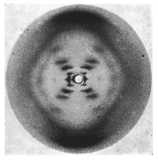
Coming much more up to date, I wanted to consider a modern example of Data Visualisation. As with Nightingale’s work, this is not business-focused, but contains some elements which should be pertinent to the professional considering the creation of diagrams in a business context. The specific area I will now consider is Structural Biology. For the incognoscenti (no advert for IBM intended!), this area of science is focussed on determining the three-dimensional shape of biologically relevant macro-molecules, most frequently proteins or protein complexes. The history of Structural Biology is intertwined with the development of X-ray crystallography by Max von Laue and father and son team William Henry and William Lawrence Bragg; its subsequent application to organic molecules by a host of pioneers including Dorothy Crowfoot Hodgkin, John Kendrew and Max Perutz; and – of greatest resonance to the general population – Francis Crick, Rosalind Franklin, James Watson and Maurice Wilkins’s joint determination of the structure of DNA in 1953.
X-ray diffraction image of the double helix structure of the DNA molecule, taken 1952 by Raymond Gosling, commonly referred to as “Photo 51”, during work by Rosalind Franklin on the structure of DNA
While the masses of data gathered in modern X-ray crystallography needs computer software to extrapolate them to physical structures, things were more accessible in 1953. Indeed, it could be argued that Gosling and Franklin’s famous image, its characteristic “X” suggestive of two helices and thus driving Crick and Watson’s model building, is another notable example of Data Visualisation; at least in the sense of a picture (rather than numbers) suggesting some underlying truth. In this case, the production of Photo 51 led directly to the creation of the even more iconic image below (which was drawn by Francis Crick’s wife Odile and appeared in his and Watson’s seminal Nature paper[1]):
It is probably fair to say that the visualisation of data which is displayed above has had something of an impact on humankind in the fifty years since it was first drawn.
Modern Structural Biology
Today, X-ray crystallography is one of many tools available to the structural biologist with other approaches including Nuclear Magnetic Resonance Spectroscopy, Electron Microscopy and a range of biophysical techniques which I will not detain the reader by listing. The cutting edge is probably represented by the X-ray Free Electron Laser, a device originally created by repurposing the linear accelerators of the previous generation’s particle physicists. In general Structural Biology has historically sat at an intersection of Physics and Biology.
However, before trips to synchrotrons can be planned, the Structural Biologist often faces the prospect of stabilising their protein of interest, ensuring that they can generate sufficient quantities of it, successfully isolating the protein and finally generating crystals of appropriate quality. This process often consumes years, in some cases decades. As with most forms of human endeavour, there are few short-cuts and the outcome is at least loosely correlated to the amount of time and effort applied (though sadly with no guarantee that hard work will always be rewarded).
From the general to the specific
At this point I should declare a personal interest, the example of Data Visualisation which I am going to consider is taken from a paper recently accepted by the Journal of Molecular Biology (JMB) and of which my wife is the first author[2]. Before looking at this exhibit, it’s worth a brief detour to provide some context.
In recent decades, the exponential growth in the breadth and depth of scientific knowledge (plus of course the velocity with which this can be disseminated), coupled with the increase in the range and complexity of techniques and equipment employed, has led to the emergence of specialists. In turn this means that, in a manner analogous to the early production lines, science has become a very collaborative activity; expert in stage one hands over the fruits of their labour to expert in stage two and so on. For this reason the typical scientific paper (and certainly those in Structural Biology) will have several authors, often spread across multiple laboratory groups and frequently in different countries. By way of example the previous paper my wife worked on had 16 authors (including a Nobel Laureate[3]). In this context, the fact the paper I will now reference was authored by just my wife and her group leader is noteworthy.
The reader may at this point be relieved to learn that I am not going to endeavour to explain the subject matter of my wife’s paper, nor the general area of biology to which it pertains (the interested are recommended to Google “membrane proteins” or “G Protein Coupled Receptors” as a starting point). Instead let’s take a look at one of the exhibits.
The above diagram (in common with Nightingale’s much earlier one) attempts to show a connection between sets of data, rather than just the data itself. I’ll elide the scientific specifics here and focus on more general issues.
First the grey upper section with the darker blots on it – which is labelled (a) – is an image of a biological assay called a Western Blot (for the interested, details can be viewed here); each vertical column (labelled at the top of the diagram) represents a sub-experiment on protein drawn from a specific sample of cells. The vertical position of a blot indicates the size of the molecules found within it (in kilodaltons); the intensity of a given blot indicates how much of the substance is present. Aside from the headings and labels, the upper part of the figure is a photographic image and so essentially analogue data[4]. So, in summary, this upper section represents the findings from one set of experiments.
At the bottom – and labelled (b) – appears an artefact familiar to anyone in business, a bar-graph. This presents results from a parallel experiment on samples of protein from the same cells (for the interested, this set of data relates to degree to which proteins in the samples bind to a specific radiolabelled ligand). The second set of data is taken from what I might refer to as a “counting machine” and is thus essentially digital. To be 100% clear, the bar chart is not a representation of the data in the upper part of the diagram, it pertains to results from a second experiment on the same samples. As indicated by the labelling, for a given sample, the column in the bar chart (b) is aligned with the column in the Western Blot above (a), connecting the two different sets of results.
Taken together the upper and lower sections[5] establish a relationship between the two sets of data. Again I’ll skip on the specifics, but the general point is that while the Western Blot (a) and the binding assay (b) tell us the same story, the Western Blot is a much more straightforward and speedy procedure. The relationship that the paper establishes means that just the Western Blot can be used to perform a simple new assay which will save significant time and effort for people engaged in the determination of the structures of membrane proteins; a valuable new insight. Clearly the relationships that have been inferred could equally have been presented in a tabular form instead and be just as relevant. It is however testament to the more atavistic side of humans that – in common with many relationships between data – a picture says it more surely and (to mix a metaphor) more viscerally. This is the essence of Data Visualisation.
What learnings can Scientific Data Visualisation provide to Business?
Using the JMB exhibit above, I wanted to now make some more general observations and consider a few questions which arise out of comparing scientific and business approaches to Data Visualisation. I think that many of these points are pertinent to analysis in general.
Normalisation
Broadly, normalisation[6] consists of defining results in relation to some established yardstick (or set of yardsticks); displaying relative, as opposed to absolute, numbers. In the JMB exhibit above, the amount of protein solubilised in various detergents is shown with reference to the un-solubilised amount found in native membranes; these reference figures appear as 100% columns to the right and left extremes of the diagram.
The most common usage of normalisation in business is growth percentages. Here the fact that London business has grown by 5% can be compared to Copenhagen having grown by 10% despite total London business being 20-times the volume of Copenhagen’s. A related business example, depending on implementation details, could be comparing foreign currency amounts at a fixed exchange rate to remove the impact of currency fluctuation.
Normalised figures are very typical in science, but, aside from the growth example mentioned above, considerably less prevalent in business. In both avenues of human endeavour, the approach should be used with caution; something that increases 200% from a very small starting point may not be relevant, be that the result of an experiment or weekly sales figures. Bearing this in mind, normalisation is often essential when looking to present data of different orders on the same graph[7]; the alternative often being that smaller data is swamped by larger, not always what is desirable.
Controls
I’ll use an anecdote to illustrate this area from a business perspective. Imagine an organisation which (as you would expect) tracks the volume of sales of a product or service it provides via a number of outlets. Imagine further that it launches some sort of promotion, perhaps valid only for a week, and notices an uptick in these sales. It is extremely tempting to state that the promotion has resulted in increased sales[8].
However this cannot always be stated with certainty. Sales may have increased for some totally unrelated reason such as (depending on what is being sold) good or bad weather, a competitor increasing prices or closing one or more of their comparable outlets and so on. Equally perniciously, the promotion maybe have simply moved sales in time – people may have been going to buy the organisation’s product or service in the weeks following a promotion, but have brought the expenditure forward to take advantage of it. If this is indeed the case, an uptick in sales may well be due to the impact of a promotion, but will be offset by a subsequent decrease.
In science, it is this type of problem that the concept of control tests is designed to combat. As well as testing a result in the presence of substance or condition X, a well-designed scientific experiment will also be carried out in the absence of substance or condition X, the latter being the control. In the JMB exhibit above, the controls appear in the columns with white labels.
There are ways to make the business “experiment” I refer to above more scientific of course. In retail business, the current focus on loyalty cards can help, assuming that these can be associated with the relevant transactions. If the business is on-line then historical records of purchasing behaviour can be similarly referenced. In the above example, the organisation could decide to offer the promotion at only a subset of the its outlets, allowing a comparison to those where no promotion applied. This approach may improve rigour somewhat, but of course it does not cater for purchases transferred from a non-promotion outlet to a promotion one (unless a whole raft of assumptions are made). There are entire industries devoted to helping businesses deal with these rather messy scenarios, but it is probably fair to say that it is normally easier to devise and carry out control tests in science.
The general take away here is that a graph which shows some change in a business output (say sales or profit) correlated to some change in a business input (e.g. a promotion, a new product launch, or a price cut) would carry a lot more weight if it also provided some measure of what would have happened without the change in input (not that this is always easy to measure).
Rigour and Scrutiny
I mention in the footnotes that the JMB paper in question includes versions of the exhibit presented above for four other membrane proteins, this being in order to firmly establish a connection. Looking at just the figure I have included here, each element of the data presented in the lower bar-graph area is based on duplicated or triplicated tests, with average results (and error bars – see the next section) being shown. When you consider that upwards of three months’ preparatory work could have gone into any of these elements and that a mistake at any stage during this time would have rendered the work useless, some impression of the level of rigour involved emerges. The result of this assiduous work is that the authors can be confident that the exhibits they have developed are accurate and will stand up to external scrutiny. Of course such external scrutiny is a key part of the scientific process and the manuscript of the paper was reviewed extensively by independent experts before being accepted for publication.
In the business world, such external scrutiny tends to apply most frequently to publicly published figures (such as audited Financial Accounts); of course external financial analysts also will look to dig into figures. There may be some internal scrutiny around both the additional numbers used to run the business and the graphical representations of these (and indeed some companies take this area very seriously), but not every internal KPI is vetted the way that the report and accounts are. Particularly in the area of Data Visualisation, there is a tension here. Graphical exhibits can have a lot of impact if they relate to the current situation or present trends; contrawise if they are substantially out-of-date, people may question their relevance. There is sometimes the expectation that a dashboard is just like its aeronautical counterpart, showing real-time information about what is going on now[9]. However a lot of the value of Data Visualisation is not about the here and now so much as trends and explanations of the factors behind the here and now. A well-thought out graph can tell a very powerful story, more powerful for most people than a table of figures. However a striking graph based on poor quality data, data which has been combined in the wrong way, or even – as sometimes happens – the wrong datasets entirely, can tell a very misleading story and lead to the wrong decisions being taken.
I am not for a moment suggesting here that every exhibit produced using Data Visualisation tools must be subject to months of scrutiny. As referenced above, in the hands of an expert such tools have the value of sometimes quickly uncovering hidden themes or factors. However, I would argue that – as in science – if the analyst involved finds something truly striking, an association which he or she feels will really resonate with senior business people, then double- or even triple-checking the data would be advisable. Asking a colleague to run their eye over the findings and to then probe for any obvious mistakes or weaknesses sounds like an appropriate next step. Internal Data Visualisations are never going to be subject to peer-review, however their value in taking sound business decisions will be increased substantially if their production reflects at least some of the rigour and scrutiny which are staples of the scientific method.
Dealing with Uncertainty
In the previous section I referred to the error bars appearing on the JMB figure above. Error bars are acknowledgements that what is being represented is variable and they indicate the extent of such variability. When dealing with a physical system (be that mechanical or – as in the case above – biological), behaviour is subject to many factors, not all of which can be eliminated or adjusted for and not all of which are predictable. This means that repeating an experiment under ostensibly identical conditions can lead to different results[10]. If the experiment is well-designed and if the experimenter is diligent, then such variability is minimised, but never eliminated. Error bars are a recognition of this fundamental aspect of the universe as we understand it.
While de rigueur in science, error bars seldom make an appearance in business, even – in my experience – in estimates of business measures which emerge from statistical analyses[11]. Even outside the realm of statistically generated figures, more business measures are subject to uncertainty than might initially be thought. An example here might be a comparison (perhaps as part of the externally scrutinised report and accounts) of the current quarter’s sales to the previous one (or the same one last year). In companies where sales may be tied to – for example – the number of outlets, care is paid to making these figures like-for-like. This might include only showing numbers for outlets which were in operation in the prior period and remain in operation now (i.e. excluding sales from both closed outlets or newly opened ones). However, outside the area of high-volume low-value sales where the Law of Large Numbers[12] rules, other factors could substantially skew a given quarter’s results for many organisations. Something as simple as a key customer delaying a purchase (so that it fell in Q3 this year instead of Q2 last) could have a large impact on quarterly comparisons. Again companies will sometimes look to include adjustments to cater for such timing or related issues, but this cannot be a precise process.
The main point I am making here is that many aspects of the information produced in companies is uncertain. The cash transactions in a quarter are of course the cash transactions in a quarter, but the above scenario suggests that they may not always 100% reflect actual business conditions (and you cannot adjust for everything). Equally where you get in to figures that would be part of most companies’ financial results, outstanding receivables and allowance for bad debts, the spectre of uncertainty arises again without a statistical model in sight. In many industries, regulators are pushing for companies to include more forward-looking estimates of future assets and liabilities in their Financials. While this may be a sensible reaction to recent economic crises, the approach inevitably leads to more figures being produced from models. Even when these models are subject to external review, as is the case with most regulatory-focussed ones, they are still models and there will be uncertainty around the numbers that they generate. While companies will often provide a range of estimates for things like guidance on future earnings per share, providing a range of estimates for historical financial exhibits is not really a mainstream activity.
Which perhaps gets me back to the subject of error bars on graphs. In general I think that their presence in Data Visualisations can only add value, not subtract it. In my article entitled Limitations of Business Intelligence I include the following passage which contains an exhibit showing how the Bank of England approaches communicating the uncertainty inevitably associated with its inflation estimates:
Business Intelligence is not a crystal ball, Predictive Analytics is not a crystal ball either. They are extremely useful tools […] but they are not universal panaceas.
An inflation prediction from The Bank of England Illustrating the fairly obvious fact that uncertainty increases in proportion to time from now.
[…] Statistical models will never give you precise answers to what will happen in the future – a range of outcomes, together with probabilities associated with each is the best you can hope for (see above). Predictive Analytics will not make you prescient, instead it can provide you with useful guidance, so long as you remember it is a prediction, not fact.
While I can’t see them figuring in formal financial statements any time soon, perhaps there is a case for more business Data Visualisations to include error bars.
In Summary
So, as is often the case, I have embarked on a journey. I started with an early example of Data Visualisation, diverted in to a particular branch of science with which I have some familiarity and hopefully returned, again as is often the case, to make some points which I think are pertinent to both the Business Intelligence practitioner and the consumers (and indeed commissioners) of Data Visualisations. Back in “All that glisters is not gold” – some thoughts on dashboards I made some more general comments about the best Data Visualisations having strong informational foundations underpinning them. While this observation remains true, I do see a lot of value in numerically able and intellectually curious people using Data Visualisation tools to quickly make connections which had not been made before and to tease out patterns from large data sets. In addition there can be great value in using Data Visualisation to present more quotidian information in a more easily digestible manner. However I also think that some of the learnings from science which I have presented in this article suggest that – as with all powerful tools – appropriate discretion on the part of the people generating Data Visualisation exhibits and on the part of the people consuming such content would be prudent. In particular the business equivalents of establishing controls, applying suitable rigour to data generation / combination and including information about uncertainty on exhibits where appropriate are all things which can help make Data Visualisation more honest and thus – at least in my opinion – more valuable.
The list of scientists involved in the development of X-ray Crystallography and Structural Biology which was presented earlier in the text encompasses a further nine such laureates (four of whom worked at my wife’s current research institute), though sadly this number does not include Rosalind Franklin. Over 20 Nobel Prizes have been awarded to people working in the field of Structural Biology, you can view an interactive time line of these here.
[4]
The intensity, size and position of blots are often digitised by specialist software, but this is an aside for our purposes.
[5]
Plus four other analogous exhibits which appear in the paper and relate to different proteins.
[6]
Normalisation has a precise mathematical meaning, actually (somewhat ironically for that most precise of activities) more than one. Here I am using the term more loosely.
[7]
That’s assuming you don’t want to get into log scales, something I have only come across once in over 25 years in business.
[8]
The uptick could be as compared to the week before, or to some other week (e.g. the same one last year or last month maybe) or versus an annual weekly average. The change is what is important here, not what the change is with respect to.
[9]
Of course some element of real-time information is indeed both feasible and desirable; for more analytic work (which encompasses many aspects of Data Visualisation) what is normally more important is sufficient historical data of good enough quality.
[10]
Anyone interested in some of the reasons for this is directed to my earlier article Patterns patterns everywhere.


![Belt and Braces [or suspenders if you are from the US, which has quite a different connotation in the UK!]](https://peterjamesthomas.com/wp-content/uploads/2017/03/belt-and-braces.png?w=700&h=394 "Belt and Braces [or suspenders if you are from the US, which has quite a different connotation in the UK!]")
")


")

")


