No this article has not escaped from my Maths & Science section, it is actually about data matters. But first of all, channeling Jennifer Aniston [1], “here comes the Science bit – concentrate”.
Shared Shapes
The Theory of Common Descent holds that any two organisms, extant or extinct, will have a common ancestor if you roll the clock back far enough. For example, each of fish, amphibians, reptiles and mammals had a common ancestor over 500 million years ago. As shown below, the current organism which is most like this common ancestor is the Lancelet [2].
To bring things closer to home, each of the Great Apes (Orangutans, Gorillas, Chimpanzees, Bonobos and Humans) had a common ancestor around 13 million years ago.
So far so simple. As one would expect, animals sharing a recent common ancestor would share many attributes with both it and each other.
Convergent Evolution refers to something else. It describes where two organisms independently evolve very similar attributes that were not features of their most recent common ancestor. Thus these features are not inherited, instead evolutionary pressure has led to the same attributes developing twice. An example is probably simpler to understand.
The image at the start of this article is of an Ichthyosaur (top) and Dolphin. It is striking how similar their body shapes are. They also share other characteristics such as live birth of young, tail first. The last Ichthyosaur died around 66 million years ago alongside many other archosaurs, notably the Dinosaurs [3]. Dolphins are happily still with us, but the first toothed whale (not a Dolphin, but probably an ancestor of them) appeared around 30 million years ago. The ancestors of the modern Bottlenose Dolphins appeared a mere 5 million years ago. Thus there is tremendous gap of time between the last Ichthyosaur and the proto-Dolphins. Ichthyosaurs are reptiles, they were covered in small scales [4]. Dolphins are mammals and covered in skin not massively different to our own. The most recent common ancestor of Ichthyosaurs and Dolphins probably lived around quarter of a billion years ago and looked like neither of them. So the shape and other attributes shared by Ichthyosaurs and Dolphins do not come from a common ancestor, they have developed independently (and millions of years apart) as adaptations to similar lifestyles as marine hunters. This is the essence of Convergent Evolution.
That was the Science, here comes the Technology…
A Brief Hydrology of Data Lakes
From 2000 to 2015, I had some success [5] with designing and implementing Data Warehouse architectures much like the following:
As a lot of my work then was in Insurance or related fields, the Analytical Repositories tended to be Actuarial Databases and / or Exposure Management Databases, developed in collaboration with such teams. Even back then, these were used for activities such as Analytics, Dashboards, Statistical Modelling, Data Mining and Advanced Visualisation.
Overlapping with the above, from around 2012, I began to get involved in also designing and implementing Big Data Architectures; initially for narrow purposes and later Data Lakes spanning entire enterprises. Of course some architectures featured both paradigms as well.
One of the early promises of a Data Lake approach was that – once all relevant data had been ingested – this would be directly leveraged by Data Scientists to derive insight.
Over time, it became clear that it would be useful to also have some merged / conformed and cleansed data structures in the Data Lake. Once the output of Data Science began to be used to support business decisions, a need arose to consider how it could be audited and both data privacy and information security considerations also came to the fore.
Next, rather than just being the province of Data Scientists, there were moves to use Data Lakes to support general Data Discovery and even business Reporting and Analytics as well. This required additional investments in metadata.
The types of issues with Data Lake adoption that I highlighted in Draining the Swamp earlier this year also led to the advent of techniques such as Data Curation [6]. In parallel, concerns about expensive Data Science resource spending 80% of their time in Data Wrangling [7] led to the creation of a new role, that of Data Engineer. These people take on much of the heavy lifting of consolidating, fixing and enriching datasets, allowing the Data Scientists to focus on Statistical Analysis, Data Mining and Machine Learning.
All of which leads to a modified Big Data / Data Lake architecture, embodying people and processes as well as technology and looking something like the exhibit above.
This is where the observant reader will see the concept of Convergent Evolution playing out in the data arena as well as the Natural World.
In Closing
Lest it be thought that I am saying that Data Warehouses belong to a bygone era, it is probably worth noting that the archosaurs, Ichthyosaurs included, dominated the Earth for orders of magnitude longer that the mammals and were only dethroned by an asymmetric external shock, not any flaw their own finely honed characteristics.
Also, to be crystal clear, much as while there are similarities between Ichthyosaurs and Dolphins there are also clear differences, the same applies to Data Warehouse and Data Lake architectures. When you get into the details, differences between Data Lakes and Data Warehouses do emerge; there are capabilities that each has that are not features of the other. What is undoubtedly true however is that the same procedural and operational considerations that played a part in making some Warehouses seem unwieldy and unresponsive are also beginning to have the same impact on Data Lakes.
If you are in the business of turning raw data into actionable information, then there are inevitably considerations that will apply to any technological solution. The key lesson is that shape of your architecture is going to be pretty similar, regardless of the technical underpinnings.
Notes
[1]
The two of us are constantly mistaken for one another.
[2]
To be clear the common ancestor was not a Lancelet, rather Lancelets sit on the branch closest to this common ancestor.
[3]
Ichthyosaurs are not Dinosaurs, but a different branch of ancient reptiles.
[4]
This is actually a matter of debate in paleontological circles, but recent evidence suggests small scales.
Today the recipients of the 2017 Nobel Prize for Chemistry were announced [1]. I was delighted to learn that one of the three new Laureates was Richard Henderson, former Director of the UK Medical Research Council’s Laboratory of Molecular Biology in Cambridge; an institute universally known as the LMB. Richard becomes the fifteenth Nobel Prize winner who worked at the LMB. The fourteenth was Venkatraman Ramakrishnan in 2009. Venki was joint Head of Structural Studies at the LMB, prior to becoming President of the Royal Society [2].
I have mentioned the LMB in these pages before [3]. In my earlier article, which focussed on Data Visualisation in science, I also provided a potted history of X-ray crystallography, which included the following paragraph:
Today, X-ray crystallography is one of many tools available to the structural biologist with other approaches including Nuclear Magnetic Resonance Spectroscopy, Electron Microscopy and a range of biophysical techniques.
I have highlighted the term Electron Microscopy above and it was for his immense contributions to the field of Cryo-electron Microscopy (Cryo-EM) that Richard was awarded his Nobel Prize; more on this shortly.
First of all some disclosure. The LMB is also my wife’s alma mater, she received her PhD for work she did there between 2010 and 2014. Richard was one of two people who examined her as she defended her thesis [4]. As Venki initially interviewed her for the role, the bookends of my wife’s time at the LMB were formed by two Nobel laureates; an notable symmetry.
The press release about Richard’s Nobel Prize includes the following text:
The Nobel Prize in Chemistry 2017 is awarded to Jacques Dubochet, Joachim Frank and Richard Henderson for the development of cryo-electron microscopy, which both simplifies and improves the imaging of biomolecules. This method has moved biochemistry into a new era.
[…]
Electron microscopes were long believed to only be suitable for imaging dead matter, because the powerful electron beam destroys biological material. But in 1990, Richard Henderson succeeded in using an electron microscope to generate a three-dimensional image of a protein at atomic resolution. This breakthrough proved the technology’s potential.
Electron microscopes [5] work by passing a beam of electrons through a thin film of the substance being studied. The electrons interact with the constituents of the sample and go on to form an image which captures information about these interactions (nowadays mostly on an electronic detector of some sort). Because the wavelength of electrons [6] is so much shorter than light [7], much finer detail can be obtained using electron microscopy than with light microscopy. Indeed electron microscopes can be used to “see” structures at the atomic scale. Of course it is not quite as simple as printing out the image snapped by you SmartPhone. The data obtained from electron microscopy needs to be interpreted by software; again we will come back to this point later.
Cryo-EM refers to how the sample being examined is treated prior to (and during) microscopy. Here a water-suspended sample of the substance is frozen (to put it mildly) in liquid ethane to temperatures around -183 °C and maintained at that temperature during the scanning procedure. The idea here is to protect the sample from the damaging effects of the cathode rays [8] it is subjected to during microscopy.
A Matter of Interpretation
On occasion, I write articles which are entirely scientific or mathematical in nature, but more frequently I bring observations from these fields back into my own domain, that of data, information and insight. This piece will follow the more typical course. To do this, I will rely upon a perspective that Richard Henderson wrote for the Proceedings of the National Academy of Science back in 2013 [9].
Here we come back to the interpretation of Cryo-EM data in order to form an image. In the article, Richard refers to:
[Some researchers] who simply record images, follow an established (or sometimes a novel or inventive [10]) protocol for 3D map calculation, and then boldly interpret and publish their map without any further checks or attempts to validate the result. Ten years ago, when the field was in its infancy, referees would simply have to accept the research results reported in manuscripts at face value. The researchers had recorded images, carried out iterative computer processing, and obtained a map that converged, but had no way of knowing whether it had converged to the true structure or some complete artifact. There were no validation tests, only an instinct about whether a particular map described in the publication looked right or wrong.
The title of Richard’s piece includes the phrase “Einstein from noise”. This refers to an article published in the Journal of Structural Biology in 2009 [11]. Here the authors provided pure white noise (i.e. a random set of black and white points) as the input to an Algorithm which is intended to produce EM maps and – after thousands of iterations – ended up with the following iconic mage:
Richard lists occurrences of meaning being erroneously drawn from EM data from his own experience of reviewing draft journal articles and cautions scientists to hold themselves to the highest standards in this area, laying out meticulous guidelines for how the creation of EM images should be approached, checked and rechecked.
The obvious correlation here is to areas of Data Science such as Machine Learning. Here again algorithms are applied iteratively to data sets with the objective of discerning meaning. Here too conscious or unconscious bias on behalf of the people involved can lead to the business equivalent of Einstein ex machina. It is instructive to see the level of rigour which a Nobel Laureate views as appropriate in an area such as the algorithmic processing of data. Constantly questioning your results and validating that what emerges makes sense and is defensible is just one part of what can lead to gaining a Nobel Prize [12]. The opposite approach will invariably lead to disappointment in either academia or in business.
Having introduced a strong cautionary note, I’d like to end this article with a much more positive tone by extending my warm congratulations to Richard both for his well-deserved achievement, but more importantly for his unwavering commitment to rolling back the bounds of human knowledge.
If you are interested in learning more about Cryo-Electron Microscopy, the following LMB video, which features Richard Henderson and colleagues, may be of interest:
Her thesis was passed without correction – an uncommon occurrence – and her contribution to the field was described as significant in the formal documentation.
[5]
More precisely this description applies to Transmission Electron Microscopes, which are the type of kit used in Cryo-EM.
[6]
The wave-particle duality that readers may be familiar with when speaking about light waves / photons also applies to all sub-atomic particles. Electrons have both a wave and a particle nature and so, in particular, have wavelengths.
[7]
This is still the case even if ultraviolet or more energetic light is used instead of visible light.
[8]
Cathode rays are of course just beams of electrons.
As readers will have noticed, my wife and I have spent a lot of time talking to medical practitioners in recent months. The same readers will also know that my wife is a Structural Biologist, whose work I have featured before in Data Visualisation – A Scientific Treatment[1]. Some of our previous medical interactions had led to me thinking about the nexus between medical science and statistics [2]. More recently, my wife had a discussion with a doctor which brought to mind some of her own previous scientific work. Her observations about the connections between these two areas have formed the genesis of this article. While the origins of this piece are in science and medicine, I think that the learnings have broader applicability.
So the general context is a medical test, the result of which was my wife being told that all was well [3]. Given that humans are complicated systems (to say the very least), my wife was less than convinced that just because reading X was OK it meant that everything else was also necessarily OK. She contrasted the approach of the physician with something from her own experience and in particular one of the experiments that formed part of her PhD thesis. I’m going to try to share the central point she was making with you without going in to all of the scientific details [4]. However to do this I need to provide at least some high-level background.
Structural Biology is broadly the study of the structure of large biological molecules, which mostly means proteins and protein assemblies. What is important is not the chemical make up of these molecules (how many carbon, hydrogen, oxygen, nitrogen and other atoms they consist of), but how these atoms are arranged to create three dimensional structures. An example of this appears below:
This image is of a bacterial Ribosome. Ribosomes are miniature machines which assemble amino acids into proteins as part of the chain which converts information held in DNA into useful molecules [5]. Ribosomes are themselves made up of a number of different proteins as well as RNA.
In order to determine the structure of a given protein, it is necessary to first isolate it in sufficient quantity (i.e. to purify it) and then subject it to some form of analysis, for example X-ray crystallography, electron microscopy or a variety of other biophysical techniques. Depending on the analytical procedure adopted, further work may be required, such as growing crystals of the protein. Something that is generally very important in this process is to increase the stability of the protein that is being investigated [6]. The type of protein that my wife was studying [7] is particularly unstable as its natural home is as part of the wall of cells – removed from this supporting structure these types of proteins quickly degrade.
So one of my wife’s tasks was to better stabilise her target protein. This can be done in a number of ways [8] and I won’t get into the technicalities. After one such attempt, my wife looked to see whether her work had been successful. In her case the relative stability of her protein before and after modification is determined by a test called a Thermostability Assay.
In the image above, you can see the combined results of several such assays carried out on both the unmodified and modified protein. Results for the unmodified protein are shown as a green line [9] and those for the modified protein as a blue line [10]. The fact that the blue line (and more particularly the section which rapidly slopes down from the higher values to the lower ones) is to the right of the green one indicates that the modification has been successful in increasing thermostability.
So my wife had done a great job – right? Well things were not so simple as they might first seem. There are two different protocols relating to how to carry out this thermostability assay. These basically involve doing some of the required steps in a different order. So if the steps are A, B, C and D, then protocol #1 consists of A ↦ B ↦ C ↦ D and protocol #2 consists of A ↦ C ↦ B ↦ D. My wife was thorough enough to also use this second protocol with the results shown below:
Here we have the opposite finding, the same modification to the protein seems to have now decreased its stability. There are some good reasons why this type of discrepancy might have occurred [11], but overall my wife could not conclude that this attempt to increase stability had been successful. This sort of thing happens all the time and she moved on to the next idea. This is all part of the rather messy process of conducting science [12].
I’ll let my wife explain her perspective on these results in her own words:
In general you can’t explain everything about a complex biological system with one set of data or the results of one test. It will seldom be the whole picture. Protocol #1 for the thermostability assay was the gold standard in my lab before the results I obtained above. Now protocol #1 is used in combination with another type of assay whose efficacy I also explored. Together these give us an even better picture of stability. The gold standard shifted. However, not even this bipartite test tells you everything. In any complex system (be that Biological or a complicated dataset) there are always going to be unknowns. What I think is important is knowing what you can and can’t account for. In my experience in science, there is generally much much more that can’t be explained than can.
As ever translating all of this to a business context is instructive. Conscientious Data Scientists or business-focussed Statisticians who come across something interesting in a model or analysis will always try (where feasible) to corroborate this by other means; they will try to perform a second “experiment” to verify their initial findings. They will also realise that even two supporting results obtained in different ways will not in general be 100% conclusive. However the highest levels of conscientiousness may be more honoured in breach than observance [13]. Also there may not be an alternative “experiment” that can be easily run. Whatever the motivations or circumstances, it is not beyond the realm of possibility that some Data Science findings are true only in the same way that my wife thought she had successfully stabilised her protein before carrying out the second assay.
I would argue that business will often have much to learn from the levels of rigour customary in most scientific research [14]. It would be nice to think that the same rigour is always applied in commercial matters as academic ones. Unfortunately experience would tend to suggest the contrary is sometimes the case. However, it would also be beneficial if people working on statistical models in industry went out of their way to stress not only what phenomena these models can explain, but what they are unable to explain. Knowing what you don’t know is the first step towards further enlightenment.
Notes
[1]
Indeed this previous article had a sub-section titled Rigour and Scrutiny, echoing some of the themes in this piece.
As in the earlier article, apologies for the circumlocution. I’m both looking to preserve some privacy and save the reader from boredom.
[4]
Anyone interested in more information is welcome to read her thesis which is in any case in the public domain. It is 188 pages long, which is reasonably lengthy even by my standards.
[5]
They carry out translation which refers to synthesising proteins based on information carried by messenger RNA, mRNA.
[6]
Some proteins are naturally stable, but many are not and will not survive purification or later steps in their native state.
Chopping off flexible sections, adding other small proteins which act as scaffolding, getting antibodies or other biological molecules to bind to the protein and so on.
[9]
Actually a sigmoidal dose-response curve.
[10]
For anyone with colour perception problems, the green line has markers which are diamonds and the blue line has markers which are triangles.
[11]
As my wife writes [with my annotations]:
A possible explanation for this effect was that while T4L [the protein she added to try to increase stability – T4 Lysozyme] stabilised the binding pocket, the other domains of the receptor were destabilised. Another possibility was that the introduction of T4L caused an increase in the flexibility of CL3, thus destabilising the receptor. A method for determining whether this was happening would be to introduce rigid linkers at the AT1R-T4L junction [AT1R was the protein she was studying, angiotensin II type 1 receptor], or other placements of T4L. Finally AT1R might exist as a dimer and the addition of T4L might inhibit the formation of dimers, which could also destabilise the receptor.
This blog touches on a wide range of topics, including social media, cultural transformation, general technology and – last but not least – sporting analogies. However, its primary focus has always been on data and information-centric matters in a business context. Having said this, all but the more cursory of readers will have noted the prevalence of pieces with a Mathematical or Scientific bent. To some extent this is a simple reflection of the author’s interests and experience, but a stronger motivation is often to apply learnings from different fields to the business data arena. This article is probably more scientific in subject matter than most, but I will also look to highlight some points pertinent to commerce towards the end.
Introduction
The topic I want to turn my attention to in this article is public trust in science. This is a subject that has consumed many column inches in recent years. One particular area of focus has been climate science, which, for fairly obvious political reasons, has come in for even more attention than other scientific disciplines of late. It would be distracting to get into the arguments about climate change and humanity’s role in it here [1] and in a sense this is just the latest in a long line of controversies that have somehow become attached to science. An obvious second example here is the misinformation circling around both the efficacy and side effects of vaccinations [2]. In both of these cases, it seems that at least a sizeable minority of people are willing to query well-supported scientific findings. In some ways, this is perhaps linked to the general mistrust of “experts” and “elites” [3] that was explicitly to the fore in the UK’s European Union Referendum debate [4].
“People in this country have had enough of experts”
– Michael Gove [5], at this point UK Justice Secretary and one of the main proponents of the Leave campaign, speaking on Sky News, June 2016.
Mr Gove was talking about economists who held a different point of view to his own. However, his statement has wider resonance and cannot be simply dismissed as the misleading sound-bite of an experienced politician seeking to press his own case. It does indeed appear that in many places around the world experts are trusted much less than they used to be and that includes scientists.
“Many political upheavals of recent years, such as the rise of populist parties in Europe, Donald Trump’s nomination for the American presidency and Britain’s vote to leave the EU, have been attributed to a revolt against existing elites.”
A Brief [6] History of the Public Perception of Science
Note: This section is focussed on historical developments in the public’s trust in science. If the reader would like to skip on to more toast-centric content, then please click here.
Answering questions about the erosion of trust in politicians and the media is beyond the scope of this humble blog. Wondering what has happened to trust in science is firmly in its crosshairs. One part of the answer is that – for some time – scientists were held in too much esteem and the pendulum was inevitably going to swing back the other way. For a while the pace of scientific progress and the miracles of technology which this unleashed placed science on a pedestal from which there was only one direction of travel. During this period in which science was – in general – uncritically held in great regard, the messy reality of actual science was never really highlighted. The very phrase “scientific facts” is actually something of an oxymoron. What we have is instead scientific theories. Useful theories are consistent with existing observations and predict new phenomena. However – as I explained in Patterns patterns everywhere – a theory is only as good as the latest set of evidence and some cherished scientific theories have been shown to be inaccurate; either in general, or in some specific circumstances [7]. However saying “we have a good model that helps us explain many aspects of a phenomenon and predict more, but it doesn’t cover everything and there are some uncertainties” is a little more of a mouthful than “we have discovered that…”.
There have been some obvious landmarks along the way to science’s current predicament. The unprecedented destruction unleashed by the team working on the Manhattan Project at first made the scientists involved appear God-like. It also seemed to suggest that the path to Great Power status was through growing or acquiring the best Physicists. However, as the prolonged misery caused in Japan by the twin nuclear strikes became more apparent and as the Cold War led to generations living under the threat of mutually assured destruction, the standing attached by the general public to Physicists began to wane; the God-like mantle began to slip. While much of our modern world and its technology was created off the back of now fairly old theories like Quantum Chromodynamics and – most famously – Special and General Relativity, the actual science involved became less and less accessible to the man or woman in the street. For all the (entirely justified) furore about the detection of the Higgs Boson, few people would be able to explain much about what it is and how it fits into the Standard Model of particle physics.
In the area of medicine and pharmacology, the Thalidomide tragedy, where a drug prescribed to help pregnant women suffering from morning sickness instead led to terrible birth defects in more than 10,000 babies, may have led to more stringent clinical trials, but also punctured the air of certainty that had surrounded the development of the latest miracle drug. While medical science and related disciplines have vastly improved the health of much of the globe, the glacial progress in areas such as oncology has served as a reminder of the fallibility of some scientific endeavours. In a small way, the technical achievements of that apogee of engineering, NASA, were undermined by loss of crafts and astronauts. Most notably the Challenger and Columbia fatalities served to further remove the glossy veneer that science had acquired in the 1940s to 1960s.
Lest it be thought at this point that I am decrying science, or even being anti-scientific, nothing could be further from the truth. I firmly believe that the ever growing body of scientific knowledge is one of humankind’s greatest achievements, if not its greatest. From our unpromising vantage point on an unremarkable little planet in our equally common-all-garden galaxy we have been able to grasp many of the essential truths about the whole Universe from the incomprehensibly gigantic to the most infinitesimal constituent of a sub-atomic particle. However, it seems that many people do not fully embrace the grandeur of our achievements, or indeed in many cases the unexpected beauty and harmony that they have revealed [8]. It is to the task of understanding this viewpoint that I am addressing my thoughts.
More recently, the austerity that has enveloped much of the developed world since the 2008 Financial Crisis has had two reinforcing impacts on science in many countries. First funding has often been cut, leading to pressure on research programmes and scientists increasingly having to make an economic case for their activities; a far cry from the 1950s. Second, income has been effectively stagnant for the vast majority of people, this means that scientific expenditure can seem something of a luxury and also fuels the anti-elite feelings cited by The Economist earlier in this article.
Into this seeming morass steps Anita Makri, “editor/writer/producer and former research scientist”. In a recent Nature article she argues that the form of science communicated in popular media leaves the public vulnerable to false certainty. I reproduce some of her comments here:
“Much of the science that the public knows about and admires imparts a sense of wonder and fun about the world, or answers big existential questions. It’s in the popularization of physics through the television programmes of physicist Brian Cox and in articles about new fossils and quirky animal behaviour on the websites of newspapers. It is sellable and familiar science: rooted in hypothesis testing, experiments and discovery.
Although this science has its place, it leaves the public […] with a different, outdated view to that of scientists of what constitutes science. People expect science to offer authoritative conclusions that correspond to the deterministic model. When there’s incomplete information, imperfect knowledge or changing advice — all part and parcel of science — its authority seems to be undermined. […] A popular conclusion of that shifting scientific ground is that experts don’t know what they’re talking about.”
After my speculations about the reasons why science is held in less esteem than once was the case, I’ll return to more prosaic matters; namely food and specifically that humble staple of many a breakfast table, toast. Food science has often fared no better than its brother disciplines. The scientific guidance issued to people wanting to eat healthily can sometimes seem to gyrate wildly. For many years fat was the source of all evil, more recently sugar has become public enemy number one. Red wine was meant to have beneficial effects on heart health, then it was meant to be injurious; I’m not quite sure what the current advice consists of. As Makri states above, when advice changes as dramatically as it can do in food science, people must begin to wonder whether the scientists really know anything at all.
So where does toast fit in? Well the governmental body charged with providing advice about food in the UK is called the Food Standards Agency. They describe their job as “using our expertise and influence so that people can trust that the food they buy and eat is safe and honest.” While the FSA do sterling work in areas such as publicly providing ratings of food hygiene for restaurants and the like, their most recent campaign is one which seems at best ill-advised and at worst another nail in the public perception of the reliability of scientific advice. Such things matter because they contribute to the way that people view science in general. If scientific advice about food is seen as unsound, surely there must be questions around scientific advice about climate change, or vaccinations.
Before I am accused of belittling the FSA’s efforts, let’s consider the campaign in question, which is called Go for Gold and encourages people to consume less acrylamide. Here is some of what the FSA has to say about the matter:
“Today, the Food Standards Agency (FSA) is launching a campaign to ‘Go for Gold’, helping people understand how to minimise exposure to a possible carcinogen called acrylamide when cooking at home.
Acrylamide is a chemical that is created when many foods, particularly starchy foods like potatoes and bread, are cooked for long periods at high temperatures, such as when baking, frying, grilling, toasting and roasting. The scientific consensus is that acrylamide has the potential to cause cancer in humans.
[…]
as a general rule of thumb, aim for a golden yellow colour or lighter when frying, baking, toasting or roasting starchy foods like potatoes, root vegetables and bread.”
The Go for Gold campaign was picked up by various media outlets in the UK. For example the BBC posted an article on its web-site which opened by saying:
“Bread, chips and potatoes should be cooked to a golden yellow colour, rather than brown, to reduce our intake of a chemical which could cause cancer, government food scientists are warning.”
The BBC has been obsessed with neutrality on all subjects recently [9], but in this case they did insert the reasonable counterpoint that:
“However, Cancer Research UK [10] said the link was not proven in humans.”
Acrylamide is certainly a nasty chemical. Amongst other things, it is used in polyacrylamide gel electrophoresis, a technique used in biochemistry. If biochemists mix and pour their own gels, they have to monitor their exposure and there are time-based and lifetime limits as to how often they can do such procedures [11]. Acrylamide has also been shown to lead to cancer in mice. So what could be more reasonable that the FSA’s advice?
Food Safety – A Statistical / Risk Based Approach
Earlier I introduced Anita Makri, it is time to meet our second protagonist, David Spiegelhalter, Winton Professor for the Public Understanding of Risk in the Statistical Laboratory, Centre for Mathematical Sciences, University of Cambridge [12]. Professor Spiegelhalter has penned a response to the FSA’s Go for Gold campaign. I feel that this merits reading in entirety, but here are some highlights:
“Very high doses [of Acrylamide] have been shown to increase the risk of mice getting cancer. The IARC (International Agency for Research on Cancer) considers it a ‘probable human carcinogen’, putting it in the same category as many chemicals, red meat, being a hairdresser and shift-work.
However, there is no good evidence of harm from humans consuming acrylamide in their diet: Cancer Research UK say that ‘At the moment, there is no strong evidence linking acrylamide and cancer.’
This is not for want of trying. A massive report from the European Food Standards Agency (EFSA) lists 16 studies and 36 publications, but concludes
‘In the epidemiological studies available to date, AA intake was not associated with an increased risk of most common cancers, including those of the GI or respiratory tract, breast, prostate and bladder. A few studies suggested an increased risk for renal cell, and endometrial (in particular in never-smokers) and ovarian cancer, but the evidence is limited and inconsistent. Moreover, one study suggested a lower survival in non-smoking women with breast cancer with a high pre-diagnostic exposure to AA but more studies are necessary to confirm this result. (p185)’
[…]
[Based on the EFSA study] adults with the highest consumption of acrylamide could consume 160 times as much and still only be at a level that toxicologists think unlikely to cause increased tumours in mice.
[…]
This all seems rather reassuring, and may explain why it’s been so difficult to observe any effect of acrylamide in diet.”
Indeed, Professor Spiegelhalter, an esteemed statistician, also points out that most studies will adopt the standard criteria for statistical significance. Given that such significance levels are often set at 5%, then this means that:
“[As] each study is testing an association with a long list of cancers […], we would expect 1 in 20 of these associations to be positive by chance alone.”
He closes his article by stating – not unreasonably – that the FSA’s time and attention might be better spent on areas where causality between an agent and morbidity is well-established, for example obesity. My assumption is that the FSA has a limited budget and has to pick and choose what food issues to weigh in on. Even if we accept for the moment that there is some slight chance of a causal link between the consumption of low levels of acrylamide and cancer, there are plenty of other areas in which causality is firmly established; obesity as mentioned by Professor Spiegelhalter, excessive use of alcohol, even basic kitchen hygiene. It is hard to understand why the FSA did not put more effort into these and instead focussed on an area where the balance of scientific judgement is that there is unlikely to be an issue.
Having a mathematical background perhaps biases me, but I tend to side with Professor Spiegelhalter’s point of view. I don’t want to lay the entire blame for the poor view that some people have of science at the FSA’s door, but I don’t think campaigns like Go for Gold help very much either. The apocryphal rational man or woman will probably deduce that there is not an epidemic of acrylamide poisoning in progress. This means that they may question what the experts at the FSA are going on about. In turn this reduces respect for other – perhaps more urgent – warnings about food and drink. Such a reaction is also likely to colour how the same rational person thinks about “expert” advice in general. All of this can contribute to further cracks appearing in the public edifice of science, an outcome I find very unfortunate.
So what is to be done?
A Call for a New and More Honest Approach to Science Communications
As promised I’ll return to Anita Makri’s thoughts in the same article referenced above:
“It’s more difficult to talk about science that’s inconclusive, ambivalent, incremental and even political — it requires a shift in thinking and it does carry risks. If not communicated carefully, the idea that scientists sometimes ‘don’t know’ can open the door to those who want to contest evidence.
[…]
Scientists can influence what’s being presented by articulating how this kind of science works when they talk to journalists, or when they advise on policy and communication projects. It’s difficult to do, because it challenges the position of science as a singular guide to decision making, and because it involves owning up to not having all of the answers all the time while still maintaining a sense of authority. But done carefully, transparency will help more than harm. It will aid the restoration of trust, and clarify the role of science as a guide.”
The scientific method is meant to be about honesty. You record what you see, not what you want to see. If the data don’t support your hypothesis, you discard or amend your hypothesis. The peer-review process is meant to hold scientists to the highest levels of integrity. What Makri seems to be suggesting is for scientists to turn their lenses on themselves and how they communicate their work. Being honest where there is doubt may be scary, but not as scary as being caught out pushing certainty where no certainty is currently to be had.
Epilogue
At the beginning of this article, I promised that I would bring things back to a business context. With lots of people with PhDs in numerate sciences now plying their trade as data scientists and the like, there is an attempt to make commerce more scientific [13]. Understandably, the average member of a company will have less of an appreciation of statistics and statistical methods than their data scientists do. This can lead to data science seeming like magic; the philosopher’s stone [14]. There are obvious parallels here with how Physicists were seen in the period immediately after the Second World War.
Earlier in the text, I mused about what factors may have led to a deterioration in how the public views science and scientists. I think that there is much to be learnt from the issues I have covered in this article. If data scientists begin to try to peddle absolute truth and perfect insight (both of which, it is fair to add, are often expected from them by non-experts), as opposed to ranges of outcomes and probabilities, then the same decline in reputation probably awaits them. Instead it would be better if data scientists heeded Anita Makri’s words and tried to always be honest about what they don’t know as well as what they do.
Notes
[1]
Save to note that there really is no argument in scientific circles.
As ever Randall Munroe makes the point pithily in his Earth Temperature Timeline – https://xkcd.com/1732/.
For a primer on the area, you could do worse than watching The Royal Society‘s video:
[2]
For the record, my daughter has had every vaccine known to the UK and US health systems and I’ve had a bunch of them recently as well.
[3]
Most scientists I know would be astonished that they are considered part of the amorphous, ill-defined and obviously malevolent global “elite”. Then “elite” is just one more proxy for “the other” something which it is not popular to be in various places in the world at present.
[4]
Or what passed for debate in these post-truth times.
[5]
Mr Gove studied English at Lady Margaret Hall, Oxford, where he was also President of the Oxford Union. Clearly Oxford produces less experts than it used to in previous eras.
[6]
One that is also probably wildly inaccurate and certainly incomplete.
[7]
So Newton’s celebrated theory of gravitation is “wrong” but actually works perfectly well in most circumstances. The the Rutherford–Bohr model, where atoms are little Solar Systems, with the nucleus circled by electrons much as the planets circle the Sun is “wrong”, but actually does serve to explain a number of things; if sadly not the orbital angular momentum of electrons.
[8]
Someone should really write a book about that – watch this space!
[9]
Not least in the aforementioned EU Referendum where it felt the need to follow the views of the vast majority of economists with those of the tiny minority, implying that the same weight be attached to both points of view. For example, 99.9999% of people believe the world to be round, but in the interests of balance my mate Jim reckons it is flat.
[10]
According to their web-site: “the world’s leading charity dedicated to beating cancer through research”.
[11]
As attested to personally by the only proper scientist in our family.
[12]
Unlike Oxford (according to Mr Gove anyway), Cambridge clearly still aspires to creating experts.
[13]
By this I mean proper science and not pseudo-science like management theory and the like.
[14]
In the original, non-J.K. Rowling sense of the phrase.
Having enjoyed Simon’s sport journalism (particularly his insightful and amusing commentary on Test Match cricket) for many years, I was interested to learn about this new book via his web-site. As an avid consumer of pop-science literature and already being aware of Simon’s considerable abilities as a writer, I was keen to read Ten Million Aliens. To be brief, I would recommend the book to anyone with an enquiring mind, an interest in the natural world and its endless variety, or just an affection for good science writing. My only sadness was that the number of phyla eventually had to come to an end. I laughed in places, I was better informed than before reading a chapter in others and the autobiographical anecdotes and other general commentary on the state of our stewardship of the planet added further dimensions. I look forward to Simon’s next book.
Instead this piece contains some general musings which came to mind while reading Ten Million Aliens and – as is customary – applies some of these to my own fields of professional endeavour.
Some Background
Regular readers of this blog will be aware of my affection for Cricket[1] and also my interest in Science[2]. Simon Barnes’s work spans both of these passions. I became familiar with Simon’s journalism when he was Chief Sports Writer for The Times[3] an organ he wrote for over 32 years. Given my own sporting interests, I first read his articles specifically about Cricket and sometimes Rugby Union, but began to appreciate his writing in general and to consume his thoughts on many other sports.
There is something about Simon’s writing which I (and no doubt many others) find very engaging. He manages to be both insightful and amusing and displays both elegance of phrase and erudition without ever seeming to show off, or to descend into the overly-florid prose of which I can sometimes (OK often) be guilty. It also helps that we seem to share a favourite cricketer in the shape of David Gower, who appears above and was the most graceful bastman to have played for England in the last forty years. However, it is not Simon’s peerless sports writing that I am going to focus on here. For several years he also penned a wildlife column for The Times and is a patron of a number of wildlife charities. He has written books on, amongst other topics, birds, horses, his safari experiences and conservation in general.
My own interest in science merges into an appreciation of the natural world, perhaps partly also related to the amount of time I have spent in remote and wild places rock-climbing and bouldering. As I started to write this piece, some welcome November Cambridge sun threw shadows of the Green Finches and Great Tits on our feeders across the monitor. Earlier in the day, my wife and I managed to catch a Lesser Spotted Woodpecker, helping itself to our peanuts. Last night we stood on our balcony listening to two Tawny Owls serenading each other. Our favourite Corvidae family are also very common around here and we have had each of the birds appearing in the bottom row of the above image on our balcony at some point. My affection for living dinosaurs also extends to their cousins, the herpetiles, but that is perhaps a topic for another day.
Ten Million Aliens has the modest objectives, revealed by its sub-title, of saying something interesting about about each of the (at the last count) thirty-five phyla of the Animal Kingdom[4] and of providing some insights in to a few of the thousands of familes and species that make these up. Simon’s boundless enthusiasm for the life he sees around him (and indeed the life that is often hidden from all bar the most intrepid of researchers), his ability to bring even what might be viewed as ostensibly dull subject matter[5] to life and a seemingly limitless trove of pertinent personal anecdotes, all combine to ensure not only that he achieves these objectives, but that he does so with some élan.
Classifications and Hierarchies
Well having said that this article wasn’t going to be a book review, I guess it has borne a striking resemblance to one so far. Now to take a different tack; one which relates to three of the words that I referenced and provided links to in the last paragraph of the previous section: phylum, family and species. These are all levels in the general classification of life. At least one version of where these three levels fit into the overall scheme of things appears in the image above[6]. Some readers may even be able to recall a related mnemonic from years gone by: Kings Play Chess on Fine Green Sand[7].
The father of modern taxonomy, Carl Linnaeus, founded his original biological classification – not unreasonably – on the shared characteristics of organisms; things that look similar are probably related. Relations mean that like things can be collected together into groups and that the groups can be further consolidated into super-groups. This approach served science well for a long time. However when researchers began to find more and more examples of convergent evolution[8], Linnaeus’s rule of thumb was seen to not always apply and complementary approaches also began to be adopted.
One of these approaches, called Cladistics, focuses on common ancestors rather than shared physical characteristics. Breakthroughs in understanding the genetic code provided impetus to this technique. The above diagram, referred to as a cladogram, represents one school of thought about the relationship between avian dinosaurs, non-avian dinosaurs and various other reptiles that I mentioned above.
It is at this point that the Business Intelligence professional may begin to detect something somewhat familiar[9]. I am of course talking about both dimensions and organising these into hierarchies. Dimensions are the atoms of Business Intelligence and Data Warehousing[10]. In Biological Classification: H. sapiens is part of Homo , which is part of Hominidae, which is part of Primates, which is part of Mammalia, which is part of Chordata, which then gets us back up to Animalia[11]. In Business Intelligence: Individuals make up Teams, which make up Offices, which make up Countries and Regions.
Above I references different approaches to Biological Classification, one based on shared attributes, the other on homology of DNA. This also reminds me of the multiple ways to roll-up dimensions. To pick the most obvious, Day rolls up to Month, Quarter, Half-Year and Year; but also in a different manner to Week and then Year. Given that the aforementioned DNA evidence has caused a reappraisal of the connections between many groups of animals, the structures of Biological Classification are not rigid and instead can change over time[12]. Different approaches to grouping living organisms can provide a range of perspectives, each with its own benefits. In a similar way, good BI/DW design practices should account for both dimensions changing and the fact that different insights may well be provided by parallel dimension hierarchies.
In summary, I suppose what I am saying is that BI/DW practitioners, as well as studying the works of Inmon and Kimball, might want to consider expanding their horizons to include Barnes; to say nothing of Linnaeus[13]. They might find something instructive in these other taxonomical works.
Notes
[1]
Articles from this blog in which I intertwine Cricket and aspects of business, technology and change include (in chronological order):
Articles on this site which reference either Science or Mathematics are far too numerous to list in full. A short selection of the ones I enjoyed writing most would include (again in chronological order):
Though this elides both Domains and Johny-come-latelies like super-families, sub-genuses and hyper-orders [I may have made that last one up of course].
[8]
For example the wings of Pterosaurs, Birds and Bats.
[9]
No pun intended.
[10]
This metaphor becomes rather cumbersome when one tries to extend it to cover measures. It’s tempting to perhaps align these with fundamental forces, and thus bosons as opposed to combinations of fermions, but the analogy breaks down pretty quickly, so let’s conveniently forget that multidimensional data structures have fact tables at their hearts for now.
[11]
Here I am going to strive manfully to avoid getting embroiled in discussions about domains, superregnums, superkingdoms, empires, or regios and instead leave the interested reader to explore these areas themselves if they so desire. Ten Million Aliens itself could be one good starting point, as could the following link.
[12]
Science is yet to determine whether these slowly changing dimensions are of Type 1, 2, 3 or 4 (it has however been definitively established that they are not Type 6 / Hybrid).
[13]
Interesting fact of the day: Linnaeus’s seminal work included an entry for The Kraken, under Cephalopoda
The above diagram was compiled by Florence Nightingale, who was – according to The Font – “a celebrated English social reformer and statistician, and the founder of modern nursing”. It is gratifying to see her less high-profile role as a number-cruncher acknowledged up-front and central; particularly as she died in 1910, eight years before women in the UK were first allowed to vote and eighteen before universal suffrage. This diagram is one of two which are generally cited in any article on Data Visualisation. The other is Charles Minard’s exhibit detailing the advance on, and retreat from, Moscow of Napoleon Bonaparte’s Grande Armée in 1812 (Data Visualisation had a military genesis in common with – amongst many other things – the internet). I’ll leave the reader to look at this second famous diagram if they want to; it’s just a click away.
While there are more elements of numeric information in Minard’s work (what we would now call measures), there is a differentiating point to be made about Nightingale’s diagram. This is that it was specifically produced to aid members of the British parliament in their understanding of conditions during the Crimean War (1853-56); particularly given that such non-specialists had struggled to understand traditional (and technical) statistical reports. Again, rather remarkably, we have here a scenario where the great and the good were listening to the opinions of someone who was barred from voting on the basis of lacking a Y chromosome. Perhaps more pertinently to this blog, this scenario relates to one of the objectives of modern-day Data Visualisation in business; namely explaining complex issues, which don’t leap off of a page of figures, to busy decision makers, some of whom may not be experts in the specific subject area (another is of course allowing the expert to discern less than obvious patterns in large or complex sets of data). Fortunately most business decision makers don’t have to grapple with the progression in number of “deaths from Preventible or Mitigable Zymotic diseases” versus ”deaths from wounds” over time, but the point remains.
Data Visualisation in one branch of Science
Coming much more up to date, I wanted to consider a modern example of Data Visualisation. As with Nightingale’s work, this is not business-focused, but contains some elements which should be pertinent to the professional considering the creation of diagrams in a business context. The specific area I will now consider is Structural Biology. For the incognoscenti (no advert for IBM intended!), this area of science is focussed on determining the three-dimensional shape of biologically relevant macro-molecules, most frequently proteins or protein complexes. The history of Structural Biology is intertwined with the development of X-ray crystallography by Max von Laue and father and son team William Henry and William Lawrence Bragg; its subsequent application to organic molecules by a host of pioneers including Dorothy Crowfoot Hodgkin, John Kendrew and Max Perutz; and – of greatest resonance to the general population – Francis Crick, Rosalind Franklin, James Watson and Maurice Wilkins’s joint determination of the structure of DNA in 1953.
X-ray diffraction image of the double helix structure of the DNA molecule, taken 1952 by Raymond Gosling, commonly referred to as “Photo 51”, during work by Rosalind Franklin on the structure of DNA
While the masses of data gathered in modern X-ray crystallography needs computer software to extrapolate them to physical structures, things were more accessible in 1953. Indeed, it could be argued that Gosling and Franklin’s famous image, its characteristic “X” suggestive of two helices and thus driving Crick and Watson’s model building, is another notable example of Data Visualisation; at least in the sense of a picture (rather than numbers) suggesting some underlying truth. In this case, the production of Photo 51 led directly to the creation of the even more iconic image below (which was drawn by Francis Crick’s wife Odile and appeared in his and Watson’s seminal Nature paper[1]):
It is probably fair to say that the visualisation of data which is displayed above has had something of an impact on humankind in the fifty years since it was first drawn.
Modern Structural Biology
Today, X-ray crystallography is one of many tools available to the structural biologist with other approaches including Nuclear Magnetic Resonance Spectroscopy, Electron Microscopy and a range of biophysical techniques which I will not detain the reader by listing. The cutting edge is probably represented by the X-ray Free Electron Laser, a device originally created by repurposing the linear accelerators of the previous generation’s particle physicists. In general Structural Biology has historically sat at an intersection of Physics and Biology.
However, before trips to synchrotrons can be planned, the Structural Biologist often faces the prospect of stabilising their protein of interest, ensuring that they can generate sufficient quantities of it, successfully isolating the protein and finally generating crystals of appropriate quality. This process often consumes years, in some cases decades. As with most forms of human endeavour, there are few short-cuts and the outcome is at least loosely correlated to the amount of time and effort applied (though sadly with no guarantee that hard work will always be rewarded).
From the general to the specific
At this point I should declare a personal interest, the example of Data Visualisation which I am going to consider is taken from a paper recently accepted by the Journal of Molecular Biology (JMB) and of which my wife is the first author[2]. Before looking at this exhibit, it’s worth a brief detour to provide some context.
In recent decades, the exponential growth in the breadth and depth of scientific knowledge (plus of course the velocity with which this can be disseminated), coupled with the increase in the range and complexity of techniques and equipment employed, has led to the emergence of specialists. In turn this means that, in a manner analogous to the early production lines, science has become a very collaborative activity; expert in stage one hands over the fruits of their labour to expert in stage two and so on. For this reason the typical scientific paper (and certainly those in Structural Biology) will have several authors, often spread across multiple laboratory groups and frequently in different countries. By way of example the previous paper my wife worked on had 16 authors (including a Nobel Laureate[3]). In this context, the fact the paper I will now reference was authored by just my wife and her group leader is noteworthy.
The reader may at this point be relieved to learn that I am not going to endeavour to explain the subject matter of my wife’s paper, nor the general area of biology to which it pertains (the interested are recommended to Google “membrane proteins” or “G Protein Coupled Receptors” as a starting point). Instead let’s take a look at one of the exhibits.
The above diagram (in common with Nightingale’s much earlier one) attempts to show a connection between sets of data, rather than just the data itself. I’ll elide the scientific specifics here and focus on more general issues.
First the grey upper section with the darker blots on it – which is labelled (a) – is an image of a biological assay called a Western Blot (for the interested, details can be viewed here); each vertical column (labelled at the top of the diagram) represents a sub-experiment on protein drawn from a specific sample of cells. The vertical position of a blot indicates the size of the molecules found within it (in kilodaltons); the intensity of a given blot indicates how much of the substance is present. Aside from the headings and labels, the upper part of the figure is a photographic image and so essentially analogue data[4]. So, in summary, this upper section represents the findings from one set of experiments.
At the bottom – and labelled (b) – appears an artefact familiar to anyone in business, a bar-graph. This presents results from a parallel experiment on samples of protein from the same cells (for the interested, this set of data relates to degree to which proteins in the samples bind to a specific radiolabelled ligand). The second set of data is taken from what I might refer to as a “counting machine” and is thus essentially digital. To be 100% clear, the bar chart is not a representation of the data in the upper part of the diagram, it pertains to results from a second experiment on the same samples. As indicated by the labelling, for a given sample, the column in the bar chart (b) is aligned with the column in the Western Blot above (a), connecting the two different sets of results.
Taken together the upper and lower sections[5] establish a relationship between the two sets of data. Again I’ll skip on the specifics, but the general point is that while the Western Blot (a) and the binding assay (b) tell us the same story, the Western Blot is a much more straightforward and speedy procedure. The relationship that the paper establishes means that just the Western Blot can be used to perform a simple new assay which will save significant time and effort for people engaged in the determination of the structures of membrane proteins; a valuable new insight. Clearly the relationships that have been inferred could equally have been presented in a tabular form instead and be just as relevant. It is however testament to the more atavistic side of humans that – in common with many relationships between data – a picture says it more surely and (to mix a metaphor) more viscerally. This is the essence of Data Visualisation.
What learnings can Scientific Data Visualisation provide to Business?
Using the JMB exhibit above, I wanted to now make some more general observations and consider a few questions which arise out of comparing scientific and business approaches to Data Visualisation. I think that many of these points are pertinent to analysis in general.
Normalisation
Broadly, normalisation[6] consists of defining results in relation to some established yardstick (or set of yardsticks); displaying relative, as opposed to absolute, numbers. In the JMB exhibit above, the amount of protein solubilised in various detergents is shown with reference to the un-solubilised amount found in native membranes; these reference figures appear as 100% columns to the right and left extremes of the diagram.
The most common usage of normalisation in business is growth percentages. Here the fact that London business has grown by 5% can be compared to Copenhagen having grown by 10% despite total London business being 20-times the volume of Copenhagen’s. A related business example, depending on implementation details, could be comparing foreign currency amounts at a fixed exchange rate to remove the impact of currency fluctuation.
Normalised figures are very typical in science, but, aside from the growth example mentioned above, considerably less prevalent in business. In both avenues of human endeavour, the approach should be used with caution; something that increases 200% from a very small starting point may not be relevant, be that the result of an experiment or weekly sales figures. Bearing this in mind, normalisation is often essential when looking to present data of different orders on the same graph[7]; the alternative often being that smaller data is swamped by larger, not always what is desirable.
Controls
I’ll use an anecdote to illustrate this area from a business perspective. Imagine an organisation which (as you would expect) tracks the volume of sales of a product or service it provides via a number of outlets. Imagine further that it launches some sort of promotion, perhaps valid only for a week, and notices an uptick in these sales. It is extremely tempting to state that the promotion has resulted in increased sales[8].
However this cannot always be stated with certainty. Sales may have increased for some totally unrelated reason such as (depending on what is being sold) good or bad weather, a competitor increasing prices or closing one or more of their comparable outlets and so on. Equally perniciously, the promotion maybe have simply moved sales in time – people may have been going to buy the organisation’s product or service in the weeks following a promotion, but have brought the expenditure forward to take advantage of it. If this is indeed the case, an uptick in sales may well be due to the impact of a promotion, but will be offset by a subsequent decrease.
In science, it is this type of problem that the concept of control tests is designed to combat. As well as testing a result in the presence of substance or condition X, a well-designed scientific experiment will also be carried out in the absence of substance or condition X, the latter being the control. In the JMB exhibit above, the controls appear in the columns with white labels.
There are ways to make the business “experiment” I refer to above more scientific of course. In retail business, the current focus on loyalty cards can help, assuming that these can be associated with the relevant transactions. If the business is on-line then historical records of purchasing behaviour can be similarly referenced. In the above example, the organisation could decide to offer the promotion at only a subset of the its outlets, allowing a comparison to those where no promotion applied. This approach may improve rigour somewhat, but of course it does not cater for purchases transferred from a non-promotion outlet to a promotion one (unless a whole raft of assumptions are made). There are entire industries devoted to helping businesses deal with these rather messy scenarios, but it is probably fair to say that it is normally easier to devise and carry out control tests in science.
The general take away here is that a graph which shows some change in a business output (say sales or profit) correlated to some change in a business input (e.g. a promotion, a new product launch, or a price cut) would carry a lot more weight if it also provided some measure of what would have happened without the change in input (not that this is always easy to measure).
Rigour and Scrutiny
I mention in the footnotes that the JMB paper in question includes versions of the exhibit presented above for four other membrane proteins, this being in order to firmly establish a connection. Looking at just the figure I have included here, each element of the data presented in the lower bar-graph area is based on duplicated or triplicated tests, with average results (and error bars – see the next section) being shown. When you consider that upwards of three months’ preparatory work could have gone into any of these elements and that a mistake at any stage during this time would have rendered the work useless, some impression of the level of rigour involved emerges. The result of this assiduous work is that the authors can be confident that the exhibits they have developed are accurate and will stand up to external scrutiny. Of course such external scrutiny is a key part of the scientific process and the manuscript of the paper was reviewed extensively by independent experts before being accepted for publication.
In the business world, such external scrutiny tends to apply most frequently to publicly published figures (such as audited Financial Accounts); of course external financial analysts also will look to dig into figures. There may be some internal scrutiny around both the additional numbers used to run the business and the graphical representations of these (and indeed some companies take this area very seriously), but not every internal KPI is vetted the way that the report and accounts are. Particularly in the area of Data Visualisation, there is a tension here. Graphical exhibits can have a lot of impact if they relate to the current situation or present trends; contrawise if they are substantially out-of-date, people may question their relevance. There is sometimes the expectation that a dashboard is just like its aeronautical counterpart, showing real-time information about what is going on now[9]. However a lot of the value of Data Visualisation is not about the here and now so much as trends and explanations of the factors behind the here and now. A well-thought out graph can tell a very powerful story, more powerful for most people than a table of figures. However a striking graph based on poor quality data, data which has been combined in the wrong way, or even – as sometimes happens – the wrong datasets entirely, can tell a very misleading story and lead to the wrong decisions being taken.
I am not for a moment suggesting here that every exhibit produced using Data Visualisation tools must be subject to months of scrutiny. As referenced above, in the hands of an expert such tools have the value of sometimes quickly uncovering hidden themes or factors. However, I would argue that – as in science – if the analyst involved finds something truly striking, an association which he or she feels will really resonate with senior business people, then double- or even triple-checking the data would be advisable. Asking a colleague to run their eye over the findings and to then probe for any obvious mistakes or weaknesses sounds like an appropriate next step. Internal Data Visualisations are never going to be subject to peer-review, however their value in taking sound business decisions will be increased substantially if their production reflects at least some of the rigour and scrutiny which are staples of the scientific method.
Dealing with Uncertainty
In the previous section I referred to the error bars appearing on the JMB figure above. Error bars are acknowledgements that what is being represented is variable and they indicate the extent of such variability. When dealing with a physical system (be that mechanical or – as in the case above – biological), behaviour is subject to many factors, not all of which can be eliminated or adjusted for and not all of which are predictable. This means that repeating an experiment under ostensibly identical conditions can lead to different results[10]. If the experiment is well-designed and if the experimenter is diligent, then such variability is minimised, but never eliminated. Error bars are a recognition of this fundamental aspect of the universe as we understand it.
While de rigueur in science, error bars seldom make an appearance in business, even – in my experience – in estimates of business measures which emerge from statistical analyses[11]. Even outside the realm of statistically generated figures, more business measures are subject to uncertainty than might initially be thought. An example here might be a comparison (perhaps as part of the externally scrutinised report and accounts) of the current quarter’s sales to the previous one (or the same one last year). In companies where sales may be tied to – for example – the number of outlets, care is paid to making these figures like-for-like. This might include only showing numbers for outlets which were in operation in the prior period and remain in operation now (i.e. excluding sales from both closed outlets or newly opened ones). However, outside the area of high-volume low-value sales where the Law of Large Numbers[12] rules, other factors could substantially skew a given quarter’s results for many organisations. Something as simple as a key customer delaying a purchase (so that it fell in Q3 this year instead of Q2 last) could have a large impact on quarterly comparisons. Again companies will sometimes look to include adjustments to cater for such timing or related issues, but this cannot be a precise process.
The main point I am making here is that many aspects of the information produced in companies is uncertain. The cash transactions in a quarter are of course the cash transactions in a quarter, but the above scenario suggests that they may not always 100% reflect actual business conditions (and you cannot adjust for everything). Equally where you get in to figures that would be part of most companies’ financial results, outstanding receivables and allowance for bad debts, the spectre of uncertainty arises again without a statistical model in sight. In many industries, regulators are pushing for companies to include more forward-looking estimates of future assets and liabilities in their Financials. While this may be a sensible reaction to recent economic crises, the approach inevitably leads to more figures being produced from models. Even when these models are subject to external review, as is the case with most regulatory-focussed ones, they are still models and there will be uncertainty around the numbers that they generate. While companies will often provide a range of estimates for things like guidance on future earnings per share, providing a range of estimates for historical financial exhibits is not really a mainstream activity.
Which perhaps gets me back to the subject of error bars on graphs. In general I think that their presence in Data Visualisations can only add value, not subtract it. In my article entitled Limitations of Business Intelligence I include the following passage which contains an exhibit showing how the Bank of England approaches communicating the uncertainty inevitably associated with its inflation estimates:
Business Intelligence is not a crystal ball, Predictive Analytics is not a crystal ball either. They are extremely useful tools […] but they are not universal panaceas.
An inflation prediction from The Bank of England Illustrating the fairly obvious fact that uncertainty increases in proportion to time from now.
[…] Statistical models will never give you precise answers to what will happen in the future – a range of outcomes, together with probabilities associated with each is the best you can hope for (see above). Predictive Analytics will not make you prescient, instead it can provide you with useful guidance, so long as you remember it is a prediction, not fact.
While I can’t see them figuring in formal financial statements any time soon, perhaps there is a case for more business Data Visualisations to include error bars.
In Summary
So, as is often the case, I have embarked on a journey. I started with an early example of Data Visualisation, diverted in to a particular branch of science with which I have some familiarity and hopefully returned, again as is often the case, to make some points which I think are pertinent to both the Business Intelligence practitioner and the consumers (and indeed commissioners) of Data Visualisations. Back in “All that glisters is not gold” – some thoughts on dashboards I made some more general comments about the best Data Visualisations having strong informational foundations underpinning them. While this observation remains true, I do see a lot of value in numerically able and intellectually curious people using Data Visualisation tools to quickly make connections which had not been made before and to tease out patterns from large data sets. In addition there can be great value in using Data Visualisation to present more quotidian information in a more easily digestible manner. However I also think that some of the learnings from science which I have presented in this article suggest that – as with all powerful tools – appropriate discretion on the part of the people generating Data Visualisation exhibits and on the part of the people consuming such content would be prudent. In particular the business equivalents of establishing controls, applying suitable rigour to data generation / combination and including information about uncertainty on exhibits where appropriate are all things which can help make Data Visualisation more honest and thus – at least in my opinion – more valuable.
The list of scientists involved in the development of X-ray Crystallography and Structural Biology which was presented earlier in the text encompasses a further nine such laureates (four of whom worked at my wife’s current research institute), though sadly this number does not include Rosalind Franklin. Over 20 Nobel Prizes have been awarded to people working in the field of Structural Biology, you can view an interactive time line of these here.
[4]
The intensity, size and position of blots are often digitised by specialist software, but this is an aside for our purposes.
[5]
Plus four other analogous exhibits which appear in the paper and relate to different proteins.
[6]
Normalisation has a precise mathematical meaning, actually (somewhat ironically for that most precise of activities) more than one. Here I am using the term more loosely.
[7]
That’s assuming you don’t want to get into log scales, something I have only come across once in over 25 years in business.
[8]
The uptick could be as compared to the week before, or to some other week (e.g. the same one last year or last month maybe) or versus an annual weekly average. The change is what is important here, not what the change is with respect to.
[9]
Of course some element of real-time information is indeed both feasible and desirable; for more analytic work (which encompasses many aspects of Data Visualisation) what is normally more important is sufficient historical data of good enough quality.
[10]
Anyone interested in some of the reasons for this is directed to my earlier article Patterns patterns everywhere.
Note: In the following I have used the abridgement Maths when referring to Mathematics, I appreciate that this may be jarring to US readers, omitting the ‘s’ is jarring to me, so please accept my apologies in advance.
Introduction
Regular readers of this blog will be aware of my penchant for analogies. Dominant amongst these have been sporting ones, which have formed a major part of articles such as:
I have also used other types of analogy from time to time, notably scientific ones such as in the middle sections of Recipes for Success?, or A Single Version of the Truth? – I was clearly feeling quizzical when I wrote both of those pieces! Sometimes these analogies have been buried in illustrations rather than the text as in:
Jim Harris (@ocdqblog) frequently employs analogies on his excellent Obsessive Compulsive Data Quality blog. If there is a way to form a title “The X of Data Quality”, and relate this in a meaningful way back to his area of expertise, Jim’s creative brain will find it. So it is encouraging to feel that I am not alone in adopting this approach. Indeed I see analogies employed increasingly frequently in business and technology blogs, to say nothing of in day-to-day business life.
However, recently two things have given me pause for thought. The first was the edition of Randall Munroe’s highly addictive webcomic, xkcd.com, that appeared on 6th May 2011, entitled “Teaching Physics”. The second was a blog article I read which likened a highly abstract research topic in one branch of Theoretical Physics to what BI practitioners do in their day job.
An homage to xkcd.com
Let’s consider xkcd.com first. Anyone who finds some nuggets of interest in the type of – generally rather oblique – references to matters Mathematical or Scientific that I mention above is likely to fall in love with xkcd.com. Indeed anyone who did a numerate degree, works in a technical role, or is simply interested in Mathematics, Science or Engineering would as well – as Randall says in a footnote:
“this comic occasionally contains […] advanced mathematics (which may be unsuitable for liberal-arts majors)”
Although Randall’s main aim is to entertain – something he manages to excel at – his posts can also be thought-provoking, bitter-sweet and even resonate with quite profound experiences and emotions. Who would have thought that some stick figures could achieve all that? It is perhaps indicative of the range of topics dealt with on xkcd.com that I have used it to illustrate no fewer than seven of my articles (including this one, a full list appears at the end of the article). It is encouraging that Randall’s team of corporate lawyers has generally viewed my requests to republish his work favourably.
The example of Randall’s work that I wanted to focus on is as follows.
It is worth noting that often the funniest / most challenging xkcd.com observations appear in the mouse-over text of comic strips (alt or title text for any HTML heads out there – assuming that there are any of us left). I’ll reproduce this below as it is pertinent to the discussion:
Space-time is like some simple and familiar system which is both intuitively understandable and precisely analogous, and if I were Richard Feynman I’d be able to come up with it.
If anyone needs some background on the science referred to then have a skim of this article if you need some background on the scientist mentioned (who has also made an appearance on peterjamesthomas.com in Presenting in Public) then glance through this second one.
Here comes the Science…
Randall points out the dangers of over-extending an analogy. While it has always helped me to employ the rubber-sheet analogy of warped space-time when thinking about the area, it is rather tough (for most people) to extrapolate a 2D surface being warped to a 4D hyperspace experiencing the same thing. As an erstwhile Mathematician, I find it easy enough to cope with the following generalisation:
S(1) =
The set of all points defined by one variable (x1)
– i.e. a straight line
S(2) =
The set of all points defined by two variables (x1, x2)
– i.e. a plane
S(3) =
The set of all points defined by three variables (x1, x2, x3)
– i.e. “normal” 3-space
S(4) =
The set of all points defined by four variables (x1, x2, x3, x4)
– i.e. 4-space
” ” ” “
S(n) =
The set of all points defined by n variables (x1, x2, … , xn)
– i.e. n-space
As we increase the dimensions, the Maths continues to work and you can do calculations in n-space (e.g. to determine the distance between two points) just as easily (OK with some more arithmetic) as in 3-space; Pythagoras still holds true. However, actually visualising say 7-space might be rather taxing for even a Field’s Medallist or Nobel-winning Physicist.
… and the Maths
More importantly while you can – for example – use 3-space as an analogue for some aspects of 4-space, there are also major differences. To pick on just one area, some pieces of string that are irretrievably knotted in 3-space can be untangled with ease in 4-space.
To briefly reference a probably familiar example, starting with 2-space we can look at what is clearly a family of related objects:
2-space:
A square has 4 vertexes, 4 edges joining them and 4 “faces” (each consisting of a line – so the same as edges in this case)
3-space:
A cube has 8 vertexes, 12 edges and 6 “faces” (each consisting of a square)
4-space:
A tesseract (or 4-hypercube) has 16 vertexes, 32 edges and 8 “faces” (each consisting of a cube)
Note: The reason that faces appears in inverted commas is that the physical meaning changes, only in 3-space does this have the normal connotation of a surface with two dimensions. Instead of faces, one would normally talk about the bounding cubes of a tesseract forming its cells.
Even without any particular insight into multidimensional geometry, it is not hard to see from the way that the numbers stack up that:
n-space:
An n-hypercube has 2n vertexes, 2n-1n edges and 2n “faces” (each consisting of an (n-1)-hypercube)
Again, while the Maths is compelling, it is pretty hard to visualise a tesseract. If you think that a drawing of a cube, is an attempt to render a 3D object on a 2D surface, then a picture of a tesseract would be a projection of a projection. The French (with a proud history of Mathematics) came up with a solution, just do one projection by building a 3D “picture” of a tesseract.
As aside it could be noted that the above photograph is of course a 2D projection of a 3D building, which is in turn a projection of a 4D shape; however recursion can sometimes be pushed too far!
Drawing multidimensional objects in 2D, or even building them in 3D, is perhaps a bit like employing an analogy (this sentence being of course a meta-analogy). You may get some shadowy sense of what the true object is like in n-space, but the projection can also mask essential features, or even mislead. For some things, this shadowy sense may be more than good enough and even allow you to better understand the more complex reality. However, a 2D projection will not be good enough (indeed cannot be good enough) to help you understand all properties of the 3D, let alone the 4D. Hopefully, I have used one element of the very subject matter that Randall raises in his webcomic to further bolster what I believe are a few of the general points that he is making, namely:
Analogies only work to a degree and you over-extend them at your peril
Sometimes the wholly understandable desire to make a complex subject accessible by comparing it to something simpler can confuse rather than illuminate
There are subject areas that very manfully resist any attempts to approach them in a manner other than doing the hard yards – not everything is like something less complex
Why BI is not [always] like Theoretical Physics
Having hopefully supported these points, I’ll move on to the second thing that I mentioned reading; a BI-related blog also referencing Theoretical Physics. I am not going to name the author, mention where I read their piece, state what the title was, or even cite the precise area of Physics they referred to. If you are really that interested, I’m sure that the nice people at Google can help to assuage your curiosity. With that out of the way, what were the concerns that reading this piece raised in my mind?
Well first of all, from the above discussion (and indeed the general tone of this blog), you might think that such an article would be right up my street. Sadly I came away feeling that the connection made was, tenuous at best, rather unhelpful (it didn’t really tell you anything about Business Intelligence) and also exhibited a lack of anything bar a superficial understanding of the scientific theory involved.
The analogy had been drawn based on a single word which is used in both some emerging (but as yet unvalidated) hypotheses in Theoretical Physics and in Business Intelligence. While, just like the 2D projection of a 4D shape, there are some elements in common between the two, there are some fundamental differences. This is a general problem in Science and Mathematics, everyday words are used because they have some connection with the concept in hand, but this does not always imply as close a relationship as the casual reader might infer. Some examples:
In Pure Mathematics, the members of a group may be associative, but this doesn’t mean that they tend to hang out together.
In Particle Physics, an object may have spin, but this does not mean that it has been bowled by Murali
In Structural Biology, a residue is not precisely what a Chemist might mean by one, let alone a lay-person
Part of the blame for what was, in my opinion, an erroneous connection between things that are not actually that similar lies with something that, in general, I view more positively; the popular science book. The author of the BI/Physics blog post referred to just such a tome in making his argument. I have consumed many of these books myself and I find them an interesting window into areas in which I do not have a background. The danger with them lies when – in an attempt to convey meaning that is only truly embodied (if that is the word) in Mathematical equations – our good friend the analogy is employed again. When done well, this can be very powerful and provide real insight for the non-expert reader (often the writers of pop-science books are better at this kind of thing than the scientists themselves). When done less well, this can do more than fail to illuminate, it can confuse, or even in some circumstances leave people with the wrong impression.
During my MSc, I spent a year studying the Riemann Hypothesis and the myriad of results that are built on the (unproven) assumption that it is true. Before this I had spent three years obtaining a Mathematics BSc. Before this I had taken two Maths A-levels (national exams taken in the UK during and at the end of what would equate to High School in the US), plus (less relevantly perhaps) Physics and Chemistry. One way or another I had been studying Maths for probably 15 plus years before I encountered this most famous and important of ideas.
So what is the Riemann Hypotheis? A statement of it is as follows:
The real part of all non-trivial zeros of the Riemann Zeta function is equal to one half
There! Are you any the wiser? If I wanted to explain this statement to those who have not studied Pure Mathematics at a graduate level, how would I go about it? Maybe my abilities to think laterally and be creative are not well-developed, but I struggle to think of an easily accessible way to rephrase the proposal. I could say something gnomic such as, “it is to do with the distribution of prime numbers” (while trying to avoid the heresy of adding that prime numbers are important because of cryptography – I believe that they are important because they are prime numbers!).
I spent a humble year studying this area, after years of preparation. Some of the finest Mathematical minds of the last century (sadly not a set of which I am a member) have spent vast chunks of their careers trying to inch towards a proof. The Riemann Hypothesis is not like something from normal experience; it is complicated. Some things are complicated and not easily susceptible to analogy.
Equally – despite how interesting, stimulating, rewarding and even important Business Intelligence can be – it is not Theoretical Physics and n’er the twain shall meet.
And so what?
So after this typically elliptical journey through various parts of Science and Mathematics, what have I learnt? Mainly that analogies must be treated with care and not over-extended lest they collapse in a heap. Will I therefore stop filling these pages with BI-related analogies, both textual and visual? Probably not, but maybe I’ll think twice before hitting the publish key in future!
Chronological list of articles using xkcd.com illustrations:
By way of [very necessary] explanation, this post is a response to an idea started on the blog of Curt Monash (@CurtMonash), doyen of software industry analysts. You can read the full article here. This is intended as an early April Fools celebration.
A summary:
[…] the Rules of the No-Fooling Meme are:
Rule 1: Post on your blog 1 or more surprisingly true things about you,* plus their explanations. I’m starting off with 10, but it’s OK to be a lot less wordy than I’m being. I suggest the following format:
A noteworthy capsule sentence. (Example: “I was not of mortal woman born.”)
A perfectly reasonable explanation. (Example: “I was untimely ripped from my mother’s womb. In modern parlance, she had a C-section.”)
Rule 2: Link back to this post. That explains what you’re doing.
Rule 3: Drop a link to your post into the comment thread. That will let people who check here know that you’ve contributed too.
Rule 4: Ping 1 or more other people encouraging them to join in the meme with posts of their own.
*If you want to relax the “about you” part, that’s fine too.
I won’t be as dramatic as Curt, nor will I drop any names (they have been changed to protect the guilty). I also think that my list is closer to a “things you didn’t know about me” than Curt’s original intention, but hopefully it is in the spirit of his original post. I have relaxed the “about me” part for one fact as well, but claim extenuating circumstances.
My “no-fooling” facts are, in (broadly) reverse chronological order:
I have recently corrected a Physics paper in Science – and please bear in mind that I was a Mathematician not a Physicist; I’m not linking to the paper as the error was Science’s fault not the scientists’ and the lead author was very nice about it.
My partner is shortly going to be working with one of last year’s Nobel Laureates at one of the world’s premier research institues – I’m proud, so sue me!
My partner, my eldest son and I have all attended (or are attending) the same University – though separated by over 20 years.
The same University awarded me 120% in my MSc. Number Theory exam – the irony of this appeals to me to this day; I was taught Number Theory by a Fields Medalist; by way of contrast, I got a gamma minus in second year Applied Mathematics.
Not only did I used to own a fan-site for a computer game character, I co-administered a universal bulletin board (yes I am that old) dedicated to the same character – even more amazingly, there were female members!
As far as I can tell, my code is still part of the core of software that is used rather widely in the UK and elsewhere – though I suspect that a high percentage of it has succumbed to evolutionary pressures.
I have recorded an eagle playing golf – despite not being very good at it and not playing at all now.
I have played cricket against the national teams of both Zimbabwe (in less traumatic times) and the Netherlands – Under 15s and Under 19s respectively; I have also played both with and against an England cricketer and against a West Indies cricketer (who also got me out), but I said that I wasn’t going to name drop.
[Unlike Curt] I only competed in one chess tournament – I came fourth, but only after being threatened with expulsion over an argument to do with whether I had let go of a bishop for a nanosecond; I think I was 11 at the time.
At least allegedly, one of my antecedents was one of the last hangmen in England – I’m not sure how you would go about substantiating this fact as they were meant to be sworn to secrecy; equally I’m not sure that I would want to substantiate it.
And a bonus fact (which could also be seen as oneupmanship vis à vis Curt):
One of the articles that I wrote for the UK climbing press has had substantially more unique views than any of my business-related articles on here (save for the home page itself) – sad, but true, if you don’t believe me, the proof is here.
synthesis /sinthisiss/ n. (pl.syntheses /-seez/) 1 the process of building up separate elements, esp. ideas, into a connected whole, esp. a theory or system. (O.E.D.)
Yesterday’s post entitled Recipes for success? seems to have generated quite a bit of feedback. In particular I had a couple of DMs from people I know on twitter.com (that’s direct messages for the uninitiated) and some e-mails, each of which asked me why I was so against business books. One person even made the assumption that I was anti-books and anti-learning in general.
I guess I need to go on a course designed to help people to express themselves more clearly. I am a bibliophile and would describe myself as fanatically pro-learning. As I mentioned in a comment on the earlier article, I was employing hyperbole yesterday. I would even go so far as to unequivocally state that some business books occasionally contain a certain amount of mildly valuable information.
Of course, when someone approaches a new area, I would certainly recommend that they start by researching what others have already tried and that they attempt to learn from what has previously worked and what has not. Instead, the nub of my problem is when people never graduate beyond this stage. More specifically, I worry when someone finds a web-article listing “10 steps that, if repeated in the correct sequence, will automatically lead to success” and then uncritically applies this approach to whatever activity they are about to embark on.
Assuming that the activity is something more complicated than assembling Ikea furniture, I think it pays to do two further things: a) cast your net a little wider to gather a range of opinions and approaches, and b) assemble your own approach, based borrowing pieces from different sources and sprinkling this with your own new ideas, or maybe things that have worked for you in the past (even if these were in slightly different areas). My recommendation is thus not to find the methodology or design that most closely matches your requirements, but rather to roll your own, hopefully creating something that is a closer fit.
This act of creating something new – based on research, on leveraging appropriate bits of other people’s ideas, but importantly adding your own perspective and tweaking things to suit your own situation – is what I mean by synthesis.
Of course maybe what you come up with is not a million miles from one of the existing prêt-à-porter approaches, but it may be an improvement for you in your circumstances. Also, even if your new approach proves to be suboptimal, you have acquired something important; experience. Experience will guide you in your next attempt, where you may well do better. As the saying maybe ought to go – you learn more from your own mistakes than other people’s recipes for success.
Addendum
The WordPress theme I use for this blog – Contempt – was written by Michael Heilemann a self-styled “Interface Designer, Web Developer, former Computer Game Developer and Film Lover”. Michael also writes a blog, Binary Bonsai and I felt that his article, George Lucas stole Chewbacca, but it’s OK, summed up (if you can apply the concept of summation to so detailed a piece of writing) a lot of what I am trying to cover in this piece. I’d recommend giving it a read, even if you aren’t a Star Wars fan-boy.


")
")


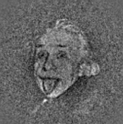


![Belt and Braces [or suspenders if you are from the US, which has quite a different connotation in the UK!]](https://peterjamesthomas.com/wp-content/uploads/2017/03/belt-and-braces.png?w=700&h=394 "Belt and Braces [or suspenders if you are from the US, which has quite a different connotation in the UK!]")
![Acrylamide [borrowed from Wikipedia]](https://peterjamesthomas.com/wp-content/uploads/2017/01/acrylamide.png?w=700 "Acrylamide [borrowed from Wikipedia]")


![Dangerous Toast [borrowed from the BBC]](https://peterjamesthomas.com/wp-content/uploads/2017/02/dangerous-toast.png?w=700 "Dangerous Toast [borrowed from the BBC]")


")


")

")


. This is your only clue.")


