The previous Dictionary was not the easiest to read on mobile devices. Because of this, the layout has been amended in this release and the mobile experience should now be greatly enhanced. Any feedback on usability would be welcome.
The new Dictionary includes 22 additional definitions, bringing the total number of entries to 220, totalling well over twenty thousand words. As usual, the new definitions range across the data arena: from Data Science and Machine Learning; to Information and Reporting; to Data Governance and Controls. They are as follows:
If you would like to contribute a definition, which will of course be acknowledged, you can use the comments section here, or the dedicated form, we look forward to hearing from you [1].
If you have found The Data & Analytics Dictionary helpful, we would love to learn more about this. Please post something in the comments section or contact us and we may even look to feature you in a future article.
The Data & Analytics Dictionary will continue to be expanded in coming months.
Notes
[1]
Please note that any submissions will be subject to editorial review and are not guaranteed to be accepted.
The recent update of The Data & Analytics Dictionary featured an entry on Charts. Entries in The Dictionary are intended to be relatively brief [1] and also the layout does not allow for many illustrations. Given this, I have used The Dictionary entries as a basis for this slightly expanded article on the subject of chart types.
A Chart is a way to organise and Visualise Data with the general objective of making it easier to understand and – in particular – to discern trends and relationships. This article will cover some of the most frequently used Chart types, which appear in alphabetical order.
Note:
Here an “axis” is a fixed reference line (sometimes invisible for stylistic reasons) which typically goes vertically up the page or horizontally from left to right across the page (but see also Radar Charts). Categories and values (see below) are plotted on axes. Most charts have two axes.
Throughout I use the word “category” to refer to something discrete that is plotted on an axis, for example France, Germany, Italy and The UK, or 2016, 2017, 2018 and 2019. I use the word “value” to refer to something more continuous plotted on an axis, such as sales or number of items etc. With a few exceptions, the Charts described below plot values against categories. Both Bubble Charts and Scatter Charts plot values against other values.
I use “series” to mean sets of categories and values. So if the categories are France, Germany, Italy and The UK; and the values are sales; then different series may pertain to sales of different products by country.
Bar & Column Charts Clustered Bar Charts, Stacked Bar Charts
Bar Charts is the generic term, but this is sometimes reserved for charts where the categories appear on the vertical axis, with Column Charts being those where categories appear on the horizontal axis. In either case, the chart has a series of categories along one axis. Extending righwards (or upwards) from each category is a rectangle whose width (height) is proportional to the value associated with this category. For example if the categories related to products, then the size of rectangle appearing against Product A might be proportional to the number sold, or the value of such sales.
Sometimes the bars are clustered to allow multiple series to be charted side-by-side, for example yearly sales for 2015 to 2018 might appear against each product category. Or – as above – sales for Product A and Product B may both be shown by country.
Another approach is to stack bars or columns on top of each other, something that is sometimes useful when comparing how the make-up of something has changed.
Bubble Charts are used to display three dimensions of data on a two dimensional chart. A circle is placed with its centre at a value on the horizontal and vertical axes according to the first two dimensions of data, but then then the area (or less commonly the diameter [2]) of the circle reflects the third dimension. The result is reminiscent of a glass of champagne (then maybe this says more about the author than anything else).
You can also use bubble charts in a quite visceral way, as exemplified by the chart above. The vertical axis plots the number of satellites of the four giant planets in the Solar System. The horizontal axis plots the closest that they ever come to the Sun. The size of the planets themselves is proportional to their relative sizes.
There does not seem to be a generally accepted definition of Cartograms. Some authorities describe them as any diagram using a map to display statistical data; I cover this type of general chart in Map Charts below. Instead I will define a Cartogram more narrowly as a geographic map where areas of map sections are changed to be proportional to some other value; resulting in a distorted map. So, in a map of Europe, the size of countries might be increased or decreased so that their new areas are proportional to each country’s GDP.
Alternatively the above cartogram of the United States has been distorted (and coloured) to emphasise the population of each state. The dark blue of California and the slightly less dark blues of Texas, Florida and New York dominate the map.
Histograms
A type of Bar Chart (typically with categories along the horizontal axis) where the categories are bins (or buckets) and the bars are proportional to the number of items falling into a bin. For example, the bins might be ranges of ages, say 0 to 19, 20 to 39, 30 to 49 and 50+ and the bars appearing against each might be the UK female population falling into each bin.
UK Referendum on EU Membership – Voting by age bracket
The diagram above is a bipartite quasi-histogram [3] that I created to illustrate another article. It is not a true histogram as it shows percentages for and against in each bin rather than overall frequencies.
UK Referendum on EU Membership – Numbers voting by age bracket
In the same article, I addressed this shortcoming with a second view of the same data, which is more histogram-like (apart from having a total category) and appears above. The point that I was making related to how Data Visualisation can both inform and mislead depending on the presentational choices taken.
Line Charts Fan Charts, Area Charts
These typically have categories across the horizontal axis and could be considered as a set of line segments joining up the tops of what would be the rectangles on a Bar Chart. Clearly multiple lines, associated with multiple series, can be plotted simultaneously without the need to cluster rectangles as is required with Bar Charts. Lines can also be used to join up the points on Scatter Charts assuming that these are sufficiently well ordered to support this.
Adaptations of Line Charts can also be used to show the probability of uncertain future events as per the exhibit above. The single red line shows the actual value of some metric up to the middle section of the chart. Thereafter it is the central prediction of a range of possible values. Lying above and below it are shaded areas which show bands of probability. For example it may be that the probability of the actual value falling within the area that has the darkest shading is 50%. A further example is contained in Limitations of Business Intelligence. Such charts are sometimes called Fan Charts.
Another type of Line Chart is the Area Chart. If we can think of a regular Line Chart as linking the tops of an invisible Bar Chart, then an Area Chart links the tops of an invisible Stacked Bar Chart. The effect is that how a band expands and contracts as we move across the chart shows how the contribution this category makes to the whole changes over time (or whatever other category we choose for the horizontal axis).
These place data on top of geographic maps. If we consider the canonical example of a map of the US divided into states, then the degree of shading of each state could be proportional to some state-related data (e.g. average income quartile of residents). Or more simply, figures could appear against each state. Bubbles could be placed at the location of major cities (or maybe a bubble per country or state etc.) with their size relating to some aspect of the locale (e.g.population). An example of this approach might be a map of US states with their relative populations denoted by Bubble area.
Also data could be overlaid on a map, for example – as shown above – coloured bands corresponding to different intensities of rainfall in different areas. This exhibit is excerpted from Hurricanes and Data Visualisation: Part I – Rainbow’s Gravity.
Pie Charts
These circular charts normally display a single series of categories with values, showing the proportion each category contributes to the total. For example a series might be the nations that make up the United Kingdom and their populations: England 55.62 million people, Scotland 5.43 million, Wales 3.13 million and Northern Ireland 1.87 million.
The whole circle represents the total of all the category values (e.g. the UK population of 66.05 million people [4]). The ratio of a segment’s angle to 360° (i.e. the whole circle) is equal to the percentage of the total represented by the linked category’s value (e.g. Scotland is 8.2% of the UK population and so will have a segment with an angle of just under 30°).
UK Referendum on EU Membership – Number voting by age bracket (see notes)
Sometimes – as illustrated above – the segments are “exploded”away from each other. This is taken from the same article as the other voting analysis exhibits.
See also: As Nice as Pie, which examines the pros and cons of this type of chart in some depth.
Radar Charts / Spider Charts
Radar Charts are used to plot one or more series of categories with values that fall into the same range. If there are six categories, then each has its own axis called a radius and the six of these radiate at equal angles from a central point. The calibration of each radial axis is the same. For example Radar Charts are often used to show ratings (say from 5 = Excellent to 1 = Poor) so each radius will have five points on it, typically with low ratings at the centre and high ones at the periphery. Lines join the values plotted on each adjacent radius, forming a jagged loop. Where more than one series is plotted, the relative scores can be easily compared. A sense of aggregate ratings can also be garnered by seeing how much of the plot of one series lies inside or outside of another.
I use Radar Charts myself extensively when assessing organisations’ data capabilities. The above exhibit shows how an organisation ranks in five areas relating to Data Architecture compared to the best in their industry sector [5].
Scatter Charts
In most of the cases we have dealt with to date, one axis has contained discrete categories and the other continuous values (though our rating example for the Radar Chart) had discrete categories and values). For a Scatter Chart both axes plot values, either continuous or discrete. A series would consist of a set of pairs of values, one to plotted on the horizontal axis and one to be plotted on the vertical axis. For example a series might be a number of pairs of midday temperature (to be plotted on the horizontal axis) and sales of ice cream (to be plotted on the vertical axis). As may be deduced from the example, often the intention is to establish a link between the pairs of values – do ice cream sales increase with temperature? This aspect can be highlighted by drawing a line of best fit on the chart; one that minimises the total distance between each plotted point and the line. Further series, say sales of coffee versus midday temperature can be added.
Here is a further example, which illustrates potential correlation between two sets of data, one on the x-axis and the other on the y-axis:
As always a note of caution must be introduced when looking to establish correlations using scatter graphs. The inimitable Randall Munroe of xkcd.com[7] explains this pithility as follows:
Tree Maps require a little bit of explanation. The best way to understand them is to start with something more familiar, a hierarchy diagram with three levels (i.e. something like an organisation chart). Consider a cafe that sells beverages, so we have a top level box labeled Beverages. The Beverages box splits into Hot Beverages and Cold Beverages at level 2. At level 3, Hot Beverages splits into Tea, Coffee, Herbal Tea and Hot Chocolate; Cold Beverages splits into Still Water, Sparkling Water, Juices and Soda. So there is one box at level 1, two at level 2 and eight at level 3. As ever a picture paints a thousand words:
Next let’s also label each of the boxes with the value of sales in the last week. If you add up the sales for Tea, Coffee, Herbal Tea and Hot Chocolate we obviously get the sales for Hot Beverages.
A Tree Map takes this idea and expands on it. A Tree Map using the data from our example above might look like this:
First, instead of being linked by lines, boxes at level 3 (leaves let’s say) appear within their parent box at level 2 (branches maybe) and the level 2 boxes appear within the overall level 1 box (the whole tree); so everything is nested. Sometimes, as is the case above, rather than having the level 2 boxes drawn explicitly, the level 3 boxes might be colour coded. So above Tea, Coffee, Herbal Tea and Hot Chocolate are mid-grey and the rest are dark grey.
Next, the size of each box (at whatever level) is proportional to the value associated with it. In our example, 66.7% of sales () are of Hot Beverages. Then two-thirds of the Beverages box will be filled with the Hot Beverages box and one-third () with the Cold Beverage box. If 20% of Cold Beverages sales () are Still Water, then the Still Water box will fill one fifth of the Cold Beverages box (or one fifteenth – – of the top level Beverages box).
It is probably obvious from the above, but it is non-trivial to find a layout that has all the boxes at the right size, particularly if you want to do something else, like have the size of boxes increase from left to right. This is a task generally best left to some software to figure out.
In Closing
The above review of various chart types is not intended to be exhaustive. For example, it doesn’t include Waterfall Charts [8], Stock Market Charts (or Open / High / Low / Close Charts [9]), or 3D Surface Charts [10] (which seldom are of much utility outside of Science and Engineering in my experience). There are also a number of other more recherché charts that may be useful in certain niche areas. However, I hope we have covered some of the more common types of charts and provided some helpful background on both their construction and usage.
Notes
[1]
Certainly by my normal standards!
[2]
Research suggests that humans are more attuned to comparing areas of circles than say their diameters.
This has been suitably redacted of course. Typically there are four other such exhibits in my assessment pack: Data Strategy, Data Organisation, MI & Analytics and Data Controls, together with a summary radar chart across all five lower level ones.
[6]
The atmospheric CO2 records were sourced from the US National Oceanographic and Atmospheric Administration’s Earth System Research Laboratory and relate to concentrations measured at their Mauna Loa station in Hawaii. The Global Average Surface Temperature records were sourced from the Earth Policy Institute, based on data from NASA’s Goddard Institute for Space Studies and relate to measurements from the latter’s Global Historical Climatology Network. This exhibit is meant to be a basic illustration of how a scatter chart can be used to compare two sets of data. Obviously actual climatological research requires a somewhat more rigorous approach than the simplistic one I have employed here.
[7]
Randall’s drawings are used (with permission) liberally throughout this site,Including:
When I recently published the latest edition of The Data & Analytics Dictionary, I included an entry on Charts which briefly covered a number of the most frequently used ones. Given that entries in the Dictionary are relatively brief [1] and that its layout allows little room for illustrations, I decided to write an expanded version as an article. This will be published in the next couple of weeks (UPDATE: now published as A Picture Paints a Thousand Numbers).
One of the exhibits that I developed for this charts article was to illustrate the use of Bubble Charts. Given my childhood interest in Astronomy, I came up with the following – somewhat whimsical – exhibit:
Bubble Charts are used to plot three dimensions of data on a two dimensional graph. Here the horizontal axis is how far each of the gas and ice giants is from the Sun [2], the vertical axis is how many satellites each planet has [3] and the final dimension – indicated by the size of the “bubbles” – is the actual size of each planet [4].
Anyway, I thought it was a prettier illustration of the utility of Bubble Charts that the typical market size analysis they are often used to display.
However, while I was doing this, my older daughter wandered into my office and said “look at the picture I drew for you Daddy” [5]. Coincidentally my muse had been her muse and the result is the Data Visualisation appearing at the top of this article. Equally coincidentally, my daughter had also encoded three dimensions of data in her drawing:
She also started off trying to capture relative size. After a great start with Mercury, Venus and Earth, she then ran into some Data Quality issues with the later planets (she is only four).
Here is an annotated version:
I think I’m at least OK at Data Visualisation, but my daughter’s drawing rather knocked mine into a cocked hat [7]. And she included a comet, which makes any Data Visualisation better in my humble opinion; what Chart would not benefit from the inclusion of a comet?
Notes
[1]
For me at least that is.
[2]
Actually the measurement is the closest that each planet comes to the Sun, its perihelion.
[3]
This may seem a somewhat arbitrary thing to plot, but a) the exhibit is meant to be illustrative only and b) there does nevertheless seem to be a correlation of sorts; I’m sure there is some Physical reason for this, which I’ll have to look into sometime.
[4]
Bubble Charts typically offer the option to scale bubbles such that either their radius / diameter or their area is in proportion to the value to be displayed. I chose the equatorial radius as my metric.
[5]
It has to be said that this is not an atypical occurence.
[6]
For at least the four rocky planets, it might have taken a while to draw all 79 of Jupiter’s moons.
[7]
I often check my prose for phrases that may be part of British idiom but not used elsewhere. In doing this, I learnt today that “knock into a cocked hat” was originally an American phrase; it is first found in the 1830s.
After a hiatus of a few months, the latest version of the peterjamesthomas.com Data and Analytics Dictionary is now available. It includes 30 new definitions, some of which have been contributed by people like Tenny Thomas Soman, George Firican, Scott Taylor and and Taru Väre. Thanks to all of these for their help.
If you would like to contribute a definition, which will of course be acknowledged, you can use the comments section here, or the dedicated form, we look forward to hearing from you [1].
If you have found The Data & Analytics Dictionary helpful, we would love to learn more about this. Please post something in the comments section or contact us and we may even look to feature you in a future article.
The Data & Analytics Dictionary will continue to be expanded in coming months.
Notes
[1]
Please note that any submissions will be subject to editorial review and are not guaranteed to be accepted.
This is the second year in which I have produced a retrospective of my blogging activity. As in 2017, I have failed miserably in my original objective of posting this early in January. Despite starting to write this piece on 18th December 2018, I have somehow sneaked into the second quarter before getting round to completing it. Maybe I will do better with 2019’s highlights!
Anyway, 2018 was a record-breaking year for peterjamesthomas.com. The site saw more traffic than in any other year since its inception; indeed hits were over a third higher than in any previous year. This increase was driven in part by the launch of my new Maths & Science section, articles from which claimed no fewer than 6 slots in the 2018 top 10 articles, when measured by hits [1]. Overall the total number of articles and new pages I published exceeded 2017’s figures to claim the second spot behind 2009; our first year in business.
As with every year, some of my work was viewed by tens of thousands of people, while other pieces received less attention. This is my selection of the articles that I enjoyed writing most, which does not always overlap with the most popular ones. Given the advent of the Maths & Science section, there are now seven categories into which I have split articles. These are as follows:
In each category, I will pick out one or two pieces which I feel are both representative of my overall content and worth a read. I would be more than happy to receive any feedback on my selections, or suggestions for different choices.
What alarm bells might alert you to problems with your Data Strategy; based on the author’s extensive experience of both developing Data Strategies and vetting existing ones.
A survey of more than 10,000 Data Scientists highlights a set of problems that will seem very, very familiar to anyone working in the data space for a few years.
Two Forbes articles argue different perspectives about the role of Chief Data Officer. The first (by Lauren deLisa Coleman) stresses its importance, the second (by Randy Bean) highlights some of the challenges that CDOs face.
Many companies want to become data driven, but getting started on the journey towards this goal can be tough. This article offers a framework for building momentum in the early stages of a Data Programme.
A review of some of the problems that can beset Data Lakes, together with some ideas about what to do to fix these from Dan Woods (Forbes), Paul Barth (Podium Data) and Dave Wells (Eckerson Group).
The number π is surrounded by a fog of misunderstanding and even mysticism. This article seeks to address some common misconceptions about π, to show that in many ways it is just like any other number, but also to demonstrate some of its less common properties.
One of the more recent chapters in my forthcoming book on Group Theory and Particle Physics. This focuses on the seminal contributions of Mathematician Emmy Noether to the fundamentals of Physics and the connection between Symmetry and Conservation Laws.
The peterjamesthomas.com Data and Analytics Dictionary is an active document and I will continue to issue revised versions of it periodically. Here are 20 new definitions, including the first from other contributors (thanks Tenny!):
People are now also welcome to contribute their own definitions. You can use the comments section here, or the dedicated form. Submissions will be subject to editorial review and are not guaranteed to be accepted.
Work by the inimitable Randall Munroe, author of long-running web-comic, xkcd.com, has been featured (with permission) multiple times on these pages [1]. The above image got me thinking that I had not penned a data visualisation article since the series starting with Hurricanes and Data Visualisation: Part I – Rainbow’s Gravity nearly a year ago. Randall’s perspective led me to consider that staple of PowerPoint presentations, the humble and much-maligned Pie Chart.
While the history is not certain, most authorities credit the pioneer of graphical statistics, William Playfair, with creating this icon, which appeared in his Statistical Breviary, first published in 1801 [2]. Later Florence Nightingale (a statistician in case you were unaware) popularised Pie Charts. Indeed a Pie Chart variant (called a Polar Chart) that Nightingale compiled appears at the beginning of my article Data Visualisation – A Scientific Treatment.
I can’t imagine any reader has managed to avoid seeing a Pie Chart before reading this article. But, just in case, here is one (Since writing Rainbow’s Gravity – see above for a link – I have tried to avoid a rainbow palette in visualisations, hence the monochromatic exhibit):
The above image is a representation of the following dataset:
Label
Count
A
4,500
B
3,000
C
3,000
D
3,000
E
4,500
Total
18,000
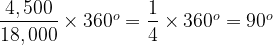
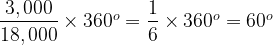
The Pie Chart consists of a circle divided in to five sectors, each is labelled A through E. The basic idea is of course that the amount of the circle taken up by each sector is proportional to the count of items associated with each category, A through E. What is meant by the innocent “amount of the circle” here? The easiest way to look at this is that going all the way round a circle consumes 360°. If we consider our data set, the total count is 18,000, which will equate to 360°. The count for A is 4,500 and we need to consider what fraction of 18,000 this represents and then apply this to 360°:
So A must take up 90°, or equivalently one quarter of the total circle. Similarly for B:
Or one sixth of the circle.
If we take this approach then – of course – the sum of all of the sectors must equal the whole circle and neither more nor less than this (pace Randall). In our example:
Label
Degrees
A
90°
B
60°
C
60°
D
60°
E
90°
Total
360°
So far, so simple. Now let’s consider a second data-set as follows:
Label
Count
A
9,480,301
B
6,320,201
C
6,320,200
D
6,320,201
E
9,480,301
Total
37,921,204
What does its Pie Chart look like? Well it’s actually rather familiar, it looks like this:
This observation stresses something important about Pie Charts. They show how a number of categories contribute to a whole figure, but they only show relative figures (percentages of the whole if you like) and not the absolute figures. The totals in our two data-sets differ by a factor of over 2,100 times, but their Pie Charts are identical. We will come back to this point again later on.
Pie Charts have somewhat fallen into disrepute over the years. Some of this is to do with their ubiquity, but there is also at least one more substantial criticism. This is that the human eye is bad at comparing angles, particularly if they are not aligned to some reference point, e.g. a vertical. To see this consider the two Pie Charts below (please note that these represent a different data set from above – for starters, there are only four categories plotted as opposed to five earlier on):
The details of the underlying numbers don’t actually matter that much, but let’s say that the left-hand Pie Chart represents annual sales in 2016, broken down by four product lines. The right-hand chart has the same breakdown, but for 2017. This provides some context to our discussions.
Suppose what is of interest is how the sales for each product line in the 2016 chart compare to their counterparts in the right-hand one; e.g. A and A’, B and B’ and so on. Well for the As, we have the helpful fact that they both start from a vertical line and then swing down and round, initially rightwards. This can be used to gauge that A’ is a bit bigger than A. What about B and B’? Well they start in different places and end in different places, looking carefully, we can see that B’ is bigger than B. C and C’ are pretty easy, C is a lot bigger. Then we come to D and D’, I find this one a bit tricky, but we can eventually hazard a guess that they are pretty much the same.
So we can compare Pie Charts and talk about how sales change between two years, what’s the problem? The issue is that it takes some time and effort to reach even these basic conclusions. How about instead of working out which is bigger, A or A’, I ask the reader to guess by what percentage A’ is bigger. This is not trivial to do based on just the charts.
If we really want to look at year-on-year growth, we would prefer that the answer leaps off the page; after all, isn’t that the whole point of visualisations rather than tables of numbers? What if we focus on just the right-hand diagram? Can you say with certainty which is bigger, A or C, B or D? You can work to an answer, but it takes longer than should really be the case for a graphical exhibit.
Aside:
There is a further point to be made here and it relates to what we said Pie Charts show earlier in this piece. What we have in our two Pie Charts above is the make-up of a whole number (in the example we have been working through, this is total annual sales) by categories (product lines). These are percentages and what we have been doing above is to compare the fact that A made up 30% of the total sales in 2016 and 33% in 2017. What we cannot say based on just the above exhibits is how actual sales changed. The total sales may have gone up or down, the Pie Chat does not tell us this, it just deals in how the make-up of total sales has shifted.
Some people try to address this shortcoming, which can result in exhibits such as:
Here some attempt has been made to show the growth in the absolute value of sales year on year. The left-hand Pie Chart is smaller and so we assume that annual sales have increased between 2016 and 2017. The most logical thing to do would be to have the change in total area of the two Pie Charts to be in proportion to the change in sales between the two years (in this case – based on the underlying data – 2017 sales are 69% bigger than 2016 sales). However, such an approach, while adding information, makes the task of comparing sectors from year to year even harder.
The general argument is that Nested Bar Charts are better for the type of scenario I have presented and the types of questions I asked above. Looking at the same annual sales data this way we could generate the following graph:
Aside:
While Bar Charts are often used to show absolute values, what we have above is the same “percentage of the whole” data that was shown in the Pie Charts. We have already covered the relative / absolute issue inherent in Pie Charts, from now on, each new chart will be like a Pie Chart inasmuch as it will contain relative (percentage of the whole) data, not absolute. Indeed you could think about generating the bar graph above by moving the Pie Chart sectors around and squishing them into new shapes, while preserving their area.
The Bar Chart makes the yearly comparisons a breeze and it is also pretty easy to take a stab at percentage differences. For example B’ looks about a fifth bigger than B (it’s actually 17.5% bigger) [3]. However, what I think gets lost here is a sense of the make-up of the elements of the two sets. We can see that A is the biggest value in the first year and A’ in the second, but it is harder to gauge what percentage of the overall both A and A’ represent.
To do this better, we could move to a Stacked Bar Chart as follows (again with the same sales data):
Aside:
Once more, we are dealing with how proportions have changed – to put it simply the height of both “skyscrapers” is the same. If we instead shifted to absolute values, then our exhibit might look more like:
The observant reader will note that I have also added dashed lines linking the same category for each year. These help to show growth. Regardless of what angle to the horizontal the lower line for a category makes, if it and the upper category line diverge (as for B and B’), then the category is growing; if they converge (as for C and C’), the category is shrinking [4]. Parallel lines indicate a steady state. Using this approach, we can get a better sense of the relative size of categories in the two years.
However, here – despite the dashed lines – we lose at least some of of the year-on-year comparative power of the Nested Bar Chart above. In turn the Nested Bar Chart loses some of the attributes of the original Pie Chart. In truth, there is no single chart which fits all purposes. Trying to find one is analogous to trying to find a planar projection of a sphere that preserves angles, distances and areas [5].
Rather than finding the Philosopher’s Stone [6] of an all-purpose chart, the challenge for those engaged in data visualisation is to anticipate the central purpose of an exhibit and to choose a chart type that best resonates with this. Sometimes, the Pie Chart can be just what is required, as I found myself in my article, A Tale of Two [Brexit] Data Visualisations, which closed with the following image:
UK Referendum on EU Membership – Number voting by age bracket (see caveats in original article)
Or, to put it another way:
You may very well be well bred
Chart aesthetics filling your head
But there’s always some special case, time or place
To replace perfect taste
For instance…
Never cry ’bout a Chart of Pie
You can still do fine with a Chart of Pie
People may well laugh at this humble graph
But it can be just the thing you need to help the staff
Never cry ’bout a Chart of Pie
Though without due care things can go awry
Bars are fine, Columns shine
Lines are ace, Radars race
Boxes fly, but never cry about a Chart of Pie
With apologies to the Disney Corporation!
Addendum:
It was pointed out to me by Adam Carless that I had omitted the following thing of beauty from my Pie Chart menagerie. How could I have forgotten?
It is claimed that some Theoretical Physicists (and most Higher Dimensional Geometers) can visualise in four dimensions. Perhaps this facility would be of some use in discerning meaning from the above exhibit.
Playfair also most likely was the first to introduce line, area and bar charts.
[3]
Recall again we are comparing percentages, so 50% is 25% bigger than 40%.
[4]
This assertion would not hold for absolute values, or rather parallel lines would indicate that the absolute value of sales (not the relative one) had stayed constant across the two years.
No this article has not escaped from my Maths & Science section, it is actually about data matters. But first of all, channeling Jennifer Aniston [1], “here comes the Science bit – concentrate”.
Shared Shapes
The Theory of Common Descent holds that any two organisms, extant or extinct, will have a common ancestor if you roll the clock back far enough. For example, each of fish, amphibians, reptiles and mammals had a common ancestor over 500 million years ago. As shown below, the current organism which is most like this common ancestor is the Lancelet [2].
To bring things closer to home, each of the Great Apes (Orangutans, Gorillas, Chimpanzees, Bonobos and Humans) had a common ancestor around 13 million years ago.
So far so simple. As one would expect, animals sharing a recent common ancestor would share many attributes with both it and each other.
Convergent Evolution refers to something else. It describes where two organisms independently evolve very similar attributes that were not features of their most recent common ancestor. Thus these features are not inherited, instead evolutionary pressure has led to the same attributes developing twice. An example is probably simpler to understand.
The image at the start of this article is of an Ichthyosaur (top) and Dolphin. It is striking how similar their body shapes are. They also share other characteristics such as live birth of young, tail first. The last Ichthyosaur died around 66 million years ago alongside many other archosaurs, notably the Dinosaurs [3]. Dolphins are happily still with us, but the first toothed whale (not a Dolphin, but probably an ancestor of them) appeared around 30 million years ago. The ancestors of the modern Bottlenose Dolphins appeared a mere 5 million years ago. Thus there is tremendous gap of time between the last Ichthyosaur and the proto-Dolphins. Ichthyosaurs are reptiles, they were covered in small scales [4]. Dolphins are mammals and covered in skin not massively different to our own. The most recent common ancestor of Ichthyosaurs and Dolphins probably lived around quarter of a billion years ago and looked like neither of them. So the shape and other attributes shared by Ichthyosaurs and Dolphins do not come from a common ancestor, they have developed independently (and millions of years apart) as adaptations to similar lifestyles as marine hunters. This is the essence of Convergent Evolution.
That was the Science, here comes the Technology…
A Brief Hydrology of Data Lakes
From 2000 to 2015, I had some success [5] with designing and implementing Data Warehouse architectures much like the following:
As a lot of my work then was in Insurance or related fields, the Analytical Repositories tended to be Actuarial Databases and / or Exposure Management Databases, developed in collaboration with such teams. Even back then, these were used for activities such as Analytics, Dashboards, Statistical Modelling, Data Mining and Advanced Visualisation.
Overlapping with the above, from around 2012, I began to get involved in also designing and implementing Big Data Architectures; initially for narrow purposes and later Data Lakes spanning entire enterprises. Of course some architectures featured both paradigms as well.
One of the early promises of a Data Lake approach was that – once all relevant data had been ingested – this would be directly leveraged by Data Scientists to derive insight.
Over time, it became clear that it would be useful to also have some merged / conformed and cleansed data structures in the Data Lake. Once the output of Data Science began to be used to support business decisions, a need arose to consider how it could be audited and both data privacy and information security considerations also came to the fore.
Next, rather than just being the province of Data Scientists, there were moves to use Data Lakes to support general Data Discovery and even business Reporting and Analytics as well. This required additional investments in metadata.
The types of issues with Data Lake adoption that I highlighted in Draining the Swamp earlier this year also led to the advent of techniques such as Data Curation [6]. In parallel, concerns about expensive Data Science resource spending 80% of their time in Data Wrangling [7] led to the creation of a new role, that of Data Engineer. These people take on much of the heavy lifting of consolidating, fixing and enriching datasets, allowing the Data Scientists to focus on Statistical Analysis, Data Mining and Machine Learning.
All of which leads to a modified Big Data / Data Lake architecture, embodying people and processes as well as technology and looking something like the exhibit above.
This is where the observant reader will see the concept of Convergent Evolution playing out in the data arena as well as the Natural World.
In Closing
Lest it be thought that I am saying that Data Warehouses belong to a bygone era, it is probably worth noting that the archosaurs, Ichthyosaurs included, dominated the Earth for orders of magnitude longer that the mammals and were only dethroned by an asymmetric external shock, not any flaw their own finely honed characteristics.
Also, to be crystal clear, much as while there are similarities between Ichthyosaurs and Dolphins there are also clear differences, the same applies to Data Warehouse and Data Lake architectures. When you get into the details, differences between Data Lakes and Data Warehouses do emerge; there are capabilities that each has that are not features of the other. What is undoubtedly true however is that the same procedural and operational considerations that played a part in making some Warehouses seem unwieldy and unresponsive are also beginning to have the same impact on Data Lakes.
If you are in the business of turning raw data into actionable information, then there are inevitably considerations that will apply to any technological solution. The key lesson is that shape of your architecture is going to be pretty similar, regardless of the technical underpinnings.
Notes
[1]
The two of us are constantly mistaken for one another.
[2]
To be clear the common ancestor was not a Lancelet, rather Lancelets sit on the branch closest to this common ancestor.
[3]
Ichthyosaurs are not Dinosaurs, but a different branch of ancient reptiles.
[4]
This is actually a matter of debate in paleontological circles, but recent evidence suggests small scales.
Between November and December 2017, I published the three parts of my Anatomy of a Data Function. These were cunningly called Part I, Part II and Part III. Eight months is a long time in the data arena and I have now issued an update.
The peterjamesthomas.com Data and Analytics Dictionary has always had internal tags (anchors for those old enough to recall their HTML) which allowed me, as its author, to link to individual entries from other web-pages I write. An example of the use of these is my article, A Brief History of Databases.
I have now made these tags public. Each entry in the Dictionary is followed by the full tag address in a box. This is accompanied by a link icon as follows:
Clicking on the link icon will copy the tag address to your clipboard. Alternatively the tag URL may just be copied from the box containing it directly. You can then use this address in your own article to link back to the D&AD entry.
As with the vast majority of my work, the contents of the Data and Analytics Dictionary is covered by a Creative Commons Attribution 4.0 International Licence. This means you can include my text or images in your own web-pages, presentations, Word documents etc. You can even modify my work, so long as you point out that you have done this.
If you would like to link back to the Data and Analytics Dictionary to provide definitions of terms that you are using, this should now be very easy. For example:
Lorem ipsum dolor sit amet, consectetur adipiscing Big Data elit. Duis tempus nisi sit amet libero vehicula Data Lake, sed tempor leo consectetur. Pellentesque suscipit sed felisData Governance ac mattis. Fusce mattis luctus posuere. Duis a Spark mattis velit. In scelerisque massa ac turpis viverra, acLogistic Regression pretium neque condimentum.
Equally, I’d be delighted if you wanted to include part of all of the text of an entry in the Data and Analytics Dictionary in your own work, commercial or personal; a link back using this new functionality would be very much appreciated.
I hope that this new functionality will be useful. An update to the Dictionary’s contents will be published in the next couple of months.

")


 ) are of Hot Beverages. Then two-thirds of the Beverages box will be filled with the Hot Beverages box and one-third (
 ) with the Cold Beverage box. If 20% of Cold Beverages sales (
 ) are Still Water, then the Still Water box will fill one fifth of the Cold Beverages box (or one fifteenth –
  – of the top level Beverages box).


")


")
")


