The peterjamesthomas.com Data and Analytics Dictionary is an active document and I will continue to issue revised versions of it periodically. Here are 20 new definitions, including the first from other contributors (thanks Tenny!):
People are now also welcome to contribute their own definitions. You can use the comments section here, or the dedicated form. Submissions will be subject to editorial review and are not guaranteed to be accepted.
Work by the inimitable Randall Munroe, author of long-running web-comic, xkcd.com, has been featured (with permission) multiple times on these pages [1]. The above image got me thinking that I had not penned a data visualisation article since the series starting with Hurricanes and Data Visualisation: Part I – Rainbow’s Gravity nearly a year ago. Randall’s perspective led me to consider that staple of PowerPoint presentations, the humble and much-maligned Pie Chart.
While the history is not certain, most authorities credit the pioneer of graphical statistics, William Playfair, with creating this icon, which appeared in his Statistical Breviary, first published in 1801 [2]. Later Florence Nightingale (a statistician in case you were unaware) popularised Pie Charts. Indeed a Pie Chart variant (called a Polar Chart) that Nightingale compiled appears at the beginning of my article Data Visualisation – A Scientific Treatment.
I can’t imagine any reader has managed to avoid seeing a Pie Chart before reading this article. But, just in case, here is one (Since writing Rainbow’s Gravity – see above for a link – I have tried to avoid a rainbow palette in visualisations, hence the monochromatic exhibit):
The above image is a representation of the following dataset:
Label
Count
A
4,500
B
3,000
C
3,000
D
3,000
E
4,500
Total
18,000
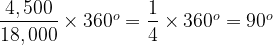
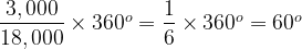
The Pie Chart consists of a circle divided in to five sectors, each is labelled A through E. The basic idea is of course that the amount of the circle taken up by each sector is proportional to the count of items associated with each category, A through E. What is meant by the innocent “amount of the circle” here? The easiest way to look at this is that going all the way round a circle consumes 360°. If we consider our data set, the total count is 18,000, which will equate to 360°. The count for A is 4,500 and we need to consider what fraction of 18,000 this represents and then apply this to 360°:
So A must take up 90°, or equivalently one quarter of the total circle. Similarly for B:
Or one sixth of the circle.
If we take this approach then – of course – the sum of all of the sectors must equal the whole circle and neither more nor less than this (pace Randall). In our example:
Label
Degrees
A
90°
B
60°
C
60°
D
60°
E
90°
Total
360°
So far, so simple. Now let’s consider a second data-set as follows:
Label
Count
A
9,480,301
B
6,320,201
C
6,320,200
D
6,320,201
E
9,480,301
Total
37,921,204
What does its Pie Chart look like? Well it’s actually rather familiar, it looks like this:
This observation stresses something important about Pie Charts. They show how a number of categories contribute to a whole figure, but they only show relative figures (percentages of the whole if you like) and not the absolute figures. The totals in our two data-sets differ by a factor of over 2,100 times, but their Pie Charts are identical. We will come back to this point again later on.
Pie Charts have somewhat fallen into disrepute over the years. Some of this is to do with their ubiquity, but there is also at least one more substantial criticism. This is that the human eye is bad at comparing angles, particularly if they are not aligned to some reference point, e.g. a vertical. To see this consider the two Pie Charts below (please note that these represent a different data set from above – for starters, there are only four categories plotted as opposed to five earlier on):
The details of the underlying numbers don’t actually matter that much, but let’s say that the left-hand Pie Chart represents annual sales in 2016, broken down by four product lines. The right-hand chart has the same breakdown, but for 2017. This provides some context to our discussions.
Suppose what is of interest is how the sales for each product line in the 2016 chart compare to their counterparts in the right-hand one; e.g. A and A’, B and B’ and so on. Well for the As, we have the helpful fact that they both start from a vertical line and then swing down and round, initially rightwards. This can be used to gauge that A’ is a bit bigger than A. What about B and B’? Well they start in different places and end in different places, looking carefully, we can see that B’ is bigger than B. C and C’ are pretty easy, C is a lot bigger. Then we come to D and D’, I find this one a bit tricky, but we can eventually hazard a guess that they are pretty much the same.
So we can compare Pie Charts and talk about how sales change between two years, what’s the problem? The issue is that it takes some time and effort to reach even these basic conclusions. How about instead of working out which is bigger, A or A’, I ask the reader to guess by what percentage A’ is bigger. This is not trivial to do based on just the charts.
If we really want to look at year-on-year growth, we would prefer that the answer leaps off the page; after all, isn’t that the whole point of visualisations rather than tables of numbers? What if we focus on just the right-hand diagram? Can you say with certainty which is bigger, A or C, B or D? You can work to an answer, but it takes longer than should really be the case for a graphical exhibit.
Aside:
There is a further point to be made here and it relates to what we said Pie Charts show earlier in this piece. What we have in our two Pie Charts above is the make-up of a whole number (in the example we have been working through, this is total annual sales) by categories (product lines). These are percentages and what we have been doing above is to compare the fact that A made up 30% of the total sales in 2016 and 33% in 2017. What we cannot say based on just the above exhibits is how actual sales changed. The total sales may have gone up or down, the Pie Chat does not tell us this, it just deals in how the make-up of total sales has shifted.
Some people try to address this shortcoming, which can result in exhibits such as:
Here some attempt has been made to show the growth in the absolute value of sales year on year. The left-hand Pie Chart is smaller and so we assume that annual sales have increased between 2016 and 2017. The most logical thing to do would be to have the change in total area of the two Pie Charts to be in proportion to the change in sales between the two years (in this case – based on the underlying data – 2017 sales are 69% bigger than 2016 sales). However, such an approach, while adding information, makes the task of comparing sectors from year to year even harder.
The general argument is that Nested Bar Charts are better for the type of scenario I have presented and the types of questions I asked above. Looking at the same annual sales data this way we could generate the following graph:
Aside:
While Bar Charts are often used to show absolute values, what we have above is the same “percentage of the whole” data that was shown in the Pie Charts. We have already covered the relative / absolute issue inherent in Pie Charts, from now on, each new chart will be like a Pie Chart inasmuch as it will contain relative (percentage of the whole) data, not absolute. Indeed you could think about generating the bar graph above by moving the Pie Chart sectors around and squishing them into new shapes, while preserving their area.
The Bar Chart makes the yearly comparisons a breeze and it is also pretty easy to take a stab at percentage differences. For example B’ looks about a fifth bigger than B (it’s actually 17.5% bigger) [3]. However, what I think gets lost here is a sense of the make-up of the elements of the two sets. We can see that A is the biggest value in the first year and A’ in the second, but it is harder to gauge what percentage of the overall both A and A’ represent.
To do this better, we could move to a Stacked Bar Chart as follows (again with the same sales data):
Aside:
Once more, we are dealing with how proportions have changed – to put it simply the height of both “skyscrapers” is the same. If we instead shifted to absolute values, then our exhibit might look more like:
The observant reader will note that I have also added dashed lines linking the same category for each year. These help to show growth. Regardless of what angle to the horizontal the lower line for a category makes, if it and the upper category line diverge (as for B and B’), then the category is growing; if they converge (as for C and C’), the category is shrinking [4]. Parallel lines indicate a steady state. Using this approach, we can get a better sense of the relative size of categories in the two years.
However, here – despite the dashed lines – we lose at least some of of the year-on-year comparative power of the Nested Bar Chart above. In turn the Nested Bar Chart loses some of the attributes of the original Pie Chart. In truth, there is no single chart which fits all purposes. Trying to find one is analogous to trying to find a planar projection of a sphere that preserves angles, distances and areas [5].
Rather than finding the Philosopher’s Stone [6] of an all-purpose chart, the challenge for those engaged in data visualisation is to anticipate the central purpose of an exhibit and to choose a chart type that best resonates with this. Sometimes, the Pie Chart can be just what is required, as I found myself in my article, A Tale of Two [Brexit] Data Visualisations, which closed with the following image:
UK Referendum on EU Membership – Number voting by age bracket (see caveats in original article)
Or, to put it another way:
You may very well be well bred
Chart aesthetics filling your head
But there’s always some special case, time or place
To replace perfect taste
For instance…
Never cry ’bout a Chart of Pie
You can still do fine with a Chart of Pie
People may well laugh at this humble graph
But it can be just the thing you need to help the staff
Never cry ’bout a Chart of Pie
Though without due care things can go awry
Bars are fine, Columns shine
Lines are ace, Radars race
Boxes fly, but never cry about a Chart of Pie
With apologies to the Disney Corporation!
Addendum:
It was pointed out to me by Adam Carless that I had omitted the following thing of beauty from my Pie Chart menagerie. How could I have forgotten?
It is claimed that some Theoretical Physicists (and most Higher Dimensional Geometers) can visualise in four dimensions. Perhaps this facility would be of some use in discerning meaning from the above exhibit.
Playfair also most likely was the first to introduce line, area and bar charts.
[3]
Recall again we are comparing percentages, so 50% is 25% bigger than 40%.
[4]
This assertion would not hold for absolute values, or rather parallel lines would indicate that the absolute value of sales (not the relative one) had stayed constant across the two years.
No this article has not escaped from my Maths & Science section, it is actually about data matters. But first of all, channeling Jennifer Aniston [1], “here comes the Science bit – concentrate”.
Shared Shapes
The Theory of Common Descent holds that any two organisms, extant or extinct, will have a common ancestor if you roll the clock back far enough. For example, each of fish, amphibians, reptiles and mammals had a common ancestor over 500 million years ago. As shown below, the current organism which is most like this common ancestor is the Lancelet [2].
To bring things closer to home, each of the Great Apes (Orangutans, Gorillas, Chimpanzees, Bonobos and Humans) had a common ancestor around 13 million years ago.
So far so simple. As one would expect, animals sharing a recent common ancestor would share many attributes with both it and each other.
Convergent Evolution refers to something else. It describes where two organisms independently evolve very similar attributes that were not features of their most recent common ancestor. Thus these features are not inherited, instead evolutionary pressure has led to the same attributes developing twice. An example is probably simpler to understand.
The image at the start of this article is of an Ichthyosaur (top) and Dolphin. It is striking how similar their body shapes are. They also share other characteristics such as live birth of young, tail first. The last Ichthyosaur died around 66 million years ago alongside many other archosaurs, notably the Dinosaurs [3]. Dolphins are happily still with us, but the first toothed whale (not a Dolphin, but probably an ancestor of them) appeared around 30 million years ago. The ancestors of the modern Bottlenose Dolphins appeared a mere 5 million years ago. Thus there is tremendous gap of time between the last Ichthyosaur and the proto-Dolphins. Ichthyosaurs are reptiles, they were covered in small scales [4]. Dolphins are mammals and covered in skin not massively different to our own. The most recent common ancestor of Ichthyosaurs and Dolphins probably lived around quarter of a billion years ago and looked like neither of them. So the shape and other attributes shared by Ichthyosaurs and Dolphins do not come from a common ancestor, they have developed independently (and millions of years apart) as adaptations to similar lifestyles as marine hunters. This is the essence of Convergent Evolution.
That was the Science, here comes the Technology…
A Brief Hydrology of Data Lakes
From 2000 to 2015, I had some success [5] with designing and implementing Data Warehouse architectures much like the following:
As a lot of my work then was in Insurance or related fields, the Analytical Repositories tended to be Actuarial Databases and / or Exposure Management Databases, developed in collaboration with such teams. Even back then, these were used for activities such as Analytics, Dashboards, Statistical Modelling, Data Mining and Advanced Visualisation.
Overlapping with the above, from around 2012, I began to get involved in also designing and implementing Big Data Architectures; initially for narrow purposes and later Data Lakes spanning entire enterprises. Of course some architectures featured both paradigms as well.
One of the early promises of a Data Lake approach was that – once all relevant data had been ingested – this would be directly leveraged by Data Scientists to derive insight.
Over time, it became clear that it would be useful to also have some merged / conformed and cleansed data structures in the Data Lake. Once the output of Data Science began to be used to support business decisions, a need arose to consider how it could be audited and both data privacy and information security considerations also came to the fore.
Next, rather than just being the province of Data Scientists, there were moves to use Data Lakes to support general Data Discovery and even business Reporting and Analytics as well. This required additional investments in metadata.
The types of issues with Data Lake adoption that I highlighted in Draining the Swamp earlier this year also led to the advent of techniques such as Data Curation [6]. In parallel, concerns about expensive Data Science resource spending 80% of their time in Data Wrangling [7] led to the creation of a new role, that of Data Engineer. These people take on much of the heavy lifting of consolidating, fixing and enriching datasets, allowing the Data Scientists to focus on Statistical Analysis, Data Mining and Machine Learning.
All of which leads to a modified Big Data / Data Lake architecture, embodying people and processes as well as technology and looking something like the exhibit above.
This is where the observant reader will see the concept of Convergent Evolution playing out in the data arena as well as the Natural World.
In Closing
Lest it be thought that I am saying that Data Warehouses belong to a bygone era, it is probably worth noting that the archosaurs, Ichthyosaurs included, dominated the Earth for orders of magnitude longer that the mammals and were only dethroned by an asymmetric external shock, not any flaw their own finely honed characteristics.
Also, to be crystal clear, much as while there are similarities between Ichthyosaurs and Dolphins there are also clear differences, the same applies to Data Warehouse and Data Lake architectures. When you get into the details, differences between Data Lakes and Data Warehouses do emerge; there are capabilities that each has that are not features of the other. What is undoubtedly true however is that the same procedural and operational considerations that played a part in making some Warehouses seem unwieldy and unresponsive are also beginning to have the same impact on Data Lakes.
If you are in the business of turning raw data into actionable information, then there are inevitably considerations that will apply to any technological solution. The key lesson is that shape of your architecture is going to be pretty similar, regardless of the technical underpinnings.
Notes
[1]
The two of us are constantly mistaken for one another.
[2]
To be clear the common ancestor was not a Lancelet, rather Lancelets sit on the branch closest to this common ancestor.
[3]
Ichthyosaurs are not Dinosaurs, but a different branch of ancient reptiles.
[4]
This is actually a matter of debate in paleontological circles, but recent evidence suggests small scales.
This article is about facts. Facts are sometimes less solid than we would like to think; sometimes they are downright malleable. To illustrate, consider the fact that in 98 episodes of Dragnet, Sergeant Joe Friday never uttered the words “Just the facts Ma’am”, though he did often employ the variant alluded to in the image above [1]. Equally, Rick never said “Play it again Sam” in Casablanca [2] and St. Paul never suggested that “money is the root of all evil” [3]. As Michael Caine never said in any film, “not a lot of people know that” [4].
Up-front Acknowledgements
These normally appear at the end of an article, but it seemed to make sense to start with them in this case:
Fact-based decision making. It sounds good doesn’t it? Especially if you consider the alternatives: going on gut feel, doing what you did last time, guessing, not taking a decision at all. However – as is often the case with issues I deal with on this blog – fact-based decision-making is easier to say than it is to achieve. Here I will look to cover some of the obstacles and suggest a potential way to navigate round them. Let’s start however with some definitions.
NOUN A conclusion or resolution reached after consideration.
(Oxford Dictionaries)
So one can infer that fact-based decision-making is the process of reaching a conclusion based on consideration of things that are known to be true. Again, it sounds great doesn’t it? It seems that all you have to do is to find things that are true. How hard can that be? Well actually quite hard as it happens. Let’s cover what can go wrong (note: this section is not intended to be exhaustive, links are provided to more in-depth articles where appropriate):
Accuracy of Data that is captured
A number of factors can play into the accuracy of data capture. Some systems (even in 2018) can still make it harder to capture good data than to ram in bad. Often an issue may also be a lack of master data definitions, so that similar data is labelled differently in different systems.
A more pernicious problem is combinatorial data accuracy, two data items are both valid, but not in combination with each other. However, often the biggest stumbling block is a human one, getting people to buy in to the idea that the care and attention they pay to data capture will pay dividends later in the process.
Data may be perfectly valid, but still not represent reality. Here I’ll let Neil Raden point out the central issue in his customary style:
People find the most ingenious ways to distort measurement systems to generate the numbers that are desired, not only NOT providing the desired behaviors, but often becoming more dysfunctional through the effort.
[…] voluntary compliance to the [US] tax code encourages a national obsession with “loopholes”, and what salesman hasn’t “sandbagged” a few deals for next quarter after she has met her quota for the current one?
Where there is a reward to be gained or a punishment to be avoided, by hitting certain numbers in a certain way, the creativeness of humans often comes to the fore. It is hard to account for such tweaking in measurement systems.
Timing issues with Data
Timing is often problematic. For example, a transaction completed near the end of a period gets recorded in the next period instead, one early in a new period goes into the prior period, which is still open. There is also (as referenced by Neil in his comments above) the delayed booking of transactions in order to – with the nicest possible description – smooth revenues. It is not just hypothetical salespeople who do this of course. Entire organisations can make smoothing adjustments to their figures before publishing and deferral or expedition of obligations and earnings has become something of an art form in accounting circles. While no doubt most of this tweaking is done with the best intentions, it can compromise the fact-based approach that we are aiming for.
Reliability with which Data is moved around and consolidated
In our modern architectures, replete with web-services, APIs, cloud-based components and the quasi-instantaneous transmission of new transactions, it is perhaps not surprising that occasionally some data gets lost in translation [5] along the way. That is before data starts to be Sqooped up into Data Lakes, or other such Data Repositories, and then otherwise manipulated in order to derive insight or provide regular information. All of these are processes which can introduce their own errors. Suffice it to say that transmission, collation and manipulation of data can all reduce its accuracy.
Pertinence and fidelity of metrics developed from Data
Here we get past issues with data itself (or how it is handled and moved around) and instead consider how it is used. Metrics are seldom reliant on just one data element, but are often rather combinations. The different elements might come in because a given metric is arithmetical in nature, e.g.
Choices are made as to how to construct such compound metrics and how to relate them to actual business outcomes. For example:
Is this a good way to define New Business Growth? Are there any weaknesses in this definition, for example is it sensitive to any glitches in – say – the tagging of Repeat Business? Do we need to take account of pricing changes between Repeat Business this year and last year? Is New Business Growth something that is even worth tracking; what will we do as a result of understanding this?
The above is a somewhat simple metric, in a section of Using historical data to justify BI investments – Part I, I cover some actual Insurance industry metrics that build on each other and are a little more convoluted. The same article also considers how to – amongst other things – match revenue and outgoings when the latter are spread over time. There are often compromises to be made in defining metrics. Some of these are based on the data available. Some relate to inherent issues with what is being measured. In other cases, a metric may be a best approximation to some indication of business health; a proxy used because that indication is not directly measurable itself. In the last case, staff turnover may be a proxy for staff morale, but it does not directly measure how employees are feeling (a competitor might be poaching otherwise happy staff for example).
I have used the above image before in these pages [6]. The situation it describes may seem farcical, but it is actually not too far away from some extrapolations I have seen in a business context. For example, a prediction of full-year sales may consist of this year’s figures for the first three quarters supplemented by prior year sales for the final quarter. While our metric may be better than nothing, there are some potential distortions related to such an approach:
Repeat business may have fallen into Q4 last year, but was processed in Q3 this year. This shift in timing would lead to such business being double-counted in our year end estimate.
Taking point 1 to one side, sales may be growing or contracting compared to the previous year. Using Q4 prior year as is would not reflect this.
It is entirely feasible that some market event occurs this year ( for example the entrance or exit of a competitor, or the launch of a new competitor product) which would render prior year figures a poor guide.
Of course all of the above can be adjusted for, but such adjustments would be reliant on human judgement, making any projections similarly reliant on people’s opinions (which as Neil points out may be influenced, conciously or unconsciously, by self-interest). Where sales are based on conversions of prospects, the quantum of prospects might be a more useful predictor of Q4 sales. However here a historical conversion rate would need to be calculated (or conversion probabilities allocated by the salespeople involved) and we are back into essentially the same issues as catalogued above.
Having spent 18 years working in various parts of the Insurance industry, statistical estimates being part of the standard set of metrics is pretty familiar to me [7]. However such estimates appear in a number of industries, sometimes explicitly, sometimes implicitly. A clear parallel would be credit risk in Retail Banking, but something as simple as an estimate of potentially delinquent debtors is an inherently statistical figure (albeit one that may not depend on the output of a statistical model).
The thing with statistical estimates is that they are never a single figure but a range. A model may for example spit out a figure like £12.4 million ± £0.5 million. Let’s unpack this.
Well the output of the model will probably be something analogous to the above image. Here a distribution has been fitted to the business event being modelled. The central point of this (the one most likely to occur according to the model) is £12.4 million. The model is not saying that £12.4 million is the answer, it is saying it is the central point of a range of potential figures. We typically next select a symmetrical range above and below the central figure such that we cover a high proportion of the possible outcomes for the figure being modelled; 95% of them is typical [8]. In the above example, the range extends plus £0. 5 million above £12.4 million and £0.5 million below it (hence the ± sign).
Of course the problem is then that Financial Reports (or indeed most Management Reports) are not set up to cope with plus or minus figures, so typically one of £12.4 million (the central prediction) or £11.9 million (the most conservative estimate [9]) is used. The fact that the number itself is uncertain can get lost along the way. By the time that people who need to take decisions based on such information are in the loop, the inherent uncertainty of the prediction may have disappeared. This can be problematic. Suppose a real result of £12.4 million sees an organisation breaking even, but one of £11.9 million sees a small loss being recorded. This could have quite an influence on what course of action managers adopt [10]; are they relaxed, or concerned?
Beyond the above, it is not exactly unheard of for statistical models to have glitches, sometimes quite big glitches [11].
This segment could easily expand into a series of articles itself. Hopefully I have covered enough to highlight that there may be some challenges in this area.
And so what?
Even if we somehow avoid all of the above pitfalls, there remains one booby-trap that is likely to snare us, absent the necessary diligence. This was alluded to in the section about the definition of metrics:
Is New Business Growth something that is even worth tracking; what will we do as a result of understanding this?
Unless a reported figure, or output of a model, leads to action being taken, it is essentially useless. Facts that never lead to anyone doing anything are like lists learnt by rote at school and regurgitated on demand parrot-fashion; they demonstrate the mechanism of memory, but not that of understanding. As Neil puts it in his article:
[…] technology is never a solution to social problems, and interactions between human beings are inherently social. This is why performance management is a very complex discipline, not just the implementation of dashboard or scorecard technology.
How to Measure the Unmeasurable
Our dream of fact-based decision-making seems to be crumbling to dust. Regular facts are subject to data quality issues, or manipulation by creative humans. As data is moved from system to system and repository to repository, the facts can sometimes acquire an “alt-” prefix. Timing issues and the design of metrics can also erode accuracy. Then there are many perils and pitfalls associated with simple extrapolation and less simple statistical models. Finally, any fact that manages to emerge from this gantlet [12] unscathed may then be totally ignored by those whose actions it is meant to guide. What can be done?
As happens elsewhere on this site, let me turn to another field for inspiration. Not for the first time, let’s consider what Science can teach us about dealing with such issues with facts. In a recent article [13] in my Maths & Science section, I examined the nature of Scientific Theory and – in particular – explored the imprecision inherent in the Scientific Method. Here is some of what I wrote:
It is part of the nature of scientific theories that (unlike their Mathematical namesakes) they are not “true” and indeed do not seek to be “true”. They are models that seek to describe reality, but which often fall short of this aim in certain circumstances. General Relativity matches observed facts to a greater degree than Newtonian Gravity, but this does not mean that General Relativity is “true”, there may be some other, more refined, theory that explains everything that General Relativity does, but which goes on to explain things that it does not. This new theory may match reality in cases where General Relativity does not. This is the essence of the Scientific Method, never satisfied, always seeking to expand or improve existing thought.
I think that the Scientific Method that has served humanity so well over the centuries is applicable to our business dilemma. In the same way that a Scientific Theory is never “true”, but instead useful for explaining observations and predicting the unobserved, business metrics should be judged less on their veracity (though it would be nice if they bore some relation to reality) and instead on how often they lead to the right action being taken and the wrong action being avoided. This is an argument for metrics to be simple to understand and tied to how decision-makers actually think, rather than some other more abstruse and theoretical definition.
A proxy metric is fine, so long as it yields the right result (and the right behaviour) more often than not. A metric with dubious data quality is still useful if it points in the right direction; if the compass needle is no more than a few degrees out. While of course steps that improve the accuracy of metrics are valuable and should be undertaken where cost-effective, at least equal attention should be paid to ensuring that – when the metric has been accessed and digested – something happens as a result. This latter goal is a long way from the arcana of data lineage and metric definition, it is instead the province of human psychology; something that the accomploished data professional should be adept at influencing.
I have touched on how to positively modify human behaviour in these pages a number of times before [14]. It is a subject that I will be coming back to again in coming months, so please watch this space.
Without getting into too many details, what you are typically doing is stating that there is a less than 5% chance that the measurements forming model input match the distribution due to a fluke; but this is not meant to be a primer on null hypotheses.
[9]
Of course, depending on context, £12.9 million could instead be the most conservative estimate.
[10]
This happens a lot in election polling. Candidate A may be estimated to be 3 points ahead of Candidate B, but with an error margin of 5 points, it should be no real surprise when Candidate B wins the ballot.
[11]
Try googling Nobel Laureates Myron Scholes and Robert Merton and then look for references to Long-term Capital Management.
[12]
Yes I meant “gantlet” that is the word in the original phrase, not “gauntlet” and so connections with gloves are wide of the mark.
This article was originally intended for publication late in the year it reviews, but, as they [1] say, the best-laid schemes o’ mice an’ men gang aft agley…
In 2017 I wrote more articles [2] than in any year since 2009, which was the first full year of this site’s existence. Some were viewed by thousands of people, others received less attention. Here I am going to ignore the metric of popular acclaim and instead highlight a few of the articles that I enjoyed writing most, or sometimes re-reading a few months later [3]. Given the breadth of subject matter that appears on peterjamesthomas.com, I have split this retrospective into six areas, which are presented in decreasing order of the number of 2017 articles I wrote in each. These are as follows:
In each category, I will pick out two or three of pieces which I feel are both representative of my overall content and worth a read. I would be more than happy to receive any feedback on my selections, or suggestions for different choices.
Three articles focussed on the structure and components of a modern Data Function and how its components interact with both each other and the wider organisation in order to support business goals.
How one of the most famous scientific data visualisations, the Periodic Table, has been repurposed to explain where the atoms we are all made of come from via the processes of nucleosynthesis.
Two articles on how Data Visualisation is used in Meteorology. Part I provides a worked example illustrating some of the problems that can arise when adopting a rainbow colour palette in data visualisation. Part II grapples with hurricane prediction and covers some issues with data visualisations that are intended to convey safety information to the public.
What links Climate Change, the Manhattan Project, Brexit and Toast? How do these relate to the public’s trust in Science? What does this mean for Data Scientists?
Answers provided by Nature, The University of Cambridge and the author.
The wisdom of the crowd relies upon essentially democratic polling of a large number of respondents; an approach that has several shortcomings, not least the lack of weight attached to people with specialist knowledge. The Surprisingly Popular algorithm addresses these shortcomings and so far has out-performed existing techniques in a range of studies.
The 2017 Nobel Prize for Chemistry was awarded to Structural Biologist Richard Henderson and two other co-recipients. What can Machine Learning practitioners learn from Richard’s observations about how to generate images from Cryo-Electron Microscopy data?
Musings on the overlapping roles of Chief Analytics Officer and Chief Data Officer and thoughts on whether there should be just one Top Data Job in an organisation.
Many Chief Data Officer job descriptions have a list of requirements that resemble Swiss Army Knives. This article argues that the CDO must be the conductor of an orchestra, not someone who is a virtuoso in every single instrument.
Paul Barsch (EY & Teradata) provides some insight into why Big Data projects fail, what you can do about this and how best to treat any such projects that head off the rails. With additional contributions from Big Data gurus Albert Einstein, Thomas Edison and Samuel Beckett.
Thoughts on trends in interest in Hadoop and Spark, featuring George Hill, James Kobielus, Kashif Saiyed and Martyn Richard Jones, together with the author’s perspective on the importance of technology in data-centric work.
and Finally…
I would like to close this review of 2017 with a final article, one that somehow defies classification:
An illustrated Buffyverse take on Business gobbledygook – What would Buffy do about thinking outside the box? To celebrate 20 years of Buffy the Vampire Slayer and 1st April 2017.
In the first article in this mini-series we looked at alternative approaches to colour and how these could inform or mislead in data visualisations relating to weather events. In particular we discussed drawbacks of using a rainbow palette in such visualisations and some alternatives. Here we move into much more serious territory, how best to inform the public about what a specific hurricane will do next and the risks that it poses. It would not be an exaggeration to say that sometimes this area may be a matter of life and death. As with rainbow-coloured maps of weather events, some aspects of how the estimated future course of hurricanes are communicated and understood leave much to be desired.
The above diagram is called a the cone of uncertainty of a hurricane. Cone of uncertainty sounds like an odd term. What does it mean? Let’s start by offering a historical perspective on hurricane modelling.
Paleomodelling
Well like any other type of weather prediction, determining the future direction and speed of a hurricane is not an exact science [2]. In the earlier days of hurricane modelling, Meteorologists used to employ statistical models, which were built based on detailed information about previous hurricanes, took as input many data points about the history of a current hurricane’s evolution and provided as output a prediction of what it could do in coming days.
There were a variety of statistical models, but the output of them was split into two types when used for hurricane prediction.
A) A prediction of the next location of the hurricane was made. This included an average error (in km) based on the inaccuracy of previous hurricane predictions. A percentage of this, say 80%, gave a “circle of uncertainty”, x km around the prediction.
B) Many predictions were generated and plotted; each had a location and an probability associated with it. The centroid of these (adjusted by the probability associated with each location) was calculated and used as the central prediction (cf. A). A circle was drawn (y km from the centroid) so that a percentage of the predictions fell within this. Above, there are 100 estimates and the chosen percentage is 80%; so 80 points lie within the red “circle of uncertainty”.
Type A
First, the model could have generated a single prediction (the centre of the hurricane will be at 32.3078° N, 64.7505° W tomorrow) and supplemented this with an error measure. The error measure would have been based on historical hurricane data and related to how far out prior predictions had been on average; this measure would have been in kilometres. It would have been typical to employ some fraction of the error measure to define a “circle of uncertainty” around the central prediction; 80% in the example directly above (compared to two thirds in the NWS exhibit at the start of the article).
Type B
Second, the model could have generated a large number of mini-predictions, each of which would have had a probability associated with it (e.g. the first two estimates of location could be that the centre of the hurricane is at 32.3078° N, 64.7505° W with a 5% chance, or a mile away at 32.3223° N, 64.7505° W with a 2% chance and so on). In general if you had picked the “centre of gravity” of the second type of output, it would have been analogous to the single prediction of the first type of output [3]. The spread of point predictions in the second method would have also been analogous to the error measure of the first. Drawing a circle around the centroid would have captured a percentage of the mini-predictions, once more 80% in the example immediately above and two thirds in the NWS chart, generating another “circle of uncertainty”.
Here comes the Science
That was then of course, nowadays the statistical element of hurricane models is less significant. With increased processing power and the ability to store and manipulate vast amounts of data, most hurricane models instead rely upon scientific models; let’s call this Type C.
Type C
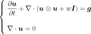
As the air is a fluid [4], its behaviour falls into the area of study known as fluid dynamics. If we treat the atmosphere as being viscous, then the appropriate equation governing fluid dynamics is the Navier-Stokes equation, which is itself derived from the Cauchy Momentum equation:
If viscosity is taken as zero (as a simplification), instead the Euler equations apply:
The reader may be glad to know that I don’t propose to talk about any of the above equations any further.
To get back to the model, in general the atmosphere will be split into a three dimensional grid (the atmosphere has height as well). The current temperature, pressure, moisture content etc. are fed in (or sometimes interpolated) at each point and equations such as the ones above are used to determine the evolution of fluid flow at a given grid element. Of course – as is typical in such situations – approximations of the equations are used and there is some flexibility over which approximations to employ. Also, there may be uncertainty about the input parameters, so statistics does not disappear entirely. Leaving this to one side, how the atmospheric conditions change over time at each grid point rolls up to provide a predictive basis for what a hurricane will do next.
Although the methods are very different, the output of these scientific models will be pretty similar, qualitatively, to the Type A statistical model above. In particular, uncertainty will be delineated based on how well the model performed on previous occasions. For example, what was the average difference between prediction and fact after 6 hours, 12 hours and so on. Again, the uncertainty will have similar characteristics to that of Type A above.
A Section about Conics
In all of the cases discussed above, we have a central prediction (which may be an average of several predictions as per Type B) and a circular distribution around this indicating uncertainty. Let’s consider how these predictions might change as we move into the future.
If today is Monday, then there will be some uncertainty about what the hurricane does on Tuesday. For Wednesday, the uncertainty will be greater than for Tuesday (the “circle of uncertainty” will have grown) and so on. With the Type A and Type C outputs, the error measure will increase with time. With the Type B output, if the model spits out 100 possible locations for the hurricane on a specific day (complete with the likelihood of each of these occurring), then these will be fairly close together on Tuesday and further apart on Wednesday. In all cases, uncertainty about the location of the becomes smeared out over time, resulting in a larger area where it is likely to be located and a bigger “circle of uncertainty”.
This is where the circles of uncertainty combine to become a cone of uncertainty. For the same example, on each day, the meteorologists will plot the central prediction for the hurricane’s location and then draw a circle centered on this which captures the uncertainty of the prediction. For the same reason as stated above, the size of the circle will (in general) increase with time; Wednesday’s circle will be bigger than Tuesday’s. Also each day’s central prediction will be in a different place from the previous day’s as the hurricane moves along. Joining up all of these circles gives us the cone of uncertainty [5].
If the central predictions imply that a hurricane is moving with constant speed and direction, then its cone of uncertainty would look something like this:
In this diagram, broadly speaking, on each day, there is a 67% probability that the centre of the hurricane will be found within the relevant circle that makes up the cone of uncertainty. We will explore the implications of the underlined phrase in the next section.
Of course hurricanes don’t move in a single direction at an unvarying pace (see the actual NWS exhibit above as opposed to my idealised rendition), so part of the purpose of the cone of uncertainty diagram is to elucidate this.
The Central Issue
So hopefully the intent of the NWS chart at the beginning of this article is now clearer. What is the problem with it? Well I’ll go back to the words I highlighted couple of paragraphs back:
There is a 67% probability that the centre of the hurricane will be found within the relevant circle that makes up the cone of uncertainty
So the cone helps us with where the centre of the hurricane may be. A reasonable question is, what about the rest of the hurricane?
For ease of reference, here is the NWS exhibit again:
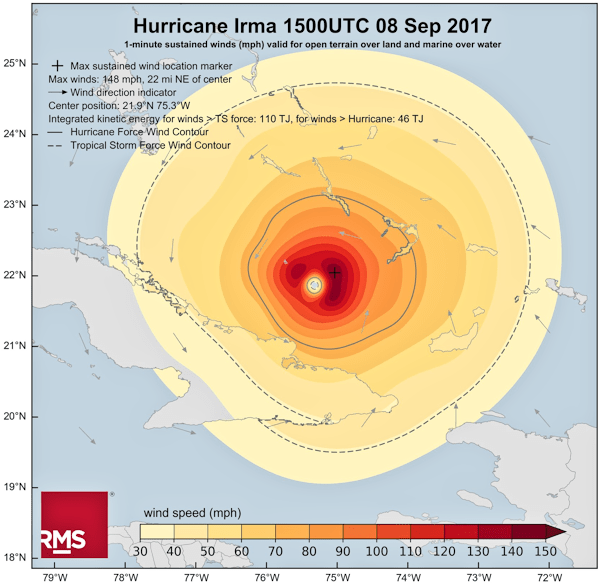
Let’s first of all pause to work out how big some of the NWS “circles of uncertainty” are. To do this we can note that the grid lines (though not labelled) are clearly at 5° intervals. The distance between two lines of latitude (ones drawn parallel to the equator) that are 1° apart from each other is a relatively consistent number; approximately 111 km [6]. This means that the lines of latitude on the page are around 555 km apart. Using this as a reference, the “circle of uncertainty” labelled “8 PM Sat” has a diameter of about 420 km (260 miles).
Let’s now consider how big Hurricane Irma was [7].
Aside: I’d be remiss if I didn’t point out here that RMS have selected what seems to me to be a pretty good colour palette in the chart above.
Well there is no defined sharp edge of a hurricane, rather the speed of winds tails off as may be seen in the above diagram. In order to get some sense of the size of Irma, I’ll use the dashed line in the chart that indicates where wind speeds drop below that classified as a tropical storm (65 kmph or 40 mph [8]). This area is not uniform, but measures around 580 km (360 miles) wide.
A) The size of the hurricane is greater than the size of the “circle of uncertainty”, the former extends 80 km beyond the circumference of the latter in all directions.
B) The “circle of uncertainty” captures the area within which the hurricane’s centre is likely to fall. But this includes cases where the centre of the hurricane is on the circumference of the “circle of uncertainty”. This means the the furthermost edge of the hurricane could be up to 290 km outside of the “circle of uncertainty”.
There are two issues here, which are illustrated in the above diagram.
Issue A
Irma was actually bigger [9] than at least some of the “circles of uncertainty”. A cursory glance at the NWS exhibit would probably give the sense that the cone of uncertainty represents the extent of the storm, it doesn’t. In our example, Irma extends 80 km beyond the “circle of uncertainty” we measured above. If you thought you were safe because you were 50 km from the edge of the cone, then this was probably an erroneous conclusion.
Issue B
Even more pernicious, because each “circle of uncertainty” provides an area within which the centre of the hurricane could be situated, this includes cases where the centre of the hurricane sits on the circumference of the “circle of uncertainty”. This, together with the size of the storm, means that someone 290 km from the edge of the “circle of uncertainty” could suffer 65 kmph (40 mph) winds. Again, based on the diagram, if you felt that you were guaranteed to be OK if you were 250 km away from the edge of the cone, you could get a nasty surprise.
These are not academic distinctions, the real danger that hurricane cones were misinterpreted led the NWS to start labelling their charts with “This cone DOES NOT REPRESENT THE SIZE OF THE STORM!!” [10].
Even Florida senator Marco Rubio got in on the act, tweeting:
When you need a politician help you avoid misinterpreting a data visualisation, you know that there is something amiss.
In Summary
The last thing I want to do is to appear critical of the men and women of the US National Weather Service. I’m sure that they do a fine job. If anything, the issues we have been dissecting here demonstrate that even highly expert people with a strong motivation to communicate clearly can still find it tough to select the right visual metaphor for a data visualisation; particularly when there is a diverse audience consuming the results. It also doesn’t help that there are many degrees of uncertainty here: where might the centre of the storm be? how big might the storm be? how powerful might the storm be? in which direction might the storm move? Layering all of these onto a single exhibit while still rendering it both legible and of some utility to the general public is not a trivial exercise.
The cone of uncertainty is a precise chart, so long as the reader understands what it is showing and what it is not. Perhaps the issue lies more in the eye of the beholder. However, having to annotate your charts to explain what they are not is never a good look on anyone. The NWS are clearly aware of the issues, I look forward to viewing whatever creative solution they come up with later this hurricane season.
Acknowledgements
I would like to thank Dr Steve Smith, Head of Catastrophic Risk at Fractal Industries, for reviewing this piece and putting me right on some elements of modern hurricane prediction. I would also like to thank my friend and former colleague, Dr Raveem Ismail, also of Fractal Industries, for introducing me to Steve. Despite the input of these two experts, responsibility for any errors or omissions remains mine alone.
I don’t mean to imply by this that the estimation process is unscientific of course. Indeed, as we will see later, hurricane prediction is becoming more scientific all the time.
[3]
If both methods were employed in parallel, it would not be too surprising if their central predictions were close to each other.
[4]
A gas or a liquid.
[5]
A shape traced out by a particle traveling with constant speed and with a circle of increasing radius inscribed around it would be a cone.
[6]
The distance between lines of longitude varies between 111 km at the equator and 0 km at either pole. This is because lines of longitude are great circles (or meridians) that meet at the poles. Lines of latitude are parallel circles (parallels) progressing up and down the globe from the equator.
[7]
At a point in time of course. Hurricanes change in size over time as well as in their direction/speed of travel and energy.
[8]
I am rounding here. The actual threshold values are 63 kmph and 39 mph.
[9]
Using the definition of size that we have adopted above.
[10]
Their use of capitals, bold and multiple exclamation marks.
Since its launch in August of this year, the peterjamesthomas.com Data and Analytics Dictionary has received a welcome amount of attention with various people on different social media platforms praising its usefulness, particularly as an introduction to the area. A number of people have made helpful suggestions for new entries or improvements to existing ones. I have also been rounding out the content with some more terms relating to each of Data Governance, Big Data and Data Warehousing. As a result, The Dictionary now has over 80 main entries (not including ones that simply refer the reader to another entry, such as Linear Regression, which redirects to Model).
“It is a truth universally acknowledged, that an organisation in possession of some data, must be in want of a Chief Data Officer”
— Growth and Governance, by Jane Austen (1813) [1]
I wrote about a theoretical job description for a Chief Data Officer back in November 2015 [2]. While I have been on “paternity leave” following the birth of our second daughter, a couple of genuine CDO job specs landed in my inbox. While unable to respond for the aforementioned reasons, I did leaf through the documents. Something immediately struck me; they were essentially wish-lists covering a number of data-related fields, rather than a description of what a CDO might actually do. Clearly I’m not going to cite the actual text here, but the following is representative of what appeared in both requirement lists:
Mandatory Requirements:
Solid commercial understanding and 5 years spent in [insert industry sector here]
The above list may have descended into farce towards the end, but I would argue that the problems started to occur much earlier. The above is not a description of what is required to be a successful CDO, it’s a description of a Swiss Army Knife. There is also the minor practical point that, out of a World population of around 7.5 billion, there may well be no one who ticks all the boxes [4].
Let’s make the fallacy of this type of job description clearer by considering what a simmilar approach would look like if applied to what is generally the most senior role in an organisation, the CEO. Whoever drafted the above list of requirements would probably characterise a CEO as follows:
The best salesperson in the organisation
The best accountant in the organisation
The best M&A person in the organisation
The best customer service operative in the organisation
The best facilities manager in the organisation
The best janitor in the organisation
The best purchasing clerk in the organisation
The best lawyer in the organisation
The best programmer in the organisation
The best marketer in the organisation
The best product developer in the organisation
The best HR person in the organisation, etc., etc., …
Of course a CEO needs to be none of the above, they need to be a superlative leader who is expert at running an organisation (even then, they may focus on plotting the way forward and leave the day to day running to others). For the avoidance of doubt, I am not saying that a CEO requires no domain knowledge and has no expertise, they would need both, however they don’t have to know every aspect of company operations better than the people who do it.
The same argument applies to CDOs. Domain knowledge probably should span most of what is in the job description (save for maybe the three items with footnotes), but knowledge is different to expertise. As CDOs don’t grow on trees, they will most likely be experts in one or a few of the areas cited, but not all of them. Successful CDOs will know enough to be able to talk to people in the areas where they are not experts. They will have to be competent at hiring experts in every area of a CDO’s purview. But they do not have to be able to do the job of every data-centric staff member better than the person could do themselves. Even if you could identify such a CDO, they would probably lose their best staff very quickly due to micromanagement.
A CDO has to be a conductor of both the data function orchestra and of the use of data in the wider organisation. This is a talent in itself. An internationally renowned conductor may have previously been a violinist, but it is unlikely they were also a flautist and a percussionist. They do however need to be able to tell whether or not the second trumpeter is any good or not; this is not the same as being able to play the trumpet yourself of course. The conductor’s key skill is in managing the efforts of a large group of people to create a cohesive – and harmonious – whole.
The CDO is of course still a relatively new role in mainstream organisations [5]. Perhaps these job descriptions will become more realistic as the role becomes more familiar. It is to be hoped so, else many a search for a new CDO will end in disappointment.
Having twisted her text to my own purposes at the beginning of this article, I will leave the last words to Jane Austen:
“A scheme of which every part promises delight, can never be successful; and general disappointment is only warded off by the defence of some little peculiar vexation.”
— Pride and Prejudice, by Jane Austen (1813)
Notes
[1]
Well if a production company can get away with Pride and Prejudice and Zombies, then I feel I am on reasonably solid ground here with this title.
I also seem to be riffing on JA rather a lot at present, I used Rationality and Reality as the title of one of the chapters in my [as yet unfinished] Mathematical book, Glimpses of Symmetry.
Most readers will immediately spot the obvious mistake here. Of course all three of these requirements should be mandatory.
[4]
To take just one example, gaining a PhD in a numerical science, a track record of highly-cited papers and also obtaining an MBA would take most people at least a few weeks of effort. Is it likely that such a person would next focus on a PRINCE2 or TOGAF qualification?
I find myself frequently being asked questions around terminology in Data and Analytics and so thought that I would try to define some of the more commonly used phrases and words. My first attempt to do this can be viewed in a new page added to this site (this also appears in the site menu):
I plan to keep this up-to-date as the field continues to evolve.
I hope that my efforts to explain some concepts in my main area of specialism are both of interest and utility to readers. Any suggestions for new entries or comments on existing ones are more than welcome.
As readers will have noticed, my wife and I have spent a lot of time talking to medical practitioners in recent months. The same readers will also know that my wife is a Structural Biologist, whose work I have featured before in Data Visualisation – A Scientific Treatment[1]. Some of our previous medical interactions had led to me thinking about the nexus between medical science and statistics [2]. More recently, my wife had a discussion with a doctor which brought to mind some of her own previous scientific work. Her observations about the connections between these two areas have formed the genesis of this article. While the origins of this piece are in science and medicine, I think that the learnings have broader applicability.
So the general context is a medical test, the result of which was my wife being told that all was well [3]. Given that humans are complicated systems (to say the very least), my wife was less than convinced that just because reading X was OK it meant that everything else was also necessarily OK. She contrasted the approach of the physician with something from her own experience and in particular one of the experiments that formed part of her PhD thesis. I’m going to try to share the central point she was making with you without going in to all of the scientific details [4]. However to do this I need to provide at least some high-level background.
Structural Biology is broadly the study of the structure of large biological molecules, which mostly means proteins and protein assemblies. What is important is not the chemical make up of these molecules (how many carbon, hydrogen, oxygen, nitrogen and other atoms they consist of), but how these atoms are arranged to create three dimensional structures. An example of this appears below:
This image is of a bacterial Ribosome. Ribosomes are miniature machines which assemble amino acids into proteins as part of the chain which converts information held in DNA into useful molecules [5]. Ribosomes are themselves made up of a number of different proteins as well as RNA.
In order to determine the structure of a given protein, it is necessary to first isolate it in sufficient quantity (i.e. to purify it) and then subject it to some form of analysis, for example X-ray crystallography, electron microscopy or a variety of other biophysical techniques. Depending on the analytical procedure adopted, further work may be required, such as growing crystals of the protein. Something that is generally very important in this process is to increase the stability of the protein that is being investigated [6]. The type of protein that my wife was studying [7] is particularly unstable as its natural home is as part of the wall of cells – removed from this supporting structure these types of proteins quickly degrade.
So one of my wife’s tasks was to better stabilise her target protein. This can be done in a number of ways [8] and I won’t get into the technicalities. After one such attempt, my wife looked to see whether her work had been successful. In her case the relative stability of her protein before and after modification is determined by a test called a Thermostability Assay.
In the image above, you can see the combined results of several such assays carried out on both the unmodified and modified protein. Results for the unmodified protein are shown as a green line [9] and those for the modified protein as a blue line [10]. The fact that the blue line (and more particularly the section which rapidly slopes down from the higher values to the lower ones) is to the right of the green one indicates that the modification has been successful in increasing thermostability.
So my wife had done a great job – right? Well things were not so simple as they might first seem. There are two different protocols relating to how to carry out this thermostability assay. These basically involve doing some of the required steps in a different order. So if the steps are A, B, C and D, then protocol #1 consists of A ↦ B ↦ C ↦ D and protocol #2 consists of A ↦ C ↦ B ↦ D. My wife was thorough enough to also use this second protocol with the results shown below:
Here we have the opposite finding, the same modification to the protein seems to have now decreased its stability. There are some good reasons why this type of discrepancy might have occurred [11], but overall my wife could not conclude that this attempt to increase stability had been successful. This sort of thing happens all the time and she moved on to the next idea. This is all part of the rather messy process of conducting science [12].
I’ll let my wife explain her perspective on these results in her own words:
In general you can’t explain everything about a complex biological system with one set of data or the results of one test. It will seldom be the whole picture. Protocol #1 for the thermostability assay was the gold standard in my lab before the results I obtained above. Now protocol #1 is used in combination with another type of assay whose efficacy I also explored. Together these give us an even better picture of stability. The gold standard shifted. However, not even this bipartite test tells you everything. In any complex system (be that Biological or a complicated dataset) there are always going to be unknowns. What I think is important is knowing what you can and can’t account for. In my experience in science, there is generally much much more that can’t be explained than can.
As ever translating all of this to a business context is instructive. Conscientious Data Scientists or business-focussed Statisticians who come across something interesting in a model or analysis will always try (where feasible) to corroborate this by other means; they will try to perform a second “experiment” to verify their initial findings. They will also realise that even two supporting results obtained in different ways will not in general be 100% conclusive. However the highest levels of conscientiousness may be more honoured in breach than observance [13]. Also there may not be an alternative “experiment” that can be easily run. Whatever the motivations or circumstances, it is not beyond the realm of possibility that some Data Science findings are true only in the same way that my wife thought she had successfully stabilised her protein before carrying out the second assay.
I would argue that business will often have much to learn from the levels of rigour customary in most scientific research [14]. It would be nice to think that the same rigour is always applied in commercial matters as academic ones. Unfortunately experience would tend to suggest the contrary is sometimes the case. However, it would also be beneficial if people working on statistical models in industry went out of their way to stress not only what phenomena these models can explain, but what they are unable to explain. Knowing what you don’t know is the first step towards further enlightenment.
Notes
[1]
Indeed this previous article had a sub-section titled Rigour and Scrutiny, echoing some of the themes in this piece.
As in the earlier article, apologies for the circumlocution. I’m both looking to preserve some privacy and save the reader from boredom.
[4]
Anyone interested in more information is welcome to read her thesis which is in any case in the public domain. It is 188 pages long, which is reasonably lengthy even by my standards.
[5]
They carry out translation which refers to synthesising proteins based on information carried by messenger RNA, mRNA.
[6]
Some proteins are naturally stable, but many are not and will not survive purification or later steps in their native state.
Chopping off flexible sections, adding other small proteins which act as scaffolding, getting antibodies or other biological molecules to bind to the protein and so on.
[9]
Actually a sigmoidal dose-response curve.
[10]
For anyone with colour perception problems, the green line has markers which are diamonds and the blue line has markers which are triangles.
[11]
As my wife writes [with my annotations]:
A possible explanation for this effect was that while T4L [the protein she added to try to increase stability – T4 Lysozyme] stabilised the binding pocket, the other domains of the receptor were destabilised. Another possibility was that the introduction of T4L caused an increase in the flexibility of CL3, thus destabilising the receptor. A method for determining whether this was happening would be to introduce rigid linkers at the AT1R-T4L junction [AT1R was the protein she was studying, angiotensin II type 1 receptor], or other placements of T4L. Finally AT1R might exist as a dimer and the addition of T4L might inhibit the formation of dimers, which could also destabilise the receptor.


")


")
")


?")


![Belt and Braces [or suspenders if you are from the US, which has quite a different connotation in the UK!]](https://peterjamesthomas.com/wp-content/uploads/2017/03/belt-and-braces.png?w=700&h=394 "Belt and Braces [or suspenders if you are from the US, which has quite a different connotation in the UK!]")
