This is the second year in which I have produced a retrospective of my blogging activity. As in 2017, I have failed miserably in my original objective of posting this early in January. Despite starting to write this piece on 18th December 2018, I have somehow sneaked into the second quarter before getting round to completing it. Maybe I will do better with 2019’s highlights!
Anyway, 2018 was a record-breaking year for peterjamesthomas.com. The site saw more traffic than in any other year since its inception; indeed hits were over a third higher than in any previous year. This increase was driven in part by the launch of my new Maths & Science section, articles from which claimed no fewer than 6 slots in the 2018 top 10 articles, when measured by hits [1]. Overall the total number of articles and new pages I published exceeded 2017’s figures to claim the second spot behind 2009; our first year in business.
As with every year, some of my work was viewed by tens of thousands of people, while other pieces received less attention. This is my selection of the articles that I enjoyed writing most, which does not always overlap with the most popular ones. Given the advent of the Maths & Science section, there are now seven categories into which I have split articles. These are as follows:
In each category, I will pick out one or two pieces which I feel are both representative of my overall content and worth a read. I would be more than happy to receive any feedback on my selections, or suggestions for different choices.
What alarm bells might alert you to problems with your Data Strategy; based on the author’s extensive experience of both developing Data Strategies and vetting existing ones.
A survey of more than 10,000 Data Scientists highlights a set of problems that will seem very, very familiar to anyone working in the data space for a few years.
Two Forbes articles argue different perspectives about the role of Chief Data Officer. The first (by Lauren deLisa Coleman) stresses its importance, the second (by Randy Bean) highlights some of the challenges that CDOs face.
Many companies want to become data driven, but getting started on the journey towards this goal can be tough. This article offers a framework for building momentum in the early stages of a Data Programme.
A review of some of the problems that can beset Data Lakes, together with some ideas about what to do to fix these from Dan Woods (Forbes), Paul Barth (Podium Data) and Dave Wells (Eckerson Group).
The number π is surrounded by a fog of misunderstanding and even mysticism. This article seeks to address some common misconceptions about π, to show that in many ways it is just like any other number, but also to demonstrate some of its less common properties.
One of the more recent chapters in my forthcoming book on Group Theory and Particle Physics. This focuses on the seminal contributions of Mathematician Emmy Noether to the fundamentals of Physics and the connection between Symmetry and Conservation Laws.
In the first article in this mini-series we looked at alternative approaches to colour and how these could inform or mislead in data visualisations relating to weather events. In particular we discussed drawbacks of using a rainbow palette in such visualisations and some alternatives. Here we move into much more serious territory, how best to inform the public about what a specific hurricane will do next and the risks that it poses. It would not be an exaggeration to say that sometimes this area may be a matter of life and death. As with rainbow-coloured maps of weather events, some aspects of how the estimated future course of hurricanes are communicated and understood leave much to be desired.
The above diagram is called a the cone of uncertainty of a hurricane. Cone of uncertainty sounds like an odd term. What does it mean? Let’s start by offering a historical perspective on hurricane modelling.
Paleomodelling
Well like any other type of weather prediction, determining the future direction and speed of a hurricane is not an exact science [2]. In the earlier days of hurricane modelling, Meteorologists used to employ statistical models, which were built based on detailed information about previous hurricanes, took as input many data points about the history of a current hurricane’s evolution and provided as output a prediction of what it could do in coming days.
There were a variety of statistical models, but the output of them was split into two types when used for hurricane prediction.
A) A prediction of the next location of the hurricane was made. This included an average error (in km) based on the inaccuracy of previous hurricane predictions. A percentage of this, say 80%, gave a “circle of uncertainty”, x km around the prediction.
B) Many predictions were generated and plotted; each had a location and an probability associated with it. The centroid of these (adjusted by the probability associated with each location) was calculated and used as the central prediction (cf. A). A circle was drawn (y km from the centroid) so that a percentage of the predictions fell within this. Above, there are 100 estimates and the chosen percentage is 80%; so 80 points lie within the red “circle of uncertainty”.
Type A
First, the model could have generated a single prediction (the centre of the hurricane will be at 32.3078° N, 64.7505° W tomorrow) and supplemented this with an error measure. The error measure would have been based on historical hurricane data and related to how far out prior predictions had been on average; this measure would have been in kilometres. It would have been typical to employ some fraction of the error measure to define a “circle of uncertainty” around the central prediction; 80% in the example directly above (compared to two thirds in the NWS exhibit at the start of the article).
Type B
Second, the model could have generated a large number of mini-predictions, each of which would have had a probability associated with it (e.g. the first two estimates of location could be that the centre of the hurricane is at 32.3078° N, 64.7505° W with a 5% chance, or a mile away at 32.3223° N, 64.7505° W with a 2% chance and so on). In general if you had picked the “centre of gravity” of the second type of output, it would have been analogous to the single prediction of the first type of output [3]. The spread of point predictions in the second method would have also been analogous to the error measure of the first. Drawing a circle around the centroid would have captured a percentage of the mini-predictions, once more 80% in the example immediately above and two thirds in the NWS chart, generating another “circle of uncertainty”.
Here comes the Science
That was then of course, nowadays the statistical element of hurricane models is less significant. With increased processing power and the ability to store and manipulate vast amounts of data, most hurricane models instead rely upon scientific models; let’s call this Type C.
Type C
As the air is a fluid [4], its behaviour falls into the area of study known as fluid dynamics. If we treat the atmosphere as being viscous, then the appropriate equation governing fluid dynamics is the Navier-Stokes equation, which is itself derived from the Cauchy Momentum equation:
If viscosity is taken as zero (as a simplification), instead the Euler equations apply:
The reader may be glad to know that I don’t propose to talk about any of the above equations any further.
To get back to the model, in general the atmosphere will be split into a three dimensional grid (the atmosphere has height as well). The current temperature, pressure, moisture content etc. are fed in (or sometimes interpolated) at each point and equations such as the ones above are used to determine the evolution of fluid flow at a given grid element. Of course – as is typical in such situations – approximations of the equations are used and there is some flexibility over which approximations to employ. Also, there may be uncertainty about the input parameters, so statistics does not disappear entirely. Leaving this to one side, how the atmospheric conditions change over time at each grid point rolls up to provide a predictive basis for what a hurricane will do next.
Although the methods are very different, the output of these scientific models will be pretty similar, qualitatively, to the Type A statistical model above. In particular, uncertainty will be delineated based on how well the model performed on previous occasions. For example, what was the average difference between prediction and fact after 6 hours, 12 hours and so on. Again, the uncertainty will have similar characteristics to that of Type A above.
A Section about Conics
In all of the cases discussed above, we have a central prediction (which may be an average of several predictions as per Type B) and a circular distribution around this indicating uncertainty. Let’s consider how these predictions might change as we move into the future.
If today is Monday, then there will be some uncertainty about what the hurricane does on Tuesday. For Wednesday, the uncertainty will be greater than for Tuesday (the “circle of uncertainty” will have grown) and so on. With the Type A and Type C outputs, the error measure will increase with time. With the Type B output, if the model spits out 100 possible locations for the hurricane on a specific day (complete with the likelihood of each of these occurring), then these will be fairly close together on Tuesday and further apart on Wednesday. In all cases, uncertainty about the location of the becomes smeared out over time, resulting in a larger area where it is likely to be located and a bigger “circle of uncertainty”.
This is where the circles of uncertainty combine to become a cone of uncertainty. For the same example, on each day, the meteorologists will plot the central prediction for the hurricane’s location and then draw a circle centered on this which captures the uncertainty of the prediction. For the same reason as stated above, the size of the circle will (in general) increase with time; Wednesday’s circle will be bigger than Tuesday’s. Also each day’s central prediction will be in a different place from the previous day’s as the hurricane moves along. Joining up all of these circles gives us the cone of uncertainty [5].
If the central predictions imply that a hurricane is moving with constant speed and direction, then its cone of uncertainty would look something like this:
In this diagram, broadly speaking, on each day, there is a 67% probability that the centre of the hurricane will be found within the relevant circle that makes up the cone of uncertainty. We will explore the implications of the underlined phrase in the next section.
Of course hurricanes don’t move in a single direction at an unvarying pace (see the actual NWS exhibit above as opposed to my idealised rendition), so part of the purpose of the cone of uncertainty diagram is to elucidate this.
The Central Issue
So hopefully the intent of the NWS chart at the beginning of this article is now clearer. What is the problem with it? Well I’ll go back to the words I highlighted couple of paragraphs back:
There is a 67% probability that the centre of the hurricane will be found within the relevant circle that makes up the cone of uncertainty
So the cone helps us with where the centre of the hurricane may be. A reasonable question is, what about the rest of the hurricane?
For ease of reference, here is the NWS exhibit again:
Let’s first of all pause to work out how big some of the NWS “circles of uncertainty” are. To do this we can note that the grid lines (though not labelled) are clearly at 5° intervals. The distance between two lines of latitude (ones drawn parallel to the equator) that are 1° apart from each other is a relatively consistent number; approximately 111 km [6]. This means that the lines of latitude on the page are around 555 km apart. Using this as a reference, the “circle of uncertainty” labelled “8 PM Sat” has a diameter of about 420 km (260 miles).
Let’s now consider how big Hurricane Irma was [7].
Aside: I’d be remiss if I didn’t point out here that RMS have selected what seems to me to be a pretty good colour palette in the chart above.
Well there is no defined sharp edge of a hurricane, rather the speed of winds tails off as may be seen in the above diagram. In order to get some sense of the size of Irma, I’ll use the dashed line in the chart that indicates where wind speeds drop below that classified as a tropical storm (65 kmph or 40 mph [8]). This area is not uniform, but measures around 580 km (360 miles) wide.
A) The size of the hurricane is greater than the size of the “circle of uncertainty”, the former extends 80 km beyond the circumference of the latter in all directions.
B) The “circle of uncertainty” captures the area within which the hurricane’s centre is likely to fall. But this includes cases where the centre of the hurricane is on the circumference of the “circle of uncertainty”. This means the the furthermost edge of the hurricane could be up to 290 km outside of the “circle of uncertainty”.
There are two issues here, which are illustrated in the above diagram.
Issue A
Irma was actually bigger [9] than at least some of the “circles of uncertainty”. A cursory glance at the NWS exhibit would probably give the sense that the cone of uncertainty represents the extent of the storm, it doesn’t. In our example, Irma extends 80 km beyond the “circle of uncertainty” we measured above. If you thought you were safe because you were 50 km from the edge of the cone, then this was probably an erroneous conclusion.
Issue B
Even more pernicious, because each “circle of uncertainty” provides an area within which the centre of the hurricane could be situated, this includes cases where the centre of the hurricane sits on the circumference of the “circle of uncertainty”. This, together with the size of the storm, means that someone 290 km from the edge of the “circle of uncertainty” could suffer 65 kmph (40 mph) winds. Again, based on the diagram, if you felt that you were guaranteed to be OK if you were 250 km away from the edge of the cone, you could get a nasty surprise.
These are not academic distinctions, the real danger that hurricane cones were misinterpreted led the NWS to start labelling their charts with “This cone DOES NOT REPRESENT THE SIZE OF THE STORM!!” [10].
Even Florida senator Marco Rubio got in on the act, tweeting:
When you need a politician help you avoid misinterpreting a data visualisation, you know that there is something amiss.
In Summary
The last thing I want to do is to appear critical of the men and women of the US National Weather Service. I’m sure that they do a fine job. If anything, the issues we have been dissecting here demonstrate that even highly expert people with a strong motivation to communicate clearly can still find it tough to select the right visual metaphor for a data visualisation; particularly when there is a diverse audience consuming the results. It also doesn’t help that there are many degrees of uncertainty here: where might the centre of the storm be? how big might the storm be? how powerful might the storm be? in which direction might the storm move? Layering all of these onto a single exhibit while still rendering it both legible and of some utility to the general public is not a trivial exercise.
The cone of uncertainty is a precise chart, so long as the reader understands what it is showing and what it is not. Perhaps the issue lies more in the eye of the beholder. However, having to annotate your charts to explain what they are not is never a good look on anyone. The NWS are clearly aware of the issues, I look forward to viewing whatever creative solution they come up with later this hurricane season.
Acknowledgements
I would like to thank Dr Steve Smith, Head of Catastrophic Risk at Fractal Industries, for reviewing this piece and putting me right on some elements of modern hurricane prediction. I would also like to thank my friend and former colleague, Dr Raveem Ismail, also of Fractal Industries, for introducing me to Steve. Despite the input of these two experts, responsibility for any errors or omissions remains mine alone.
I don’t mean to imply by this that the estimation process is unscientific of course. Indeed, as we will see later, hurricane prediction is becoming more scientific all the time.
[3]
If both methods were employed in parallel, it would not be too surprising if their central predictions were close to each other.
[4]
A gas or a liquid.
[5]
A shape traced out by a particle traveling with constant speed and with a circle of increasing radius inscribed around it would be a cone.
[6]
The distance between lines of longitude varies between 111 km at the equator and 0 km at either pole. This is because lines of longitude are great circles (or meridians) that meet at the poles. Lines of latitude are parallel circles (parallels) progressing up and down the globe from the equator.
[7]
At a point in time of course. Hurricanes change in size over time as well as in their direction/speed of travel and energy.
[8]
I am rounding here. The actual threshold values are 63 kmph and 39 mph.
[9]
Using the definition of size that we have adopted above.
[10]
Their use of capitals, bold and multiple exclamation marks.
This blog touches on a wide range of topics, including social media, cultural transformation, general technology and – last but not least – sporting analogies. However, its primary focus has always been on data and information-centric matters in a business context. Having said this, all but the more cursory of readers will have noted the prevalence of pieces with a Mathematical or Scientific bent. To some extent this is a simple reflection of the author’s interests and experience, but a stronger motivation is often to apply learnings from different fields to the business data arena. This article is probably more scientific in subject matter than most, but I will also look to highlight some points pertinent to commerce towards the end.
Introduction
The topic I want to turn my attention to in this article is public trust in science. This is a subject that has consumed many column inches in recent years. One particular area of focus has been climate science, which, for fairly obvious political reasons, has come in for even more attention than other scientific disciplines of late. It would be distracting to get into the arguments about climate change and humanity’s role in it here [1] and in a sense this is just the latest in a long line of controversies that have somehow become attached to science. An obvious second example here is the misinformation circling around both the efficacy and side effects of vaccinations [2]. In both of these cases, it seems that at least a sizeable minority of people are willing to query well-supported scientific findings. In some ways, this is perhaps linked to the general mistrust of “experts” and “elites” [3] that was explicitly to the fore in the UK’s European Union Referendum debate [4].
“People in this country have had enough of experts”
– Michael Gove [5], at this point UK Justice Secretary and one of the main proponents of the Leave campaign, speaking on Sky News, June 2016.
Mr Gove was talking about economists who held a different point of view to his own. However, his statement has wider resonance and cannot be simply dismissed as the misleading sound-bite of an experienced politician seeking to press his own case. It does indeed appear that in many places around the world experts are trusted much less than they used to be and that includes scientists.
“Many political upheavals of recent years, such as the rise of populist parties in Europe, Donald Trump’s nomination for the American presidency and Britain’s vote to leave the EU, have been attributed to a revolt against existing elites.”
A Brief [6] History of the Public Perception of Science
Note: This section is focussed on historical developments in the public’s trust in science. If the reader would like to skip on to more toast-centric content, then please click here.
Answering questions about the erosion of trust in politicians and the media is beyond the scope of this humble blog. Wondering what has happened to trust in science is firmly in its crosshairs. One part of the answer is that – for some time – scientists were held in too much esteem and the pendulum was inevitably going to swing back the other way. For a while the pace of scientific progress and the miracles of technology which this unleashed placed science on a pedestal from which there was only one direction of travel. During this period in which science was – in general – uncritically held in great regard, the messy reality of actual science was never really highlighted. The very phrase “scientific facts” is actually something of an oxymoron. What we have is instead scientific theories. Useful theories are consistent with existing observations and predict new phenomena. However – as I explained in Patterns patterns everywhere – a theory is only as good as the latest set of evidence and some cherished scientific theories have been shown to be inaccurate; either in general, or in some specific circumstances [7]. However saying “we have a good model that helps us explain many aspects of a phenomenon and predict more, but it doesn’t cover everything and there are some uncertainties” is a little more of a mouthful than “we have discovered that…”.
There have been some obvious landmarks along the way to science’s current predicament. The unprecedented destruction unleashed by the team working on the Manhattan Project at first made the scientists involved appear God-like. It also seemed to suggest that the path to Great Power status was through growing or acquiring the best Physicists. However, as the prolonged misery caused in Japan by the twin nuclear strikes became more apparent and as the Cold War led to generations living under the threat of mutually assured destruction, the standing attached by the general public to Physicists began to wane; the God-like mantle began to slip. While much of our modern world and its technology was created off the back of now fairly old theories like Quantum Chromodynamics and – most famously – Special and General Relativity, the actual science involved became less and less accessible to the man or woman in the street. For all the (entirely justified) furore about the detection of the Higgs Boson, few people would be able to explain much about what it is and how it fits into the Standard Model of particle physics.
In the area of medicine and pharmacology, the Thalidomide tragedy, where a drug prescribed to help pregnant women suffering from morning sickness instead led to terrible birth defects in more than 10,000 babies, may have led to more stringent clinical trials, but also punctured the air of certainty that had surrounded the development of the latest miracle drug. While medical science and related disciplines have vastly improved the health of much of the globe, the glacial progress in areas such as oncology has served as a reminder of the fallibility of some scientific endeavours. In a small way, the technical achievements of that apogee of engineering, NASA, were undermined by loss of crafts and astronauts. Most notably the Challenger and Columbia fatalities served to further remove the glossy veneer that science had acquired in the 1940s to 1960s.
Lest it be thought at this point that I am decrying science, or even being anti-scientific, nothing could be further from the truth. I firmly believe that the ever growing body of scientific knowledge is one of humankind’s greatest achievements, if not its greatest. From our unpromising vantage point on an unremarkable little planet in our equally common-all-garden galaxy we have been able to grasp many of the essential truths about the whole Universe from the incomprehensibly gigantic to the most infinitesimal constituent of a sub-atomic particle. However, it seems that many people do not fully embrace the grandeur of our achievements, or indeed in many cases the unexpected beauty and harmony that they have revealed [8]. It is to the task of understanding this viewpoint that I am addressing my thoughts.
More recently, the austerity that has enveloped much of the developed world since the 2008 Financial Crisis has had two reinforcing impacts on science in many countries. First funding has often been cut, leading to pressure on research programmes and scientists increasingly having to make an economic case for their activities; a far cry from the 1950s. Second, income has been effectively stagnant for the vast majority of people, this means that scientific expenditure can seem something of a luxury and also fuels the anti-elite feelings cited by The Economist earlier in this article.
Into this seeming morass steps Anita Makri, “editor/writer/producer and former research scientist”. In a recent Nature article she argues that the form of science communicated in popular media leaves the public vulnerable to false certainty. I reproduce some of her comments here:
“Much of the science that the public knows about and admires imparts a sense of wonder and fun about the world, or answers big existential questions. It’s in the popularization of physics through the television programmes of physicist Brian Cox and in articles about new fossils and quirky animal behaviour on the websites of newspapers. It is sellable and familiar science: rooted in hypothesis testing, experiments and discovery.
Although this science has its place, it leaves the public […] with a different, outdated view to that of scientists of what constitutes science. People expect science to offer authoritative conclusions that correspond to the deterministic model. When there’s incomplete information, imperfect knowledge or changing advice — all part and parcel of science — its authority seems to be undermined. […] A popular conclusion of that shifting scientific ground is that experts don’t know what they’re talking about.”
After my speculations about the reasons why science is held in less esteem than once was the case, I’ll return to more prosaic matters; namely food and specifically that humble staple of many a breakfast table, toast. Food science has often fared no better than its brother disciplines. The scientific guidance issued to people wanting to eat healthily can sometimes seem to gyrate wildly. For many years fat was the source of all evil, more recently sugar has become public enemy number one. Red wine was meant to have beneficial effects on heart health, then it was meant to be injurious; I’m not quite sure what the current advice consists of. As Makri states above, when advice changes as dramatically as it can do in food science, people must begin to wonder whether the scientists really know anything at all.
So where does toast fit in? Well the governmental body charged with providing advice about food in the UK is called the Food Standards Agency. They describe their job as “using our expertise and influence so that people can trust that the food they buy and eat is safe and honest.” While the FSA do sterling work in areas such as publicly providing ratings of food hygiene for restaurants and the like, their most recent campaign is one which seems at best ill-advised and at worst another nail in the public perception of the reliability of scientific advice. Such things matter because they contribute to the way that people view science in general. If scientific advice about food is seen as unsound, surely there must be questions around scientific advice about climate change, or vaccinations.
Before I am accused of belittling the FSA’s efforts, let’s consider the campaign in question, which is called Go for Gold and encourages people to consume less acrylamide. Here is some of what the FSA has to say about the matter:
“Today, the Food Standards Agency (FSA) is launching a campaign to ‘Go for Gold’, helping people understand how to minimise exposure to a possible carcinogen called acrylamide when cooking at home.
Acrylamide is a chemical that is created when many foods, particularly starchy foods like potatoes and bread, are cooked for long periods at high temperatures, such as when baking, frying, grilling, toasting and roasting. The scientific consensus is that acrylamide has the potential to cause cancer in humans.
[…]
as a general rule of thumb, aim for a golden yellow colour or lighter when frying, baking, toasting or roasting starchy foods like potatoes, root vegetables and bread.”
The Go for Gold campaign was picked up by various media outlets in the UK. For example the BBC posted an article on its web-site which opened by saying:
“Bread, chips and potatoes should be cooked to a golden yellow colour, rather than brown, to reduce our intake of a chemical which could cause cancer, government food scientists are warning.”
The BBC has been obsessed with neutrality on all subjects recently [9], but in this case they did insert the reasonable counterpoint that:
“However, Cancer Research UK [10] said the link was not proven in humans.”
Acrylamide is certainly a nasty chemical. Amongst other things, it is used in polyacrylamide gel electrophoresis, a technique used in biochemistry. If biochemists mix and pour their own gels, they have to monitor their exposure and there are time-based and lifetime limits as to how often they can do such procedures [11]. Acrylamide has also been shown to lead to cancer in mice. So what could be more reasonable that the FSA’s advice?
Food Safety – A Statistical / Risk Based Approach
Earlier I introduced Anita Makri, it is time to meet our second protagonist, David Spiegelhalter, Winton Professor for the Public Understanding of Risk in the Statistical Laboratory, Centre for Mathematical Sciences, University of Cambridge [12]. Professor Spiegelhalter has penned a response to the FSA’s Go for Gold campaign. I feel that this merits reading in entirety, but here are some highlights:
“Very high doses [of Acrylamide] have been shown to increase the risk of mice getting cancer. The IARC (International Agency for Research on Cancer) considers it a ‘probable human carcinogen’, putting it in the same category as many chemicals, red meat, being a hairdresser and shift-work.
However, there is no good evidence of harm from humans consuming acrylamide in their diet: Cancer Research UK say that ‘At the moment, there is no strong evidence linking acrylamide and cancer.’
This is not for want of trying. A massive report from the European Food Standards Agency (EFSA) lists 16 studies and 36 publications, but concludes
‘In the epidemiological studies available to date, AA intake was not associated with an increased risk of most common cancers, including those of the GI or respiratory tract, breast, prostate and bladder. A few studies suggested an increased risk for renal cell, and endometrial (in particular in never-smokers) and ovarian cancer, but the evidence is limited and inconsistent. Moreover, one study suggested a lower survival in non-smoking women with breast cancer with a high pre-diagnostic exposure to AA but more studies are necessary to confirm this result. (p185)’
[…]
[Based on the EFSA study] adults with the highest consumption of acrylamide could consume 160 times as much and still only be at a level that toxicologists think unlikely to cause increased tumours in mice.
[…]
This all seems rather reassuring, and may explain why it’s been so difficult to observe any effect of acrylamide in diet.”
Indeed, Professor Spiegelhalter, an esteemed statistician, also points out that most studies will adopt the standard criteria for statistical significance. Given that such significance levels are often set at 5%, then this means that:
“[As] each study is testing an association with a long list of cancers […], we would expect 1 in 20 of these associations to be positive by chance alone.”
He closes his article by stating – not unreasonably – that the FSA’s time and attention might be better spent on areas where causality between an agent and morbidity is well-established, for example obesity. My assumption is that the FSA has a limited budget and has to pick and choose what food issues to weigh in on. Even if we accept for the moment that there is some slight chance of a causal link between the consumption of low levels of acrylamide and cancer, there are plenty of other areas in which causality is firmly established; obesity as mentioned by Professor Spiegelhalter, excessive use of alcohol, even basic kitchen hygiene. It is hard to understand why the FSA did not put more effort into these and instead focussed on an area where the balance of scientific judgement is that there is unlikely to be an issue.
Having a mathematical background perhaps biases me, but I tend to side with Professor Spiegelhalter’s point of view. I don’t want to lay the entire blame for the poor view that some people have of science at the FSA’s door, but I don’t think campaigns like Go for Gold help very much either. The apocryphal rational man or woman will probably deduce that there is not an epidemic of acrylamide poisoning in progress. This means that they may question what the experts at the FSA are going on about. In turn this reduces respect for other – perhaps more urgent – warnings about food and drink. Such a reaction is also likely to colour how the same rational person thinks about “expert” advice in general. All of this can contribute to further cracks appearing in the public edifice of science, an outcome I find very unfortunate.
So what is to be done?
A Call for a New and More Honest Approach to Science Communications
As promised I’ll return to Anita Makri’s thoughts in the same article referenced above:
“It’s more difficult to talk about science that’s inconclusive, ambivalent, incremental and even political — it requires a shift in thinking and it does carry risks. If not communicated carefully, the idea that scientists sometimes ‘don’t know’ can open the door to those who want to contest evidence.
[…]
Scientists can influence what’s being presented by articulating how this kind of science works when they talk to journalists, or when they advise on policy and communication projects. It’s difficult to do, because it challenges the position of science as a singular guide to decision making, and because it involves owning up to not having all of the answers all the time while still maintaining a sense of authority. But done carefully, transparency will help more than harm. It will aid the restoration of trust, and clarify the role of science as a guide.”
The scientific method is meant to be about honesty. You record what you see, not what you want to see. If the data don’t support your hypothesis, you discard or amend your hypothesis. The peer-review process is meant to hold scientists to the highest levels of integrity. What Makri seems to be suggesting is for scientists to turn their lenses on themselves and how they communicate their work. Being honest where there is doubt may be scary, but not as scary as being caught out pushing certainty where no certainty is currently to be had.
Epilogue
At the beginning of this article, I promised that I would bring things back to a business context. With lots of people with PhDs in numerate sciences now plying their trade as data scientists and the like, there is an attempt to make commerce more scientific [13]. Understandably, the average member of a company will have less of an appreciation of statistics and statistical methods than their data scientists do. This can lead to data science seeming like magic; the philosopher’s stone [14]. There are obvious parallels here with how Physicists were seen in the period immediately after the Second World War.
Earlier in the text, I mused about what factors may have led to a deterioration in how the public views science and scientists. I think that there is much to be learnt from the issues I have covered in this article. If data scientists begin to try to peddle absolute truth and perfect insight (both of which, it is fair to add, are often expected from them by non-experts), as opposed to ranges of outcomes and probabilities, then the same decline in reputation probably awaits them. Instead it would be better if data scientists heeded Anita Makri’s words and tried to always be honest about what they don’t know as well as what they do.
Notes
[1]
Save to note that there really is no argument in scientific circles.
As ever Randall Munroe makes the point pithily in his Earth Temperature Timeline – https://xkcd.com/1732/.
For a primer on the area, you could do worse than watching The Royal Society‘s video:
[2]
For the record, my daughter has had every vaccine known to the UK and US health systems and I’ve had a bunch of them recently as well.
[3]
Most scientists I know would be astonished that they are considered part of the amorphous, ill-defined and obviously malevolent global “elite”. Then “elite” is just one more proxy for “the other” something which it is not popular to be in various places in the world at present.
[4]
Or what passed for debate in these post-truth times.
[5]
Mr Gove studied English at Lady Margaret Hall, Oxford, where he was also President of the Oxford Union. Clearly Oxford produces less experts than it used to in previous eras.
[6]
One that is also probably wildly inaccurate and certainly incomplete.
[7]
So Newton’s celebrated theory of gravitation is “wrong” but actually works perfectly well in most circumstances. The the Rutherford–Bohr model, where atoms are little Solar Systems, with the nucleus circled by electrons much as the planets circle the Sun is “wrong”, but actually does serve to explain a number of things; if sadly not the orbital angular momentum of electrons.
[8]
Someone should really write a book about that – watch this space!
[9]
Not least in the aforementioned EU Referendum where it felt the need to follow the views of the vast majority of economists with those of the tiny minority, implying that the same weight be attached to both points of view. For example, 99.9999% of people believe the world to be round, but in the interests of balance my mate Jim reckons it is flat.
[10]
According to their web-site: “the world’s leading charity dedicated to beating cancer through research”.
[11]
As attested to personally by the only proper scientist in our family.
[12]
Unlike Oxford (according to Mr Gove anyway), Cambridge clearly still aspires to creating experts.
[13]
By this I mean proper science and not pseudo-science like management theory and the like.
[14]
In the original, non-J.K. Rowling sense of the phrase.
The Periodic Table, is one of the truly iconic scientific images [1], albeit one with a variety of forms. In the picture above, the normal Periodic Table has been repurposed in a novel manner to illuminate a different field of scientific enquiry. This version was created by Professor Jennifer Johnson (@jajohnson51) of The Ohio State University and the Sloan Digital Sky Survey (SDSS). It comes from an article on the SDSS blog entitled Origin of the Elements in the Solar System; I’d recommend reading the original post.
The historical perspective
A modern rendering of the Periodic Table appears above. It probably is superfluous to mention, but the Periodic Table is a visualisation of an underlying principle about elements; that they fall into families with similar properties and that – if appropriately arranged – patterns emerge with family members appearing at regular intervals. Thus the Alkali Metals [2], all of which share many important characteristics, form a column on the left-hand extremity of the above Table; the Noble Gases [3] form a column on the far right; and, in between, other families form further columns.
Given that the underlying principle driving the organisation of the Periodic Table is essentially a numeric one, we can readily see that it is not just a visualisation, but a data visualisation. This means that Professor Johnson and her colleagues are using an existing data visualisation to convey new information, a valuable technique to have in your arsenal.
One of the original forms of the Periodic Table appears above, alongside its inventor, Dmitri Mendeleev.
As with most things in science [4], my beguilingly straightforward formulation of “its inventor” is rather less clear-cut in practice. Mendeleev’s work – like Newton’s before him – rested “on the shoulders of giants” [5]. However, as with many areas of scientific endeavour, the chain of contributions winds its way back a long way and specifically to one of the greatest exponents of the scientific method [6], Antoine Lavoisier. The later Law of Triads [7], was another significant step along the path and – to mix a metaphor – many other scientists provided pieces of the jigsaw puzzle that Mendeleev finally assembled. Indeed around the same time as Mendeleev published his ideas [8], so did the much less celebrated Julius Meyer; Meyer and Mendeleev’s work shared several characteristics.
The epithet of inventor attached to Mendeleev for two main reasons: his leaving of gaps in his table, pointing the way to as yet undiscovered elements; and his ordering of table entries according to family behaviour rather than atomic mass [9]. None of this is to take away from Mendeleev’s seminal work, it is wholly appropriate that his name will always be linked with his most famous insight. Instead it is my intention is to demonstrate that the the course of true science never did run smooth [10].
The Johnson perspective
Since its creation – and during its many reformulations – the Periodic Table has acted as a pointer for many areas of scientific enquiry. Why do elements fall into families in this way? How many elements are there? Is it possible to achieve the Alchemists’ dream and transmute one element into another? However, the question which Professor Johnson’s diagram addresses is another one, Why is there such an abundance of elements and where did they all come from?
The term nucleosynthesis that appears in the title of this article covers processes by which different atoms are formed from either base nucleons (protons and neutrons) or the combination of smaller atoms. It is nucleosynthesis which attempts to answer the question we are now considering. There are different types.
Our current perspective on where everything in the observable Universe came from is of course the Big Bang [11]. This rather tidily accounts for the abundance of element 1, Hydrogen, and much of that of element 2, Helium. This is our first type of nucleosynthesis, Big Bang nucleosynthesis. However, it does not explain where all of the heavier elements came from [12]. The first part of the answer is from processes of nuclear fusion in stars. The most prevalent form of this is the fusion of Hydrogen to form Helium (accounting for the remaining Helium atoms), but this process continues creating heavier elements, albeit in ever decreasing quantities. This is stellar nucleosynthesis and refers to those elements created in stars during their normal lives.
While readers may be ready to accept the creation of these heavier elements in stars, an obvious question is How come they aren’t in stars any longer? The answer lies in what happens at the end of the life of a star. This is something that depends on a number of factors, but particularly its mass and also whether or not it is associated with another star, e.g. in a binary system.
Broadly speaking, higher mass stars tend to go out with a bang [13], lower mass ones with various kinds of whimpers. The exception to the latter is where the low mass star is coupled to another star, arrangements which can also lead to a considerable explosion as well [14]. Of whatever type, violent or passive, star deaths create all of the rest of the heavier elements. Supernovae are also responsible for releasing many heavy elements in to interstellar space, and this process is tagged explosive nucleosynthesis.
Into this relatively tidy model of nucleosynthesis intrudes the phenomenon of cosmic ray fission, by which cosmic rays [15] impact on heavier elements causing them to split into smaller constituents. We believe that this process is behind most of the Beryllium and Boron in the Universe as well as some of the Lithium. There are obviously other mechanisms at work like radioactive decay, but the vast majority of elements are created either in stars or during the death of stars.
I have elided many of the details of nucleosynthesis here, it is a complicated and evolving field. What Professor Johnson’s graphic achieves is to reflect current academic thinking around which elements are produced by which type of process. The diagram certainly highlights the fact that the genesis of the elements is a complex story. Perhaps less prosaically, it also encapulates Carl Sagan‘s famous aphorism, the one that Professor Johnson quotes at the beginning of her article and which I will use to close mine.
Lithium, Sodium, Potassium, Rubidium, Caesium and Francium (Hydrogen sometimes is shown as topping this list as well).
[3]
Helium, Argon, Neon, Krypton, Xenon and Radon.
[4]
Watch this space for an article pertinent to this very subject.
[5]
Isaac Newton on 15th February 1676. in a letter to Robert Hooke; but employing a turn of phrase which had been in use for many years.
[6]
And certainly the greatest scientist ever to be beheaded.
[7]
Döbereiner, J. W. (1829) “An Attempt to Group Elementary Substances according to Their Analogies”. Annalen der Physik und Chemie.
[8]
In truth somewhat earlier.
[9]
The emergence of atomic number as the organising principle behind the ordering of elements happened somewhat later, vindicating Mendeleev’s approach.
We have:
atomic mass ≅ number of protons in the nucleus of an element + number of neutrons
whereas:
atomic number = number of protons only
The number of neutrons can jump about between successive elements meaning that arranging them in order of atomic mass gives a different result from atomic number.
[10]
With apologies to The Bard.
[11]
I really can’t conceive that anyone who has read this far needs the Big Bang further expounded to them, but if so, then GIYF.
[12]
We think that the Big Bang also created some quantities of Lithium and several other heavier elements, as covered in Professor Johnson’s diagram.
Type-Ia supernovae are a phenomenon that allow us to accurately measure the size of the universe and how this is changing.
[15]
Cosmic rays are very high energy particles that originate from outside of the Solar System and consist mostly of very fast moving protons (aka Hydrogen nuclei) and other atomic nuclei similarly stripped of their electrons.
The title of the discussion thread posted was “Business Intelligence vs. Business Analytics: What’s the Difference?” and the original poster was Jon Dohner from Information Builders. To me the thread topic is something of an old chestnut and takes me back to the heady days of early 2009. Back then, Big Data was maybe a lot more than just a twinkle in Doug Cutting and Mike Cafarella‘s eyes, but it had yet to rise to its current level of media ubiquity.
Nostalgia is not going to be enough for me to start quoting from my various articles of the time[2] and neither am I going to comment on the pros and cons of Information Builders’ toolset. Instead I am more interested in a different turn that discussions took based on some comments posted by Peter Birksmith of Insurance Australia Group.
Peter talked about two streams of work being carried out on the same source data. These are Business Intelligence (BI) and Information Analytics (IA). I’ll let Peter explain more himself:
BI only produces reports based on data sources that have been transformed to the requirements of the Business and loaded into a presentation layer. These reports present KPI’s and Business Metrics as well as paper-centric layouts for consumption. Analysis is done via Cubes and DQ although this analysis is being replaced by IA.
[…]
IA does not produce a traditional report in the BI sense, rather, the reporting is on Trends and predictions based on raw data from the source. The idea in IA is to acquire all data in its raw form and then analysis this data to build the foundation KPI and Metrics but are not the actual Business Metrics (If that makes sense). This information is then passed back to BI to transform and generate the KPI Business report.
I was interested in the dual streams that Peter referred to and, given that I have some experience of insurance organisations and how they work, penned the following reply[3]:
Hi Peter,
I think you are suggesting an organisational and technology framework where the source data bifurcates and goes through two parallel processes and two different “departments”. On one side, there is a more traditional, structured, controlled and rules-based transformation; probably as the result of collaborative efforts of a number of people, maybe majoring on the technical side – let’s call it ETL World. On the other a more fluid, analytical (in the original sense – the adjective is much misused) and less controlled (NB I’m not necessarily using this term pejoratively) transformation; probably with greater emphasis on the skills and insights of individuals (though probably as part of a team) who have specific business knowledge and who are familiar with statistical techniques pertinent to the domain – let’s call this ~ETL World, just to be clear :-).
You seem to be talking about the two of these streams constructively interfering with each other (I have been thinking about X-ray Crystallography recently). So insights and transformations (maybe down to either pseudo-code or even code) from ~ETL World influence and may be adopted wholesale by ETL World.
I would equally assume that, if ETL World‘s denizens are any good at their job, structures, datasets and master data which they create (perhaps early in the process before things get multidimensional) may make work more productive for the ~ETLers. So it should be a collaborative exercise with both groups focused on the same goal of adding value to the organisation.
If I have this right (an assumption I realise) then it all seems very familiar. Given we both have Insurance experience, this sounds like how a good information-focused IT team would interact with Actuarial or Exposure teams. When I have built successful information architectures in insurance, in parallel with delivering robust, reconciled, easy-to-use information to staff in all departments and all levels, I have also created, maintained and extended databases for the use of these more statistically-focused staff (the ~ETLers).
These databases, which tend to be based on raw data have become more useful as structures from the main IT stream (ETL World) have been applied to these detailed repositories. This might include joining key tables so that analysts don’t have to repeat this themselves every time, doing some basic data cleansing, or standardising business entities so that different data can be more easily combined. You are of course right that insights from ~ETL World often influence the direction of ETL World as well. Indeed often such insights will need to move to ETL World (and be produced regularly and in a manner consistent with existing information) before they get deployed to the wider field.
It is sort of like a research team and a development team, but where both “sides” do research and both do development, but in complementary areas (reminiscent of a pair of entangled electrons in a singlet state, each of whose spin is both up and down until they resolve into one up and one down in specific circumstances – sorry again I did say “no more science analogies”). Of course, once more, this only works if there is good collaboration and both ETLers and ~ETLers are focussed on the same corporate objectives.
So I suppose I’m saying that I don’t think – at least in Insurance – that this is a new trend. I can recall working this way as far back as 2000. However, what you describe is not a bad way to work, assuming that the collaboration that I mention is how the teams work.
I am aware that I must have said “collaboration” 20 times – your earlier reference to “silos” does however point to a potential flaw in such arrangements.
I think that the perspective of actuaries having been data scientists long before the latter term emerged is a sound one.
Although the genesis of this thread dates to over five years ago (an aeon in terms of information technology), I think that – in the current world where some aspects of the old divide between technically savvy users[4] and IT staff with strong business knowledge[5] has begun to disappear – there is both an opportunity for businesses and a threat. If silos develop and the skills of a range of different people are not combined effectively, then we have a situation where:
| ETL World | + | ~ETL World | < | ETL World ∪ ~ETL World |
If instead collaboration, transparency and teamwork govern interactions between different sets of people then the equation flips to become:
| ETL World | + | ~ETL World | ≥ | ETL World ∪ ~ETL World |
Perhaps the way that Actuarial and IT departments work together in enlightened insurance companies points the way to a general solution for the organisational dynamics of modern information provision. Maybe also the, by now somewhat venerable, concept of a Business Intelligence Competency Centre, a unified team combining the best and brightest from many fields, is an idea whose time has come.
Notes
[1]
A link to the actual discussion thread is provided here. However You need to be a member of the TDWI Group to view this.
[2]
Anyone interested in ancient history is welcome to take a look at the following articles from a few years back:
Note: In the following I have used the abridgement Maths when referring to Mathematics, I appreciate that this may be jarring to US readers, omitting the ‘s’ is jarring to me, so please accept my apologies in advance.
Introduction
Regular readers of this blog will be aware of my penchant for analogies. Dominant amongst these have been sporting ones, which have formed a major part of articles such as:
I have also used other types of analogy from time to time, notably scientific ones such as in the middle sections of Recipes for Success?, or A Single Version of the Truth? – I was clearly feeling quizzical when I wrote both of those pieces! Sometimes these analogies have been buried in illustrations rather than the text as in:
Jim Harris (@ocdqblog) frequently employs analogies on his excellent Obsessive Compulsive Data Quality blog. If there is a way to form a title “The X of Data Quality”, and relate this in a meaningful way back to his area of expertise, Jim’s creative brain will find it. So it is encouraging to feel that I am not alone in adopting this approach. Indeed I see analogies employed increasingly frequently in business and technology blogs, to say nothing of in day-to-day business life.
However, recently two things have given me pause for thought. The first was the edition of Randall Munroe’s highly addictive webcomic, xkcd.com, that appeared on 6th May 2011, entitled “Teaching Physics”. The second was a blog article I read which likened a highly abstract research topic in one branch of Theoretical Physics to what BI practitioners do in their day job.
An homage to xkcd.com
Let’s consider xkcd.com first. Anyone who finds some nuggets of interest in the type of – generally rather oblique – references to matters Mathematical or Scientific that I mention above is likely to fall in love with xkcd.com. Indeed anyone who did a numerate degree, works in a technical role, or is simply interested in Mathematics, Science or Engineering would as well – as Randall says in a footnote:
“this comic occasionally contains […] advanced mathematics (which may be unsuitable for liberal-arts majors)”
Although Randall’s main aim is to entertain – something he manages to excel at – his posts can also be thought-provoking, bitter-sweet and even resonate with quite profound experiences and emotions. Who would have thought that some stick figures could achieve all that? It is perhaps indicative of the range of topics dealt with on xkcd.com that I have used it to illustrate no fewer than seven of my articles (including this one, a full list appears at the end of the article). It is encouraging that Randall’s team of corporate lawyers has generally viewed my requests to republish his work favourably.
The example of Randall’s work that I wanted to focus on is as follows.
It is worth noting that often the funniest / most challenging xkcd.com observations appear in the mouse-over text of comic strips (alt or title text for any HTML heads out there – assuming that there are any of us left). I’ll reproduce this below as it is pertinent to the discussion:
Space-time is like some simple and familiar system which is both intuitively understandable and precisely analogous, and if I were Richard Feynman I’d be able to come up with it.
If anyone needs some background on the science referred to then have a skim of this article if you need some background on the scientist mentioned (who has also made an appearance on peterjamesthomas.com in Presenting in Public) then glance through this second one.
Here comes the Science…
Randall points out the dangers of over-extending an analogy. While it has always helped me to employ the rubber-sheet analogy of warped space-time when thinking about the area, it is rather tough (for most people) to extrapolate a 2D surface being warped to a 4D hyperspace experiencing the same thing. As an erstwhile Mathematician, I find it easy enough to cope with the following generalisation:
S(1) =
The set of all points defined by one variable (x1)
– i.e. a straight line
S(2) =
The set of all points defined by two variables (x1, x2)
– i.e. a plane
S(3) =
The set of all points defined by three variables (x1, x2, x3)
– i.e. “normal” 3-space
S(4) =
The set of all points defined by four variables (x1, x2, x3, x4)
– i.e. 4-space
” ” ” “
S(n) =
The set of all points defined by n variables (x1, x2, … , xn)
– i.e. n-space
As we increase the dimensions, the Maths continues to work and you can do calculations in n-space (e.g. to determine the distance between two points) just as easily (OK with some more arithmetic) as in 3-space; Pythagoras still holds true. However, actually visualising say 7-space might be rather taxing for even a Field’s Medallist or Nobel-winning Physicist.
… and the Maths
More importantly while you can – for example – use 3-space as an analogue for some aspects of 4-space, there are also major differences. To pick on just one area, some pieces of string that are irretrievably knotted in 3-space can be untangled with ease in 4-space.
To briefly reference a probably familiar example, starting with 2-space we can look at what is clearly a family of related objects:
2-space:
A square has 4 vertexes, 4 edges joining them and 4 “faces” (each consisting of a line – so the same as edges in this case)
3-space:
A cube has 8 vertexes, 12 edges and 6 “faces” (each consisting of a square)
4-space:
A tesseract (or 4-hypercube) has 16 vertexes, 32 edges and 8 “faces” (each consisting of a cube)
Note: The reason that faces appears in inverted commas is that the physical meaning changes, only in 3-space does this have the normal connotation of a surface with two dimensions. Instead of faces, one would normally talk about the bounding cubes of a tesseract forming its cells.
Even without any particular insight into multidimensional geometry, it is not hard to see from the way that the numbers stack up that:
n-space:
An n-hypercube has 2n vertexes, 2n-1n edges and 2n “faces” (each consisting of an (n-1)-hypercube)
Again, while the Maths is compelling, it is pretty hard to visualise a tesseract. If you think that a drawing of a cube, is an attempt to render a 3D object on a 2D surface, then a picture of a tesseract would be a projection of a projection. The French (with a proud history of Mathematics) came up with a solution, just do one projection by building a 3D “picture” of a tesseract.
As aside it could be noted that the above photograph is of course a 2D projection of a 3D building, which is in turn a projection of a 4D shape; however recursion can sometimes be pushed too far!
Drawing multidimensional objects in 2D, or even building them in 3D, is perhaps a bit like employing an analogy (this sentence being of course a meta-analogy). You may get some shadowy sense of what the true object is like in n-space, but the projection can also mask essential features, or even mislead. For some things, this shadowy sense may be more than good enough and even allow you to better understand the more complex reality. However, a 2D projection will not be good enough (indeed cannot be good enough) to help you understand all properties of the 3D, let alone the 4D. Hopefully, I have used one element of the very subject matter that Randall raises in his webcomic to further bolster what I believe are a few of the general points that he is making, namely:
Analogies only work to a degree and you over-extend them at your peril
Sometimes the wholly understandable desire to make a complex subject accessible by comparing it to something simpler can confuse rather than illuminate
There are subject areas that very manfully resist any attempts to approach them in a manner other than doing the hard yards – not everything is like something less complex
Why BI is not [always] like Theoretical Physics
Having hopefully supported these points, I’ll move on to the second thing that I mentioned reading; a BI-related blog also referencing Theoretical Physics. I am not going to name the author, mention where I read their piece, state what the title was, or even cite the precise area of Physics they referred to. If you are really that interested, I’m sure that the nice people at Google can help to assuage your curiosity. With that out of the way, what were the concerns that reading this piece raised in my mind?
Well first of all, from the above discussion (and indeed the general tone of this blog), you might think that such an article would be right up my street. Sadly I came away feeling that the connection made was, tenuous at best, rather unhelpful (it didn’t really tell you anything about Business Intelligence) and also exhibited a lack of anything bar a superficial understanding of the scientific theory involved.
The analogy had been drawn based on a single word which is used in both some emerging (but as yet unvalidated) hypotheses in Theoretical Physics and in Business Intelligence. While, just like the 2D projection of a 4D shape, there are some elements in common between the two, there are some fundamental differences. This is a general problem in Science and Mathematics, everyday words are used because they have some connection with the concept in hand, but this does not always imply as close a relationship as the casual reader might infer. Some examples:
In Pure Mathematics, the members of a group may be associative, but this doesn’t mean that they tend to hang out together.
In Particle Physics, an object may have spin, but this does not mean that it has been bowled by Murali
In Structural Biology, a residue is not precisely what a Chemist might mean by one, let alone a lay-person
Part of the blame for what was, in my opinion, an erroneous connection between things that are not actually that similar lies with something that, in general, I view more positively; the popular science book. The author of the BI/Physics blog post referred to just such a tome in making his argument. I have consumed many of these books myself and I find them an interesting window into areas in which I do not have a background. The danger with them lies when – in an attempt to convey meaning that is only truly embodied (if that is the word) in Mathematical equations – our good friend the analogy is employed again. When done well, this can be very powerful and provide real insight for the non-expert reader (often the writers of pop-science books are better at this kind of thing than the scientists themselves). When done less well, this can do more than fail to illuminate, it can confuse, or even in some circumstances leave people with the wrong impression.
During my MSc, I spent a year studying the Riemann Hypothesis and the myriad of results that are built on the (unproven) assumption that it is true. Before this I had spent three years obtaining a Mathematics BSc. Before this I had taken two Maths A-levels (national exams taken in the UK during and at the end of what would equate to High School in the US), plus (less relevantly perhaps) Physics and Chemistry. One way or another I had been studying Maths for probably 15 plus years before I encountered this most famous and important of ideas.
So what is the Riemann Hypotheis? A statement of it is as follows:
The real part of all non-trivial zeros of the Riemann Zeta function is equal to one half
There! Are you any the wiser? If I wanted to explain this statement to those who have not studied Pure Mathematics at a graduate level, how would I go about it? Maybe my abilities to think laterally and be creative are not well-developed, but I struggle to think of an easily accessible way to rephrase the proposal. I could say something gnomic such as, “it is to do with the distribution of prime numbers” (while trying to avoid the heresy of adding that prime numbers are important because of cryptography – I believe that they are important because they are prime numbers!).
I spent a humble year studying this area, after years of preparation. Some of the finest Mathematical minds of the last century (sadly not a set of which I am a member) have spent vast chunks of their careers trying to inch towards a proof. The Riemann Hypothesis is not like something from normal experience; it is complicated. Some things are complicated and not easily susceptible to analogy.
Equally – despite how interesting, stimulating, rewarding and even important Business Intelligence can be – it is not Theoretical Physics and n’er the twain shall meet.
And so what?
So after this typically elliptical journey through various parts of Science and Mathematics, what have I learnt? Mainly that analogies must be treated with care and not over-extended lest they collapse in a heap. Will I therefore stop filling these pages with BI-related analogies, both textual and visual? Probably not, but maybe I’ll think twice before hitting the publish key in future!
Chronological list of articles using xkcd.com illustrations:
A lot of human scientific and technological progress over the span of recorded history has been related to discerning patterns. People noticed that the Sun and Moon both had regular periodicity to their movements, leading to models that ultimately changed our view of our place in the Universe. The apparently wandering trails swept out by the planets were later regularised by the work of Johannes Kepler and Tycho Brahe; an outstanding example of a simple idea explaining more complex observations.
In general Mathematics has provided a framework for understanding the world around us; perhaps most elegantly (at least in work that is generally accessible to the non-professional) in Newton’s Laws of Motion (which explained why Kepler and Brahe’s models for planetary movement worked). The simple formulae employed by Newton seemed to offer a precise set of rules governing everything from the trajectory of an arrow to the orbits of the planets and indeed galaxies; a triumph for the application of Mathematics to the natural world and surely one of humankind’s greatest achievements.
For centuries it appeared that natural phenomena seemed to have simple principles underlying them, which were susceptible to description in the language of Mathematics. Sometimes (actually much more often than you might think) the Mathematics became complicated and precision was dropped in favour of – generally more than good enough – estimation; but philosophically Mathematics and the nature of things appeared to be inextricably interlinked. The Physicist and Nobel Laureate E.P. Wigner put this rather more eloquently:
The miracle of the appropriateness of the language of mathematics for the formulation of the laws of physics is a wonderful gift which we neither understand nor deserve.
In my youth I studied Group Theory, a branch of mathematics concerned with patterns and symmetry. The historical roots (no pun intended[1]) of Group Theory are in the solvability of polynomial equations, but the relation with symmetry emerged over time; revealing an important linkage between geometry and algebra. While Group Theory is a part of Pure Mathematics (supposedly studied for its own intrinsic worth, rather than any real-world applications), its applications are actually manifold. Just one example is that groups lie (again no pun intended[2]) at the heart of the Standard Model of Particle Physics.
However, two major challenges to this happy symbiosis between Mathematics and the Natural Sciences arose. One was an abrupt earthquake caused by Kurt Gödel in 1931. The other was more of a slowly rising flood, beginning in the 1880s with Henri Poincaré and (arguably) culminating with Ruelle, May and Yorke in 1977 (though with many other notables contributing both before and after 1977). The linkage between Mathematics and Science persists, but maybe some of the chains that form it have been weakened.
Potentially fallacious patterns
However, rather than this article becoming a dissertation on incompleteness theorems or (the rather misleadingly named) chaos theory, I wanted to return to something more visceral that probably underpins at least the beginnings of the long association of Mathematics and Science. Here I refer to people’s general view that things tend to behave the same way as they have in the past. As mentioned at the beginning of this article, the sun comes up each morning, the moon waxes and wanes each month, summer becomes autumn (fall) becomes winter becomes spring and so on. When you knock your coffee cup over it reliably falls to the ground and the contents spill everywhere. These observations about genuine patterns have served us well over the centuries.
It seems a very common human trait to look for patterns. Given the ubiquity of this, it is likely to have had some evolutionary benefit. Indeed patterns are often there and are often useful – there is indeed normally more traffic on the roads at 5pm on Fridays than on other days of the week. Government spending does (with the possible exception of current circumstances) generally go up in advance of an election. However such patterns may be less useful in other areas. While winter is generally colder than summer (in the Northern hemisphere), the average temperature and average rainfall in any given month varies a lot year-on-year. Nevertheless, even within this variability, we try to discern patterns to changes that occur in the weather.
We may come to the conclusion that winters are less severe than when we were younger and thus impute a trend in gradually moderating winters; perhaps punctuated by some years that don’t fit what we assume is an underlying curve. We may take rolling averages to try to iron out local “noise” in various phenomena such as stock prices. This technique relies on the assumption that things change gradually. If the average July temperature has increased by 2°C in the last 100 years, then it maybe makes sense to assume that it will increase by the same 2°C ±0.2°C in the next 100 years. Some of the work I described earlier has rigorously proved that a lot of these human precepts are untrue in many important fields, not least weather prediction. The phrase long-term forecast has been 100% shown to be an oxymoron. Many systems – even the simplest, even those which are apparently stable[3] – can change rapidly and unpredictably and weather is one of them.
For the avoidance of doubt I am not leaping into the general Climate Change debate here – except in the most general sense. Instead I am highlighting the often erroneous human tendency to believe that when things change they do so smoothly and predictably. That when a pattern shifts, it does so to something quite like the previous pattern. While this assumed smoothness is at the foundation of many of our most powerful models and techniques (for example the grand edifice of The Calculus), in many circumstances it is not a good fit for the choppiness seen in nature.
Obligatory topical section on volcanoes
The above observations about the occasionally illusory nature of patterns lead us to more current matters. I was recently reading an article about the Eyjafjallajokull eruption in The Economist. This is suffused with a search for patterns in the history of volcanic eruptions. Here are just a few examples:
Last time Eyjafjallajokull erupted, from late 1821 to early 1823, it also had quite viscous lava. But that does not mean it produced fine ash continuously all the time. The activity settled into a pattern of flaring up every now and then before dying back down to a grumble. If this eruption continues for a similar length of time, it would seem fair to expect something similar.
Previous eruptions of Eyjafjallajokull seem to have acted as harbingers of a subsequent Katla [a nearby volcano] eruptions.
[However] Only two or three […] of the 23 eruptions of Katla over historical times (which in Iceland means the past 1,200 years or so) have been preceded by eruptions of Eyjafjallajokull.
Katla does seem to erupt on a semi-regular basis, with typical periods between eruptions of between 30 and 80 years. The last eruption was in 1918, which makes the next overdue.
To be fair, The Economist did lace their piece with various caveats, for example the above-quoted “it would seem fair to expect”, but not all publications are so scrupulous. There is perhaps something comforting in all this numerology, maybe it gives us the illusion that we can make meaningful predictions about what a volcano will do next. Modern geologists have used a number of techniques to warn of imminent eruptions and these approaches have been successful and saved lives. However this is not the same thing as predicting that an eruption is likely in the next ten years solely because they normally occur every century and it is 90 years since the last one. Long-term forecasts of volcanic activity are as chimerical as long-term weather forecasts.
A little light analysis
Looking at another famous volcano, Vesuvius, I have put together the following simple chart.
The average period between eruptions is just shy of 14 years, but the pattern is anything but regular. If we expand our range a bit, we might ask how many eruptions occurred between 10 and 20 years after the previous one. The answer is just 9 of the 26[4], or about 35%. Even if we expand our range to periods of calm lasting between 5 and 25 years (so 10 years of leeway on either side), we only capture 77% of eruptions. The standard deviation of the periods between recorded eruptions is a whopping 12.5; eruptions of Vesuvius are not regular events.
One aspect of truly random distributions at first seems counterfactual, this is their lumpiness. It might seem reasonable to assume that a random set of events would lead to a nicely spaced out distribution; maybe not a set of evenly-spaced points, but a close approximation to one. In fact the opposite is generally true; random distributions will have clusters of events close to each other and large gaps between them.
The above exhibit (a non-wrapped version of which may be viewed by clicking on it) illustrates this point. It compares a set of pseudo-random numbers (the upper points) with a set of truly random numbers (the lower points)[5]. There are some gaps in the upper distribution, but none are large and the spread is pretty even. By contrast in the lower set there are many large gaps (some of the more major ones being tagged a, … ,h) and significant clumping[6]. Which of these two distributions more closely matches the eruptions of Vesuvius? What does this tell us about the predictability of its eruptions?
The predictive analytics angle
As always in closing I will bring these discussions back to a business focus. The above observations should give people involved in applying statistical techniques to make predictions about the future some pause for thought. Here I am not targeting the professional statistician; I assume such people will be more than aware of potential pitfalls and possess much greater depth of knowledge than myself about how to avoid them. However many users of numbers will not have this background and we are all genetically programmed to seek patterns, even where none may exist. Predictive analytics is a very useful tool when applied correctly and when its findings are presented as a potential range of outcomes, complete with associated probabilities. Unfortunately this is not always the case.
It is worth noting that many business events can be just as unpredictable as volcanic eruptions. Trying to foresee the future with too much precision is going to lead to disappointment; to say nothing of being engulfed by lava flows.
Explanatory notes
[1]
The solvability of polynomials is of course equivalent to whether or not roots of them exist.
[2]
Lie groups lie at the heart of quantum field theory – a interesting lexicographical symmetry in itself
[3]
Indeed it has been argued that non-linear systems are more robust in response to external stimuli than classical ones. The latter tend to respond to “jolts” in a smooth manner leading to a change in state. The former often will revert to their previous strange attractor. It has been postulated that evolution has taken advantage of this fact in demonstrably chaotic systems such as the human heart.
[4]
Here I include the – to date – 66 years since Vesuvius’ last eruption in 1944 and exclude the eruption in 1631 as there is no record of the preceding one.
[5]
For anyone interested, the upper set of numbers were generated using Excel’s RAND() function and the lower are successive triplets of the decimal expansion of pi, e.g. 141, 592, 653 etc.
[6]
Again for those interested the average gap in the upper set is 10.1 with a standard deviation of 4.3; the figures for the lower set are 9.7 and 9.6 respectively.
Standard note: You need to be a member of both LinkedIn.com and the group mentioned to view the discussions.
Introduction
Here are a couple of sections from the original poster’s starting comments:
I’ve been thinking: is one version of the truth attainable or is it a bit of snake oil? Is it a helpful concept that powerfully communicates a way out of spreadmart purgatory? Or does the idea of one version of the truth gloss over the fact that context or point of view are an inherent part of any statement about data, which effectively makes truth relative? I’m leaning toward the latter position.
[…]
There can only be one version of the truth if everyone speaks the same language and has a common point of view. I’m not sure this is attainable. To the extent that it is, it’s definitely not a technology exercise. It’s organizational change management. It’s about changing the culture of an organization and potentially breaking down longstanding barriers.
Please join the group if you would like to read the whole post and the subsequent discussions, which were very lively. Here I am only going to refer to these tangentially and instead focus on the concept of a single version of the truth itself.
Readers who are not interested in the ellipitcal section of this article and who would instead like to cut to the chase are invited to click here (warning there are still some ellipses in the latter sections).
A [very] brief and occasionally accurate history of truth
I have discovered a truly marvellous proof of the nature of truth, which this column is too narrow to contain.
— Pierre de Tomas (1637)
Instead of trying to rediscover M. Tomas’ proof, I’ll simply catalogue some of the disciplines that have been associated (rightly or wrongly) with trying to grapple with the area:
Various branches of Philosophy, including:
Metaphysics
Epistemology
Ethics
Logic
History
Religion (or more perhaps more generally spirituality)
Natural Science
Mathematics
and of course Polygraphism
Given my background in Pure Mathematics the reader might expect me to trumpet the claims of this discipline to be the sole arbiter of truth; I would reply yes and no. Mathematics does indeed deal in absolute truth, but only of the type: if we assume A and B, it then follows that C is true. This is known as the axiomatic approach. Mathematics makes no claim for the veracity of axioms themselves (though clearly many axioms would be regarded as self-evidently true to the non-professional). I will also manfully resist the temptation to refer to the wrecking ball that Kurt Gödel’s took to axiomatic systems in 1931.
I have also made reference (admittedly often rather obliquely) to various branches of science on this blog, so perhaps this is another place to search for truth. However the Physical sciences do not really deal in anything as absolute as truth. Instead they develop models that approximate observations, these are called scientific theories. A good theory will both explain aspects of currently observed phenomena and offer predictions for yet-to-be-observed behaviour (what use is a model if it doesn’t tell us things that we don’t already know?). In this way scientific theories are rather like Business Analytics.
Unlike mathematical theories, the scientific versions are rather resistant to proof. Somewhat unfairly, while a mountain of experiments that are consistent with a scientific theory do not prove it, it takes only one incompatible data point to disprove it. When such an inconvenient fact rears its head, the theory will need to be revised to accommodate the new data, or entirely discarded and replaced by a new theory. This is of course an iterative process and precisely how our scientific learning increases. Warning bells generally start to ring when a scientist starts to talk about their theory being true, as opposed to a useful tool. The same observation could be made of those who begin to view their Business Analytics models as being true, but that is perhaps a story for another time.
I am going to come back to Physical science (or more specifically Physics) a little later, but for now let’s agree that this area is not going to result in defining truth either. Some people would argue that truth is the preserve of one of the other subjects listed above, either Philosophy or Religion. I’m not going to get into a debate on the merits of either of these views, but I will state that perhaps the latter is more concerned with personal truth than supra-individual truth (otherwise why do so many religious people disagree with each other?).
Discussing religion on a blog is also a certain way to start a fire, so I’ll move quickly on. I’m a little more relaxed about criticising some aspects of Philosophy; to me this can all too easily descend into solipism (sometimes even quicker than artificial intelligence and cognitive science do). Although Philosophy could be described as the search for truth, I’m not convinced that this is the same as finding it. Maybe truth itself doesn’t really exist, so attempting to create a single version of it is doomed to failure. However, perhaps there is hope.
After the preceding divertimento, it is time to return to the more prosaic world of Business Intelligence. However there is first room for the promised reference to Physics. For me, the phrase “a single version of the truth” always has echoes of the search for a Grand Unified Theory (GUT). Analogous to our discussions about truth, there are some (minor) definitional issues with GUT as well.
Some hold that GUT applies to a unification of the electromagnetic, weak nuclear and strong nuclear forces at very high energy levels (the first two having already been paired in the electroweak force). Others that GUT refers to a merging of the particles and forces covered by the Standard Model of Quantum Mechanics (which works well for the very small) with General Relativity (which works well for the very big). People in the first camp might refer to this second unification as a ToE (Theory of Everything), but there is sometimes a limit to how much Douglas Adams’ esteemed work applies to reality.
For the purposes of this article, I’ll perform the standard scientific trick of a simplifying assumption and use GUT in the grander sense of the term.
Scientists have striven to find a GUT for decades, if not centuries, and several candidates have been proposed. GUT has proved to be something of a Holy Grail for Physicists. Work in this area, while not as yet having been successful (at least at the time of writing), has undeniably helped to shed a light on many other areas where our understanding was previously rather dim.
This is where the connection with a single version of the truth comes in. Not so much that either concept is guaranteed to be achievable, but that a lot of good and useful things can be accomplished on a journey towards both of them. If, in a given organisation, the journey to a single version of the truth reaches its ultimate destination, then great. However if, in an another company, a single version of the truth remains eternally just over the next hill, or round the next corner, then this is hardly disastrous and maybe it is the journey itself (and the aspirations with which it is commenced on) that matters more than the destination.
Before I begin to sound too philosophical (cf. above) let me try to make this more concrete by going back to our starting point with some Mathematics and considering some Venn diagrams.
Ordo ab chao
In my experience the following is the type of situation that a good Business Intelligence programme should address:
The problems here are manifold:
Although the various report systems are shown as separate, the real situation is probably much worse. Each of the reporting and analysis systems will overlap, perhaps substantially, with one or more or the other ones. Indeed the overlapping may be so convoluted that it would be difficult to represent this in two dimensions and I am not going to try. This means that you can invariably ask the same question (how much have we sold this month) of different systems and get different answers. It may be difficult to tell which of these is correct, indeed none of them may be a true reflection of business reality.
There are a whole set of things that may be treated differently in the different ellipses. I’ll mention just two for now: date and currency. In one system a transaction may be recorded in a month when it is entered into the system. In another it may be allocated to the month when the event actually occurred (sometimes quite a while before it is entered). In a third perhaps the transaction is only dated once it has been authorised by a supervisor.
In a multi-currency environment reports may be in the transactional currency, rolled-up to the currency of the country in which they occurred, or perhaps aggregated across many countries in a number of “corporate” currencies. Which rate to use (rate on the day, average for the month, rolling average for the last year, a rate tied to some earlier business transaction etc.) may be different in different systems, equally the rate may well vary according to the date of the transaction (making the last set of comments about which date is used even more pertinent).
A whole set of other issues arise when you begin to consider things such as taxation (are figures nett or gross), discounts, commissions to other parties, phased transactions and financial estimates. Some reports may totally ignore these, others my take account of some but not others. A mist of misunderstanding is likely to arise.
Something that is not drawn on the above diagram is the flow of data between systems. Typically there will be a spaghetti-like flow of bits and bytes between the different areas. What is also not that uncommon is that there is both bifurcation and merging in these flows. For example, some sorts of transactions from Business Unit A may end up in the Marketing database, whereas others do not. Perhaps transactions carried out on behalf of another company in the group appear in Business Unit B’s reports, but must be excluded from the local P&L. The combinations are almost limitless.
Interfaces can also do interesting things to data, re-labelling it, correcting (or so their authors hope) errors in source data and generally twisting the input to form output that may be radically different. Also, when interfaces are anything other than real-time, they introduce a whole new arena in which dates can get muddled. For instance, what if a business transaction occurred in a front-end system on the last day of a year, but was not interfaced to a corporate database until the first day of the next one – which year does it get allocated to in the two places?
Finally, the above says nothing about the costs (staff and software) of maintaining a heterogeneous reporting landscape; or indeed the costs of wasted time arguing about which numbers are right, or attempting to perform tortuous (and ultimately fruitless) reconciliations.
Now the ideal situation is that we move to the following diagram:
This looks all very nice and tidy, but there are still two major problems.
A full realisation of this transformation may be prohibitively expensive, or time-consuming.
Having brought everything together into one place offers an opportunity to standardise terminology and to eliminate the confusion caused by redundancy. However, it doesn’t per se address the other points made from 2. onwards above.
The need to focus on what is possible in a reasonable time-frame and at a reasonable cost may lead to a more pragmatic approach where the number of reporting and analysis systems is reduced, but to a number greater than one. Good project management may indeed dictate a rolling programme of consolidation, with opportunities to review what has worked and what has not and to ascertain whether business value is indeed being generated by the programme.
Nevertheless, I would argue that it is beneficial to envisage a final state for the information architecture, even if there is a tacit acceptance that this may not be realised for years, if at all. Such a framework helps to guide work in a way that making it up as we go along does not. I cover this area in more detail in both Holistic vs Incremental approaches to BI and Tactical Meandering for those who are interested.
It is also inevitable that even in a single BI system data will need to be presented in different ways for different purposes. To take just one example, if you goal is to see how the make up of a book of business has varied over time, then it is eminently sensible to use a current exchange rate for all transactions; thereby removing any skewing of the figures caused by forex fluctuations. This is particularly the case when trying to assess the profitability of business where revenue occurs at a discrete point in the past, but costs may be spread out over time.
However, if it is necessary to look at how the organisation’s cash-flow is changing over time, then the impact of fluctuations in foreign exchange rates must be taken into account. Sadly if an American company wants to report how much revenue it has from its French subsidiary then the figures must reflect real-life euro / dollar rates (unrealised and realised foreign currency gains and losses notwithstanding).
What is important here is labelling. Ideally each report should show the assumptions under which it has been compiled at the top. This would include the exchange rate strategy used, the method by which transactions are allocated to dates, whether figures are nett or gross and which transactions (if any) have been excluded. Under this approach, while it is inevitable that the totals on some reports will not agree, at least the reports themselves will explain why this is the case.
So this is my take on a single version of the truth. It is both a) an aspirational description of the ideal situation and something that is worth striving for and b) a convenient marketing term – a sound-bite if you will – that presents a palatable way of describing a complex set of concepts. I tried to capture this essence in my reply to the LinkedIn.com thread, which was as follows:
To me, the (extremely hackneyed) phrase “a single version of the truth” means a few things:
One place to go to run reports and perform analysis (as opposed to several different, unreconciled, overlapping systems and local spreadsheets / Access DBs)
When something, say “growth” appears on a report, cube, or dashboard, it is always calculated the same way and means the same thing (e.g. if you have growth in dollar terms and growth excluding the impact of currency fluctuations, then these are two measures and should be clearly tagged as such).
More importantly, that the organisation buys into there being just one set of figures that will be used and self-polices attempts to subvert this with roll-your-own data.
Of course none of this equates to anything to do with truth in the normal sense of the word. However life is full of imprecise terminology, which nevertheless manages to convey meaning better than overly precise alternatives.
More’s Utopia was never intended to depict a realistic place or system of government. These facts have not stopped generations of thinkers and doers from aspiring to make the world a better place, while realising that the ultimate goal may remain out of reach. In my opinion neither should the unlikelihood of achieving a perfect single version of the truth deter Business Intelligence professionals from aspiring to this Utopian vision.
I have come pretty close to achieving a single version of the truth in a large, complex organisation. Pretty close is not 100%, but in Business Intelligence anything above 80% is certainly more than worth the effort.


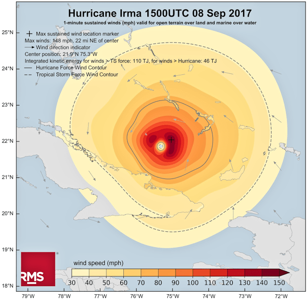


![Acrylamide [borrowed from Wikipedia]](https://peterjamesthomas.com/wp-content/uploads/2017/01/acrylamide.png?w=700 "Acrylamide [borrowed from Wikipedia]")


![Dangerous Toast [borrowed from the BBC]](https://peterjamesthomas.com/wp-content/uploads/2017/02/dangerous-toast.png?w=700 "Dangerous Toast [borrowed from the BBC]")


")
")

")
")
")


. This is your only clue.")


![First published in September 1843 to take part in 'a severe contest between intelligence, which presses forward, and an unworthy, timid ignorance obstructing our progress' [nice use of the Oxford / Harvard comma BTW]](https://peterjamesthomas.com/wp-content/uploads/2010/03/the-economist.jpg?w=700 "First published in September 1843 to take part in 'a severe contest between intelligence, which presses forward, and an unworthy, timid ignorance obstructing our progress' [nice use of the Oxford / Harvard comma BTW]")


