
This is the second of two articles whose genesis was the nexus of hurricanes and data visualisation. The first article was, Part I – Rainbow’s Gravity [1].
Introduction
In the first article in this mini-series we looked at alternative approaches to colour and how these could inform or mislead in data visualisations relating to weather events. In particular we discussed drawbacks of using a rainbow palette in such visualisations and some alternatives. Here we move into much more serious territory, how best to inform the public about what a specific hurricane will do next and the risks that it poses. It would not be an exaggeration to say that sometimes this area may be a matter of life and death. As with rainbow-coloured maps of weather events, some aspects of how the estimated future course of hurricanes are communicated and understood leave much to be desired.

The above diagram is called a the cone of uncertainty of a hurricane. Cone of uncertainty sounds like an odd term. What does it mean? Let’s start by offering a historical perspective on hurricane modelling.
Paleomodelling
Well like any other type of weather prediction, determining the future direction and speed of a hurricane is not an exact science [2]. In the earlier days of hurricane modelling, Meteorologists used to employ statistical models, which were built based on detailed information about previous hurricanes, took as input many data points about the history of a current hurricane’s evolution and provided as output a prediction of what it could do in coming days.

There were a variety of statistical models, but the output of them was split into two types when used for hurricane prediction.

B) Many predictions were generated and plotted; each had a location and an probability associated with it. The centroid of these (adjusted by the probability associated with each location) was calculated and used as the central prediction (cf. A). A circle was drawn (y km from the centroid) so that a percentage of the predictions fell within this. Above, there are 100 estimates and the chosen percentage is 80%; so 80 points lie within the red “circle of uncertainty”.
Type A
First, the model could have generated a single prediction (the centre of the hurricane will be at 32.3078° N, 64.7505° W tomorrow) and supplemented this with an error measure. The error measure would have been based on historical hurricane data and related to how far out prior predictions had been on average; this measure would have been in kilometres. It would have been typical to employ some fraction of the error measure to define a “circle of uncertainty” around the central prediction; 80% in the example directly above (compared to two thirds in the NWS exhibit at the start of the article).
Type B
Second, the model could have generated a large number of mini-predictions, each of which would have had a probability associated with it (e.g. the first two estimates of location could be that the centre of the hurricane is at 32.3078° N, 64.7505° W with a 5% chance, or a mile away at 32.3223° N, 64.7505° W with a 2% chance and so on). In general if you had picked the “centre of gravity” of the second type of output, it would have been analogous to the single prediction of the first type of output [3]. The spread of point predictions in the second method would have also been analogous to the error measure of the first. Drawing a circle around the centroid would have captured a percentage of the mini-predictions, once more 80% in the example immediately above and two thirds in the NWS chart, generating another “circle of uncertainty”.
Here comes the Science

That was then of course, nowadays the statistical element of hurricane models is less significant. With increased processing power and the ability to store and manipulate vast amounts of data, most hurricane models instead rely upon scientific models; let’s call this Type C.
Type C
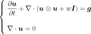
As the air is a fluid [4], its behaviour falls into the area of study known as fluid dynamics. If we treat the atmosphere as being viscous, then the appropriate equation governing fluid dynamics is the Navier-Stokes equation, which is itself derived from the Cauchy Momentum equation:

If viscosity is taken as zero (as a simplification), instead the Euler equations apply:
The reader may be glad to know that I don’t propose to talk about any of the above equations any further.

To get back to the model, in general the atmosphere will be split into a three dimensional grid (the atmosphere has height as well). The current temperature, pressure, moisture content etc. are fed in (or sometimes interpolated) at each point and equations such as the ones above are used to determine the evolution of fluid flow at a given grid element. Of course – as is typical in such situations – approximations of the equations are used and there is some flexibility over which approximations to employ. Also, there may be uncertainty about the input parameters, so statistics does not disappear entirely. Leaving this to one side, how the atmospheric conditions change over time at each grid point rolls up to provide a predictive basis for what a hurricane will do next.
Although the methods are very different, the output of these scientific models will be pretty similar, qualitatively, to the Type A statistical model above. In particular, uncertainty will be delineated based on how well the model performed on previous occasions. For example, what was the average difference between prediction and fact after 6 hours, 12 hours and so on. Again, the uncertainty will have similar characteristics to that of Type A above.
A Section about Conics

In all of the cases discussed above, we have a central prediction (which may be an average of several predictions as per Type B) and a circular distribution around this indicating uncertainty. Let’s consider how these predictions might change as we move into the future.
If today is Monday, then there will be some uncertainty about what the hurricane does on Tuesday. For Wednesday, the uncertainty will be greater than for Tuesday (the “circle of uncertainty” will have grown) and so on. With the Type A and Type C outputs, the error measure will increase with time. With the Type B output, if the model spits out 100 possible locations for the hurricane on a specific day (complete with the likelihood of each of these occurring), then these will be fairly close together on Tuesday and further apart on Wednesday. In all cases, uncertainty about the location of the becomes smeared out over time, resulting in a larger area where it is likely to be located and a bigger “circle of uncertainty”.
This is where the circles of uncertainty combine to become a cone of uncertainty. For the same example, on each day, the meteorologists will plot the central prediction for the hurricane’s location and then draw a circle centered on this which captures the uncertainty of the prediction. For the same reason as stated above, the size of the circle will (in general) increase with time; Wednesday’s circle will be bigger than Tuesday’s. Also each day’s central prediction will be in a different place from the previous day’s as the hurricane moves along. Joining up all of these circles gives us the cone of uncertainty [5].
If the central predictions imply that a hurricane is moving with constant speed and direction, then its cone of uncertainty would look something like this:

In this diagram, broadly speaking, on each day, there is a 67% probability that the centre of the hurricane will be found within the relevant circle that makes up the cone of uncertainty. We will explore the implications of the underlined phrase in the next section.
Of course hurricanes don’t move in a single direction at an unvarying pace (see the actual NWS exhibit above as opposed to my idealised rendition), so part of the purpose of the cone of uncertainty diagram is to elucidate this.
The Central Issue
So hopefully the intent of the NWS chart at the beginning of this article is now clearer. What is the problem with it? Well I’ll go back to the words I highlighted couple of paragraphs back:
There is a 67% probability that the centre of the hurricane will be found within the relevant circle that makes up the cone of uncertainty
So the cone helps us with where the centre of the hurricane may be. A reasonable question is, what about the rest of the hurricane?
For ease of reference, here is the NWS exhibit again:
Let’s first of all pause to work out how big some of the NWS “circles of uncertainty” are. To do this we can note that the grid lines (though not labelled) are clearly at 5° intervals. The distance between two lines of latitude (ones drawn parallel to the equator) that are 1° apart from each other is a relatively consistent number; approximately 111 km [6]. This means that the lines of latitude on the page are around 555 km apart. Using this as a reference, the “circle of uncertainty” labelled “8 PM Sat” has a diameter of about 420 km (260 miles).
Let’s now consider how big Hurricane Irma was [7].
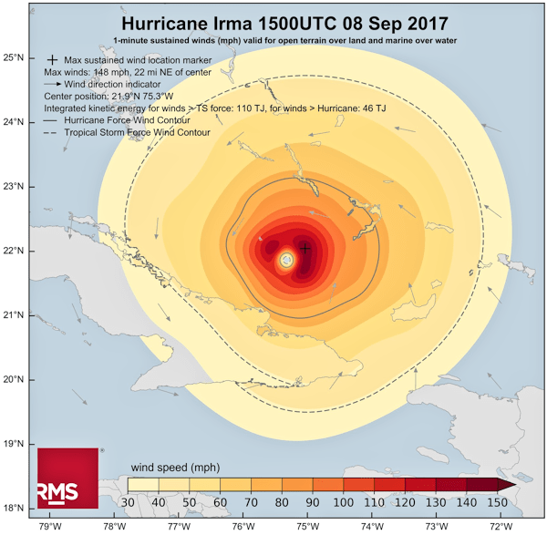
Aside: I’d be remiss if I didn’t point out here that RMS have selected what seems to me to be a pretty good colour palette in the chart above.
Well there is no defined sharp edge of a hurricane, rather the speed of winds tails off as may be seen in the above diagram. In order to get some sense of the size of Irma, I’ll use the dashed line in the chart that indicates where wind speeds drop below that classified as a tropical storm (65 kmph or 40 mph [8]). This area is not uniform, but measures around 580 km (360 miles) wide.

B) The “circle of uncertainty” captures the area within which the hurricane’s centre is likely to fall. But this includes cases where the centre of the hurricane is on the circumference of the “circle of uncertainty”. This means the the furthermost edge of the hurricane could be up to 290 km outside of the “circle of uncertainty”.
There are two issues here, which are illustrated in the above diagram.
Issue A
Irma was actually bigger [9] than at least some of the “circles of uncertainty”. A cursory glance at the NWS exhibit would probably give the sense that the cone of uncertainty represents the extent of the storm, it doesn’t. In our example, Irma extends 80 km beyond the “circle of uncertainty” we measured above. If you thought you were safe because you were 50 km from the edge of the cone, then this was probably an erroneous conclusion.
Issue B
Even more pernicious, because each “circle of uncertainty” provides an area within which the centre of the hurricane could be situated, this includes cases where the centre of the hurricane sits on the circumference of the “circle of uncertainty”. This, together with the size of the storm, means that someone 290 km from the edge of the “circle of uncertainty” could suffer 65 kmph (40 mph) winds. Again, based on the diagram, if you felt that you were guaranteed to be OK if you were 250 km away from the edge of the cone, you could get a nasty surprise.

These are not academic distinctions, the real danger that hurricane cones were misinterpreted led the NWS to start labelling their charts with “This cone DOES NOT REPRESENT THE SIZE OF THE STORM!!” [10].
Even Florida senator Marco Rubio got in on the act, tweeting:

When you need a politician help you avoid misinterpreting a data visualisation, you know that there is something amiss.
In Summary

The last thing I want to do is to appear critical of the men and women of the US National Weather Service. I’m sure that they do a fine job. If anything, the issues we have been dissecting here demonstrate that even highly expert people with a strong motivation to communicate clearly can still find it tough to select the right visual metaphor for a data visualisation; particularly when there is a diverse audience consuming the results. It also doesn’t help that there are many degrees of uncertainty here: where might the centre of the storm be? how big might the storm be? how powerful might the storm be? in which direction might the storm move? Layering all of these onto a single exhibit while still rendering it both legible and of some utility to the general public is not a trivial exercise.
The cone of uncertainty is a precise chart, so long as the reader understands what it is showing and what it is not. Perhaps the issue lies more in the eye of the beholder. However, having to annotate your charts to explain what they are not is never a good look on anyone. The NWS are clearly aware of the issues, I look forward to viewing whatever creative solution they come up with later this hurricane season.
Acknowledgements
I would like to thank Dr Steve Smith, Head of Catastrophic Risk at Fractal Industries, for reviewing this piece and putting me right on some elements of modern hurricane prediction. I would also like to thank my friend and former colleague, Dr Raveem Ismail, also of Fractal Industries, for introducing me to Steve. Despite the input of these two experts, responsibility for any errors or omissions remains mine alone.
Notes
| [1] |
I also squeezed Part I(b) – The Mona Lisa in between the two articles I originally planned. |
| [2] |
I don’t mean to imply by this that the estimation process is unscientific of course. Indeed, as we will see later, hurricane prediction is becoming more scientific all the time. |
| [3] |
If both methods were employed in parallel, it would not be too surprising if their central predictions were close to each other. |
| [4] |
A gas or a liquid. |
| [5] |

A shape traced out by a particle traveling with constant speed and with a circle of increasing radius inscribed around it would be a cone. |
| [6] |

The distance between lines of longitude varies between 111 km at the equator and 0 km at either pole. This is because lines of longitude are great circles (or meridians) that meet at the poles. Lines of latitude are parallel circles (parallels) progressing up and down the globe from the equator. |
| [7] |
At a point in time of course. Hurricanes change in size over time as well as in their direction/speed of travel and energy. |
| [8] |
I am rounding here. The actual threshold values are 63 kmph and 39 mph. |
| [9] |
Using the definition of size that we have adopted above. |
| [10] |
Their use of capitals, bold and multiple exclamation marks. |
From: peterjamesthomas.com, home of The Data and Analytics Dictionary

[…] two articles whose genesis was the nexus of hurricanes and data visualisation. The second article, Part II – Map Reading, has now been published. […]
[…] Data Visualisation is called Rainbow’s Gravity and was published earlier this week. Part two, Map Reading, has now also been published. Here is an unplanned post slotting into the gap between the two. […]
[…] Data Visualisation, Rainbow’s Gravity and was published earlier back in September. Part two, Map Reading, joined it this month. In between, the first hurricane-centric article acquired an addendum, The […]
[…] September & October Hurricanes and Data Visualisation: Part I – Rainbow’s Gravity and Part II – Map Reading […]
[…] of complex seismological or meteorological models to assess catastrophic insurance risk (see Hurricanes and Data Visualisation: Part II – Map Reading). I have helped the latter to be very successful myself and seen good results in other […]