
Work by the inimitable Randall Munroe, author of long-running web-comic, xkcd.com, has been featured (with permission) multiple times on these pages [1]. The above image got me thinking that I had not penned a data visualisation article since the series starting with Hurricanes and Data Visualisation: Part I – Rainbow’s Gravity nearly a year ago. Randall’s perspective led me to consider that staple of PowerPoint presentations, the humble and much-maligned Pie Chart.
While the history is not certain, most authorities credit the pioneer of graphical statistics, William Playfair, with creating this icon, which appeared in his Statistical Breviary, first published in 1801 [2]. Later Florence Nightingale (a statistician in case you were unaware) popularised Pie Charts. Indeed a Pie Chart variant (called a Polar Chart) that Nightingale compiled appears at the beginning of my article Data Visualisation – A Scientific Treatment.
I can’t imagine any reader has managed to avoid seeing a Pie Chart before reading this article. But, just in case, here is one (Since writing Rainbow’s Gravity – see above for a link – I have tried to avoid a rainbow palette in visualisations, hence the monochromatic exhibit):

The above image is a representation of the following dataset:
|
The Pie Chart consists of a circle divided in to five sectors, each is labelled A through E. The basic idea is of course that the amount of the circle taken up by each sector is proportional to the count of items associated with each category, A through E. What is meant by the innocent “amount of the circle” here? The easiest way to look at this is that going all the way round a circle consumes 360°. If we consider our data set, the total count is 18,000, which will equate to 360°. The count for A is 4,500 and we need to consider what fraction of 18,000 this represents and then apply this to 360°:
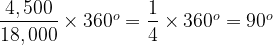
So A must take up 90°, or equivalently one quarter of the total circle. Similarly for B:
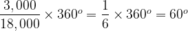
Or one sixth of the circle.
If we take this approach then – of course – the sum of all of the sectors must equal the whole circle and neither more nor less than this (pace Randall). In our example:
|
So far, so simple. Now let’s consider a second data-set as follows:
|
What does its Pie Chart look like? Well it’s actually rather familiar, it looks like this:
This observation stresses something important about Pie Charts. They show how a number of categories contribute to a whole figure, but they only show relative figures (percentages of the whole if you like) and not the absolute figures. The totals in our two data-sets differ by a factor of over 2,100 times, but their Pie Charts are identical. We will come back to this point again later on.
Pie Charts have somewhat fallen into disrepute over the years. Some of this is to do with their ubiquity, but there is also at least one more substantial criticism. This is that the human eye is bad at comparing angles, particularly if they are not aligned to some reference point, e.g. a vertical. To see this consider the two Pie Charts below (please note that these represent a different data set from above – for starters, there are only four categories plotted as opposed to five earlier on):

The details of the underlying numbers don’t actually matter that much, but let’s say that the left-hand Pie Chart represents annual sales in 2016, broken down by four product lines. The right-hand chart has the same breakdown, but for 2017. This provides some context to our discussions.
Suppose what is of interest is how the sales for each product line in the 2016 chart compare to their counterparts in the right-hand one; e.g. A and A’, B and B’ and so on. Well for the As, we have the helpful fact that they both start from a vertical line and then swing down and round, initially rightwards. This can be used to gauge that A’ is a bit bigger than A. What about B and B’? Well they start in different places and end in different places, looking carefully, we can see that B’ is bigger than B. C and C’ are pretty easy, C is a lot bigger. Then we come to D and D’, I find this one a bit tricky, but we can eventually hazard a guess that they are pretty much the same.
So we can compare Pie Charts and talk about how sales change between two years, what’s the problem? The issue is that it takes some time and effort to reach even these basic conclusions. How about instead of working out which is bigger, A or A’, I ask the reader to guess by what percentage A’ is bigger. This is not trivial to do based on just the charts.
If we really want to look at year-on-year growth, we would prefer that the answer leaps off the page; after all, isn’t that the whole point of visualisations rather than tables of numbers? What if we focus on just the right-hand diagram? Can you say with certainty which is bigger, A or C, B or D? You can work to an answer, but it takes longer than should really be the case for a graphical exhibit.
| Aside:
There is a further point to be made here and it relates to what we said Pie Charts show earlier in this piece. What we have in our two Pie Charts above is the make-up of a whole number (in the example we have been working through, this is total annual sales) by categories (product lines). These are percentages and what we have been doing above is to compare the fact that A made up 30% of the total sales in 2016 and 33% in 2017. What we cannot say based on just the above exhibits is how actual sales changed. The total sales may have gone up or down, the Pie Chat does not tell us this, it just deals in how the make-up of total sales has shifted. Some people try to address this shortcoming, which can result in exhibits such as:
Here some attempt has been made to show the growth in the absolute value of sales year on year. The left-hand Pie Chart is smaller and so we assume that annual sales have increased between 2016 and 2017. The most logical thing to do would be to have the change in total area of the two Pie Charts to be in proportion to the change in sales between the two years (in this case – based on the underlying data – 2017 sales are 69% bigger than 2016 sales). However, such an approach, while adding information, makes the task of comparing sectors from year to year even harder. |

The general argument is that Nested Bar Charts are better for the type of scenario I have presented and the types of questions I asked above. Looking at the same annual sales data this way we could generate the following graph:

| Aside:
While Bar Charts are often used to show absolute values, what we have above is the same “percentage of the whole” data that was shown in the Pie Charts. We have already covered the relative / absolute issue inherent in Pie Charts, from now on, each new chart will be like a Pie Chart inasmuch as it will contain relative (percentage of the whole) data, not absolute. Indeed you could think about generating the bar graph above by moving the Pie Chart sectors around and squishing them into new shapes, while preserving their area. |
The Bar Chart makes the yearly comparisons a breeze and it is also pretty easy to take a stab at percentage differences. For example B’ looks about a fifth bigger than B (it’s actually 17.5% bigger) [3]. However, what I think gets lost here is a sense of the make-up of the elements of the two sets. We can see that A is the biggest value in the first year and A’ in the second, but it is harder to gauge what percentage of the overall both A and A’ represent.
To do this better, we could move to a Stacked Bar Chart as follows (again with the same sales data):

| Aside:
Once more, we are dealing with how proportions have changed – to put it simply the height of both “skyscrapers” is the same. If we instead shifted to absolute values, then our exhibit might look more like:
|
")
The observant reader will note that I have also added dashed lines linking the same category for each year. These help to show growth. Regardless of what angle to the horizontal the lower line for a category makes, if it and the upper category line diverge (as for B and B’), then the category is growing; if they converge (as for C and C’), the category is shrinking [4]. Parallel lines indicate a steady state. Using this approach, we can get a better sense of the relative size of categories in the two years.
However, here – despite the dashed lines – we lose at least some of of the year-on-year comparative power of the Nested Bar Chart above. In turn the Nested Bar Chart loses some of the attributes of the original Pie Chart. In truth, there is no single chart which fits all purposes. Trying to find one is analogous to trying to find a planar projection of a sphere that preserves angles, distances and areas [5].
Rather than finding the Philosopher’s Stone [6] of an all-purpose chart, the challenge for those engaged in data visualisation is to anticipate the central purpose of an exhibit and to choose a chart type that best resonates with this. Sometimes, the Pie Chart can be just what is required, as I found myself in my article, A Tale of Two [Brexit] Data Visualisations, which closed with the following image:

Or, to put it another way:
Chart aesthetics filling your head
But there’s always some special case, time or place
To replace perfect taste
For instance…
Never cry ’bout a Chart of Pie
You can still do fine with a Chart of Pie
People may well laugh at this humble graph
But it can be just the thing you need to help the staff
Never cry ’bout a Chart of Pie
Though without due care things can go awry
Bars are fine, Columns shine
Lines are ace, Radars race
Boxes fly, but never cry about a Chart of Pie
With apologies to the Disney Corporation!
Addendum:
It was pointed out to me by Adam Carless that I had omitted the following thing of beauty from my Pie Chart menagerie. How could I have forgotten?

It is claimed that some Theoretical Physicists (and most Higher Dimensional Geometers) can visualise in four dimensions. Perhaps this facility would be of some use in discerning meaning from the above exhibit.
Notes
| [1] |
Including:
and of course |
| [2] |
Playfair also most likely was the first to introduce line, area and bar charts. |
| [3] |
Recall again we are comparing percentages, so 50% is 25% bigger than 40%. |
| [4] |
This assertion would not hold for absolute values, or rather parallel lines would indicate that the absolute value of sales (not the relative one) had stayed constant across the two years. |
| [5] |
A little-known Mathematician, going by the name of Gauss, had something to say about this back in 1828 – Disquisitiones generales circa superficies curvas. I hope you read Latin. |
| [6] |

No, not that one!. |
From: peterjamesthomas.com, home of The Data and Analytics Dictionary, The Anatomy of a Data Function and A Brief History of Databases


