Since its launch in August of this year, the peterjamesthomas.com Data and Analytics Dictionary has received a welcome amount of attention with various people on different social media platforms praising its usefulness, particularly as an introduction to the area. A number of people have made helpful suggestions for new entries or improvements to existing ones. I have also been rounding out the content with some more terms relating to each of Data Governance, Big Data and Data Warehousing. As a result, The Dictionary now has over 80 main entries (not including ones that simply refer the reader to another entry, such as Linear Regression, which redirects to Model).
Regular readers may recall my March 2017 article [1] which started by exploring failure rates of Big Data implementations. In this, amongst other facts, we learnt that between a half and two-thirds of a range of major business transformations fail to deliver lasting value [2]. After recently reading a pair of Harvard Business Review articles from back in 2016 [3], I can also add Analytics. Here is a salient quote from the second article:
Only a little more than one in three of the three-dozen companies that we studied met the objectives of their analytics initiatives over the long term. Clearly, driving major innovations with analytics was harder than many executives expected.
Once more we see what appears to be a fundamental constant emerge, around 60% of most major business endeavours cannot be classified as unqualified successes. I feel that we should come up with a name for this figure and ideally use a Greek letter to denote it, maybe φ which is as close to “F” for failure as the Greek alphabet gets [4].
The authors based their study on a 20 years of research spanning 36 client companies. The drew a surprising conclusion:
Efforts to adopt analytics upset the balance of power in the C-suite, and this shift often had a negative impact on analytics initiatives.
As ever (and as indeed I concluded in my previous article) reasons for failure have little to do with technology and everything to do with humans and how they interact with each other. This is one of the reasons I get incensed by Analytics teams saying things like “the business didn’t know what they wanted” or “adoption wasn’t strong enough” when their programmes fail.
For a start, Analytics is a business discipline and the Analytics team should view themselves as a business team. Second, to me it is pretty clear that a core activity for such teams is working with stakeholders to form an appreciation of their products or services, their competitive landscape, the markets they operate in, their day-to-day challenges and, on top of all this, what they want from data; even if this requires some teasing out (e.g. spending time shadowing people or using mock-ups or prototypes to show the art of the possible). Also Analytics teams must take accountability for driving adoption themselves, rather than assuming that someone else will deal with this, or worse, that “if we build it, they will come” [5].
The C-suite aspect is tougher, but in my own work I try to spend time with Executives to understand their world views and to make sure I align what I am doing with their priorities. Building relationships here can help to reduce the likelihood of Executive strife impacting on an Analytics programme. However, I do also agree with the authors that the CEO has a key role to play here in ensuring that his or her team embrace becoming a data-driven organisation, even if this means changes in roles and responsibilities for some.
I’d encourage readers to take a look at the original HBR material, it contains a number of other pertinent observations above and beyond the ones I have highlighted here. When either looking to prevent issues from arising, or trying to mitigating them once they do, my article, 20 Risks that Beset Data Programmes, can also be a useful reference.
Beyond this, my simplest advice is to always remember the human angle in any Analytics programme. This is more likely to determine success or failure than technical excellence, or embracing the latest and greatest Data Visualisation or Analysis tools [6].
This also includes a quote from Samuel Beckett, which provided the inspiration for the title of this article.
[2]
The specifics were, Big Data implementations, Data Warehousing, ERP systems and Mergers and Acquisitions; please see the earlier article for the source of the figures.
To this you could add any number of technology-based programmes, such as CRM implementations, Digital Transformation and even outsourcing. The main message is doing some things successfully is hard.
La Gioconda – by Leonardo da Vinci
(painted some time between 1503 and 1506)
The first half of my planned thoughts on Hurricanes and Data Visualisation is called Rainbow’s Gravity and was published earlier this week. Part two, Map Reading, has now also been published. Here is an unplanned post slotting into the gap between the two.
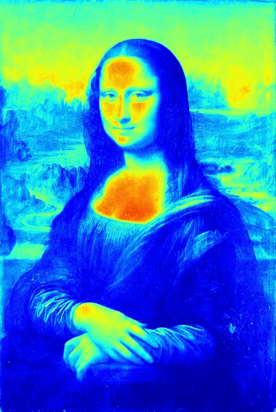
The image above is iconic enough to require no introduction. In response to my article about the use of a rainbow palette Quora user Hyunjun Ji decided to illustrate the point using this famous painting. Here is the Mona Lisa rendered using a rainbow colour map:
Here is the same image using the viridis colormap [1]:
The difference in detail conveyed between these two images is vast. I’ll let Hyunjun explain in his own words [2]:
In these images, the rainbow color map might look colorful, but for example, if you take a look at the neck and forehead, you observe a very rapid red to green color change.
Another thing about the rainbow colormap is that it is not uniform, especially in terms of brightness. When you go from small to large data, its brightness does not monotonically increase or decrease. Instead, it goes up and down, confusing human perception.
To emphasise his point, Hyunjun then converted the rainbow Mona Lisa back to greyscale, this final image really brings home how much information is lost by adopting a rainbow palette.
Hyunjun’s points were striking enough for me to want to share them with a wider audience and I thank him for providing this pithy insight.
According to its creators, viridis is designed to be:
Colorful, spanning as wide a palette as possible so as to make differences easy to see,
Perceptually uniform, meaning that values close to each other have similar-appearing colors and values far away from each other have more different-appearing colors, consistently across the range of values,
Robust to colorblindness, so that the above properties hold true for people with common forms of colorblindness, as well as in grey scale printing, and
This is the first of two articles whose genesis was the nexus of hurricanes and data visualisation. The second article, Part II – Map Reading, has now been published.
Introduction
This first article is not a critique of Thomas Pynchon‘s celebrated work, instead it refers to a grave malady that can afflict otherwise health data visualisations; the use and abuse of rainbow colours. This is an area that some data visualisation professionals can get somewhat hot under the collar about; there is even a Twitter hashtag devoted to opposing this colour choice, #endtherainbow.
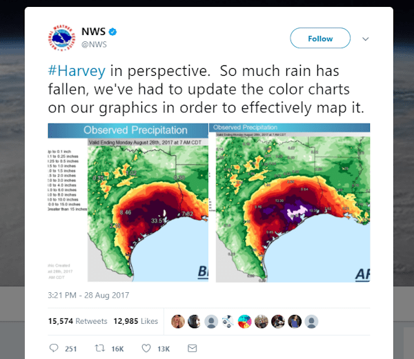
The [mal-] practice has come under additional scrutiny in recent weeks due to the major meteorological events causing so much damage and even loss of life in the Caribbean and southern US; hurricanes Harvey and Irma. Of course the most salient point about these two megastorms is their destructive capability. However the observations that data visualisers make about how information about hurricanes is conveyed do carry some weight in two areas; how the public perceives these phenomena and how they perceive scientific findings in general [1]. The issues at stake are ones of both clarity and inclusiveness. Some of these people felt that salt was rubbed in the wound when the US National Weather Service, avid users of rainbows [2], had to add another colour to their normal palette for Harvey:
In 2015, five scientists collectively wrote a letter to Nature entitled “Scrap rainbow colour scales” [3]. In this they state:
It is time to clamp down on the use of misleading rainbow colour scales that are increasingly pervading the literature and the media. Accurate graphics are key to clear communication of scientific results to other researchers and the public — an issue that is becoming ever more important.
At this point I have to admit to using rainbow colour schemes myself professionally and personally [4]; it is often the path of least resistance. I do however think that the #endtherainbow advocates have a point, one that I will try to illustrate below.
Many Marvellous Maps
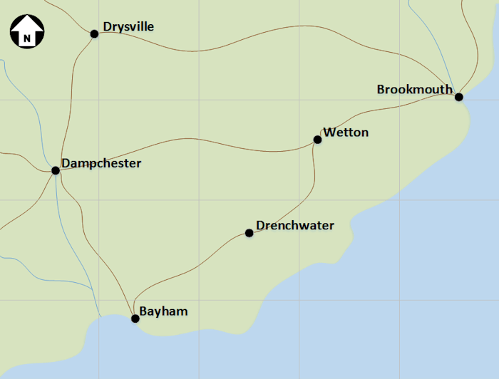
Let’s start by introducing the idyllic coastal county of Thomasshire, a map of which appears below:
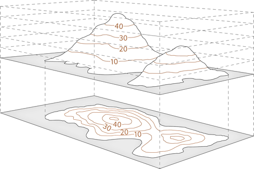
Of course this is a cartoon map, it might be more typical to start with an actual map from Google Maps or some other provider [5], but this doesn’t matter to the argument we will construct here. Let’s suppose that – rather than anything as potentially catastrophic as a hurricane – the challenge is simply to record the rainfall due to a nasty storm that passed through this shire [6]. Based on readings from various weather stations (augmented perhaps by information drawn from radar), rainfall data would be captured and used to build up a rain contour map, much like the elevation contour maps that many people will recall from Geography lessons at school [7].
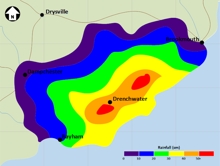
If we were to adopt a rainbow colour scheme, then such a map might look something like the one shown below:
Here all areas coloured purple will have received between 0 and 10 cm of rain, blue between 10 and 20 cm of rain and so on.
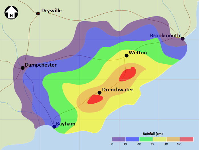
At this point I apologise to any readers who suffer from migraine. An obvious drawback of this approach is how garish it is. Also the solid colours block out details of the underlying map. Well something can be done about both of these issues by making the contour colours transparent. This both tones them down and allows map details to remain at least semi-visible. This gets us a new map:
Here we get into the core of the argument about the suitability of a rainbow palette. Again quoting from the Nature letter:
[…] spectral-type colour palettes can introduce false perceptual thresholds in the data (or hide genuine ones); they may also mask fine detail in the data. These palettes have no unique perceptual ordering, so they can de-emphasize data extremes by placing the most prominent colour near the middle of the scale.
[…]
Journals should not tolerate poor visual communication, particularly because better alternatives to rainbow scales are readily available (see NASA Earth Observatory).
In our map, what we are looking to do is to show increasing severity of the deluge as we pass from purple (indigo / violet) up to red. But the ROYGBIV [8] colours of the spectrum are ill-suited to this. Our eyes react differently to different colours and will not immediately infer the gradient in rainfall that the image is aiming to convey. The NASA article the authors cite above uses a picture to paint a thousand words:
Compared to a monochromatic or grayscale palette the rainbow palette tends to accentuate contrast in the bright cyan and yellow regions, but blends together through a wide range of greens. Sourced from NASA
Another salient point is that a relatively high proportion of people suffer from one or other of the various forms of colour blindness [9]. Even the most tastefully pastel rainbow chart will disadvantage such people seeking to derive meaning from it.
Getting Over the Rainbow
So what could be another approach? Well one idea is to show gradients of whatever the diagram is tracking using gradients of colour; this is the essence of the NASA recommendation. I have attempted to do just this in the next map.
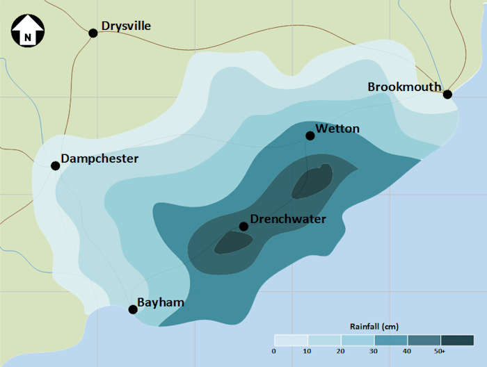
I chose a bluey-green tone both as it was to hand in the Visio palette I was using and also to avoid confusion with the blue sea (more on this later). Rather than different colours, the idea is to map intensity of rainfall to intensity of colour. This should address both colour-blindness issues and the problems mentioned above with discriminating between ROYGBIV colours. I hope that readers will agree that it is easier to grasp what is happening at a glance when looking at this chart than in the ones that preceded it.
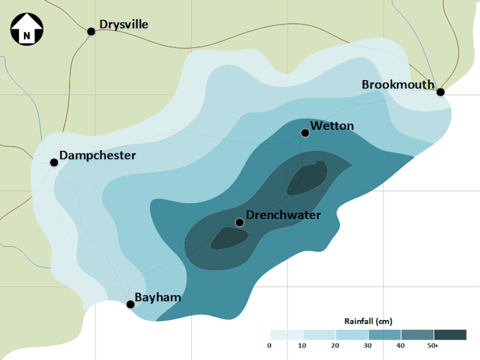
However, from a design point of view, there is still one issue here; the sea. There are too many bluey colours here for my taste, so let’s remove the sea colouration to get:
Some purists might suggest also turning the land white (or maybe a shade of grey), others would mention that the grid-lines add little value (especially as they are not numbered). Both would probably have a point, however I think that use can also push minimalism too far. I am pretty happy that our final map delivers the information it is intended to convey much more accurately and more immediately than any of its predecessors.
Comparing the first two rainbow maps to this last one, it is perhaps easy to see why so many people engaged in the design of data visualisations want to see an end to ROYGBIV palettes. In the saying, there is a pot of gold at the end of the rainbow, but of course this can never be reached. I strongly suspect that, despite the efforts of the #endtherainbow crowd, an end to the usage of this particular palette will be equally out of reach. However I hope that this article is something that readers will bear in mind when next deciding on how best to colour their business graph, diagram or data visualisation. I am certainly going to try to modify my approach as well.
The story of hurricanes and data visualisation will continue in Part II – Map Reading, which is currently forthcoming.
Notes
[1]
For some more thoughts on the public perception of science, see Toast.
[2]
I guess it’s appropriate from at least one point of view.
Ed Hawkins – National Centre for Atmospheric Science, University of Reading, UK (@ed_hawkins)
Doug McNeall – Met Office Hadley Centre, Exeter, UK (@dougmcneall)
Jonny Williams – University of Bristol, UK (LinkedIn page)
David B. Stephenson – University of Exeter, UK (Academic page)
David Carlson – World Meteorological Organization, Geneva, Switzerland (retired June 2017).
[4]
I did also go through a brief monochromatic phase, but it didn’t last long.
[5]
I guess it might take some time to find Thomasshire on Google Maps.
[6]
Based on the data I am graphing here, it was a very nasty storm indeed! In this article, I am not looking for realism, just to make some points about the design of diagrams.
Whereas contours on a physical geography map (see above) link areas with the same elevation above sea level, rainfall contour lines would link areas with the same precipitation.
[8]
Red, Orange, Yellow, Green, Blue, Indigo, Violet.
[9]
Red–green color blindness, the most common sort, affects 80 in 1,000 of males and 4 in 1,000 of females of Northern European descent.
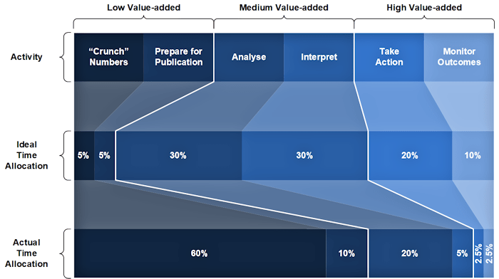
My objective in this brief article is to compare how much time and effort is spent on certain information-related activities in an organisation that has adopted best practice, compared to what is typical in all too many organisations. For the avoidance of doubt, when I say people here I am focussing on staff who would ostensibly be the consumers of information, not data professionals who are engaged in providing such information. What follows relates to the end users of information.
What I have done at the top of the above exhibit (labelled “Activity” on the left-hand side) is to lay out the different types of information-related work that end users engage in, splitting these into low, medium and high valued-added components as we scan across the page.
Low value is number crunching and prettifying exhibits for publication
Medium value is analysis and interpretation of information
High value is taking action based on insights and then monitoring to check whether the desired outcome has been achieved
In the centre of the diagram (labelled “Ideal Time Allocation”), I have shown what I believe is a best practice allocation of time to these activities. It is worth pointing out that that I am recommending that significant time (60%) is spent on analysis and interpretation; while tagged as of medium-value, this type of work is a prerequisite for the higher value activities, you cannot really avoid it. Despite this, there is a still 30% of time devoted to the high-value activities of action and monitoring of results. The remaining 10% is expended on low-value activities.
At the bottom of the chart (labelled “Actual Time Allocation”), I have tried to estimate how people’s time is actually spent in organisations where insufficient attention has been paid to the information landscape; a large number of organisations fit into this category in my experience. I am not trying to be 100% precise here, but I believe that the figures are representative of what I have seen in several organisations. In fact I think that the estimated amount of time spent on low value activities is probably greater than 70% in many cases; however I don’t want to be accused of exaggeration.
Clearly a lack of robust, reliable and readily available information can mean that highly skilled staff spend their time generating information rather than analysing and interpreting it and then using such insights as the basis for action. This results in the bulk of their work being low valued-added. The medium and high value activities are squeezed out as there are only so many hours in the day.
It is obvious that such a state of affairs is sub-optimal and needs to be addressed. My experience of using diagrams like the one shown here is that they can be very valuable in explaining what is wrong with current information arrangements and highlighting the need for change.
An interesting exercise is to estimate what the bottom of the diagram would look like for your organisation. Are you close to best practice, or some way from this and in need of urgent change?
I find myself frequently being asked questions around terminology in Data and Analytics and so thought that I would try to define some of the more commonly used phrases and words. My first attempt to do this can be viewed in a new page added to this site (this also appears in the site menu):
I plan to keep this up-to-date as the field continues to evolve.
I hope that my efforts to explain some concepts in my main area of specialism are both of interest and utility to readers. Any suggestions for new entries or comments on existing ones are more than welcome.
“Prediction and explanation are exactly symmetrical. Explanations are, in effect, predictions about what has happened; predictions are explanations about what’s going to happen.”
– John Rogers Searle
The above image is from Eckerson Group‘s article Predictions for 2017. Eckerson Group’s Founder and Principal Consultant, Wayne Eckerson (@weckerson), is someone whose ideas I have followed on-line for several years; indeed I’m rather surprised I have not posted about his work here before today.
As was possibly said by a variety of people, “prediction is very difficult, especially about the future” [1]. I did turn my hand to crystal ball gazing back in 2009 [2], but the Eckerson Group’s attempt at futurology is obviously much more up-to-date. As per my review of Bruno Aziza’s thoughts on the AtScale blog, I’m not going to cut and paste the text that Wayne and his associates have penned wholesale, instead I’d recommend reading the original article.
Here though are a number of points that caught my eye, together with some commentary of my own (the latter appears in italics below). I’ll split these into the same groups that Wayne & Co. use and also stick to their indexing, hence the occasional gaps in numbering. Where I have elided text, I trust that I have not changed the intended meaning:
Data Management
1.
The enterprise data marketplace becomes a priority. As companies begin to recognize the undesirable side effects of self-service they are looking for ways to reap self-service benefits without suffering the downside. […] The enterprise data marketplace returns us to the single-source vision that was once touted as the real benefit of Enterprise Data Warehouses.
I’ve always thought of self-service as something of a cop-out. It tends to avoid data teams doing anything as arduous (and in some cases out of their comfort zone) as understanding what makes a business tick and getting to grips with the key questions that an organisation needs to answer in order to be successful [3]. With this messy and human-centric stuff out of the way, the data team can retreat into the comfort of nice orderly technological matters or friendly statistical models.
However, what Eckerson Group describe here is “an Amazon-like data marketplace”, which it seems to me has more of a chance of being successful. However, such a marketplace will only function if it embodies the same focus on key business questions and how they are answered. The paradigm within which such questions are framed may be different, more community based and more federated for example, but the questions will still be of paramount importance.
3.
New kinds of data governance organizations and practices emerge. Long-standing, command-and-control data governance practices fail to meet the challenges of big data and of data democratization. […]
I think that this is overdue. To date Data Governance, where it is implemented at all, tends to be too police-like. I entirely agree that there are circumstances in which a Data Governance team or body needs to be able to put its foot down [4], but if all that Data Governance does is police-work, then it will ultimately fail. Instead good Data Governance needs to recognise that it is part of a much more fluid set of processes [5], whose aim is to add business value; to facilitate things being done as well as sometimes to stop the wrong path being taken.
Data Science
1.
Self-service and automated predictive analytics tools will cause some embarrassing mistakes. Business users now have the opportunity to use predictive models but they may not recognize the limits of the models themselves. […]
I think this is a very valid point. As well as not understanding the limitations of some models [6], there is not widespread understanding of statistics in many areas of business. The concept of a central prediction surrounded by different outcomes with different probabilities is seldom seen in commercial circles [7]. In addition there seems to be a lack of appreciation of how big an impact the statistical methodology employed can have on what a model tells you [8].
Business Analytics
1.
Modern analytic platforms dominate BI. Business intelligence (BI) has evolved from purpose-built tools in the 1990s to BI suites in the 2000s to self-service visualization tools in the 2010s. Going forward, organizations will replace tools and suites with modern analytics platforms that support all modes of BI and all types of users […]
Again, if it comes to fruition, such consolidation is overdue. Ideally the tools and technologies will blend into the background, good data-centric work is never about the technology and always about the content and the efforts involved in ensuring that it is relevant, accurate, consistent and timely [9]. Also information is often of most use when it is made available to people taking decisions at the precise point that they need it. This observation highlights the need for data to be integrated into systems and digital estates instead of simply being bound to an analytical hub.
So some food for thought from Wayne and his associates. The points they make (including those which I haven’t featured in this article) are serious and well-thought-out ones. It will be interesting to see how things have moved on by the beginning of 2018.
Notes
[1]
According to WikiQuotes, this has most famously been attributed to Danish theoretical physicist and father of Quantum Mechanics, Niels Bohr (in Teaching and Learning Elementary Social Studies (1970) by Arthur K. Ellis, p. 431). However it has also been ascribed to various humourists, the Danish poet Piet Hein: “det er svært at spå – især om fremtiden” and Danish cartoonist Storm P (Robert Storm Petersen). Perhaps it is best to say that a Dane made the comment and leave it at that.
Of course similar words have also been said to have been originated by Yogi Berra, but then that goes for most malapropisms you could care to mention. As Mr Berra himself says “I really didn’t say everything I said”.
[2]
See Trends in Business Intelligence. I have to say that several of these have come to pass, albeit sometimes in different ways to the ones I envisaged back then.
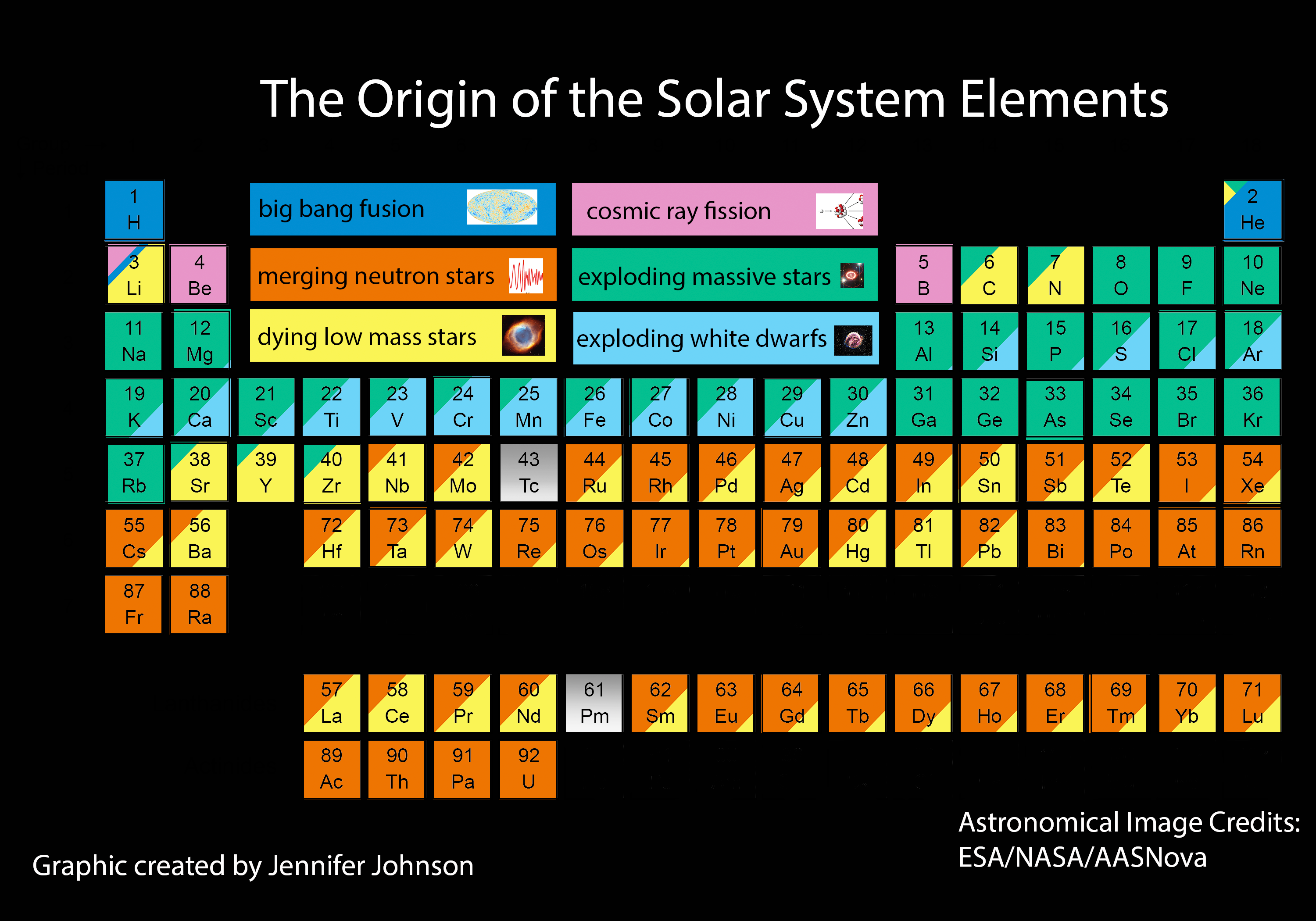
The Periodic Table, is one of the truly iconic scientific images [1], albeit one with a variety of forms. In the picture above, the normal Periodic Table has been repurposed in a novel manner to illuminate a different field of scientific enquiry. This version was created by Professor Jennifer Johnson (@jajohnson51) of The Ohio State University and the Sloan Digital Sky Survey (SDSS). It comes from an article on the SDSS blog entitled Origin of the Elements in the Solar System; I’d recommend reading the original post.
The historical perspective
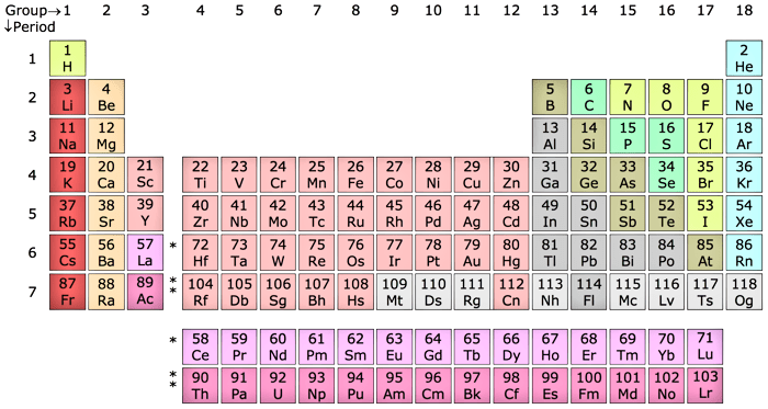
A modern rendering of the Periodic Table appears above. It probably is superfluous to mention, but the Periodic Table is a visualisation of an underlying principle about elements; that they fall into families with similar properties and that – if appropriately arranged – patterns emerge with family members appearing at regular intervals. Thus the Alkali Metals [2], all of which share many important characteristics, form a column on the left-hand extremity of the above Table; the Noble Gases [3] form a column on the far right; and, in between, other families form further columns.
Given that the underlying principle driving the organisation of the Periodic Table is essentially a numeric one, we can readily see that it is not just a visualisation, but a data visualisation. This means that Professor Johnson and her colleagues are using an existing data visualisation to convey new information, a valuable technique to have in your arsenal.
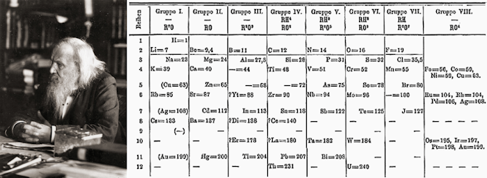
One of the original forms of the Periodic Table appears above, alongside its inventor, Dmitri Mendeleev.
As with most things in science [4], my beguilingly straightforward formulation of “its inventor” is rather less clear-cut in practice. Mendeleev’s work – like Newton’s before him – rested “on the shoulders of giants” [5]. However, as with many areas of scientific endeavour, the chain of contributions winds its way back a long way and specifically to one of the greatest exponents of the scientific method [6], Antoine Lavoisier. The later Law of Triads [7], was another significant step along the path and – to mix a metaphor – many other scientists provided pieces of the jigsaw puzzle that Mendeleev finally assembled. Indeed around the same time as Mendeleev published his ideas [8], so did the much less celebrated Julius Meyer; Meyer and Mendeleev’s work shared several characteristics.
The epithet of inventor attached to Mendeleev for two main reasons: his leaving of gaps in his table, pointing the way to as yet undiscovered elements; and his ordering of table entries according to family behaviour rather than atomic mass [9]. None of this is to take away from Mendeleev’s seminal work, it is wholly appropriate that his name will always be linked with his most famous insight. Instead it is my intention is to demonstrate that the the course of true science never did run smooth [10].
The Johnson perspective
Since its creation – and during its many reformulations – the Periodic Table has acted as a pointer for many areas of scientific enquiry. Why do elements fall into families in this way? How many elements are there? Is it possible to achieve the Alchemists’ dream and transmute one element into another? However, the question which Professor Johnson’s diagram addresses is another one, Why is there such an abundance of elements and where did they all come from?
The term nucleosynthesis that appears in the title of this article covers processes by which different atoms are formed from either base nucleons (protons and neutrons) or the combination of smaller atoms. It is nucleosynthesis which attempts to answer the question we are now considering. There are different types.
Our current perspective on where everything in the observable Universe came from is of course the Big Bang [11]. This rather tidily accounts for the abundance of element 1, Hydrogen, and much of that of element 2, Helium. This is our first type of nucleosynthesis, Big Bang nucleosynthesis. However, it does not explain where all of the heavier elements came from [12]. The first part of the answer is from processes of nuclear fusion in stars. The most prevalent form of this is the fusion of Hydrogen to form Helium (accounting for the remaining Helium atoms), but this process continues creating heavier elements, albeit in ever decreasing quantities. This is stellar nucleosynthesis and refers to those elements created in stars during their normal lives.
While readers may be ready to accept the creation of these heavier elements in stars, an obvious question is How come they aren’t in stars any longer? The answer lies in what happens at the end of the life of a star. This is something that depends on a number of factors, but particularly its mass and also whether or not it is associated with another star, e.g. in a binary system.
Broadly speaking, higher mass stars tend to go out with a bang [13], lower mass ones with various kinds of whimpers. The exception to the latter is where the low mass star is coupled to another star, arrangements which can also lead to a considerable explosion as well [14]. Of whatever type, violent or passive, star deaths create all of the rest of the heavier elements. Supernovae are also responsible for releasing many heavy elements in to interstellar space, and this process is tagged explosive nucleosynthesis.
Into this relatively tidy model of nucleosynthesis intrudes the phenomenon of cosmic ray fission, by which cosmic rays [15] impact on heavier elements causing them to split into smaller constituents. We believe that this process is behind most of the Beryllium and Boron in the Universe as well as some of the Lithium. There are obviously other mechanisms at work like radioactive decay, but the vast majority of elements are created either in stars or during the death of stars.
I have elided many of the details of nucleosynthesis here, it is a complicated and evolving field. What Professor Johnson’s graphic achieves is to reflect current academic thinking around which elements are produced by which type of process. The diagram certainly highlights the fact that the genesis of the elements is a complex story. Perhaps less prosaically, it also encapulates Carl Sagan‘s famous aphorism, the one that Professor Johnson quotes at the beginning of her article and which I will use to close mine.
Lithium, Sodium, Potassium, Rubidium, Caesium and Francium (Hydrogen sometimes is shown as topping this list as well).
[3]
Helium, Argon, Neon, Krypton, Xenon and Radon.
[4]
Watch this space for an article pertinent to this very subject.
[5]
Isaac Newton on 15th February 1676. in a letter to Robert Hooke; but employing a turn of phrase which had been in use for many years.
[6]
And certainly the greatest scientist ever to be beheaded.
[7]
Döbereiner, J. W. (1829) “An Attempt to Group Elementary Substances according to Their Analogies”. Annalen der Physik und Chemie.
[8]
In truth somewhat earlier.
[9]
The emergence of atomic number as the organising principle behind the ordering of elements happened somewhat later, vindicating Mendeleev’s approach.
We have:
atomic mass ≅ number of protons in the nucleus of an element + number of neutrons
whereas:
atomic number = number of protons only
The number of neutrons can jump about between successive elements meaning that arranging them in order of atomic mass gives a different result from atomic number.
[10]
With apologies to The Bard.
[11]
I really can’t conceive that anyone who has read this far needs the Big Bang further expounded to them, but if so, then GIYF.
[12]
We think that the Big Bang also created some quantities of Lithium and several other heavier elements, as covered in Professor Johnson’s diagram.
Type-Ia supernovae are a phenomenon that allow us to accurately measure the size of the universe and how this is changing.
[15]
Cosmic rays are very high energy particles that originate from outside of the Solar System and consist mostly of very fast moving protons (aka Hydrogen nuclei) and other atomic nuclei similarly stripped of their electrons.
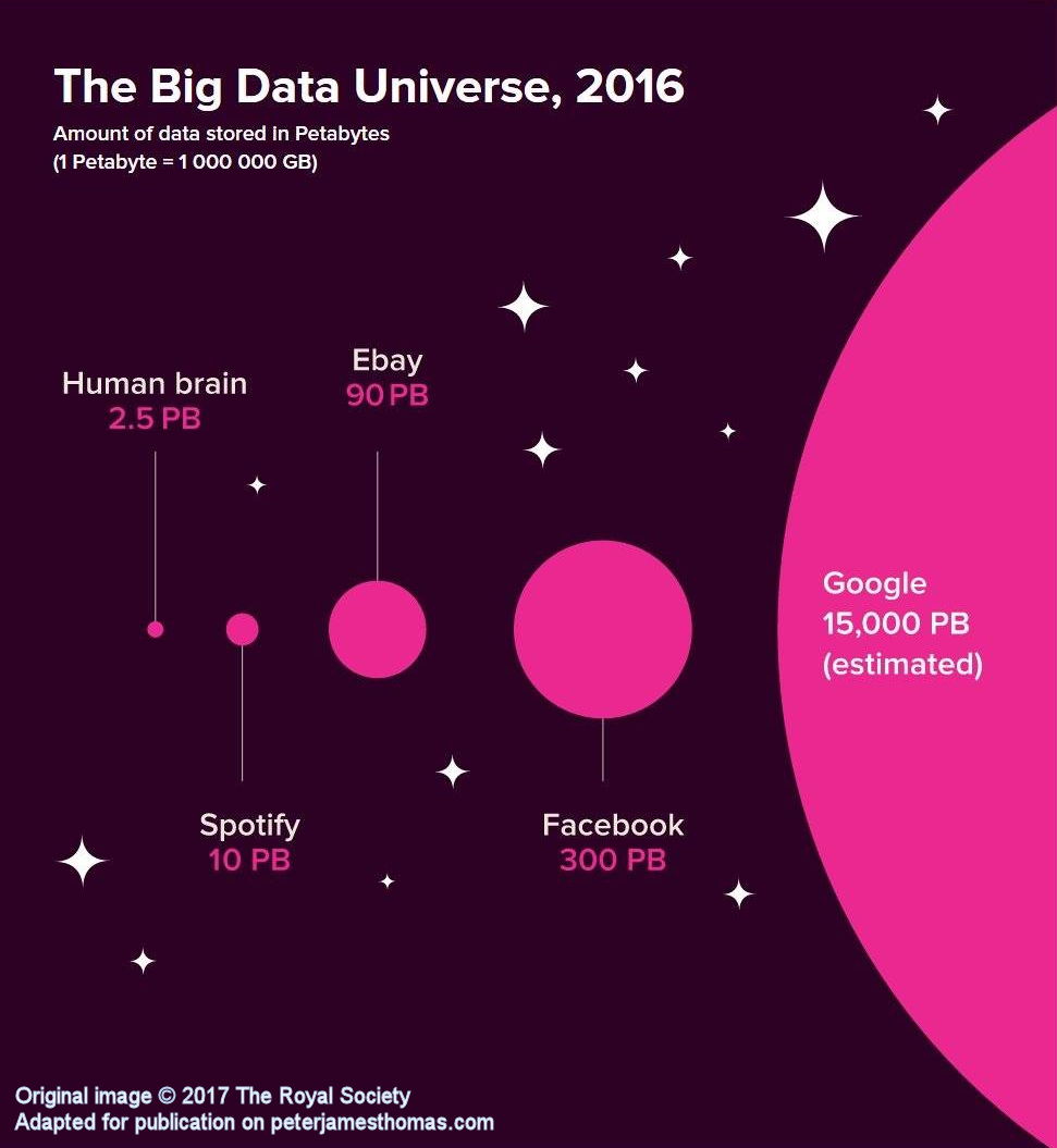
The above image is part of a much bigger infographic produced by The Royal Society about machine learning. You can view the whole image here.
I felt that this component was interesting in a stand-alone capacity.
The legend explains that a petabyte (Pb) is equal to a million gigabytes (Gb) [1], or 1 Pb = 106 Gb. A gigabyte itself is a billion bytes, or 1 Gb = 109 bytes. Recalling how we multiply indeces we can see that 1 Pb = 106 × 109 bytes = 106 + 9 bytes = 1015 bytes. 1015 also has a name, it’s called a quadrillion. Written out long hand:
1 quadrillion = 1,000,000,000,000,000
The estimate of the amount of data held by Google is fifteen thousand petabytes, let’s write that out long hand as well:
15,000 Pb = 15,000,000,000,000,000,000 bytes
That’s a lot of zeros. As is traditional with big numbers, let’s try to put this in context.
The average size of a photo on an iPhone 7 is about 3.5 megabytes (1 Mb = 1,000,000 bytes), so Google could store about 4.3 trillion of such photos.
Stepping it up a bit, the average size of a high quality photo stored in CR2 format from a Canon EOS 5D Mark IV is ten times bigger at 35 Mb, so Google could store a mere 430 billion of these.
A high definition (1080p) movie is on average around 6 Gb, so Google could store the equivalent of 2.5 billion movies.
If Google employees felt that this resolution wasn’t doing it for them, they could upgrade to 150 million 4K movies at around 100 Gb each.
If instead they felt like reading, they could hold the equivalent of The Library of Congress print collections a mere 75 thousand times over [2].
Rather than talking about bytes, 15,000 petametres is equivalent to about 1,600 light years and at this distance from us we find Messier Object 47 (M47), a star cluster which was first described an impressively long time ago in 1654.
If instead we consider 15,000 peta-miles, then this is around 2.5 million light years, which gets us all the way to our nearest neighbour, the Andromeda Galaxy[3].
The fastest that humankind has got anything bigger than a handful of sub-atomic particles to travel is the 17 kilometres per second (11 miles per second) at which Voyager 1 is currently speeding away from the Sun. At this speed, it would take the probe about 43 billion years to cover the 15,000 peta-miles to Andromeda. This is over three times longer than our best estimate of the current age of the Universe.
Finally a more concrete example. If we consider a small cube, made of well concrete, and with dimensions of 1 cm in each direction, how big would a stack of 15,000 quadrillion of them be? Well, if arranged into a cube, each of the sides would be just under 25 km (15 and a bit miles) long. That’s a pretty big cube.
If the base was placed in the vicinity of New York City, it would comfortably cover Manhattan, plus quite a bit of Brooklyn and The Bronx, plus most of Jersey City. It would extend up to Hackensack in the North West and almost reach JFK in the South East. The top of the cube would plough through the Troposphere and get half way through the Stratosphere before topping out. It would vie with Mars’s Olympus Mons for the title of highest planetary structure in the Solar System [4].
It is probably safe to say that 15,000 Pb is an astronomical figure.
Google played a central role in the initial creation of the collection of technologies that we now use the term Big Data to describe The image at the beginning of this article perhaps explains why this was the case (and indeed why they continue to be at the forefront of developing newer and better ways of dealing with large data sets).
As a point of order, when people start talking about “big data”, it is worth recalling just how big “big data” really is.
Notes
[1]
In line with The Royal Society, I’m going to ignore the fact that these definitions were originally all in powers of 2 not 10.
[2]
The size of The Library of Congress print collections seems to have become irretrievably connected with the figure 10 terabytes (10 × 1012 bytes) for some reason. No one knows precisely, but 200 Tb seems to be a more reasonable approximation.
[3]
Applying the unimpeachable logic of eminent pseudoscientist and numerologist Erich von Däniken, what might be passed over as a mere coincidence by lesser minds, instead presents incontrovertible proof that Google’s PageRank algorithm was produced with the assistance of extraterrestrial life; which, if you think about it, explains quite a lot.
[4]
Though I suspect not for long, unless we chose some material other than concrete. Then I’m not a materials scientist, so what do I know?
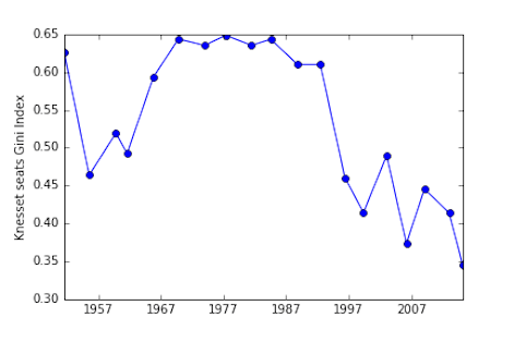
No neither my observations on the work of Kafka, nor that of Escher[1]. Instead some musings relating on how to transform a bare bones and unengaging chart into something that both captures the attention of the reader and better informs them of the message that the data displayed is relaying. Let’s consider an example:
Before:
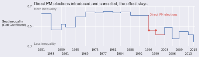
After:
The two images above are both renderings of the same dataset, which tracks the degree of fragmentation of the Israeli parliament – the Knesset – over time [2]. They are clearly rather different and – I would argue – the latter makes it a lot easier to absorb information and thus to draw inferences.
Both are the work of Boris Gorelik a data scientist at Automattic, a company that is most well-known for creating freemium SAAS blogging platform, WordPress.com and open source blogging software, WordPress [3].
I have been a contented WordPress.com user since the inception of this blog back in November 2008, so it was with interest that I learnt that Automattic have their own data-focussed blog, Data for Breakfast, unsurprisingly hosted on WordPress.com. It was on Data for Breakfast that I found Boris’s article, Evolution of a Plot: Better Data Visualization, One Step at a Time. In this he takes the reader step by step through what he did to transform his data visualisation from the ugly duckling “before” exhibit to the beautiful swan “after” exhibit.
Boris is using Python and various related libraries to do his data visualisation work. Given that I stopped commercially programming sometime around 2009 (admittedly with a few lapses since), I typically use the much more quotidian Excel for most of the charts that appear on peterjamesthomas.com[4]. Sometimes, where warranted, I enhance these using Visio and / or PaintShop Pro.
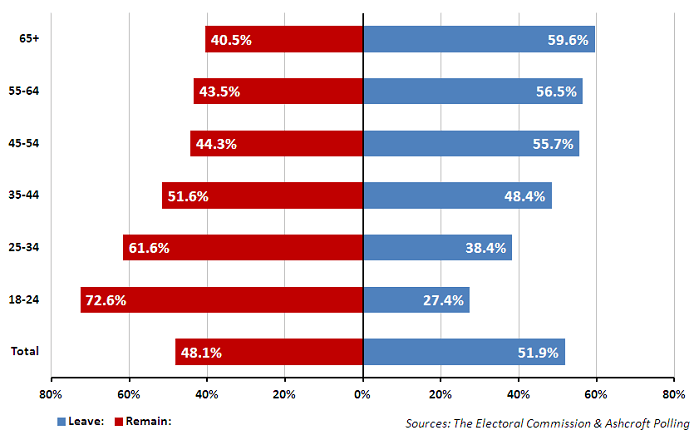
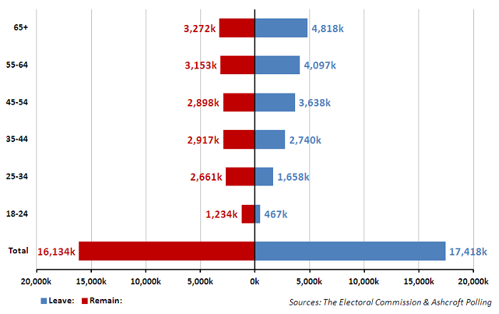
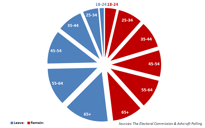
For example, the three [5] visualisations featured in A Tale of Two [Brexit] Data Visualisations were produced this way. Despite the use of Calibri, which is probably something of a giveaway, I hope that none of these resembles a straight-out-of-the-box Excel graph [6].
UK Referendum on EU Membership – Percentage voting by age bracket (see notes)
UK Referendum on EU Membership – Numbers voting by age bracket (see notes)
UK Referendum on EU Membership – Number voting by age bracket (see notes)
While, in the above, I have not gone to the lengths that Boris has in transforming his initial and raw chart into something much more readable, I do my best to make my Excel charts look at least semi-professional. My reasoning is that, when the author of a chart has clearly put some effort into what their chart looks like and has at least attempted to consider how it will be read by people, then this is a strong signal that the subject matter merits some closer consideration.
Next time I develop a chart for posting on these pages, I may take Boris’s lead and also publish how I went about creating it.
Notes
[1]
Though the latter’s work has adorned these pages on several occasions and indeed appears in my seminar decks.
[2]
Boris has charted a metric derived from how many parties there have been and how many representatives of each. See his article itself for further background.
[3]
You can learn more about the latter at WordPress.org.










![2017 the Road Ahead [Borrowed from Eckerson Group]](https://peterjamesthomas.com/wp-content/uploads/2017/02/2017-the-road-ahead.png?w=700 "2017 the Road Ahead [Borrowed from Eckerson Group]")