(painted some time between 1503 and 1506)
The first half of my planned thoughts on Hurricanes and Data Visualisation is called Rainbow’s Gravity and was published earlier this week. Part two, Map Reading, has now also been published. Here is an unplanned post slotting into the gap between the two.
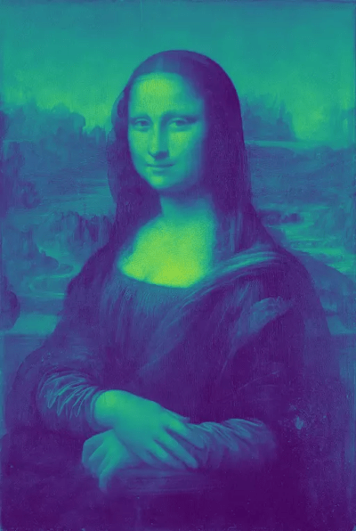
The image above is iconic enough to require no introduction. In response to my article about the use of a rainbow palette Quora user Hyunjun Ji decided to illustrate the point using this famous painting. Here is the Mona Lisa rendered using a rainbow colour map:

Here is the same image using the viridis colormap [1]:

The difference in detail conveyed between these two images is vast. I’ll let Hyunjun explain in his own words [2]:
In these images, the rainbow color map might look colorful, but for example, if you take a look at the neck and forehead, you observe a very rapid red to green color change.
Another thing about the rainbow colormap is that it is not uniform, especially in terms of brightness. When you go from small to large data, its brightness does not monotonically increase or decrease. Instead, it goes up and down, confusing human perception.
To emphasise his point, Hyunjun then converted the rainbow Mona Lisa back to greyscale, this final image really brings home how much information is lost by adopting a rainbow palette.

Hyunjun’s points were striking enough for me to want to share them with a wider audience and I thank him for providing this pithy insight.
Notes
| [1] |
viridis is an add-in package for the R statistical language, based on a colourmap originally developed for Python, see https://cran.r-project.org/web/packages/viridis/vignettes/intro-to-viridis.html. According to its creators, viridis is designed to be:
|
| [2] |
Also noting that the Mona Lisa idea comes from a presentation from the creators of viridis, Stéfan van der Walt and Nathaniel Smith. |
From: peterjamesthomas.com, home of The Data and Analytics Dictionary
You must be logged in to post a comment.