“Prediction and explanation are exactly symmetrical. Explanations are, in effect, predictions about what has happened; predictions are explanations about what’s going to happen.”
– John Rogers Searle
The above image is from Eckerson Group‘s article Predictions for 2017. Eckerson Group’s Founder and Principal Consultant, Wayne Eckerson (@weckerson), is someone whose ideas I have followed on-line for several years; indeed I’m rather surprised I have not posted about his work here before today.
As was possibly said by a variety of people, “prediction is very difficult, especially about the future” [1]. I did turn my hand to crystal ball gazing back in 2009 [2], but the Eckerson Group’s attempt at futurology is obviously much more up-to-date. As per my review of Bruno Aziza’s thoughts on the AtScale blog, I’m not going to cut and paste the text that Wayne and his associates have penned wholesale, instead I’d recommend reading the original article.
Here though are a number of points that caught my eye, together with some commentary of my own (the latter appears in italics below). I’ll split these into the same groups that Wayne & Co. use and also stick to their indexing, hence the occasional gaps in numbering. Where I have elided text, I trust that I have not changed the intended meaning:
Data Management
1.
The enterprise data marketplace becomes a priority. As companies begin to recognize the undesirable side effects of self-service they are looking for ways to reap self-service benefits without suffering the downside. […] The enterprise data marketplace returns us to the single-source vision that was once touted as the real benefit of Enterprise Data Warehouses.
I’ve always thought of self-service as something of a cop-out. It tends to avoid data teams doing anything as arduous (and in some cases out of their comfort zone) as understanding what makes a business tick and getting to grips with the key questions that an organisation needs to answer in order to be successful [3]. With this messy and human-centric stuff out of the way, the data team can retreat into the comfort of nice orderly technological matters or friendly statistical models.
However, what Eckerson Group describe here is “an Amazon-like data marketplace”, which it seems to me has more of a chance of being successful. However, such a marketplace will only function if it embodies the same focus on key business questions and how they are answered. The paradigm within which such questions are framed may be different, more community based and more federated for example, but the questions will still be of paramount importance.
3.
New kinds of data governance organizations and practices emerge. Long-standing, command-and-control data governance practices fail to meet the challenges of big data and of data democratization. […]
I think that this is overdue. To date Data Governance, where it is implemented at all, tends to be too police-like. I entirely agree that there are circumstances in which a Data Governance team or body needs to be able to put its foot down [4], but if all that Data Governance does is police-work, then it will ultimately fail. Instead good Data Governance needs to recognise that it is part of a much more fluid set of processes [5], whose aim is to add business value; to facilitate things being done as well as sometimes to stop the wrong path being taken.
Data Science
1.
Self-service and automated predictive analytics tools will cause some embarrassing mistakes. Business users now have the opportunity to use predictive models but they may not recognize the limits of the models themselves. […]
I think this is a very valid point. As well as not understanding the limitations of some models [6], there is not widespread understanding of statistics in many areas of business. The concept of a central prediction surrounded by different outcomes with different probabilities is seldom seen in commercial circles [7]. In addition there seems to be a lack of appreciation of how big an impact the statistical methodology employed can have on what a model tells you [8].
Business Analytics
1.
Modern analytic platforms dominate BI. Business intelligence (BI) has evolved from purpose-built tools in the 1990s to BI suites in the 2000s to self-service visualization tools in the 2010s. Going forward, organizations will replace tools and suites with modern analytics platforms that support all modes of BI and all types of users […]
Again, if it comes to fruition, such consolidation is overdue. Ideally the tools and technologies will blend into the background, good data-centric work is never about the technology and always about the content and the efforts involved in ensuring that it is relevant, accurate, consistent and timely [9]. Also information is often of most use when it is made available to people taking decisions at the precise point that they need it. This observation highlights the need for data to be integrated into systems and digital estates instead of simply being bound to an analytical hub.
So some food for thought from Wayne and his associates. The points they make (including those which I haven’t featured in this article) are serious and well-thought-out ones. It will be interesting to see how things have moved on by the beginning of 2018.
Notes
[1]
According to WikiQuotes, this has most famously been attributed to Danish theoretical physicist and father of Quantum Mechanics, Niels Bohr (in Teaching and Learning Elementary Social Studies (1970) by Arthur K. Ellis, p. 431). However it has also been ascribed to various humourists, the Danish poet Piet Hein: “det er svært at spå – især om fremtiden” and Danish cartoonist Storm P (Robert Storm Petersen). Perhaps it is best to say that a Dane made the comment and leave it at that.
Of course similar words have also been said to have been originated by Yogi Berra, but then that goes for most malapropisms you could care to mention. As Mr Berra himself says “I really didn’t say everything I said”.
[2]
See Trends in Business Intelligence. I have to say that several of these have come to pass, albeit sometimes in different ways to the ones I envisaged back then.
This article draws extensively on elements of the framework I use to both highlight and manage risks on data programmes. It has its genesis in work that I did early in 2012 (but draws on experience from the years before this). I have tried to refresh the content since then to reflect new thinking and new developments in the data arena.
Introduction
What are my motivations in publishing this article? Well I have both designed and implemented data and information programmes for over 17 years. In the majority of cases my programme work has been a case of executing a data strategy that I had developed myself [1]. While I have generally been able to steer these programmes to a successful outcome [2], there have been both bumps in the road and the occasional blind alley, requiring a U-turn and another direction to be selected. I have also been able to observe data programmes that ran in parallel to mine in different parts of various organisations. Finally, I have often been asked to come in and address issues with an existing data programme; something that appears to happens all too often. In short I have seen a lot of what works and what does not work. Having also run other types of programmes [3], I can also attest to data programmes being different. Failure to recognise this difference and thus approaching a data programme just like any other piece of work is one major cause of issues [4].
Before I get into my list proper, I wanted to pause to highlight a further couple of mistakes that I have seen made more than once; ones that are more generic in nature and thus don’t appear on my list of 20 risks. The first is to assume that the way that an organisation’s data is controlled and leveraged can be improved in a sustainable way by just kicking off a programme. What is more important in my experience is to establish a data function, which will then help with both the governance and exploitation of data. This data function, ideally sitting under a CDO, will of course want to initiate a range of projects, from improving data quality, to sprucing up reporting, to establishing better analytical capabilities. Best practice is to gather these activities into a programme, but things work best if the data function is established first, owns such a programme and actively partakes in its execution.
As well as the issue of ongoing versus transitory accountability for data and the undoubted damage that poorly coordinated change programmes can inflict on data assets, another driver for first establishing a data function is that data needs will always be there. On the governance side, new systems will be built, bought and integrated, bringing new data challenges. On the analytical side, there will always be new questions to be answered, or old ones to be reevaluated. While data-centric efforts will generate many projects with start and end dates, the broad stream of data work continues on in a way that, for example, the implementation of a new B2C capability does not.
The second is to believe that you will add lasting value by outsourcing anything but targeted elements of your data programme. This is not to say that there is no place for such arrangements, which I have used myself many times, just that one of the lasting benefits of gimlet-like focus on data is the IP that is built up in the data team; IP that in my experience can be leveraged in many different and beneficial ways, becoming a major asset to the organisation [5].
Having made these introductory comments, let’s get on to the main list, which is divided into broadly chronological sections, relating to stages of the programme. The 10 risks which I believe are either most likely to materialise, or which will probably have the greatest impact are highlighted in pale yellow.
Up-front Risks
Risk
Potential Impact
1.
Not appreciating the size of work for both business and technology resources.
Team is set up to fail – it is neither responsive enough to business needs (resulting in yet more “unofficial” repositories and additional fragmentation), nor is appropriate progress is made on its central objective.
2.
Not establishing a dedicated team.
The team never escapes from “the day job” or legacy / BAU issues; the past prevents the future from being built.
3.
Not establishing a unified and collaborative team.
Team is plagued by people pursuing their own agendas and trashing other people’s approaches, this consumes management time on non-value-added activities, leads to infighting and dissipates energy.
4.
Staff lack skills and prior experience of data programmes.
Time spent educating people rather than getting on with work. Sub-optimal functionality, slippages, later performance problems, higher ongoing support costs.
5.
Not establishing an appropriate management / governance structure.
Programme is not aligned with business needs, is not able to get necessary time with business users and cannot negotiate the inevitable obstacles that block its way. As a result, the programme gets “stuck in the mud”.
6.
Failing to recognise ongoing local needs when centralising.
Local business units do not have their pressing needs attended to and so lose confidence in the programme and instead go their own way. This leads to duplication of effort, increased costs and likely programme failure.
With risk 2 an analogy is trying to build a house in your spare time. If work can only be done in evenings or at the weekend, then this is going to take a long time. Nevertheless organisations too frequently expect data programmes to be absorbed in existing headcount and fitted in between people’s day jobs.
We can we extend the building metaphor to cover risk 4. If you are going to build your own house, it would help that you understand carpentry, plumbing, electricals and brick-laying and also have a grasp on the design fundamentals of how to create a structure that will withstand wind rain and snow. Too often companies embark on data programmes with staff who have a bit of a background in reporting or some related area and with managers who have never been involved in a data programme before. This is clearly a recipe for disaster.
Risk 5 reminds us that governance is also important – both to ensure that the programme stays focussed on business needs and also to help the team to negotiate the inevitable obstacles. This comes back to a successful data programme needing to be more than just a technology project.
Programme Execution Risks
Risk
Potential Impact
7.
Poor programme management.
The programme loses direction. Time is expended on non-core issues. Milestones are missed. Expenditure escalates beyond budget.
8.
Poor programme communication.
Stakeholders have no idea what is happening [6]. The programme is viewed as out of touch / not pertinent to business issues. Steering does not understand what is being done or why. Prospective users have no interest in the programme.
9.
Big Bang approach.
Too much time goes by without any value being created. The eventual Big Bang is instead a damp squib. Large sums of money are spent without any benefits.
10.
Endless search for the perfect solution / adherence to overly theoretical approaches.
Programme constantly polishes rocks rather than delivering. Data models reflect academic purity rather than real-world performance and maintenance needs.
11.
Lack of focus on interim deliverables.
Business units become frustrated and seek alternative ways to meet their pressing needs. This leads to greater fragmentation and reputational damage to programme.
12.
Insufficient time spent understanding source system data and how data is transformed as it flows between systems.
Data capabilities that do not reflect business transactions with fidelity. There is inconsistency with reports directly drawn from source systems. Reconciliation issues arise (see next point).
13.
Poor reconciliation.
If analytical capabilities do not tell a consistent story, they will not be credible and will not be used.
14.
Strong approach to data quality.
Data facilities are seen as inaccurate because of poor data going into them. Data facilities do not match actual business events due to either massaging of data or exclusion of transactions with invalid attributes.
Probably the single most common cause of failure with data programmes – and indeed or ERP projects and acquisitions and any other type of complex endeavour – is risk 7, poor programme management. Not only do programme managers have to be competent, they should also be steeped in data matters and have a good grasp of the factors that differentiate data programmes from more general work.
Relating to the other highlighted risks in this section, the programme could spend two years doing work without surfacing anything much and then, when they do make their first delivery, this is a dismal failure. In the same vein, exclusive focus on strategic capabilities could prevent attention being paid to pressing business needs. At the other end of the spectrum, interim deliveries could spiral out of control, consuming all of the data team’s time and meaning that the strategic objective is never reached. A better approach is that targeted and prioritised interims help to address pressing business needs, but also inform more strategic work. From the other perspective, progress on strategic work-streams should be leveraged whenever it can be, perhaps in less functional manners that the eventual solution, but good enough and also helping to make sure that the final deliveries are spot on [7].
User Requirement Risks
Risk
Potential Impact
15.
Not enough up-front focus on understanding key business decisions and the information necessary to take them.
Analytic capabilities do not focus on what people want or need, leading to poor adoption and benefits not being achieved.
16.
In the absence of the above, the programme becoming a technology-driven one.
The business gets what IT or Change think that they need, not what is actually needed. There is more focus on shiny toys than on actionable information. The programme forgets the needs of its customers.
17.
A focus on replicating what the organisation already has but in better tools, rather than creating what it wants.
Beautiful data visualisations that tell you close to nothing. Long lists of existing reports with their fields cross-referenced to each other and a new solution that is essentially the lowest common denominator of what is already in place; a step backwards.
The other most common reasons for data programme failure is a lack of focus on user needs and insufficient time spent with business people to ensure that systems reflect their requirements [8].
Integration Risk
Risk
Potential Impact
18.
Lack of leverage of new data capabilities in front-end / digital systems.
These systems are less effective. The data team is jealous about its capabilities being the only way that users should get information, rather than adopting a more pragmatic and value-added approach.
It is important for the data team to realise that their work, however important, is just one part of driving a business forward. Opportunities to improve other system facilities by the leverage of new data structures should be taken wherever possible.
Deployment Risks
Risk
Potential Impact
19.
Education is an afterthought, training is technology- rather than business-focused.
People neither understand the capabilities of new analytical tools, nor how to use them to derive business value. Again this leads to poor adoption and little return on investment.
20.
Declaring success after initial implementation and training.
Without continuing to water the immature roots, the plant withers. Early adoption rates fall and people return to how they were getting information pre-launch. This means that the benefits of the programme not realised.
Finally excellent technical work needs to be complemented with equal attention to business-focussed education, training using real-life scenarios and assiduous follow up. These things will make or break the programme [9].
Summary.
Of course I don’t claim that the above list is exhaustive. You could successfully mitigate all of the above risks on your data programme, but still get sunk by some other unforeseen problem arising. There is a need to be flexible and to adapt to both events and how your organisation operates; there are no guarantees and no foolproof recipes for success [10].
My recommendation to data professionals is to develop your own approach to risk management based on your own experience, your own style and the culture within which you are operating. If just a few of the items on my list of risks can be usefully amalgamated into this, then I will feel that this article has served its purpose. If you are embarking on a data programme, maybe your first one, then be warned that these are hard and your reserves of perseverance will be tested. I’d suggest leveraging whatever tools you can find in trying to forge ahead.
It is also maybe worth noting that, somewhat contrary to my point that data programmes are different, a few of the risks that I highlight above could be tweaked to apply to more general programmes as well. Hopefully the things that I have learnt over the last couple of decades of running data programmes will be something that can be of assistance to you in your own work.
Notes
[1]
For my thoughts on developing data (or interchangeably) information strategies see:
This blog touches on a wide range of topics, including social media, cultural transformation, general technology and – last but not least – sporting analogies. However, its primary focus has always been on data and information-centric matters in a business context. Having said this, all but the more cursory of readers will have noted the prevalence of pieces with a Mathematical or Scientific bent. To some extent this is a simple reflection of the author’s interests and experience, but a stronger motivation is often to apply learnings from different fields to the business data arena. This article is probably more scientific in subject matter than most, but I will also look to highlight some points pertinent to commerce towards the end.
Introduction
The topic I want to turn my attention to in this article is public trust in science. This is a subject that has consumed many column inches in recent years. One particular area of focus has been climate science, which, for fairly obvious political reasons, has come in for even more attention than other scientific disciplines of late. It would be distracting to get into the arguments about climate change and humanity’s role in it here [1] and in a sense this is just the latest in a long line of controversies that have somehow become attached to science. An obvious second example here is the misinformation circling around both the efficacy and side effects of vaccinations [2]. In both of these cases, it seems that at least a sizeable minority of people are willing to query well-supported scientific findings. In some ways, this is perhaps linked to the general mistrust of “experts” and “elites” [3] that was explicitly to the fore in the UK’s European Union Referendum debate [4].
“People in this country have had enough of experts”
– Michael Gove [5], at this point UK Justice Secretary and one of the main proponents of the Leave campaign, speaking on Sky News, June 2016.
Mr Gove was talking about economists who held a different point of view to his own. However, his statement has wider resonance and cannot be simply dismissed as the misleading sound-bite of an experienced politician seeking to press his own case. It does indeed appear that in many places around the world experts are trusted much less than they used to be and that includes scientists.
“Many political upheavals of recent years, such as the rise of populist parties in Europe, Donald Trump’s nomination for the American presidency and Britain’s vote to leave the EU, have been attributed to a revolt against existing elites.”
A Brief [6] History of the Public Perception of Science
Note: This section is focussed on historical developments in the public’s trust in science. If the reader would like to skip on to more toast-centric content, then please click here.
Answering questions about the erosion of trust in politicians and the media is beyond the scope of this humble blog. Wondering what has happened to trust in science is firmly in its crosshairs. One part of the answer is that – for some time – scientists were held in too much esteem and the pendulum was inevitably going to swing back the other way. For a while the pace of scientific progress and the miracles of technology which this unleashed placed science on a pedestal from which there was only one direction of travel. During this period in which science was – in general – uncritically held in great regard, the messy reality of actual science was never really highlighted. The very phrase “scientific facts” is actually something of an oxymoron. What we have is instead scientific theories. Useful theories are consistent with existing observations and predict new phenomena. However – as I explained in Patterns patterns everywhere – a theory is only as good as the latest set of evidence and some cherished scientific theories have been shown to be inaccurate; either in general, or in some specific circumstances [7]. However saying “we have a good model that helps us explain many aspects of a phenomenon and predict more, but it doesn’t cover everything and there are some uncertainties” is a little more of a mouthful than “we have discovered that…”.
There have been some obvious landmarks along the way to science’s current predicament. The unprecedented destruction unleashed by the team working on the Manhattan Project at first made the scientists involved appear God-like. It also seemed to suggest that the path to Great Power status was through growing or acquiring the best Physicists. However, as the prolonged misery caused in Japan by the twin nuclear strikes became more apparent and as the Cold War led to generations living under the threat of mutually assured destruction, the standing attached by the general public to Physicists began to wane; the God-like mantle began to slip. While much of our modern world and its technology was created off the back of now fairly old theories like Quantum Chromodynamics and – most famously – Special and General Relativity, the actual science involved became less and less accessible to the man or woman in the street. For all the (entirely justified) furore about the detection of the Higgs Boson, few people would be able to explain much about what it is and how it fits into the Standard Model of particle physics.
In the area of medicine and pharmacology, the Thalidomide tragedy, where a drug prescribed to help pregnant women suffering from morning sickness instead led to terrible birth defects in more than 10,000 babies, may have led to more stringent clinical trials, but also punctured the air of certainty that had surrounded the development of the latest miracle drug. While medical science and related disciplines have vastly improved the health of much of the globe, the glacial progress in areas such as oncology has served as a reminder of the fallibility of some scientific endeavours. In a small way, the technical achievements of that apogee of engineering, NASA, were undermined by loss of crafts and astronauts. Most notably the Challenger and Columbia fatalities served to further remove the glossy veneer that science had acquired in the 1940s to 1960s.
Lest it be thought at this point that I am decrying science, or even being anti-scientific, nothing could be further from the truth. I firmly believe that the ever growing body of scientific knowledge is one of humankind’s greatest achievements, if not its greatest. From our unpromising vantage point on an unremarkable little planet in our equally common-all-garden galaxy we have been able to grasp many of the essential truths about the whole Universe from the incomprehensibly gigantic to the most infinitesimal constituent of a sub-atomic particle. However, it seems that many people do not fully embrace the grandeur of our achievements, or indeed in many cases the unexpected beauty and harmony that they have revealed [8]. It is to the task of understanding this viewpoint that I am addressing my thoughts.
More recently, the austerity that has enveloped much of the developed world since the 2008 Financial Crisis has had two reinforcing impacts on science in many countries. First funding has often been cut, leading to pressure on research programmes and scientists increasingly having to make an economic case for their activities; a far cry from the 1950s. Second, income has been effectively stagnant for the vast majority of people, this means that scientific expenditure can seem something of a luxury and also fuels the anti-elite feelings cited by The Economist earlier in this article.
Into this seeming morass steps Anita Makri, “editor/writer/producer and former research scientist”. In a recent Nature article she argues that the form of science communicated in popular media leaves the public vulnerable to false certainty. I reproduce some of her comments here:
“Much of the science that the public knows about and admires imparts a sense of wonder and fun about the world, or answers big existential questions. It’s in the popularization of physics through the television programmes of physicist Brian Cox and in articles about new fossils and quirky animal behaviour on the websites of newspapers. It is sellable and familiar science: rooted in hypothesis testing, experiments and discovery.
Although this science has its place, it leaves the public […] with a different, outdated view to that of scientists of what constitutes science. People expect science to offer authoritative conclusions that correspond to the deterministic model. When there’s incomplete information, imperfect knowledge or changing advice — all part and parcel of science — its authority seems to be undermined. […] A popular conclusion of that shifting scientific ground is that experts don’t know what they’re talking about.”
After my speculations about the reasons why science is held in less esteem than once was the case, I’ll return to more prosaic matters; namely food and specifically that humble staple of many a breakfast table, toast. Food science has often fared no better than its brother disciplines. The scientific guidance issued to people wanting to eat healthily can sometimes seem to gyrate wildly. For many years fat was the source of all evil, more recently sugar has become public enemy number one. Red wine was meant to have beneficial effects on heart health, then it was meant to be injurious; I’m not quite sure what the current advice consists of. As Makri states above, when advice changes as dramatically as it can do in food science, people must begin to wonder whether the scientists really know anything at all.
So where does toast fit in? Well the governmental body charged with providing advice about food in the UK is called the Food Standards Agency. They describe their job as “using our expertise and influence so that people can trust that the food they buy and eat is safe and honest.” While the FSA do sterling work in areas such as publicly providing ratings of food hygiene for restaurants and the like, their most recent campaign is one which seems at best ill-advised and at worst another nail in the public perception of the reliability of scientific advice. Such things matter because they contribute to the way that people view science in general. If scientific advice about food is seen as unsound, surely there must be questions around scientific advice about climate change, or vaccinations.
Before I am accused of belittling the FSA’s efforts, let’s consider the campaign in question, which is called Go for Gold and encourages people to consume less acrylamide. Here is some of what the FSA has to say about the matter:
“Today, the Food Standards Agency (FSA) is launching a campaign to ‘Go for Gold’, helping people understand how to minimise exposure to a possible carcinogen called acrylamide when cooking at home.
Acrylamide is a chemical that is created when many foods, particularly starchy foods like potatoes and bread, are cooked for long periods at high temperatures, such as when baking, frying, grilling, toasting and roasting. The scientific consensus is that acrylamide has the potential to cause cancer in humans.
[…]
as a general rule of thumb, aim for a golden yellow colour or lighter when frying, baking, toasting or roasting starchy foods like potatoes, root vegetables and bread.”
The Go for Gold campaign was picked up by various media outlets in the UK. For example the BBC posted an article on its web-site which opened by saying:
“Bread, chips and potatoes should be cooked to a golden yellow colour, rather than brown, to reduce our intake of a chemical which could cause cancer, government food scientists are warning.”
The BBC has been obsessed with neutrality on all subjects recently [9], but in this case they did insert the reasonable counterpoint that:
“However, Cancer Research UK [10] said the link was not proven in humans.”
Acrylamide is certainly a nasty chemical. Amongst other things, it is used in polyacrylamide gel electrophoresis, a technique used in biochemistry. If biochemists mix and pour their own gels, they have to monitor their exposure and there are time-based and lifetime limits as to how often they can do such procedures [11]. Acrylamide has also been shown to lead to cancer in mice. So what could be more reasonable that the FSA’s advice?
Food Safety – A Statistical / Risk Based Approach
Earlier I introduced Anita Makri, it is time to meet our second protagonist, David Spiegelhalter, Winton Professor for the Public Understanding of Risk in the Statistical Laboratory, Centre for Mathematical Sciences, University of Cambridge [12]. Professor Spiegelhalter has penned a response to the FSA’s Go for Gold campaign. I feel that this merits reading in entirety, but here are some highlights:
“Very high doses [of Acrylamide] have been shown to increase the risk of mice getting cancer. The IARC (International Agency for Research on Cancer) considers it a ‘probable human carcinogen’, putting it in the same category as many chemicals, red meat, being a hairdresser and shift-work.
However, there is no good evidence of harm from humans consuming acrylamide in their diet: Cancer Research UK say that ‘At the moment, there is no strong evidence linking acrylamide and cancer.’
This is not for want of trying. A massive report from the European Food Standards Agency (EFSA) lists 16 studies and 36 publications, but concludes
‘In the epidemiological studies available to date, AA intake was not associated with an increased risk of most common cancers, including those of the GI or respiratory tract, breast, prostate and bladder. A few studies suggested an increased risk for renal cell, and endometrial (in particular in never-smokers) and ovarian cancer, but the evidence is limited and inconsistent. Moreover, one study suggested a lower survival in non-smoking women with breast cancer with a high pre-diagnostic exposure to AA but more studies are necessary to confirm this result. (p185)’
[…]
[Based on the EFSA study] adults with the highest consumption of acrylamide could consume 160 times as much and still only be at a level that toxicologists think unlikely to cause increased tumours in mice.
[…]
This all seems rather reassuring, and may explain why it’s been so difficult to observe any effect of acrylamide in diet.”
Indeed, Professor Spiegelhalter, an esteemed statistician, also points out that most studies will adopt the standard criteria for statistical significance. Given that such significance levels are often set at 5%, then this means that:
“[As] each study is testing an association with a long list of cancers […], we would expect 1 in 20 of these associations to be positive by chance alone.”
He closes his article by stating – not unreasonably – that the FSA’s time and attention might be better spent on areas where causality between an agent and morbidity is well-established, for example obesity. My assumption is that the FSA has a limited budget and has to pick and choose what food issues to weigh in on. Even if we accept for the moment that there is some slight chance of a causal link between the consumption of low levels of acrylamide and cancer, there are plenty of other areas in which causality is firmly established; obesity as mentioned by Professor Spiegelhalter, excessive use of alcohol, even basic kitchen hygiene. It is hard to understand why the FSA did not put more effort into these and instead focussed on an area where the balance of scientific judgement is that there is unlikely to be an issue.
Having a mathematical background perhaps biases me, but I tend to side with Professor Spiegelhalter’s point of view. I don’t want to lay the entire blame for the poor view that some people have of science at the FSA’s door, but I don’t think campaigns like Go for Gold help very much either. The apocryphal rational man or woman will probably deduce that there is not an epidemic of acrylamide poisoning in progress. This means that they may question what the experts at the FSA are going on about. In turn this reduces respect for other – perhaps more urgent – warnings about food and drink. Such a reaction is also likely to colour how the same rational person thinks about “expert” advice in general. All of this can contribute to further cracks appearing in the public edifice of science, an outcome I find very unfortunate.
So what is to be done?
A Call for a New and More Honest Approach to Science Communications
As promised I’ll return to Anita Makri’s thoughts in the same article referenced above:
“It’s more difficult to talk about science that’s inconclusive, ambivalent, incremental and even political — it requires a shift in thinking and it does carry risks. If not communicated carefully, the idea that scientists sometimes ‘don’t know’ can open the door to those who want to contest evidence.
[…]
Scientists can influence what’s being presented by articulating how this kind of science works when they talk to journalists, or when they advise on policy and communication projects. It’s difficult to do, because it challenges the position of science as a singular guide to decision making, and because it involves owning up to not having all of the answers all the time while still maintaining a sense of authority. But done carefully, transparency will help more than harm. It will aid the restoration of trust, and clarify the role of science as a guide.”
The scientific method is meant to be about honesty. You record what you see, not what you want to see. If the data don’t support your hypothesis, you discard or amend your hypothesis. The peer-review process is meant to hold scientists to the highest levels of integrity. What Makri seems to be suggesting is for scientists to turn their lenses on themselves and how they communicate their work. Being honest where there is doubt may be scary, but not as scary as being caught out pushing certainty where no certainty is currently to be had.
Epilogue
At the beginning of this article, I promised that I would bring things back to a business context. With lots of people with PhDs in numerate sciences now plying their trade as data scientists and the like, there is an attempt to make commerce more scientific [13]. Understandably, the average member of a company will have less of an appreciation of statistics and statistical methods than their data scientists do. This can lead to data science seeming like magic; the philosopher’s stone [14]. There are obvious parallels here with how Physicists were seen in the period immediately after the Second World War.
Earlier in the text, I mused about what factors may have led to a deterioration in how the public views science and scientists. I think that there is much to be learnt from the issues I have covered in this article. If data scientists begin to try to peddle absolute truth and perfect insight (both of which, it is fair to add, are often expected from them by non-experts), as opposed to ranges of outcomes and probabilities, then the same decline in reputation probably awaits them. Instead it would be better if data scientists heeded Anita Makri’s words and tried to always be honest about what they don’t know as well as what they do.
Notes
[1]
Save to note that there really is no argument in scientific circles.
As ever Randall Munroe makes the point pithily in his Earth Temperature Timeline – https://xkcd.com/1732/.
For a primer on the area, you could do worse than watching The Royal Society‘s video:
[2]
For the record, my daughter has had every vaccine known to the UK and US health systems and I’ve had a bunch of them recently as well.
[3]
Most scientists I know would be astonished that they are considered part of the amorphous, ill-defined and obviously malevolent global “elite”. Then “elite” is just one more proxy for “the other” something which it is not popular to be in various places in the world at present.
[4]
Or what passed for debate in these post-truth times.
[5]
Mr Gove studied English at Lady Margaret Hall, Oxford, where he was also President of the Oxford Union. Clearly Oxford produces less experts than it used to in previous eras.
[6]
One that is also probably wildly inaccurate and certainly incomplete.
[7]
So Newton’s celebrated theory of gravitation is “wrong” but actually works perfectly well in most circumstances. The the Rutherford–Bohr model, where atoms are little Solar Systems, with the nucleus circled by electrons much as the planets circle the Sun is “wrong”, but actually does serve to explain a number of things; if sadly not the orbital angular momentum of electrons.
[8]
Someone should really write a book about that – watch this space!
[9]
Not least in the aforementioned EU Referendum where it felt the need to follow the views of the vast majority of economists with those of the tiny minority, implying that the same weight be attached to both points of view. For example, 99.9999% of people believe the world to be round, but in the interests of balance my mate Jim reckons it is flat.
[10]
According to their web-site: “the world’s leading charity dedicated to beating cancer through research”.
[11]
As attested to personally by the only proper scientist in our family.
[12]
Unlike Oxford (according to Mr Gove anyway), Cambridge clearly still aspires to creating experts.
[13]
By this I mean proper science and not pseudo-science like management theory and the like.
[14]
In the original, non-J.K. Rowling sense of the phrase.
I must of course start by offering my apologies to that doyen of data experts, Stephen King, for mangling his words to suit the purposes of this article [1].
The AtScale Big Data Maturity Survey for 2016 came to my attention through a connection (see Disclosure below). The survey covers “responses from more than 2,550 Big Data professionals, across more than 1,400 companies and 77 countries” and builds on their 2015 survey.
I won’t use the word clickbait [2], but most of the time documents like this lead you straight to a form where you can add your contact details to the organisation’s marketing database. Indeed you, somewhat inevitably, have to pay the piper to read the full survey. However AtScale are to be commended for at least presenting some of the high-level findings before asking you for the full entry price.
These headlines appear in an article on their blog. I won’t cut and paste the entire text, but a few points that stood out for me included:
Close to 70% [of respondents] have been using Big Data for more than a year (vs. 59% last year)
More than 53% of respondents are using Cloud for their Big Data deployment today and 14% of respondents have all their Big Data in the Cloud
Business Intelligence is [the] #1 workload for Big Data with 75% of respondents planning on using BI on Big Data
Accessibility, Security and Governance have become the fastest growing areas of concern year-over-year, with Governance growing most at 21%
Organizations who have deployed Spark [3] in production are 85% more likely to achieve value
Bullet 3 is perhaps notable as Big Data is often positioned – perhaps erroneously – as supporting analytics as opposed to “traditional BI” [4]. On the contrary, it appears that a lot of people are employing it in very “traditional” ways. On reflection this is hardly surprising as many organisations have as yet failed to get the best out of the last wave of information-related technology [5], let alone the current one.
However, perhaps the two most significant trends are the shift from on-premises Big Data to Cloud Big Data and the increased importance attached to Data Governance. The latter was perhaps more of a neglected area in the earlier and more free-wheeling era of Big Data. The rise in concerns about Big Data Governance is probably the single greatest pointer towards the increasing maturity of the area.
It will be interesting to see what the AtScale survey of 2017 has to say in 12 months.
Disclosure:
The contact in question is Bruno Aziza (@brunoaziza), AtScale’s Chief Marketing Officer. While I have no other connections with AtScale, Bruno and I did make the following video back in 2011 when both of us were at other companies.
Notes
[1]
Excerpted from The Gunslinger.
[2]
Oops!
[3]
Apache Hadoop – which has become almost synonymous with Big Data – has two elements, the Hadoop Distributed File Store (HDFS, the piece which deals with storage) and MapReduce (which does processing of data). Apache Spark was developed to improve upon the speed of the MapReduce approach where the same data is accessed many times, as can happen in some queries and algorithms. This is achieved in part by holding some or all of the data to be accessed in memory. Spark works with HDFS and also other distributed file systems, such as Apache Cassandra.
Some elements of the technology have changed, but the vast majority of the issues I covered in “Why Business Intelligence projects fail” hold as true today as they did back in 2009 when I wrote this piece.
The Periodic Table, is one of the truly iconic scientific images [1], albeit one with a variety of forms. In the picture above, the normal Periodic Table has been repurposed in a novel manner to illuminate a different field of scientific enquiry. This version was created by Professor Jennifer Johnson (@jajohnson51) of The Ohio State University and the Sloan Digital Sky Survey (SDSS). It comes from an article on the SDSS blog entitled Origin of the Elements in the Solar System; I’d recommend reading the original post.
The historical perspective
A modern rendering of the Periodic Table appears above. It probably is superfluous to mention, but the Periodic Table is a visualisation of an underlying principle about elements; that they fall into families with similar properties and that – if appropriately arranged – patterns emerge with family members appearing at regular intervals. Thus the Alkali Metals [2], all of which share many important characteristics, form a column on the left-hand extremity of the above Table; the Noble Gases [3] form a column on the far right; and, in between, other families form further columns.
Given that the underlying principle driving the organisation of the Periodic Table is essentially a numeric one, we can readily see that it is not just a visualisation, but a data visualisation. This means that Professor Johnson and her colleagues are using an existing data visualisation to convey new information, a valuable technique to have in your arsenal.
One of the original forms of the Periodic Table appears above, alongside its inventor, Dmitri Mendeleev.
As with most things in science [4], my beguilingly straightforward formulation of “its inventor” is rather less clear-cut in practice. Mendeleev’s work – like Newton’s before him – rested “on the shoulders of giants” [5]. However, as with many areas of scientific endeavour, the chain of contributions winds its way back a long way and specifically to one of the greatest exponents of the scientific method [6], Antoine Lavoisier. The later Law of Triads [7], was another significant step along the path and – to mix a metaphor – many other scientists provided pieces of the jigsaw puzzle that Mendeleev finally assembled. Indeed around the same time as Mendeleev published his ideas [8], so did the much less celebrated Julius Meyer; Meyer and Mendeleev’s work shared several characteristics.
The epithet of inventor attached to Mendeleev for two main reasons: his leaving of gaps in his table, pointing the way to as yet undiscovered elements; and his ordering of table entries according to family behaviour rather than atomic mass [9]. None of this is to take away from Mendeleev’s seminal work, it is wholly appropriate that his name will always be linked with his most famous insight. Instead it is my intention is to demonstrate that the the course of true science never did run smooth [10].
The Johnson perspective
Since its creation – and during its many reformulations – the Periodic Table has acted as a pointer for many areas of scientific enquiry. Why do elements fall into families in this way? How many elements are there? Is it possible to achieve the Alchemists’ dream and transmute one element into another? However, the question which Professor Johnson’s diagram addresses is another one, Why is there such an abundance of elements and where did they all come from?
The term nucleosynthesis that appears in the title of this article covers processes by which different atoms are formed from either base nucleons (protons and neutrons) or the combination of smaller atoms. It is nucleosynthesis which attempts to answer the question we are now considering. There are different types.
Our current perspective on where everything in the observable Universe came from is of course the Big Bang [11]. This rather tidily accounts for the abundance of element 1, Hydrogen, and much of that of element 2, Helium. This is our first type of nucleosynthesis, Big Bang nucleosynthesis. However, it does not explain where all of the heavier elements came from [12]. The first part of the answer is from processes of nuclear fusion in stars. The most prevalent form of this is the fusion of Hydrogen to form Helium (accounting for the remaining Helium atoms), but this process continues creating heavier elements, albeit in ever decreasing quantities. This is stellar nucleosynthesis and refers to those elements created in stars during their normal lives.
While readers may be ready to accept the creation of these heavier elements in stars, an obvious question is How come they aren’t in stars any longer? The answer lies in what happens at the end of the life of a star. This is something that depends on a number of factors, but particularly its mass and also whether or not it is associated with another star, e.g. in a binary system.
Broadly speaking, higher mass stars tend to go out with a bang [13], lower mass ones with various kinds of whimpers. The exception to the latter is where the low mass star is coupled to another star, arrangements which can also lead to a considerable explosion as well [14]. Of whatever type, violent or passive, star deaths create all of the rest of the heavier elements. Supernovae are also responsible for releasing many heavy elements in to interstellar space, and this process is tagged explosive nucleosynthesis.
Into this relatively tidy model of nucleosynthesis intrudes the phenomenon of cosmic ray fission, by which cosmic rays [15] impact on heavier elements causing them to split into smaller constituents. We believe that this process is behind most of the Beryllium and Boron in the Universe as well as some of the Lithium. There are obviously other mechanisms at work like radioactive decay, but the vast majority of elements are created either in stars or during the death of stars.
I have elided many of the details of nucleosynthesis here, it is a complicated and evolving field. What Professor Johnson’s graphic achieves is to reflect current academic thinking around which elements are produced by which type of process. The diagram certainly highlights the fact that the genesis of the elements is a complex story. Perhaps less prosaically, it also encapulates Carl Sagan‘s famous aphorism, the one that Professor Johnson quotes at the beginning of her article and which I will use to close mine.
Lithium, Sodium, Potassium, Rubidium, Caesium and Francium (Hydrogen sometimes is shown as topping this list as well).
[3]
Helium, Argon, Neon, Krypton, Xenon and Radon.
[4]
Watch this space for an article pertinent to this very subject.
[5]
Isaac Newton on 15th February 1676. in a letter to Robert Hooke; but employing a turn of phrase which had been in use for many years.
[6]
And certainly the greatest scientist ever to be beheaded.
[7]
Döbereiner, J. W. (1829) “An Attempt to Group Elementary Substances according to Their Analogies”. Annalen der Physik und Chemie.
[8]
In truth somewhat earlier.
[9]
The emergence of atomic number as the organising principle behind the ordering of elements happened somewhat later, vindicating Mendeleev’s approach.
We have:
atomic mass ≅ number of protons in the nucleus of an element + number of neutrons
whereas:
atomic number = number of protons only
The number of neutrons can jump about between successive elements meaning that arranging them in order of atomic mass gives a different result from atomic number.
[10]
With apologies to The Bard.
[11]
I really can’t conceive that anyone who has read this far needs the Big Bang further expounded to them, but if so, then GIYF.
[12]
We think that the Big Bang also created some quantities of Lithium and several other heavier elements, as covered in Professor Johnson’s diagram.
Type-Ia supernovae are a phenomenon that allow us to accurately measure the size of the universe and how this is changing.
[15]
Cosmic rays are very high energy particles that originate from outside of the Solar System and consist mostly of very fast moving protons (aka Hydrogen nuclei) and other atomic nuclei similarly stripped of their electrons.
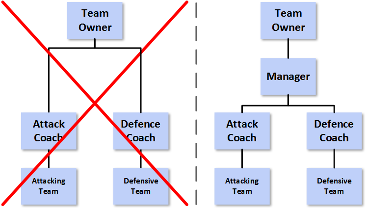
The above image appears in my updated [1] seminar deck Data Management, Analytics and People: An Eternal Golden Braid. It is featured on a slide titled “Why Data Management? – The negative case” [2]. So what was the point that I was so keen to make?
Well the whole slide looks like this…
…and the image on the left relates most directly to the last item of bulleted text on the right-hand side [3].
An Introductory Anecdote
Before getting into the meat of this article, an aside which may illuminate where I am coming from. I currently live in London, a city where I was born and to which I returned after a sojourn in Cambridge while my wife completed her PhD. Towards the end of my first period in London, we lived on a broad, but one-way road in West London. One day we received notification that the road was going to be resurfaced and moving our cars might be a useful thing to consider. The work was duly carried out and our road now had a deep black covering of fresh asphalt [4], criss-crossed by gleaming and well-defined dashed white lines demarking parking bays. Within what seemed like days, but was certainly no more than a few weeks, roadworks signs reappeared on our road, together with red and white fencing, a digger and a number of people with pneumatic drills [5] and shovels. If my memory serves me well, it was the local water company (Thames Water) who visited our road first.
The efforts of the Thames Water staff, while no doubt necessary and carried out professionally, rather spoiled our pristine road cover. I guess these things happen and coordination between local government, private firms and the sub-contractors that both employ cannot be easy [6]. However what was notable was that things did not stop with Thames Water. Over the next few months the same stretch of road was also dug up by both the Electricity and Gas utilities. There was a further set of roadworks on top of these, but my memory fails me on which organisation carried these out and for what purpose [7]; we are talking about events that occurred over eight years ago here.
The result of all this uncoordinated work was a previously pristine road surface now pock-marked by a series of new patches of asphalt, or maybe other materials; they certainly looked different and (as in the above photo) had different colours and grains. Several of these patches of new road covering overlapped each other; that is one hole redug sections previously excavated by earlier holes. Also the new patches of road surface were often either raised or depressed from the main run of asphalt, leading to a very uneven terrain. I have no idea how much it cost to repave the road in the first instance, but a few months of roadworks pretty much buried the repaving and led to a road whose surface was the opposite of smooth and consistent. I’d go so far as to say that the road was now in considerably worse condition than before the initial repaving. In any case, it could be argued that the money spent on the repaving was, for all intents and purposes, wasted.
After all this activity, our road was somewhat similar to the picture at the top of this article, but its state was much worse with more extensive patching and more overlapping layers. To this day I rather wish I had taken a photograph, which would also have saved me some money on stock photos!
I understand that each of the roadworks was in support of something that was probably desirable. For example, better sewerage, or maintenance to gas supplies which might otherwise have become dangerous. My assumption is that all of the work that followed on from the repaving needed to be done and that each was done at least as well as it had to be. Probably most of these works were completed on time and on budget. However, from the point of view of the road as a whole, the result of all these unconnected and uncoordinated works was a substantial deterioration in both its appearance and utility.
In summary, the combination of a series of roadworks, each of which either needed to be done or led to an improvement in some area, resulted in the environment in which they were carried out becoming degraded and less fit-for-purpose. A series of things which could be viewed as beneficial in isolation were instead deleterious in aggregate. At this point, the issue that I wanted to highlight in the data world is probably swimming into focus for many readers.
The Entropy of a Data Asset exposed to Change tends to a Maximum[8]
Returning to the slide I reproduce above, my assertion – which has been borne out during many years of observing the area – is that Change Programmes and Projects, if not subject to appropriately rigorous Data Governance, inevitably led to the degradation of data assets over time.
Here both my roadworks anecdote and the initial photograph illustrate the point that I am looking to make. Over the last decade or so, the delivery of technological change has evolved [9] to the point where many streams of parallel work are run independently of each other with each receiving very close management scrutiny in order to ensure delivery on-time and on-budget [10]. It should be recognised that some of this shift in modus operandi has been as a result of IT departments running projects that have spiralled out of control, or where delivery has been significantly delayed or compromised. The gimlet-like focus of Change on delivery “come Hell or High-water” represents the pendulum swinging to the other extreme.
What this shift in approach means in practice is that – as is often the case – when things go wrong or take longer than anticipated [11], areas of work are de-scoped to secure delivery dates. In my experience, 9 times out of 10 one of the things that gets thrown out is data-related work; be that not bothering to develop reporting on top of new systems, not integrating new data into existing repositories, not complying with data standards, or not implementing master data management.
As well as the danger of skipping necessary data related work, if some data-related work is actually undertaken, then corners may be cut to meet deadlines and budgets. It is not atypical for instance that a Change Programme, while adding their new capabilities to interfaces or ETL, compromises or overwrites existing functionality. This can mean that data-centric code is in a worse state after a Change Programme than before. My roadworks anecdote begins to feel all too apt a metaphor to employ.
Looking more broadly at Change Programmes, even without the curse of de-scopes, their focus is seldom data and the expertise of Change staff is not often in data matters. Because of this, such work can indeed seem to be analogous to continually digging up the same stretch of road for different purposes, combined with patching things up again in a manner that can sometimes be barely adequate. Extending our metaphor [12], the result of Change that is not controlled from a data point of view can be a landscape with lumps, bumps and pot-holes. Maybe the sewer was re-laid on time and to budget, but the road has been trashed in the process. Perhaps a new system was shoe-horned in to production, but rendered elements of an Analytical Repository useless in the process.
Avoiding these calamities is the central role of Data Governance. What these examples also stress is that, rather than the dry, policy-based area that Data Governance is often assumed to be, it must be more dynamic and much more engaged in Change Portfolios. Such engagement should ideally be early and in a helpful manner, not late and in a policing role.
The analogy I have employed here also explains why leveraging existing Governance arrangements to add in a Data Governance dimension seldom works. This would be like asking the contractors engaged in roadworks to be extra careful to liaise with each other. This won’t work as there is no real incentive for such collaboration, the motivation of getting their piece of work done quickly and cheaply will trump other considerations. Instead some independent oversight is required. Like any good “regulator” this will work best if Data Governance professionals seek to be part of the process and focus on improving it. The alternative of simply pointing out problems after the fact adds much less business value.
And Finally
In A Study in Scarlet John Watson reads an article, which turns out to have been written by his illustrious co-lodger. A passage is as follows:
“From a drop of water,” said the writer, “a logician could infer the possibility of an Atlantic or a Niagara without having seen or heard of one or the other. So all life is a great chain, the nature of which is known whenever we are shown a single link of it.”
While I don’t claim to have the same acuity of mind as Conan-Doyle’s most famous creation, I can confirm that you can learn a lot about the need for Data Governance by simply closely observing the damage done by roadworks.
Notes
[1]
I have updated my latest deck to use a different photo due to a dispute with the company I purchased the original photo from.
[2]
Which you may be glad to hear is followed directly by one titled “Why Data Management? – The positive case”.
[3]
It may be noted that I am going through a minimalist phase in my decks for public speaking. Indeed I did toy with having a deck consisting primarily of images before chickening out. Of course one benefit of being text-light is that you can focus on different elements and tell different stories for different audiences (see Presenting in Public).
[4]
Blacktop.
[5]
Jackhammers.
[6]
Indeed sometime in the late 1980s or early 1990s I was approached by one of the big consultancies about a job on a project to catalogue all proposed roadworks across London in an Oracle database. The objective of this was to better coordinate roadworks. I demurred and I believe that the project was unsuccessful, certainly by the evidence of what happened to our road.
[7]
It could well have been Thames Water again – the first time sewers, the second household water supply. It might have been British Telecom, but it probably wasn’t a cable company as they had been banned from excavations in Westminster after failing to make good after previous installations.
As with the last time I used this word (see the notes section of Alphabet Soup) and also as applies with the phenomenon in the narual world, evolution implies change, but not necessarily always improvement.
[10]
Or perhaps more realistically to ensure that delays are minimised and cost overruns managed downwards.
[11]
Frequently it must be added because of either insufficient, or the wrong type of up-front analysis, or because a delivery timeframe was agreed based on some external factor rather than on what could practically be delivered in the time available. Oftentimes both factors are present and compound each other. The overall timetable is not based on any concrete understanding of what is to be done and analysis is either curtailed to meet timeframes, or – more insidiously – its findings are massaged to fit the desired milestones.
The above image is part of a much bigger infographic produced by The Royal Society about machine learning. You can view the whole image here.
I felt that this component was interesting in a stand-alone capacity.
The legend explains that a petabyte (Pb) is equal to a million gigabytes (Gb) [1], or 1 Pb = 106 Gb. A gigabyte itself is a billion bytes, or 1 Gb = 109 bytes. Recalling how we multiply indeces we can see that 1 Pb = 106 × 109 bytes = 106 + 9 bytes = 1015 bytes. 1015 also has a name, it’s called a quadrillion. Written out long hand:
1 quadrillion = 1,000,000,000,000,000
The estimate of the amount of data held by Google is fifteen thousand petabytes, let’s write that out long hand as well:
15,000 Pb = 15,000,000,000,000,000,000 bytes
That’s a lot of zeros. As is traditional with big numbers, let’s try to put this in context.
The average size of a photo on an iPhone 7 is about 3.5 megabytes (1 Mb = 1,000,000 bytes), so Google could store about 4.3 trillion of such photos.
Stepping it up a bit, the average size of a high quality photo stored in CR2 format from a Canon EOS 5D Mark IV is ten times bigger at 35 Mb, so Google could store a mere 430 billion of these.
A high definition (1080p) movie is on average around 6 Gb, so Google could store the equivalent of 2.5 billion movies.
If Google employees felt that this resolution wasn’t doing it for them, they could upgrade to 150 million 4K movies at around 100 Gb each.
If instead they felt like reading, they could hold the equivalent of The Library of Congress print collections a mere 75 thousand times over [2].
Rather than talking about bytes, 15,000 petametres is equivalent to about 1,600 light years and at this distance from us we find Messier Object 47 (M47), a star cluster which was first described an impressively long time ago in 1654.
If instead we consider 15,000 peta-miles, then this is around 2.5 million light years, which gets us all the way to our nearest neighbour, the Andromeda Galaxy[3].
The fastest that humankind has got anything bigger than a handful of sub-atomic particles to travel is the 17 kilometres per second (11 miles per second) at which Voyager 1 is currently speeding away from the Sun. At this speed, it would take the probe about 43 billion years to cover the 15,000 peta-miles to Andromeda. This is over three times longer than our best estimate of the current age of the Universe.
Finally a more concrete example. If we consider a small cube, made of well concrete, and with dimensions of 1 cm in each direction, how big would a stack of 15,000 quadrillion of them be? Well, if arranged into a cube, each of the sides would be just under 25 km (15 and a bit miles) long. That’s a pretty big cube.
If the base was placed in the vicinity of New York City, it would comfortably cover Manhattan, plus quite a bit of Brooklyn and The Bronx, plus most of Jersey City. It would extend up to Hackensack in the North West and almost reach JFK in the South East. The top of the cube would plough through the Troposphere and get half way through the Stratosphere before topping out. It would vie with Mars’s Olympus Mons for the title of highest planetary structure in the Solar System [4].
It is probably safe to say that 15,000 Pb is an astronomical figure.
Google played a central role in the initial creation of the collection of technologies that we now use the term Big Data to describe The image at the beginning of this article perhaps explains why this was the case (and indeed why they continue to be at the forefront of developing newer and better ways of dealing with large data sets).
As a point of order, when people start talking about “big data”, it is worth recalling just how big “big data” really is.
Notes
[1]
In line with The Royal Society, I’m going to ignore the fact that these definitions were originally all in powers of 2 not 10.
[2]
The size of The Library of Congress print collections seems to have become irretrievably connected with the figure 10 terabytes (10 × 1012 bytes) for some reason. No one knows precisely, but 200 Tb seems to be a more reasonable approximation.
[3]
Applying the unimpeachable logic of eminent pseudoscientist and numerologist Erich von Däniken, what might be passed over as a mere coincidence by lesser minds, instead presents incontrovertible proof that Google’s PageRank algorithm was produced with the assistance of extraterrestrial life; which, if you think about it, explains quite a lot.
[4]
Though I suspect not for long, unless we chose some material other than concrete. Then I’m not a materials scientist, so what do I know?
No neither my observations on the work of Kafka, nor that of Escher[1]. Instead some musings relating on how to transform a bare bones and unengaging chart into something that both captures the attention of the reader and better informs them of the message that the data displayed is relaying. Let’s consider an example:
Before:
After:
The two images above are both renderings of the same dataset, which tracks the degree of fragmentation of the Israeli parliament – the Knesset – over time [2]. They are clearly rather different and – I would argue – the latter makes it a lot easier to absorb information and thus to draw inferences.
Both are the work of Boris Gorelik a data scientist at Automattic, a company that is most well-known for creating freemium SAAS blogging platform, WordPress.com and open source blogging software, WordPress [3].
I have been a contented WordPress.com user since the inception of this blog back in November 2008, so it was with interest that I learnt that Automattic have their own data-focussed blog, Data for Breakfast, unsurprisingly hosted on WordPress.com. It was on Data for Breakfast that I found Boris’s article, Evolution of a Plot: Better Data Visualization, One Step at a Time. In this he takes the reader step by step through what he did to transform his data visualisation from the ugly duckling “before” exhibit to the beautiful swan “after” exhibit.
Boris is using Python and various related libraries to do his data visualisation work. Given that I stopped commercially programming sometime around 2009 (admittedly with a few lapses since), I typically use the much more quotidian Excel for most of the charts that appear on peterjamesthomas.com[4]. Sometimes, where warranted, I enhance these using Visio and / or PaintShop Pro.
For example, the three [5] visualisations featured in A Tale of Two [Brexit] Data Visualisations were produced this way. Despite the use of Calibri, which is probably something of a giveaway, I hope that none of these resembles a straight-out-of-the-box Excel graph [6].
UK Referendum on EU Membership – Percentage voting by age bracket (see notes)
UK Referendum on EU Membership – Numbers voting by age bracket (see notes)
UK Referendum on EU Membership – Number voting by age bracket (see notes)
While, in the above, I have not gone to the lengths that Boris has in transforming his initial and raw chart into something much more readable, I do my best to make my Excel charts look at least semi-professional. My reasoning is that, when the author of a chart has clearly put some effort into what their chart looks like and has at least attempted to consider how it will be read by people, then this is a strong signal that the subject matter merits some closer consideration.
Next time I develop a chart for posting on these pages, I may take Boris’s lead and also publish how I went about creating it.
Notes
[1]
Though the latter’s work has adorned these pages on several occasions and indeed appears in my seminar decks.
[2]
Boris has charted a metric derived from how many parties there have been and how many representatives of each. See his article itself for further background.
[3]
You can learn more about the latter at WordPress.org.
This article is about the latest consumer product from the Google stable, something which will revolutionise your eating experience by combining a chicken-broth base with a nanotechnology garnish and a soupçon of deep learning techniques to create a warming meal that also provides a gastro-intestinal health-check. Wait…
…I may have got my wires crossed a bit there. No, I mis-spoke, the article is actually about ever increasing number of CxO titles [1], which has made a roster of many organisations’ executives come to resemble a set of Scrabble tiles.
Specifically I will focus on two values of x, A and D, so the CAO and CDO roles [2]. What do these TLAs [3] stand for, what do people holding these positions do and can we actually prove that, for these purposes only, “A” ≡ “D”?
Breaking the Code
The starting position is not auspicious. What might CAO stand for? Existing roles that come to mind include: Chief Accounting Officer and Chief Administrative Officer. However, in our context, it actually stands for Chief Analytics Officer. There is no ISO definition of Analytics, as I note in one of my recent seminar decks [4] (quoting the Gartner IT Glossary, but with my underlining):
Analytics has emerged as a catch-all term for a variety of different business intelligence and application-related initiatives. In particular, BI vendors use the ‘analytics’ moniker to differentiate their products from the competition. Increasingly, ‘analytics’ is used to describe statistical and mathematical data analysis that clusters, segments, scores and predicts what scenarios are most likely to happen.
I should of course mention here that my current role incorporates the word “Analytics” [5], so I may be making a point against myself. But before I start channeling my 2009 article, Business Analytics vs Business Intelligence[6], I’ll perhaps instead move on to the second acronym. How to decode CDO? Well an equally recent translation would be Chief Digital Officer, but you also come across Chief Development Officer and sometimes even Chief Diversity Officer. Our meaning will however be Chief Data Officer. You can read about what I think a CDO does here.
A observation that is perhaps obvious to make at this juncture is that when the acronym of a role is not easy to pin down, the content of the role may be equally amorphous. It is probably fair to say that this is true of both CAO and CDO job descriptions. Both are emerging roles in the majority of organisations.
Before the Flood
One thing that both roles have in common is that – in antediluvian days – their work used to be the province of another CxO, the CIO. This was before many CIOs became people who focus on solution architecture, manage relationships with outsourcers and have their time consumed by running Service Desks and heading off infrastructure issues [7]. Where organisations may have had just a CIO, they may well now have a CIO, a CAO and a CDO (and also a CTO perhaps which splits one original “C” role into four).
Aside from being a job creation scheme, the reasons for such splits are well-documented. The prevalence of outsourcing (and the complexity of managing such arrangements); the pervasiveness and criticality of technology leading to many CIOs focussing more on the care and feeding of systems than how businesses employ them; the relentless rise of Change organisations; and (frequently related to the last point) the increase in size of IT departments (particularly if staff in external partner organisations are included). All of these have pushed CIOs into more business as usual / back-room / engineering roles, leaving a vacuum in the nexus between business, technology and transformation. The fact that data processing is very different to data collation and synthesis has been another factor in CAOs and / or CDOs filling this vacuum.
Some other Points of View
As trailed in some previous articles [8], I have been thinking about the potential CAO / CDO dichotomy for some time. Towards the beginning of this period I read some notes that decision management luminary James Taylor had published based on the proceedings of the 2015 Chief Analytics Officer Summit. In the first part of these he cites comments made by Robert Morison as follows:
Practically speaking organizations need both roles [CAO and CDO] filled – either by one person or by two working closely together. This is hard because the roles are both new and evolving – role clarity was not the norm creating risk. In particular if both roles exist they must have some distinction such as demand v supply, offense v defense – adding value to data with analytics v managing data quality and consistency. But enterprises need to be ready – in particular when data is being identified as an asset by the CEO and executive team. CDOs tend to be driven by fragmented data environments, regulatory challenges, customer centricity. CAO tends to be driven by a focus on improving decision-making, moving to predictive analytics, focusing existing efforts.
Where CAO and CDO roles are separate, the former tends to work on exploiting data, the latter on data foundations / compliance. These are precisely the two vertical extremities of the spectrum I highlighted in The Chief Data Officer “Sweet Spot”. As Robert points out, in order for both to be successful, the CAO and CDO need to collaborate very closely.
Around the same time, another take on the same general question was offered by Jen Stirrup in her 2015 PASS Diary [9] article, Why are PASS doing Business Analytics at all?. Here Jen cites the Gartner distinctions between descriptive, diagnostic, predictive and prescriptive analytics adding that:
Business Intelligence and Business Analytics are a continuum. Analytics is focused more on a forward motion of the data, and a focus on value.
Channeling Douglas Adams, this model can be rehashed as:
What happened?
Why did it happen?
What is going to happen next?
What should we be doing?
As well as providing a finer grain distinguishing different types of analytics, the steps necessary to answer these questions also tend to form a bridge between what might be regarded as definitively CDO work and what might be regarded as definitively CAO work. As Jen notes, it’s a continuum. Answering “What happened?” with any accuracy requires solid data foundations and decent data quality, working out “What is going to happen next?” requires each of solid data foundations, decent data quality and a statistical approach.
Much CDO about Nothing
In some organisations, particularly the type where headcount is not a major factor in determining overall results, separate CAO and CDO departments can coexist; assuming of course that their leaders recognise their mutual dependency, park their egos at the door and get on with working together. However, even in such organisations, the question arises of to whom should the CAO and CDO report, a single person, two different people, or should one of them report to the other? In more cost-conscious organisations entirely separate departments may feel like something of a luxury.
My observation is that CAO staff generally end up doing data collation and cleansing, while CDO staff often get asked to provide data and carry out data analysis. This blurs what is already a fairly specious distinction between the two areas and provides scope for both duplication of work and – more worryingly – different answers to the same business questions. As I have mentioned in earlier articles, to anyone engaged in the fields, Analytics and Data Management are two sides of the same coin and both benefit from being part of the same unitary management structure.
If we consider the arrangements on the left-hand side of the above diagram, the two departments may end up collaborating, but the structure does not naturally lead to this. Indeed, where the priorities of the people that the CAO and CDO report in to differ, then there is scope for separate agendas, unhealthy competition and – again – duplication and waste. It is my assertion that the arrangements on the right-hand side are more likely to lead to a cohesive treatment of the spectrum of data matters and thus superior business outcomes.
In the right-hand exhibit, I have intentionally steered away from CAO and CDO titles. I recognise that there are different disciplines within the data world, but would expect virtual teams to form, disband and reform as required drawing on a variety of skills and experience. I have also indicated that the whole area should report into a single person, here given the monicker of TDJ (or Top Data Job [10]). You could of course map Analytics Lead to CAO and Data Management lead to CDO if you chose. Equally you could map one or other of these to the TDJ, with the other subservient. To an extent it doesn’t really matter. What I do think matters is that the TDJ goes to someone who understands the whole data arena; both the CAO and CDO perspectives. In my opinion this rules out most CEOs, COOs and CFOs from this role.
An analogy here comes from Robert Morison’s mention of “offense v defense” [12]. This puts me in mind of an [Association] Football Manager. In Soccer (to avoid further confusion), there are not separate offensive and defensive teams, whose presence on the field of play are mutually exclusive. Instead your defenders and attackers are different roles within one team; also sometimes defenders have to attack and attackers have to defend. The arrangements in the left-hand organogram are as if the defenders in a Soccer team were managed by one person, the attackers by another and yet they were all expected to play well together. Of course there are specialist coaches, but there is one Manager of a Soccer team who has overall accountability for tactics, selection and style of play (they also manage any specialist coaches). It is generally the Manager who lives or dies according to their team’s success. Equally, in the original right-hand organogram, if the TDJ is held by someone who understands just analytics or just data management, then it is like a Soccer Manager who only understands attack, but not defence.
The point I am trying to make is probably more readily apprehended via the following diagram:
On the assumption that the Manager on the right knows a lot about both attack and defence in Soccer, whereas the team owner is at best an interested amateur, then is the set up on the left or on the right likely to be a more formidable footballing force?
Even in American Football the analogy still holds. There are certainly offensive and defensive coaches, each of whom has “their” team on the park for a period. However, it is the Head Coach who calls the shots and this person needs to understand all of the nuances of the game.
In Closing
So, my recommendation is that – in data matters – you similarly have someone in the Top Data Job, with a broad knowledge of all aspects of data. They can be supported by specialists of course, but again someone needs to be accountable. To my mind, we already have a designation for such as person, a Chief Data Officer. However, to an extent this is semantics. A Chief Analytics Officer who is knowledgeable about Data Governance and Data Management could be the head data honcho [13], but one who only knows about analytics is likely to have their work cut out for them. Equally if CAO and CDO functions are wholly separate and only come together in an organisation under someone who has no background in data matters, then nothing but problems is going to arise.
The Top Data Job – or CDO in my parlance – has to be au fait with the span of data activities in an organisation and accountable for all work pertaining to data. If not then they will be as useful as a Soccer Manager who only knows about one aspect of the game and can only direct a handful of the 11 players on the field. Do organisations want some chance of winning the game, or to tie their hands behind their backs and don a blindfold before engaging in data activities? The choice should not really be a difficult one.
Notes
[1]
∀ x : 65 ≤ ascii(x) ≤ 90.
[2]
“C”, “A”, “O” + “C”, “D”, “O” + (for no real reason save expediency) “R” allows you to spell ACCORD, which scores 11 in Executive Scrabble.
[3]
Three Letter Acronyms.
[4]
Data Management, Analytics, People: An Eternal Golden Braid – A Metaphorical Fugue On The Data ⇒ Information ⇒ Insight ⇒ Action Journey In The Spirit Of Douglas R. Hofstadter – IRM(UK) Enterprise Data / Business Intelligence 2016
[5]
I hasten to add that it also contains the phrase “Data Management” – see here.
[6]
Probably not a great idea for any of those involved.
[7]
Whether or not this evolution (or indeed regression) of the CIO role has proved to be a good thing is perhaps best handled in a separate article.
PASS was co-founded by CA Technologies and Microsoft Corporation in 1999 to promote and educate SQL Server users around the world. Since its founding, PASS has expanded globally and diversified its membership to embrace professionals using any Microsoft data technology.
One of an occasional series [1] highlighting the genius of Randall Munroe. Randall is a prominent member of the international data community and apparently also writes some sort of web-comic as a side line [2].
Copyright xkcd.com
Data and Indiana Jones, these are a few of my favourite things… [3] Indeed I must confess to having used a variant of the image below in each of my seminar deck and – on this site back in 2009 – a previous article, A more appropriate metaphor for Business Intelligence projects.
In both cases I was highlighting that data-centric work is sometimes more like archaeology than the frequently employed metaphor of construction. To paraphrase myself, you never know what you will find until you start digging. The image suggested the unfortunate results of not making this distinction when approaching data projects.
So, perhaps I am arguing for less Data Architects and more Data Archaeologists; the whip and fedora are optional of course!
Notes
[1]
Well not that occasional as, to date, the list extends to:
![2017 the Road Ahead [Borrowed from Eckerson Group]](https://peterjamesthomas.com/wp-content/uploads/2017/02/2017-the-road-ahead.png?w=700 "2017 the Road Ahead [Borrowed from Eckerson Group]")


![Acrylamide [borrowed from Wikipedia]](https://peterjamesthomas.com/wp-content/uploads/2017/01/acrylamide.png?w=700 "Acrylamide [borrowed from Wikipedia]")


![Dangerous Toast [borrowed from the BBC]](https://peterjamesthomas.com/wp-content/uploads/2017/02/dangerous-toast.png?w=700 "Dangerous Toast [borrowed from the BBC]")


")

")
")

")
")
")

.")


")


")

")


")


")