When I posted The triangle paradox, I said that I would post a solution in few days. As per the comments on my earlier article, some via Twitter and indeed the context of the article in which this supposed mathematical conundrum was posted, the heart of the matter is an optical illusion.
If we consider just the first part of the paradox:
Then the key is in realising that the red and green triangles are not similar (in the geometric sense of the word). In particular the left hand angles are not the same, thus when lined-up they do not form the hypotenuse of the larger, compound triangle that our eyes see. In the example above, the line tracing the red and green triangles dips below what would be the hypotenuse of the big triangle. In the rearranged version, it bulges above. This is where the extra white square comes from.
It is probably easier to see this diagrammatically. The following figure has been distorted to make things easier to understand:
Let’s start with my point about the triangles not being similar:
EAB = tan-1(2/5) ≈ 21.8°
FAC = tan-1(3/8) ≈ 20.6°
So the two triangles are not similar and, as stated above, the two arrangements don’t quite line up to form the big triangle shown in the paradox. There is a “gap” between them formed by the grey parallelogram above, whose size has been exaggerated. This difference gets lost in the thickness of the lines and also our eyes just assume that the two arrangements form the same big triangle.
The area of a triangle with sides a, b and c is given by:
Sparing you the arithmetic, when you substritute the values for AE, EI and AI in the above equation, the area of ∆ AEI is precisely ½.
∆ AEI and ∆ AFI are clearly identical, so the area of parallelogram AEIF is twice the area of either is
2 x ½ = 1
This is where the “missing” square comes from.
As was pointed out in a comment on the original post, the above should form something of a warning to those who place wholly uncritical faith in data visualisation. Much like statistics, while this is a powerful tool in the hands of the expert, it can mislead if used without due care and attention.
This seems to be turning into Mathematics week at peterjamesthomas.com. The “paradox” shown in the latter part of this article was presented to the author and some of his work colleagues at a recent seminar. It kept company with some well-know trompe l’œil such as:
and
and
However the final item presented was rather more worrying as it seemed to be less related to the human eye’s (or perhaps more accurately the human brain’s) ability to discern shape from minimal cues and more to do with mathematical fallacy. The person presenting these images (actually they were slightly different ones, I have simplified the problem) claimed that they themselves had no idea about the solution.
Consider the following two triangles:
The upper one has been decomposed into two smaller triangles – one red, one green – a blue rectangle and a series of purple squares.
These shapes have then been rearranged to form the lower triangle. But something is going wrong here. Where has the additional white square come from?
Without even making recourse to Gödel, surely this result stabs at the heart of Mathematics. What is going on?
After a bit of thought and going down at least one blind alley, I managed to work this one out (and thereby save Mathematics single-handedly). I’ll publish the solution in a later article. Until then, any suggestions are welcome.
For those who don’t want to think about this too much, the solution has now been posted here.
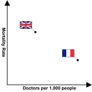
I was listening to a discussion with two medical practitioners on the radio today while driving home from work. I’ll remove the context of the diseases they were debating as the point I want to make is not specifically to do with this aspect and dropping it removes a degree of emotion from the conversation. The bone of contention between the two antagonists was the mortality rate from a certain set of diseases in the UK and whether this was to do with the competency of general practitioners (GPs, or “family doctors” for any US readers) and the diagnostic procedures they use, or to do with some other factor.
In defending her colleagues from the accusations of the first interviewee, the general practitioner said that the rate of mortality for sufferers of these diseases in other European countries (she specifically cited Belgium and France) was greater than in the UK. I should probably pause at this point to note that this comment seemed the complete opposite of every other European health survey I have read in recent years, but we will let that pass and instead focus on the second part of her argument. This was that that better diagnoses would be made if the UK hired more doctors (like her), thereby allowing them to spend more time with each patient. She backed up this assertion by then saying that France has many more doctors per 1,000 people than the UK (the figures I found were 3.7 per 1,000 for France and 2.2 per 1,000 for the UK; these were totally different to the figures she quoted, but again I’ll let that pass as she did seem to at least have the relation between the figures in each country the right way round this time).
What the GP seemed to be saying is summarised in the following chart:
I have no background in medicine, but to me the lady in question made the opposite point to the one she seemed to want to. If there are fewer doctors per capita in the UK than in France, but UK mortality rates are better, it might be more plausible to argue that less doctors implies better survival rates; this is what the above chart suggests. Of course this assertion is open to challenge and – as with most statistical phenomena – there are undoubtedly many other factors. There is also of course the old chestnut of correlation not implying causality (not that the above chart even establishes correlation). However, at the very least, the “facts” as presented did not seem to be a prima facie case for hiring more UK doctors.
Sadly for both the GP in question and for inhabitants of the UK, I think that the actual graph is more like:
This exhibit could perhaps suggest that the second doctor had a potential point, but such simplistic observations, much as we may love to make them, do not always stand up to rigorous statistical analysis. Statistical findings can be as counter-intuitive as many other mathematical results.
Speaking of statistics, when challenged on whether she had the relative mortality rates for France and the UK the right way round, the same GP said, “well you can prove anything with statistics.” We hear this phrase so often that I guess many of us come to believe it. In fact it might be more accurate to say, “selection bias is all pervasive”, or perhaps even “innumeracy will generally lead to erroneous conclusions being drawn.”
When physicians are happy to appear on national radio and exhibit what is at best a tenuous grasp of figures, one can but wonder about the risk of numerically-based medical decisions sometimes going awry. With doctors also increasingly involved in public affairs (either as expert advisers or – in the UK at least – often as members of parliament), perhaps these worries should also be extended into areas of policy making.
Even more fundamentally (but then as an ex-Mathematician I would say this), perhaps the UK needs to reassess how it teaches mathematics. Also maybe UK medical schools need to examine numeric proficiency again just before students graduate as well as many years earlier when candidates apply; just in case something in the process of producing new doctors has squeezed their previous mathematical ability out of them.
Before I begin to be seen as an opponent of the medical profession, I should close by asking a couple of questions that are perhaps closer to home for some readers. How many of the business decisions that are taken using information lovingly crafted by information professionals such as you and me are marred by an incomplete understanding of numbers on the part of [hopefully] a small subsection of users? As IT professionals, what should we be doing to minimise the likelihood of such an occurrence in our organisations?
A lot of human scientific and technological progress over the span of recorded history has been related to discerning patterns. People noticed that the Sun and Moon both had regular periodicity to their movements, leading to models that ultimately changed our view of our place in the Universe. The apparently wandering trails swept out by the planets were later regularised by the work of Johannes Kepler and Tycho Brahe; an outstanding example of a simple idea explaining more complex observations.
In general Mathematics has provided a framework for understanding the world around us; perhaps most elegantly (at least in work that is generally accessible to the non-professional) in Newton’s Laws of Motion (which explained why Kepler and Brahe’s models for planetary movement worked). The simple formulae employed by Newton seemed to offer a precise set of rules governing everything from the trajectory of an arrow to the orbits of the planets and indeed galaxies; a triumph for the application of Mathematics to the natural world and surely one of humankind’s greatest achievements.
For centuries it appeared that natural phenomena seemed to have simple principles underlying them, which were susceptible to description in the language of Mathematics. Sometimes (actually much more often than you might think) the Mathematics became complicated and precision was dropped in favour of – generally more than good enough – estimation; but philosophically Mathematics and the nature of things appeared to be inextricably interlinked. The Physicist and Nobel Laureate E.P. Wigner put this rather more eloquently:
The miracle of the appropriateness of the language of mathematics for the formulation of the laws of physics is a wonderful gift which we neither understand nor deserve.
In my youth I studied Group Theory, a branch of mathematics concerned with patterns and symmetry. The historical roots (no pun intended[1]) of Group Theory are in the solvability of polynomial equations, but the relation with symmetry emerged over time; revealing an important linkage between geometry and algebra. While Group Theory is a part of Pure Mathematics (supposedly studied for its own intrinsic worth, rather than any real-world applications), its applications are actually manifold. Just one example is that groups lie (again no pun intended[2]) at the heart of the Standard Model of Particle Physics.
However, two major challenges to this happy symbiosis between Mathematics and the Natural Sciences arose. One was an abrupt earthquake caused by Kurt Gödel in 1931. The other was more of a slowly rising flood, beginning in the 1880s with Henri Poincaré and (arguably) culminating with Ruelle, May and Yorke in 1977 (though with many other notables contributing both before and after 1977). The linkage between Mathematics and Science persists, but maybe some of the chains that form it have been weakened.
Potentially fallacious patterns
However, rather than this article becoming a dissertation on incompleteness theorems or (the rather misleadingly named) chaos theory, I wanted to return to something more visceral that probably underpins at least the beginnings of the long association of Mathematics and Science. Here I refer to people’s general view that things tend to behave the same way as they have in the past. As mentioned at the beginning of this article, the sun comes up each morning, the moon waxes and wanes each month, summer becomes autumn (fall) becomes winter becomes spring and so on. When you knock your coffee cup over it reliably falls to the ground and the contents spill everywhere. These observations about genuine patterns have served us well over the centuries.
It seems a very common human trait to look for patterns. Given the ubiquity of this, it is likely to have had some evolutionary benefit. Indeed patterns are often there and are often useful – there is indeed normally more traffic on the roads at 5pm on Fridays than on other days of the week. Government spending does (with the possible exception of current circumstances) generally go up in advance of an election. However such patterns may be less useful in other areas. While winter is generally colder than summer (in the Northern hemisphere), the average temperature and average rainfall in any given month varies a lot year-on-year. Nevertheless, even within this variability, we try to discern patterns to changes that occur in the weather.
We may come to the conclusion that winters are less severe than when we were younger and thus impute a trend in gradually moderating winters; perhaps punctuated by some years that don’t fit what we assume is an underlying curve. We may take rolling averages to try to iron out local “noise” in various phenomena such as stock prices. This technique relies on the assumption that things change gradually. If the average July temperature has increased by 2°C in the last 100 years, then it maybe makes sense to assume that it will increase by the same 2°C ±0.2°C in the next 100 years. Some of the work I described earlier has rigorously proved that a lot of these human precepts are untrue in many important fields, not least weather prediction. The phrase long-term forecast has been 100% shown to be an oxymoron. Many systems – even the simplest, even those which are apparently stable[3] – can change rapidly and unpredictably and weather is one of them.
For the avoidance of doubt I am not leaping into the general Climate Change debate here – except in the most general sense. Instead I am highlighting the often erroneous human tendency to believe that when things change they do so smoothly and predictably. That when a pattern shifts, it does so to something quite like the previous pattern. While this assumed smoothness is at the foundation of many of our most powerful models and techniques (for example the grand edifice of The Calculus), in many circumstances it is not a good fit for the choppiness seen in nature.
Obligatory topical section on volcanoes
The above observations about the occasionally illusory nature of patterns lead us to more current matters. I was recently reading an article about the Eyjafjallajokull eruption in The Economist. This is suffused with a search for patterns in the history of volcanic eruptions. Here are just a few examples:
Last time Eyjafjallajokull erupted, from late 1821 to early 1823, it also had quite viscous lava. But that does not mean it produced fine ash continuously all the time. The activity settled into a pattern of flaring up every now and then before dying back down to a grumble. If this eruption continues for a similar length of time, it would seem fair to expect something similar.
Previous eruptions of Eyjafjallajokull seem to have acted as harbingers of a subsequent Katla [a nearby volcano] eruptions.
[However] Only two or three […] of the 23 eruptions of Katla over historical times (which in Iceland means the past 1,200 years or so) have been preceded by eruptions of Eyjafjallajokull.
Katla does seem to erupt on a semi-regular basis, with typical periods between eruptions of between 30 and 80 years. The last eruption was in 1918, which makes the next overdue.
To be fair, The Economist did lace their piece with various caveats, for example the above-quoted “it would seem fair to expect”, but not all publications are so scrupulous. There is perhaps something comforting in all this numerology, maybe it gives us the illusion that we can make meaningful predictions about what a volcano will do next. Modern geologists have used a number of techniques to warn of imminent eruptions and these approaches have been successful and saved lives. However this is not the same thing as predicting that an eruption is likely in the next ten years solely because they normally occur every century and it is 90 years since the last one. Long-term forecasts of volcanic activity are as chimerical as long-term weather forecasts.
A little light analysis
Looking at another famous volcano, Vesuvius, I have put together the following simple chart.
The average period between eruptions is just shy of 14 years, but the pattern is anything but regular. If we expand our range a bit, we might ask how many eruptions occurred between 10 and 20 years after the previous one. The answer is just 9 of the 26[4], or about 35%. Even if we expand our range to periods of calm lasting between 5 and 25 years (so 10 years of leeway on either side), we only capture 77% of eruptions. The standard deviation of the periods between recorded eruptions is a whopping 12.5; eruptions of Vesuvius are not regular events.
One aspect of truly random distributions at first seems counterfactual, this is their lumpiness. It might seem reasonable to assume that a random set of events would lead to a nicely spaced out distribution; maybe not a set of evenly-spaced points, but a close approximation to one. In fact the opposite is generally true; random distributions will have clusters of events close to each other and large gaps between them.
The above exhibit (a non-wrapped version of which may be viewed by clicking on it) illustrates this point. It compares a set of pseudo-random numbers (the upper points) with a set of truly random numbers (the lower points)[5]. There are some gaps in the upper distribution, but none are large and the spread is pretty even. By contrast in the lower set there are many large gaps (some of the more major ones being tagged a, … ,h) and significant clumping[6]. Which of these two distributions more closely matches the eruptions of Vesuvius? What does this tell us about the predictability of its eruptions?
The predictive analytics angle
As always in closing I will bring these discussions back to a business focus. The above observations should give people involved in applying statistical techniques to make predictions about the future some pause for thought. Here I am not targeting the professional statistician; I assume such people will be more than aware of potential pitfalls and possess much greater depth of knowledge than myself about how to avoid them. However many users of numbers will not have this background and we are all genetically programmed to seek patterns, even where none may exist. Predictive analytics is a very useful tool when applied correctly and when its findings are presented as a potential range of outcomes, complete with associated probabilities. Unfortunately this is not always the case.
It is worth noting that many business events can be just as unpredictable as volcanic eruptions. Trying to foresee the future with too much precision is going to lead to disappointment; to say nothing of being engulfed by lava flows.
Explanatory notes
[1]
The solvability of polynomials is of course equivalent to whether or not roots of them exist.
[2]
Lie groups lie at the heart of quantum field theory – a interesting lexicographical symmetry in itself
[3]
Indeed it has been argued that non-linear systems are more robust in response to external stimuli than classical ones. The latter tend to respond to “jolts” in a smooth manner leading to a change in state. The former often will revert to their previous strange attractor. It has been postulated that evolution has taken advantage of this fact in demonstrably chaotic systems such as the human heart.
[4]
Here I include the – to date – 66 years since Vesuvius’ last eruption in 1944 and exclude the eruption in 1631 as there is no record of the preceding one.
[5]
For anyone interested, the upper set of numbers were generated using Excel’s RAND() function and the lower are successive triplets of the decimal expansion of pi, e.g. 141, 592, 653 etc.
[6]
Again for those interested the average gap in the upper set is 10.1 with a standard deviation of 4.3; the figures for the lower set are 9.7 and 9.6 respectively.
By way of [very necessary] explanation, this post is a response to an idea started on the blog of Curt Monash (@CurtMonash), doyen of software industry analysts. You can read the full article here. This is intended as an early April Fools celebration.
A summary:
[…] the Rules of the No-Fooling Meme are:
Rule 1: Post on your blog 1 or more surprisingly true things about you,* plus their explanations. I’m starting off with 10, but it’s OK to be a lot less wordy than I’m being. I suggest the following format:
A noteworthy capsule sentence. (Example: “I was not of mortal woman born.”)
A perfectly reasonable explanation. (Example: “I was untimely ripped from my mother’s womb. In modern parlance, she had a C-section.”)
Rule 2: Link back to this post. That explains what you’re doing.
Rule 3: Drop a link to your post into the comment thread. That will let people who check here know that you’ve contributed too.
Rule 4: Ping 1 or more other people encouraging them to join in the meme with posts of their own.
*If you want to relax the “about you” part, that’s fine too.
I won’t be as dramatic as Curt, nor will I drop any names (they have been changed to protect the guilty). I also think that my list is closer to a “things you didn’t know about me” than Curt’s original intention, but hopefully it is in the spirit of his original post. I have relaxed the “about me” part for one fact as well, but claim extenuating circumstances.
My “no-fooling” facts are, in (broadly) reverse chronological order:
I have recently corrected a Physics paper in Science – and please bear in mind that I was a Mathematician not a Physicist; I’m not linking to the paper as the error was Science’s fault not the scientists’ and the lead author was very nice about it.
My partner is shortly going to be working with one of last year’s Nobel Laureates at one of the world’s premier research institues – I’m proud, so sue me!
My partner, my eldest son and I have all attended (or are attending) the same University – though separated by over 20 years.
The same University awarded me 120% in my MSc. Number Theory exam – the irony of this appeals to me to this day; I was taught Number Theory by a Fields Medalist; by way of contrast, I got a gamma minus in second year Applied Mathematics.
Not only did I used to own a fan-site for a computer game character, I co-administered a universal bulletin board (yes I am that old) dedicated to the same character – even more amazingly, there were female members!
As far as I can tell, my code is still part of the core of software that is used rather widely in the UK and elsewhere – though I suspect that a high percentage of it has succumbed to evolutionary pressures.
I have recorded an eagle playing golf – despite not being very good at it and not playing at all now.
I have played cricket against the national teams of both Zimbabwe (in less traumatic times) and the Netherlands – Under 15s and Under 19s respectively; I have also played both with and against an England cricketer and against a West Indies cricketer (who also got me out), but I said that I wasn’t going to name drop.
[Unlike Curt] I only competed in one chess tournament – I came fourth, but only after being threatened with expulsion over an argument to do with whether I had let go of a bishop for a nanosecond; I think I was 11 at the time.
At least allegedly, one of my antecedents was one of the last hangmen in England – I’m not sure how you would go about substantiating this fact as they were meant to be sworn to secrecy; equally I’m not sure that I would want to substantiate it.
And a bonus fact (which could also be seen as oneupmanship vis à vis Curt):
One of the articles that I wrote for the UK climbing press has had substantially more unique views than any of my business-related articles on here (save for the home page itself) – sad, but true, if you don’t believe me, the proof is here.
Standard note: You need to be a member of both LinkedIn.com and the group mentioned to view the discussions.
Introduction
Here are a couple of sections from the original poster’s starting comments:
I’ve been thinking: is one version of the truth attainable or is it a bit of snake oil? Is it a helpful concept that powerfully communicates a way out of spreadmart purgatory? Or does the idea of one version of the truth gloss over the fact that context or point of view are an inherent part of any statement about data, which effectively makes truth relative? I’m leaning toward the latter position.
[…]
There can only be one version of the truth if everyone speaks the same language and has a common point of view. I’m not sure this is attainable. To the extent that it is, it’s definitely not a technology exercise. It’s organizational change management. It’s about changing the culture of an organization and potentially breaking down longstanding barriers.
Please join the group if you would like to read the whole post and the subsequent discussions, which were very lively. Here I am only going to refer to these tangentially and instead focus on the concept of a single version of the truth itself.
Readers who are not interested in the ellipitcal section of this article and who would instead like to cut to the chase are invited to click here (warning there are still some ellipses in the latter sections).
A [very] brief and occasionally accurate history of truth
I have discovered a truly marvellous proof of the nature of truth, which this column is too narrow to contain.
— Pierre de Tomas (1637)
Instead of trying to rediscover M. Tomas’ proof, I’ll simply catalogue some of the disciplines that have been associated (rightly or wrongly) with trying to grapple with the area:
Various branches of Philosophy, including:
Metaphysics
Epistemology
Ethics
Logic
History
Religion (or more perhaps more generally spirituality)
Natural Science
Mathematics
and of course Polygraphism
Given my background in Pure Mathematics the reader might expect me to trumpet the claims of this discipline to be the sole arbiter of truth; I would reply yes and no. Mathematics does indeed deal in absolute truth, but only of the type: if we assume A and B, it then follows that C is true. This is known as the axiomatic approach. Mathematics makes no claim for the veracity of axioms themselves (though clearly many axioms would be regarded as self-evidently true to the non-professional). I will also manfully resist the temptation to refer to the wrecking ball that Kurt Gödel’s took to axiomatic systems in 1931.
I have also made reference (admittedly often rather obliquely) to various branches of science on this blog, so perhaps this is another place to search for truth. However the Physical sciences do not really deal in anything as absolute as truth. Instead they develop models that approximate observations, these are called scientific theories. A good theory will both explain aspects of currently observed phenomena and offer predictions for yet-to-be-observed behaviour (what use is a model if it doesn’t tell us things that we don’t already know?). In this way scientific theories are rather like Business Analytics.
Unlike mathematical theories, the scientific versions are rather resistant to proof. Somewhat unfairly, while a mountain of experiments that are consistent with a scientific theory do not prove it, it takes only one incompatible data point to disprove it. When such an inconvenient fact rears its head, the theory will need to be revised to accommodate the new data, or entirely discarded and replaced by a new theory. This is of course an iterative process and precisely how our scientific learning increases. Warning bells generally start to ring when a scientist starts to talk about their theory being true, as opposed to a useful tool. The same observation could be made of those who begin to view their Business Analytics models as being true, but that is perhaps a story for another time.
I am going to come back to Physical science (or more specifically Physics) a little later, but for now let’s agree that this area is not going to result in defining truth either. Some people would argue that truth is the preserve of one of the other subjects listed above, either Philosophy or Religion. I’m not going to get into a debate on the merits of either of these views, but I will state that perhaps the latter is more concerned with personal truth than supra-individual truth (otherwise why do so many religious people disagree with each other?).
Discussing religion on a blog is also a certain way to start a fire, so I’ll move quickly on. I’m a little more relaxed about criticising some aspects of Philosophy; to me this can all too easily descend into solipism (sometimes even quicker than artificial intelligence and cognitive science do). Although Philosophy could be described as the search for truth, I’m not convinced that this is the same as finding it. Maybe truth itself doesn’t really exist, so attempting to create a single version of it is doomed to failure. However, perhaps there is hope.
After the preceding divertimento, it is time to return to the more prosaic world of Business Intelligence. However there is first room for the promised reference to Physics. For me, the phrase “a single version of the truth” always has echoes of the search for a Grand Unified Theory (GUT). Analogous to our discussions about truth, there are some (minor) definitional issues with GUT as well.
Some hold that GUT applies to a unification of the electromagnetic, weak nuclear and strong nuclear forces at very high energy levels (the first two having already been paired in the electroweak force). Others that GUT refers to a merging of the particles and forces covered by the Standard Model of Quantum Mechanics (which works well for the very small) with General Relativity (which works well for the very big). People in the first camp might refer to this second unification as a ToE (Theory of Everything), but there is sometimes a limit to how much Douglas Adams’ esteemed work applies to reality.
For the purposes of this article, I’ll perform the standard scientific trick of a simplifying assumption and use GUT in the grander sense of the term.
Scientists have striven to find a GUT for decades, if not centuries, and several candidates have been proposed. GUT has proved to be something of a Holy Grail for Physicists. Work in this area, while not as yet having been successful (at least at the time of writing), has undeniably helped to shed a light on many other areas where our understanding was previously rather dim.
This is where the connection with a single version of the truth comes in. Not so much that either concept is guaranteed to be achievable, but that a lot of good and useful things can be accomplished on a journey towards both of them. If, in a given organisation, the journey to a single version of the truth reaches its ultimate destination, then great. However if, in an another company, a single version of the truth remains eternally just over the next hill, or round the next corner, then this is hardly disastrous and maybe it is the journey itself (and the aspirations with which it is commenced on) that matters more than the destination.
Before I begin to sound too philosophical (cf. above) let me try to make this more concrete by going back to our starting point with some Mathematics and considering some Venn diagrams.
Ordo ab chao
In my experience the following is the type of situation that a good Business Intelligence programme should address:
The problems here are manifold:
Although the various report systems are shown as separate, the real situation is probably much worse. Each of the reporting and analysis systems will overlap, perhaps substantially, with one or more or the other ones. Indeed the overlapping may be so convoluted that it would be difficult to represent this in two dimensions and I am not going to try. This means that you can invariably ask the same question (how much have we sold this month) of different systems and get different answers. It may be difficult to tell which of these is correct, indeed none of them may be a true reflection of business reality.
There are a whole set of things that may be treated differently in the different ellipses. I’ll mention just two for now: date and currency. In one system a transaction may be recorded in a month when it is entered into the system. In another it may be allocated to the month when the event actually occurred (sometimes quite a while before it is entered). In a third perhaps the transaction is only dated once it has been authorised by a supervisor.
In a multi-currency environment reports may be in the transactional currency, rolled-up to the currency of the country in which they occurred, or perhaps aggregated across many countries in a number of “corporate” currencies. Which rate to use (rate on the day, average for the month, rolling average for the last year, a rate tied to some earlier business transaction etc.) may be different in different systems, equally the rate may well vary according to the date of the transaction (making the last set of comments about which date is used even more pertinent).
A whole set of other issues arise when you begin to consider things such as taxation (are figures nett or gross), discounts, commissions to other parties, phased transactions and financial estimates. Some reports may totally ignore these, others my take account of some but not others. A mist of misunderstanding is likely to arise.
Something that is not drawn on the above diagram is the flow of data between systems. Typically there will be a spaghetti-like flow of bits and bytes between the different areas. What is also not that uncommon is that there is both bifurcation and merging in these flows. For example, some sorts of transactions from Business Unit A may end up in the Marketing database, whereas others do not. Perhaps transactions carried out on behalf of another company in the group appear in Business Unit B’s reports, but must be excluded from the local P&L. The combinations are almost limitless.
Interfaces can also do interesting things to data, re-labelling it, correcting (or so their authors hope) errors in source data and generally twisting the input to form output that may be radically different. Also, when interfaces are anything other than real-time, they introduce a whole new arena in which dates can get muddled. For instance, what if a business transaction occurred in a front-end system on the last day of a year, but was not interfaced to a corporate database until the first day of the next one – which year does it get allocated to in the two places?
Finally, the above says nothing about the costs (staff and software) of maintaining a heterogeneous reporting landscape; or indeed the costs of wasted time arguing about which numbers are right, or attempting to perform tortuous (and ultimately fruitless) reconciliations.
Now the ideal situation is that we move to the following diagram:
This looks all very nice and tidy, but there are still two major problems.
A full realisation of this transformation may be prohibitively expensive, or time-consuming.
Having brought everything together into one place offers an opportunity to standardise terminology and to eliminate the confusion caused by redundancy. However, it doesn’t per se address the other points made from 2. onwards above.
The need to focus on what is possible in a reasonable time-frame and at a reasonable cost may lead to a more pragmatic approach where the number of reporting and analysis systems is reduced, but to a number greater than one. Good project management may indeed dictate a rolling programme of consolidation, with opportunities to review what has worked and what has not and to ascertain whether business value is indeed being generated by the programme.
Nevertheless, I would argue that it is beneficial to envisage a final state for the information architecture, even if there is a tacit acceptance that this may not be realised for years, if at all. Such a framework helps to guide work in a way that making it up as we go along does not. I cover this area in more detail in both Holistic vs Incremental approaches to BI and Tactical Meandering for those who are interested.
It is also inevitable that even in a single BI system data will need to be presented in different ways for different purposes. To take just one example, if you goal is to see how the make up of a book of business has varied over time, then it is eminently sensible to use a current exchange rate for all transactions; thereby removing any skewing of the figures caused by forex fluctuations. This is particularly the case when trying to assess the profitability of business where revenue occurs at a discrete point in the past, but costs may be spread out over time.
However, if it is necessary to look at how the organisation’s cash-flow is changing over time, then the impact of fluctuations in foreign exchange rates must be taken into account. Sadly if an American company wants to report how much revenue it has from its French subsidiary then the figures must reflect real-life euro / dollar rates (unrealised and realised foreign currency gains and losses notwithstanding).
What is important here is labelling. Ideally each report should show the assumptions under which it has been compiled at the top. This would include the exchange rate strategy used, the method by which transactions are allocated to dates, whether figures are nett or gross and which transactions (if any) have been excluded. Under this approach, while it is inevitable that the totals on some reports will not agree, at least the reports themselves will explain why this is the case.
So this is my take on a single version of the truth. It is both a) an aspirational description of the ideal situation and something that is worth striving for and b) a convenient marketing term – a sound-bite if you will – that presents a palatable way of describing a complex set of concepts. I tried to capture this essence in my reply to the LinkedIn.com thread, which was as follows:
To me, the (extremely hackneyed) phrase “a single version of the truth” means a few things:
One place to go to run reports and perform analysis (as opposed to several different, unreconciled, overlapping systems and local spreadsheets / Access DBs)
When something, say “growth” appears on a report, cube, or dashboard, it is always calculated the same way and means the same thing (e.g. if you have growth in dollar terms and growth excluding the impact of currency fluctuations, then these are two measures and should be clearly tagged as such).
More importantly, that the organisation buys into there being just one set of figures that will be used and self-polices attempts to subvert this with roll-your-own data.
Of course none of this equates to anything to do with truth in the normal sense of the word. However life is full of imprecise terminology, which nevertheless manages to convey meaning better than overly precise alternatives.
More’s Utopia was never intended to depict a realistic place or system of government. These facts have not stopped generations of thinkers and doers from aspiring to make the world a better place, while realising that the ultimate goal may remain out of reach. In my opinion neither should the unlikelihood of achieving a perfect single version of the truth deter Business Intelligence professionals from aspiring to this Utopian vision.
I have come pretty close to achieving a single version of the truth in a large, complex organisation. Pretty close is not 100%, but in Business Intelligence anything above 80% is certainly more than worth the effort.


 EAB = tan-1(2/5) ≈ 21.8°


![First published in September 1843 to take part in 'a severe contest between intelligence, which presses forward, and an unworthy, timid ignorance obstructing our progress' [nice use of the Oxford / Harvard comma BTW]](https://peterjamesthomas.com/wp-content/uploads/2010/03/the-economist.jpg?w=700 "First published in September 1843 to take part in 'a severe contest between intelligence, which presses forward, and an unworthy, timid ignorance obstructing our progress' [nice use of the Oxford / Harvard comma BTW]")


