Measuring the benefits of Business Intelligence

This post is based on some comments that I made on an article by Dorothy Miller at IT Business Edge. The title of Dorothy’s piece is Measuring the Return on Investment for Business Intelligence.
 
 
Introduction

Yes I am British!

In a nutshell, good BI is all about users taking better business decisions. There are other benefits, some of which I allude to in this article, but nothing outweighs the potentially massive impact of taking better decisions.

While you would think that this is a very positive scenario for BI projects, there is a fly in the ointment. BI doesn’t let users take better business decisions, only good BI does that. Which begs the question: how do you tell how good you BI is and whether it is providing the promised benefits? This difficult area is the subject of this short article.
 
 
Measuring BI payback directly

All of the various different ways of measuring return on investment, from the simplest to the most sophisticated, compare the amount of money you spend to the amount of money you gain. Establishing the first parameter for this equation should be relatively simple, determining the second one is anything but straightforward.

In its purest form, the observation that taking better decisions should result in increased profits is entirely sound. If a BI project is targeting areas at the core of a company’s business (and why would you be investing in BI if this is not the case) then there should be a positive impact on profitability. This might be through increased sales or other income (assuming that these are at a profitable price), through increased margins on sales, reduced expenses, or a combination of all three. Of course the ways that good BI can contribute to each of these areas are manifold, but each will come down essentially to one of these three things.

The problem is that many other externalities can impact each of these areas. Some industries are cyclical, the impact of competitors will vary over time, demand for products will be different at different times, the business mix will not stay constant, markets can appear and disappear very quickly sometimes. Also, often the impact of better business decisions will not be realised until some future date; this year’s decisions may impact next year’s profits, or a strategic investment decision may not bear fruit for many years. While good BI will help you to make sense of these trends, at the same time it is difficult to disentangle the impact of BI on results from them.

However, sometimes it is possible to discern the direct impact of BI and I will offer a few examples:

1. Improvements in what BI is measuring

Suppose an element of your BI system tracks the number of sales leads that an organisation has against the number of orders placed. Being able to slice and dice such numbers by territory, product, marketing campaign, channel, customer segment, customer and so on is valuable in managing the sales process. However the trending capabilities of BI will also allow you to compare before and after. If the BI tool is truly being effective, then it should be possible to show that proportion of orders to leads is greater after its implementation than before it. In fact there should be a steady upward curve post-implementation as the system beds in and also as users find more creative ways to employ the information it gathers. If this is not the case, then something is wrong.

2. What if analyses

Supposing that the BI system aims to better manage the portfolio of a business; i.e. the balance of products and/or services that it sells. Again the historical aspect of BI can help us to consider its impact. Consider the simplified example of an organisation that has just three products: A, B and C, with each making up a third of sales. A good BI system will be able to calculate profitability for each product. Inevitably, shifts in market conditions will cause these profitabilities to change over time. Our example company might react to an increase in the profitability of product A in such a way that its portfolio becomes A (50%), B (25%), C (25%) – the assumption here is that the information available in their BI system is the main catalyst for change. What is important again is that the BI system holds historical information. This should allow a what if calculation to be performed; in this case, what if the mix of products had been left at 33%/33%/33%? The difference between calculated profitability under this scenario and actual profitability is one measure of the impact of good BI.

[It is interesting to note that this approach can also be used to support the case for BI projects. One technique that I have successfully employed is to look at an organisation’s results over a five-year period, use the first three years to develop a simple hypothesis for decision making (e.g. we should sell a product if it meets a set of criteria and not otherwise) and then use the last two to validate this. This type of study says something like: if we had had better information in the past, we would have taken different decisions with the following – hopefully positive – results. To make this a little clearer, the study I carried out showed that greater availability of even very basic BI would have led to profit margins doubling. I will cover this approach in more detail in a forthcoming article.]

3. Measurable productivity increases

Aside from enabling better decisions to be taken, good BI can save people time and effort, thereby increasing productivity. It is possible to measure such things. By both general survey and a specific analysis of tasks carried out, I was able to demonstrate that pre-BI implementation it could take 5-7 days to assemble all the information needed for a key account review. Post-BI implementation, this became a matter of minutes. Care should be taken in scaling-up these figures to overall time saved, but such studies can give a good indication of increased productivity and, if accompanied by some conservative cost estimates, can be presented in terms of actual monetary impact.

4. Direct comparison of profitability

In some companies and markets it may be possible to directly measure changes in profitability relating to the use of BI. Alternatively, it may be possible to adjust results to remove the impact of some external issues (e.g. where there is publicly available information about overall trends in the market). Sometimes the relationship between the implementation of good BI and corporate results will be so striking, that there will be no argument about their correlation. This is a situation that I have experienced myself.
 
 
Measuring BI payback via proxies

Notwithstanding the above points, the most likely scenario is that it will be challenging to discern the precise impact of a BI project. Given this, instead of giving up, it is important to consider any available proxies. Some of these are discussed in this section, all rest upon the assumption that business people are rational and will only use systems that add value, making their work easier or improving decision-making.

Many of these proxies are self-evident, so I won’t offer too much commentary on them.

5. User adoption

How many people use the system and do more people want to use it? How do these numbers change over time? What is penetration like in different areas of the organisation?

6. Actual usage

Of course this relates to the previous point as well, but directly measuring usage and even using your BI tool to analyse how this changes over time is important. If there is a correlation between how much a part of the organisation uses the system and how good its results are, so much the better.

7. User retention

Of the people who are given access to the system and trained in its use, how many go on to become regular users? How does this change over time?

8. Demand for enhancements / extension to the system

If you have people wanting the system to do more, then they must be happy with how it is working in general terms.

9. Feedback from surveys

It always helps to get feedback on what you are doing. Excerpts from one such survey appear here.

10. Do business users mention the system in meetings?

When presenting figures to senior management, is the source quoted as a matter of course (hopefully to establish that the figures are reliable)?
 
 
Summary

This article has argued that establishing the benefits of BI can be difficult, but that it is by no means impossible. There are a range of techniques available to either directly or indirectly assess its impact. Of course there are probably other creative ways to do this that other organisations are employing and which I have not mentioned.

Business Intelligence practitioners should pay especial attention to this area, it is an opportunity to demonstrate that the yields from BI projects can be substantial. In fact, it is my opinion that in many industries no other type of IT project will have greater payback than BI. It should be a priority for those who tout the benefits of BI to show that there is real substance behind these claims. My experience suggests that it is definitely worth taking the time and effort to prove this convincingly.



“All that glisters is not gold” – some thoughts on dashboards

Fool's gold

Yesterday I was tweeting quotes from Poe and blogging lines attributed to Heraclitus. Today I’m moving on to Shakespeare. Kudos to anyone posting a comment pointing out the second quote that appears later in the text.
 
 
Introduction

Dashboards are all the rage at present. The basic idea is that they provide a way to quickly see what is happening, without getting lost in a sea of numbers. There are lots of different technologies out there that can help with dashboards. These range from parts of the product suites of all the main BI vendors, through boutique products dedicated to the area, all the way to simply using Java to write your own.

A lot of effort needs to go into how a dashboard is presented. The information really does need to leap off the screen, it is important that it looks professional. People are used to seeing well-designed sites on the web and if your corporate dashboard looks like it is only one step removed from Excel charts, you may have a problem. While engaging a design firm to help craft a dashboard might be overkill, it helps to get some graphic design input. I have been lucky enough over the years to have had people on my teams with experience in this area. They have mostly been hobbyists, but they had enough flair and enough of an aesthetic taste to make a difference.

However, echoing my comments on BI tools in general, I think an attractive looking dashboard is really only the icing on the cake. The cake itself has two main other ingredients:

  1. The actual figures that it presents (and how well they have been chosen) and
  2. The Information Architecture that underpins them

I’ll now consider the importance of these two areas.
 
 
Choosing the KPIs

Filtering out the KPIs

The acronym KPI is bandied about with enormous vigour in the BI community. Sometimes what the ‘K’ stands for can get a bit lost in the cacophony. Stepping back from dashboards for a few minutes, I want to focus on the measures that you have in your general business intelligence applications such as analysis cubes. Things like: sales revenue, units sold, growth, head count, profit and so on.

[Note: If you don’t like BI buzzwords, please feel free to read “figures”, or “numbers” where ever you see “measures”. I may attempt to provide my own definitions of some of these terms in the future as the Wikipedia entries aren’t always that illuminating.]

When you have built a Data Mart for a particular subject area and are looking to develop one or more cubes based on this, you may well have a myriad of measures to select from. In some of the earliest prototype cubes that my teams built, we made the mistake of having too many measures. The same observation equally applied to the number of dimensions (things that you want to slice and dice the measures by, e.g. geography, line of business, product, customer etc.). Having too many measures and dimensions led to a cube that was cumbersome, difficult to navigate and where the business purpose was less that crystal clear. These are all cardinal sins, but the last is the worst as I have referred to elsewhere. The clear objective is to cut down on both the figures and the business attributes that you want to look at them by. We set a rule (which we did break a couple of times for specialist applications) of generally having no more than ten measures and ten dimensions in a cube and ideally having less.

Well this all sounds great, the problem – and the reason for this diversion away from dashboards – is which measures do you keep and which do you drop. Here there is no real alternative to lots of discussions with business partners, building multiple prototypes to test out different combinations and, ultimately, accepting that you might make some mis-steps in your first release and need to revisit the area after it has been “shaken down” by real business use. I won’t delve into this particular process any deeper now. Suffice it to say that choosing which measures to include in a cube it is both an area that is important to get right and one in which it is all to easy to make mistakes.

So, retuning to our main discussion, if picking measures at the level of an analysis cube is hard, just how hard is it to pick KPIs for a dashboard. I recall a conversation with the CEO of a large organisation in which he basically told me to just pick the six most important figure and put them on a dashboard (with the clear implication that sooner would be rather better than later). After I had explained that the view of the CEO in this area was of paramount importance and that his input on which figures to use would be very valuable, we began to talk about what should be in and what should be out. After a period of going round in circles, I at least managed to convey the fact that this was not a trivial decision.

What you want with the KPIs on a dashboard is that they are genuinely key and that you can actually tell something from graphing them. The exercise in determining which figures to use and how to present them was a lengthy one, but very worthwhile. You need to rigorously apply the “so what?” test – what action will people take based on the trends and indicators that are presented to them. In the end we went for simplicity, with a focus on growth.

There was a map showing how each country was doing against plan; colour-coded red, amber and green according to their results. There were graphs comparing revenue to budget by month and the cumulative position and there was a break-down by business unit. The only to elements of interaction were to filter for a region or country and a business unit or line of business. Any further analysis required pulling up an underlying cube (actually we integrated the cube with the dashboard so that context was maintained moving from one to the other – this was not so easy as the dashboard and cube tools, while from the same vendor, were on two different major release numbers).

There were many iterations of the dashboard, but the one we eventually went live with received general acclaim. I’m not sure what we could have done differently to shorten the process.
 
 
Where does the data come from?

A dashboard without an underlying Information Architecture

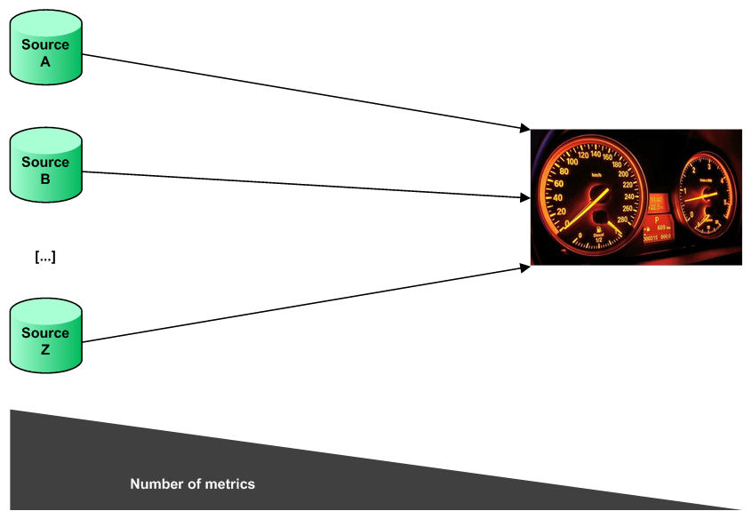
The same range of dashboard tools that I mention in the introduction are of course mostly capable of sourcing their data from pretty much anywhere. If the goal is to build a dashboard, then maybe it is tempting to do this as quickly as possible, based on whatever data sources are to hand (as in the diagram above). This is probably the quickest way to produce a dashboard, but it is unlikely to produce something that is used much, tells people anything useful, or adds any value. Why do I say this?

Well the problem with this approach is that all you are doing is reflecting what is likely to be a somewhat fragmented (and maybe even chaotic) set of information tools. Out of your sources, is there a unique place to go to get a definitive value for measure A? Do the various different sources hold data in the same way and calculate values using the same formulae? Do sources overlap (either duplicating data, or function), if so, which ones do you use? Do different sources get refreshed with the same frequency and do they treat currency the same way? Are customers and products defined consistently everywhere?

A dashboad underpinned by a proper Information Architecture

Leaving issues like these unresolved is a sure way to perpetuate a poor state of information. They are best addressed by establishing a wider information architecture (a simplified diagram of which appears above). I am not going to go into all of the benefits of such an approach, if readers would like more information, then please browse through the rest of this blog and the links to other resources that it contains (maybe this post would be a good place to start). What I will state is that a dashboard will only add value if it is part of an overall consistent approach to information, something that best practice indicates requires an Information Architecture. Anything else is simply going to be a pretty picture, signifying nothing.
 
 
Summary

So my advice to those seeking to build their first dashboard has three parts. First of all, keep it simple and identify a small group of measures and dimensions, which are highly pertinent to the core of the business and susceptible to graphical presentation. Second, dashboards are not a short-cut to management information Nirvana, they only really work when they are the final layer in a proper approach to information that spans all areas of the organisation. Finally, and partly driven by the first two observations, if you are in charge of building a dashboard, make sure that the plans you draw up reflect the complexity of the task and that you manage expectations accordingly.
 

The confluence of BI and change management

y =x^3 + 2x^2 - x + 1

The tag-line of this blog brings together business intelligence and cultural transformation. While one driver for this is that I have led BI projects that had explicit goals of cultural transformation, I think that there is a deeper connection to be explored here.

In other articles (notably “Can You Really Manage What You Measure?” by Neil Raden and Actionable Information), I discuss my experience that BI only adds value if:

  1. The information it provides answers pertinent business questions, and
  2. The answers to these questions lead to people taking action.

This means that any successful BI implementation has to consider such messy and difficult things as changing how people behave. This is where the link with change management arises.

Now of course you can argue that change management is an indispensible discipline for any business project (my strong opinion is that any IT project is a type of business project) and this is clearly true. However the parameters within which a new transaction processing system has to operate are different. Here if a person does not use the system, then work does not get done. Either it is impossible to carry out your job without the system (maybe only the system generates the necessary documentation), or not using the system to record transactions is a breech in compliance (keeping paper copies in your drawer).

BI systems are not like this. People chose to use them because they judge that they either make their business life easier, or they help to improve their decision-making (hopefully both). If someone doesn’t want to use a BI system, then they won’t and can probably get on with other parts of their job. The reason that change management is even more important in BI projects is that the element of compliance (or even coercion) is absent. If you want people to use the system and behave differently as a result, then you need to think about how best to influence them in these directions.

I have written elsewhere about the importance of marketing, education and follow-up in these areas. It also is important to explicitly recognise that a BI practitioner needs to be fully engaged in change management if they are to be successful.

A final thought also worth considering is that, as the BI industry matures and focus turns more to making it work in a business context than the latest flashy dashboard technology, it is likely that one of the things that will differentiate the best users of BI is how well they manage the necessary and desirable change that it drives.

πυρὸς θάνατος ἀέρι γένεσις, καὶ ἀέρος θάνατος ὕδατι γένεσις


A list of potential DW/BI pitfalls – by someone who has clearly been there

pitfall

Browsing through my WordPress Tag Surfer today (a really nice feature by the way), I came across an interesting list of problems that can occur in a data warehousing / business intelligence project, together with suggestions for managing these. A link appears below:

Eight Reasons why Data Warehouse and, subsequently, Business Intelligence efforts fail

The author, Raphael Klebanov, has clearly lived the data warehousing process and a lot of what he says chimes closely with my own experience.

Some of his themes around business engagement, the alignment of BI delivery with business needs and the importance of education are echoed throughout my own writing. This article is definitely worth a read in my opinion.


Yes I know the illustraion ages me.
 

Sustaining Cultural Change

This article is the final one in a trilogy focussed on enacting change. The previous instalments were as follows:

  1. Marketing Change
  2. Education and cultural transformation.

The first two pieces covered generating enthusiasm for change in advance of enacting it and then the role that professional training has in repositioning behaviours. I left off with the first training event having been a success. I will pick up the story from this point and seek to answer the question: how do you sustain initial success over the medium term?

Before starting to discuss some approaches that worked for me in this area, I should remind readers of the context. This was delivering a new BI system in a European insurance organisation with the explicit aim of enacting a cultural transformation; in this case making top-quality management information part of the corporate DNA.
 
 
Introduction

flying-buttress-h200

It is part of human nature to sometimes rest on your laurels. Having worked hard to make sure than something goes well, it is tempting to sit back and admire what you have done. Unfortunately gains are not always permanent and indeed may be quickly eroded. It is a useful to recall the adage that you are only as good as your last performance. As in a sporting contest, when you have made a good start, it is then the time to press home your advantage.

After our first successful training session, we had several other waves of training for our first report family – in fact we trained over 300 people in this first activity, 150 more than we had anticipated, such was the demand that we had generated and the positive feedback from people who had attended. But at this stage we had only won the first battle, the outcome of the war remained in the balance. We had made a good start, but it was important that the team realised that there was still a lot of work to be done. In this final article I want to talk about some of the ways in which we sustained our focus on the system and managed to embed its use in day-to-day activities.
 
 
Using new functionality to reinforce training

By the time the training team had come to the end of its first phase, the development team had produced its second report family. This was aimed at a slightly narrower group of people, so training was a less extensive task. Also we were showing new BI functionality to people who were already users, or at least had attended the training. The training for the second release was just a half day, but we asked people to book out a whole day. The extra time was spent in attending either a refresher course (for people who had not been confident enough to use the system much after initial training) or a master-class (for those who had taken to it like a duck to water). We also offered these two options to people who were not recipients of the second report family.

Inevitably there were initially some people who were not 100% converts to the new system at first; crucially less than half of users fell into this category. Over time both the enthusiasm of their peers and the fact that early adopters could present information that was not generally available at internal and external meetings began to exert pressure on even the most sceptical of people.
 
 
Travelling to the users

With later report families, which were again aimed at the mass market, we change our approach and travelled to give training in different countries. This helped to tailor our training to local needs and prevented anyone becoming isolated by language issues. Again when we travelled we would go for two days and have two half-day formal classes. The other half days were taken up with refresher courses, master classes or – something that started to become more and more requested – one-on-one sessions. These are in many ways ideal as the user can go at their own pace and focus can be on compiling and saving reports that are directly pertinent to them – classroom work has of its very nature to be more general.

Sadly we did not have unlimited funds to travel round Europe, so these one-on-one sessions morphed into using the telephone and network facilities with the trainer “taking over” the PC of the delegate to work together. This approach has also been very successful on our Help Desk.
 
 
The importance of the Help Desk

Speaking of the Help Desk – because the BU systems was very business-focussed people tended to raise business-focussed questions (as opposed to “when I click on this button, the system locks up”). This meant that the Help Desk needed to understand both the technology and the business and we used our business analysts and trainers to staff it – this is high-end resource to apply, but they were just as proud of the system as the extended team and wanted to help people to get the best of it.
 
 
Summary

So, we were relentless. We didn’t really ever lower the intensity we had established when launching the system; business adoption and retention both reflected this. Even once our cultural change had been mostly achieved and BI had become as much part of everyday life as the ‘phone or e-mail, the team continued to put just as much effort into new releases. The contributions of professional training and a business-focussed Help Desk functions were both indispensable in sustaining our success.
 

Thoughts on BI in the economic crisis from Finance Week

finance-week-manley

Another contribution to the debate about how BI will fare in the current economic climate. The article is by Julia Manley and appears on Finance Week. In particular, Julia has some valuable advice on “Selling BI to the board”


Julia Manley is head of sales and marketing at Phocas. Phocas specialises in business intellignece software and can be found here.
 

A common-sense approach to BI from Information Management

information-management

I am not sure whether it is the economic crisis focusing minds, or if there has been a turning point in the maturity of BI, but there seem to have been quite a few common-sense articles about the area recently. One I have just read is by Fei Luo at Information Management. The article may be read here.

Much of what Fei has to say chimes with my own experience of successfully driving change using BI in organisations. In particular, the observations about business involvement, having a strategy, regular business communication and the importance of training are all well-made. I would go even further saying that good BI projects must have a proper business / IT partnership at their centre; one that goes beyond business involvement and becomes business commitment.

My further thoughts about some of the themes raised by Fei Luo’s article can be viewed in the following blog posts:

Business involvement:
Having a strategy:
Business communication:
The importance of training:

I was pleased to see these areas being drawn together in a single, cogent article.


Fei Luo is vice president of information services at City National Bank, a public bank headquartered in California. Fei Luo can be reached at Fei.Luo@cnb.com.
 

Ed Sperling highlights the importance of the CIO understanding the business

forbes-sperlin

I was interested to read an article by Ed Sperling at Forbes.com. In this Ed states that:

In order to understand the flow of information, CIOs need to be intimately familiar with the direction of the business. This way, they can automate pieces of that business where it will do the most good. That can’t be done without a good understanding of how information moves through an organization, and the movement of information can’t be fully understood without understanding the business units.

It will come as no surprise to anyone who has read my earlier article about spurious distinctions between business and IT (Business is from Mars and IT is from Venus) that I strongly endorse this sentiment. Maybe the fact that mainstream commentators are talking about IT in business terms is indicative of IT beginning to come of age.


Ed Sperling is editor in chief of System-Level Design; and a contributing writer at Forbes.com.
 

Developing an international BI strategy

linkedin Business Intelligence Professionals

Introduction

I am again indebted to a question raised on the LinkedIn.com Business Intelligence Professionals group for this article. The specific thread may be viewed here and the question was the beguilingly simple “How to understand BI requirements in an organisation?”
 
 
Background

The span of my International responsibilities
The span of my international responsibilities

I have previously written about some aspects of successfully achieving this in a European environment, but thought that it would be interesting to add my thoughts about doing the same thing more recently on a wider international scale.

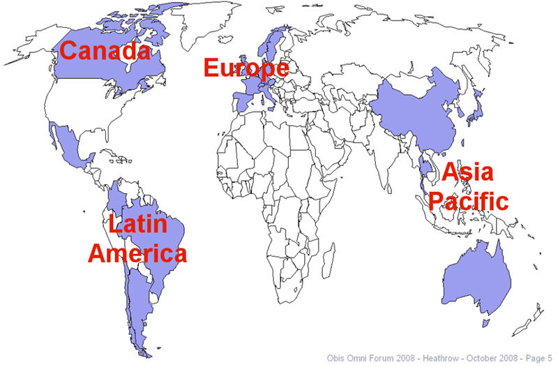
[A note here, in common with many US-based companies, “international” means all non-US markets; in my case: Asia Pacific, Europe, Canada and Latin America. By way of contrast “global” means international plus the US domestic market, i.e. all operations.]

By way of providing some context, in previous years I had successfully built and deployed an Information Architecture for the European operations of a multinational Insurance organisation and extended components of this to our Latin American subsidiaries. I had also deployed the same corporation’s financial system to its Asia Pacific business. My track-record in adding value through BI and my exposure to two major projects in the international arena led to me being asked to build on the European technology assets to develop a management information strategy for the four international regions. This article is about how I succeeded in doing this.

Consistent with the general approach that I laid out in an earlier article, my two first objectives were to understand the needs of the various business groups across the four international regions and to form a high-level picture of the IT architecture in these areas. Although I pursued these twin goals in tandem, it was the business piece that I placed most emphasis on initially. It is this area that I will have most to say about here.
 
 
Understanding the business

The way that I approached my goal of learning about the international business was not novel in any aspect except possibly its scale. As you would expect, I did it by speaking to business managers from different countries and business units in each of Asia Pacific, Canada, Europe (I revisited the European requirements to make sure I was not neglecting these), Latin America and people with international or global responsibilities.

The countries whose MI requirements I had to establish

Some of these interviews were face-to-face, but – given the geographic spread of my correspondents – the bulk of them were over the ‘phone. The many time-zones involved provided another challenge. I am based in the UK and it was not atypical to be on the ‘phone talking to Australia or Singapore at 6am my time; pick up on some European meetings during the morning; talk to Canada, Latin America and the US parent during the afternoon and evening; and be back on the ‘phone to Australia at midnight. There were a lot of these 14-hour plus days!

One thing that I was surprised by in the process was how well it worked being on the ‘phone. Although I sometimes find it a lot easier to be speaking in person, being able to pick up on visual cues and so one, using the telephone both allowed me to listen vary carefully to what was being said and to take detailed notes; it is tough taking detailed notes while maintaining eye-contact of course. I structured the interviews to explore the following areas:

  1. An overview of the manager’s markets, products, structure, strategy, growth areas and any pressing business challenges
  2. Their thoughts on the general IT infrastructure available to them; looking beyond what some people might view as the world of management information
  3. The extent and quality of their current MI, including local and corporate reporting systems and even any Access databases and spread-sheets; here I placed particular emphasis on any major gaps
  4. What their vision was for improved MI facilities; an ideal state for MI if you will

This proved to be a successful approach and I learnt a remarkable amount about the differences between countries and markets. I normally allowed 30 minutes for these calls, suggesting in my introductory e-mail that if people were pressed for time, 15 might suffice. No call was ever less than half-an-hour long, most of them expanded to be an hour or more, such was the interest generated by my line of questioning.
 
 
The scale of the work

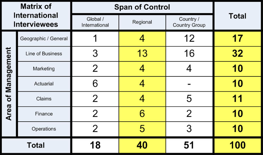
I had initially targeted speaking to around 40-50 managers, but quickly came to realise that – given the diversity of the organisation’s operations – I would need to talk to more people to get an accurate picture. As things worked out, I ended up interviewing precisely 100 managers. I started to try to describe the range of people that I talked to and quickly came to the conclusion that a picture paints a thousand words. The following exhibit provides a breakdown by geographic span of responsibility and area of the business:

The distribution of managers that I interviewed

The paper covering their detailed feedback from this exercise expanded to over 400 pages; each line of which was reviewed, sometimes amended, and signed-off by the people interviewed. Such a sign-off process certainly increases the duration of the work, but it is indispensable in my opinion. If you are inaccurate or incomplete in your understanding of the business, then you are building on foundations of sand. Of course, as well as using this exhaustive process to document business requirements, it was also a great opportunity to begin to establish relationships and also to gently start the process of marketing some of my ideas about MI.

It is clearly inappropriate for me to share my detailed findings about the business issues that the organisation was dealing with, however I will make one observation, which I think is probably replicated in many companies. When I spoke to managers at different levels within the organisation, they all cited similar strategies, challenges and priorities. This fact was testament to good communication between different tiers, however widely separated by geography, and also to a shared sense of purpose. What was however notable was that people at different levels gave varying emphasis to the issues. If a global leader prioritised areas as 1-2-3-4, it was not unusual that a manager at the country level instead ranked the same areas as 1-4-3-2. Perhaps this is not so surprising.
 
 
Understanding the systems

In parallel I also worked with the CIOs of each region and with members of their departments to understand the systems that different business units used and how they were interrelated. In doing this, it was helpful to already have the business perspective on these systems and I was able to provide general feedback about IT in each territory which was valuable to my colleagues. In this type of work (as indeed can be the case when thinking about different markets and products from the business perspective) it is sometimes easy to be overwhelmed by the differences. Instead, I made myself focus on teasing out the similarities. There ended up being many more of these that I had anticipated. In this work I relied to a great extent on my experience of consolidating data from three different underwriting systems (plus many other back-end systems) as part of my previous work in Europe.
 
 
Forming and validating a strategy

With this substantial background in both the business needs and the IT landscape, I was able to develop a management information strategy that focused on what was held in common across business units and departments, whilst still recognising the need to meet certain market-specific requirements. The lengthy hours of research that I had put in proved to be worthwhile when I presented my ideas back to many of the same group that I had interviewed and received their backing and approval.
 
 
Some final thoughts

While it was undeniably interesting and even fun to learn so much about the diverse operations of a large international organisation, the process was undeniably lengthy sometimes even arduous. It took six months from conception of the project to delivering detailed findings, recommendations and plans to the international senior management team (of course I also presented interim findings and draft recommendations several times over this period).

It remains my firm belief that this type of exercise is mandatory if you are really serious about adding value with BI. I can see no way to short-cut the process without substantially compromising on your deliverables and the value that they are intended to unlock. If you do not understand the business and its needs, it is nigh on impossible to deliver the information that they require to take decisions. In some areas of life, you just have to put in the hard work. Establishing the requirements for BI in a large international organisation is certainly one of these areas.
 

BI and a different type of outsourcing

outsourcing

The current economic climate seems to be providing ammunition for both those who favour outsourcing elements of IT and those who abjure it. I’m not going to jump into the middle of these discussions today (though I am working on an article about the pros and cons of outsourcing BI which will appear here at some future point). Instead I want to talk about another type of outsourcing, one that ended up being a major success in a BI project that I recently led. The area I want to focus on is outsourcing analysis to the business.

The project was at an Insurance company and in these types of organisations one hub for business analysis is the actuarial department. These are the highly qualified and numerate people who often spend a lot of their time in simple number crunching with the aim of ensuring that underwriters have the data they need to review books of business and to take decisions about particular accounts. As with many such people, they have both the ability and desire to operate at a more strategic level. They are sometimes prevented from doing do by the burden of work.

As I have explained elsewhere, an explicit aim of this project was cultural transformation. We wanted to place reliance on credible, easy-to-use, pertinent information at the heart of all business decisions; to make it part of the corporate DNA. One approach to achieving this was making training programmes very business focussed. One exercise that the trainers (both actuarial and indeed me) took delegates through was estimating the future profitability of a book of business based on performance in previous years (using loss triangulation if you are interested). This is a standard piece of actuarial work, but the new BI system was so intuitive that underwriters could do this for themselves. Indeed they embraced doing so, realising that they could get a better and more frequently updated insight into their books of business in this way.

This meant two things. First the number-crunching workload of actuarial was reduced. Second when underwriters and actuarial engaged in discussions, for example around insurance estimates to be included in year-end results, the process was more of an informed dialogue than the previous, sometimes adversarial, approach. Actuarial time is freed-up to focus on more complex analysis, underwriters become more empowered to manage their own portfolios and the whole organisation moves up the value chain.

This is what I mean by the idea of outsourcing analysis to the business. In some ways it is the same phenomenon as companies outsourcing internal administrative tasks to customers via web applications. However, it is more powerful than this. Instead of simply transferring costs, knowledge and expertise is spread more widely and the whole organisation begins to talk about the business in a different and more consistent manner.

It’s nice to be able to report a success story for at least one type of outsourcing.